
eBook - ePub
In Progress
See Inside a Lettering Artist's Sketchbook and Process, from Pencil to Vector
Jessica Hische
This is a test
Compartir libro
- 176 páginas
- English
- ePUB (apto para móviles)
- Disponible en iOS y Android
eBook - ePub
In Progress
See Inside a Lettering Artist's Sketchbook and Process, from Pencil to Vector
Jessica Hische
Detalles del libro
Vista previa del libro
Índice
Citas
Información del libro
This show-all romp through design-world darling Jessica Hische's sketchbook reveals the creative and technical process behind making award-winning hand lettering. See everything, from Hische's rough sketches to her polished finals for major clients such as Wes Anderson, NPR, and Starbucks. The result is a well of inspiration and brass tacks information for designers who want to sketch distinctive letterforms and hone their skills. With more than 250 images of her penciled sketches, this highly visual ebook is an essential—and entirely enjoyable—resource for those who practice or simply appreciate the art of hand lettering.
Preguntas frecuentes
¿Cómo cancelo mi suscripción?
¿Cómo descargo los libros?
Por el momento, todos nuestros libros ePub adaptables a dispositivos móviles se pueden descargar a través de la aplicación. La mayor parte de nuestros PDF también se puede descargar y ya estamos trabajando para que el resto también sea descargable. Obtén más información aquí.
¿En qué se diferencian los planes de precios?
Ambos planes te permiten acceder por completo a la biblioteca y a todas las funciones de Perlego. Las únicas diferencias son el precio y el período de suscripción: con el plan anual ahorrarás en torno a un 30 % en comparación con 12 meses de un plan mensual.
¿Qué es Perlego?
Somos un servicio de suscripción de libros de texto en línea que te permite acceder a toda una biblioteca en línea por menos de lo que cuesta un libro al mes. Con más de un millón de libros sobre más de 1000 categorías, ¡tenemos todo lo que necesitas! Obtén más información aquí.
¿Perlego ofrece la función de texto a voz?
Busca el símbolo de lectura en voz alta en tu próximo libro para ver si puedes escucharlo. La herramienta de lectura en voz alta lee el texto en voz alta por ti, resaltando el texto a medida que se lee. Puedes pausarla, acelerarla y ralentizarla. Obtén más información aquí.
¿Es In Progress un PDF/ePUB en línea?
Sí, puedes acceder a In Progress de Jessica Hische en formato PDF o ePUB, así como a otros libros populares de Arte y Arte general. Tenemos más de un millón de libros disponibles en nuestro catálogo para que explores.
Información
Categoría
ArteCategoría
Arte general
Process in Action: Differing Steps for Different Projects

Most of the work that I do falls into these categories: editorial, advertising, books, logos, and miscellaneous (which includes hard-to-categorize printed and non-printed projects, including some of my type design work). Through case studies, you’ll see how my process shifts depending on the category of work and who the work is for. We’ve gotten over the hump of technical talk; on to the pretty pictures!


Creating artwork for magazines and newspapers is very fun, and because the timelines are generally pretty tight, you can create a large portfolio of work very quickly. Early in my career, people who stumbled upon my portfolio were shocked at the amount of work I’d created in such a short period of time, and I was able to amass such a big body of work because of all the editorial projects I’d been working on. If I look at my calendar from that time, it’s packed with editorial work. I’d be working on up to twelve or fifteen jobs simultaneously, which in retrospect seems crazy. What made it possible to work on so many projects at once was the inflexibility of editorial deadlines—a magazine or newspaper went to press on a certain date, and my artwork had to be delivered by that time. I could piece together my calendar like a complicated puzzle, everything staying neatly in place, jobs hardly ever requiring many rounds of revision or pushing past their original deadlines.
One of the most fun things about editorial work is that you get to read endless fascinating articles and brainstorm about what concepts would best articulate the ideas expressed in them. I particularly love illustrating for science magazines because of all the random things I get to learn about. As an editorial illustrator, you have more freedom to experiment than you often do on other client projects because what you’re creating isn’t a part of a big expensive campaign. It isn’t going to be used by the client on everything they make for all eternity—it exists in just one issue, on one page, as a part of one article of one publication. I don’t do as many editorial jobs now as I used to, but I still love to take them on here and there as palate cleansers.
32° of Fun
Client: Northern Virginia Magazine
Art Direction: Hana Jung
Art Direction: Hana Jung
Much of my early lettering work was quite illustrative, like this piece for Northern Virginia Magazine. I wasn’t quite as crazy about point placement at this time in my career, so everything feels a bit looser. There are a lot of gradients and drop shadows (created not with the drop shadow tool, but by adding a Gaussian blur to duplicated shapes and turning the opacity down to 50 percent or lower), which makes the work feel a bit like cut paper. I used to use a paper texture layer on top of all of my work, which warmed it up and made everything feel cohesive. Now, I try not to rely on textures and tricks to make the work feel “finished.”


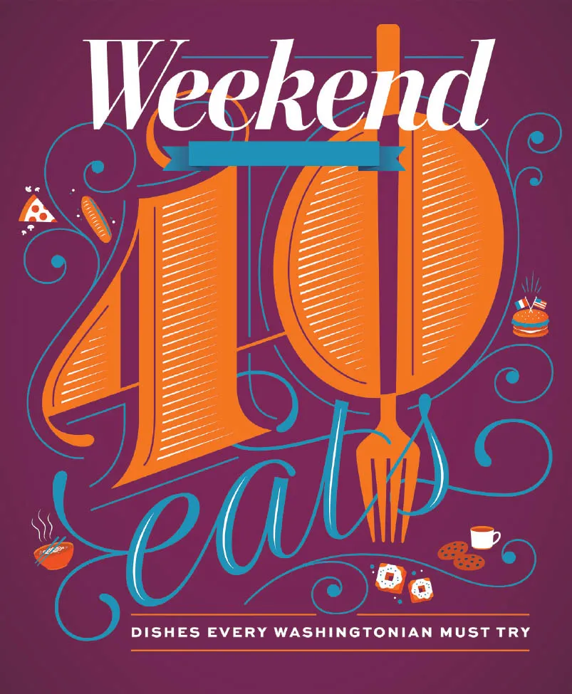
40 Eats
Client: The Washington Post
Art Direction: Chris Barber
Art Direction: Chris Barber
Chris reached out for me to create the cover of the Washington Post’s Weekend section for their annual 40 Eats feature, which highlights forty culinary things to try in DC. In previous issues, a giant 40 was a prominent feature, and as I love giant letters and numbers, I kept that in my design. I wanted to use an unexpected color palette and settled on plum, orange, and cyan.

Fortune 50
Client: Fortune magazine
Art Direction: Michael Solita
Art Direction: Michael Solita
Fortune contacted me to create a giant 50 for their upcoming issue about the fifty most powerful women. Since the timeline was tight, and the layout wasn’t totally nailed down yet, we decided to create two versions—one that was more fancy and feminine and one that was more modern and deco-influenced. The former was the one that ended up in the magazine, but I’m really...