![]()
Chapter 1
Australia’s Economic Performance
The starting point for the analysis of any economy should be an understanding of its past and present performance. The performance is what needs to be explained by more detailed analysis. This in turn provides the baseline from which we can try to build a picture of what Australia does well, and not so well, and assess what Australia needs to do to improve performance in the future.
Aggregate Performance
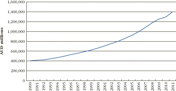
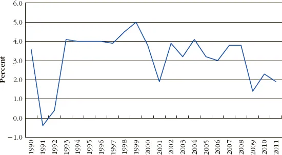
Australia’s economy has been one of the best performing in the OECD since 1990. Nominal GDP went from just over AUD 400 billion in 1990 to just under AUD 1,400 billion in 2011 (Figure 1.1). This was around 1.6 percent of global GDP. Australia’s annual GDP growth has been positive every year since 1991. Australia experienced real annual GDP growth on the order of 3 to 4 percent per year until the onset of the Global Financial Crisis in 2008, when growth dipped down to roughly 2 percent per year (Figure 1.2), which was still better than most other OECD nations. Australia stayed in positive territory, in part as the result of a stimulus package, which at AUD 42 billion was one of the world’s largest in proportional terms.1
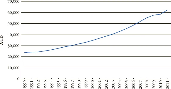
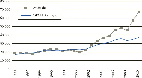
Australia’s nominal per capita GDP went from nearly AUD 24,000 per person per annum in 1990 to AUD 62,337 per person per annum in 2011 (Figure 1.3). In US dollar terms, Australia’s 2011 per capita GDP of USD 67,554 comfortably outstripped the USD 48,043 figure of the United States. It has also been well ahead of the OECD average (Figure 1.4). At the same time, Australia’s Gini coefficient in the late 2000s of 0.336 was only slightly above the OECD average of 0.316, indicating income inequality slightly greater than the OECD average.
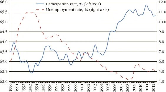
Australia has seen its workforce participation rate increase from around 63 percent in the late 1990s to over 65 percent since 2007. Australia’s unemployment rate spiked at over 12 percent in the early 1990s before falling below 5 percent before the Global Financial Crisis. Although the unemployment rate approached 6 percent in 2009–2010, it was back down near 5 percent by 2011 (Figure 1.5). Australia has high workforce participation and relatively low unemployment.
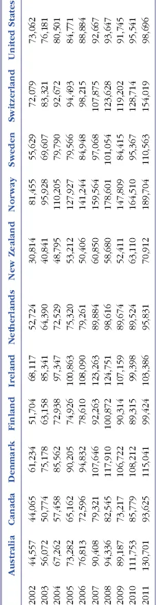
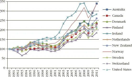
Perhaps the most interesting comparison of Australia with other countries is in GDP per person of employment age (taken as 15 to 64 years of age) in current US dollars shown in Table 1.1. This measure is, in our view, a better measure of an economy’s strength than GDP per capita or GDP per employed person, because the former counts a very young or very old population against the country, and the latter in essence penalises the country for employing marginal workers. GDP per person of employable age indicates the output the economy can generate given the potentially productive population. On this measure, Australia was nearly 40 percent below the United States in 2002 and more than 30 percent above the United States in 2011. Figure 1.6 shows that over the 1990 to 2011 period, Australia actually outperformed all of the other countries in the figure in growth in this measure.
If you have trouble viewing this table on your e-reader, you can download a copy at www.wiley.com/go/enright-petty (password: compete123).
TABLE 1.1 GDP Per Person 15–64 Years Old, Current US Dollars
Sources: International Labour Organization, Economically Active Population, Estimates and Projections, 6th ed., October 2011; World Bank, World Development Indicators, September 2012.
Despite the notoriety of Australia’s primary sector, its proportion of GDP has remained remarkably constant over the last 20 years, at 9.5 percent of GDP in 1990 and 9.7 percent in 2011.2 Of course, there are multiplier effects of the primary sector that are not captured in the simple ratio. The main shifts in the composition of Australia’s GDP over the last 20 years have been in manufacturing (22.1 percent of GDP in 1990 and 18.0 percent in 2011); the service sector (51.5 percent in 1990 and 57.7 percent in 2011); and the sum of use of residential housing, taxes net of subsidies, and statistical discrepancies (16.9 percent of GDP in 1990 and 14.7 percent in 2011).
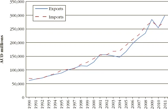
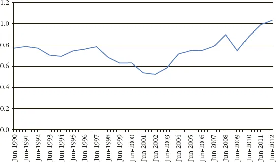
Australia’s trade has grown substantially over the last two decades (Figure 1.7). Exports were around 19.8 percent of GDP in 2010, indicating that Australia is more trade dependent than the United States (exports equal to 12.6 percent of GDP in 2010), but much less so than Canada (29.4 percent) and several small European economies which in some cases have exports equal to 50 percent of GDP or more. Australia moved from a fixed to floating exchange rate in 1983. The low for the Australian dollar was 47.75 US cents in April 2001, and the high was 110 US cents in July 2011 (Figure 1.8), indicating a substantial strengthening of the currency. By October 2012, the Australian dollar was still above 100 US cents.
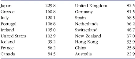
Measured as a percentage of GDP, Australia has a significantly lower level of public debt compared to most OECD nations, and a debt level even lower than fiscally conservative Switzerland and Hong Kong (see Table 1.2). Australia’s debt level had been even lower before the stimulus package put in place to combat the Global Financial Crisis. The Australian Government’s 2012–2013 budget called for a return to surplus in that year.3
TABLE 1.2 Public Debt as a Percent of GDP, Selected Nations 2011
Source: International Monetary Fund, World Economic Outlook Database, April 2012.
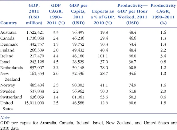
Table 1.3 compares Australia’s economic performance with a selection of comparator countries. With respect to the OECD comparators, Australia’s GDP growth for the period 1990–2011 was higher than most, GDP per capita for 2011 was near the middle, and exports as a percentage of GDP were lower than most, indicating less trade dependence than most of the OECD countries. Measuring productivity as GDP per hour worked for 2011, only Canada, Israel, and New Zealand performed worse than Australia, although taking the compound annual growth rate (CAGR) for this measure for the period 1990–2011, Australia’s performance was middling.
TABLE 1.3 Major Indicators Compared with Selected OECD Economies
Sources: OECD, StatExtracts, April 2012; World Bank, World Development Indicators, September 2012.
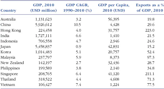
Table 1.4 compares Australia’s performance with other Asia-Pacific economies. Comparing Australia against Asia-Pacific economies, Australia’s GDP growth for the period 1990–2010 was higher than Japan and New Zealand, but lower than all other countries. Australia’s 2010 GDP per capita was significantly higher than all other nations in the table, and only Japan was less trade dependent.
TABLE 1.4 Major Indicators Compared with Asia-Pacific Economies
Sources: OECD, StatExtracts, April 2012; World Bank, World Development Indicators, September 2012.
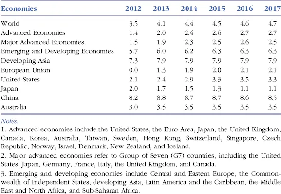
According to the IMF, Australia’s projected real GDP growth to 2017 is much lower than that of China, Developing Asia, and Emerging and Developing Economies for each year, and is projected to be lower than the world overall each year. Australia is projected to outperform advanced economies, major advanced economies, and the European Union each year to 2017, and to outperform or equal the performance of the United States (Table 1.5).
TABLE 1.5 World Economic Outlook on Real GDP Growth, 2012–2017, Percent
Source: International Monetary Fund, World Economic Outlook Database, April 2012.
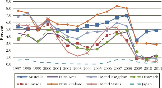
Australia’s interest rates have been fairly high compared to those of many other OECD nations. Figure 1.9 shows Australia’s interest rates against selected OECD countries and the Euro Area for the period 1997 to 2011. Australia cut interest rates 50 basis points in May 2012 and a further 25 basis points in June 2012 with additional cuts being projected by many economists.4 The cash rate of 3.5 percent in the latter portion of 2012 was the lowest since 2009.
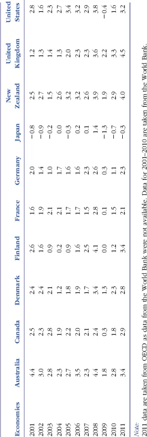
Australia’s consumer price index (CPI) shows the country’s headline inflation. Australia’s CPI has been relatively high compared to many other OECD countries during the period 2001 to 2011 as shown in Table 1.6.
If you have trouble viewing this table on your e-reader, you can download a copy at www.wiley.com/go/enright-petty (password: compete123).
TABLE 1.6 Consumer Price Inflation for Australia and Selected OECD Countries, 2001–2011
Sources: World Bank, World Development Indicators, September 2012; OECD, StatExtracts, April 2012.
Productivity
A nation’s economic performance is heavily influenced by its productivity performance. In Australia, there is widespread agreement that following a period in the 1990s during which there were significant improvements, productivity growth has slow...