![]()
Chapter 1
Telling Stories with Data
Think of all the popular data visualization works out there—the ones that you always hear in lectures or read about in blogs, and the ones that popped into your head as you were reading this sentence. What do they all have in common? They all tell an interesting story. Maybe the story was to convince you of something. Maybe it was to compel you to action, enlighten you with new information, or force you to question your own preconceived notions of reality. Whatever it is, the best data visualization, big or small, for art or a slide presentation, helps you see what the data have to say.
More Than Numbers
Face it. Data can be boring if you don’t know what you’re looking for or don’t know that there’s something to look for in the first place. It’s just a mix of numbers and words that mean nothing other than their raw values. The great thing about statistics and visualization is that they help you look beyond that. Remember, data is a representation of real life. It’s not just a bucket of numbers. There are stories in that bucket. There’s meaning, truth, and beauty. And just like real life, sometimes the stories are simple and straightforward; and other times they’re complex and roundabout. Some stories belong in a textbook. Others come in novel form. It’s up to you, the statistician, programmer, designer, or data scientist to decide how to tell the story.
This was one of the first things I learned as a statistics graduate student. I have to admit that before entering the program, I thought of statistics as pure analysis, and I thought of data as the output of a mechanical process. This is actually the case a lot of the time. I mean, I did major in electrical engineering, so it’s not all that surprising I saw data in that light.
Don’t get me wrong. That’s not necessarily a bad thing, but what I’ve learned over the years is that data, while objective, often has a human dimension to it.
For example, look at unemployment again. It’s easy to spout state averages, but as you’ve seen, it can vary a lot within the state. It can vary a lot by neighborhood. Probably someone you know lost a job over the past few years, and as the saying goes, they’re not just another statistic, right? The numbers represent individuals, so you should approach the data in that way. You don’t have to tell every individual’s story. However, there’s a subtle yet important difference between the unemployment rate increasing by 5 percentage points and several hundred thousand people left jobless. The former reads as a number without much context, whereas the latter is more relatable.
Journalism
A graphics internship at The New York Times drove the point home for me. It was only for 3 months during the summer after my second year of graduate school, but it’s had a lasting impact on how I approach data. I didn’t just learn how to create graphics for the news. I learned how to report data as the news, and with that came a lot of design, organization, fact checking, sleuthing, and research.
There was one day when my only goal was to verify three numbers in a dataset, because when The New York Times graphics desk creates a graphic, it makes sure what it reports is accurate. Only after we knew the data was reliable did we move on to the presentation. It’s this attention to detail that makes its graphics so good.
Take a look at any New York Times graphic. It presents the data clearly, concisely, and ever so nicely. What does that mean though? When you look at a graphic, you get the chance to understand the data. Important points or areas are annotated; symbols and colors are carefully explained in a legend or with points; and the Times makes it easy for readers to see the story in the data. It’s not just a graph. It’s a graphic.
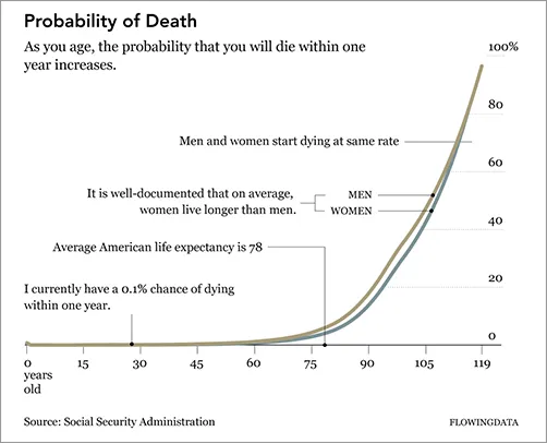
The graphic in Figure 1-1 is similar to what you will find in The New York Times. It shows the increasing probability that you will die within one year given your age.
Check out some of the best New York Times graphics at http://datafl.ws/nytimes.
The base of the graphic is simply a line chart. However, design elements help tell the story better. Labeling and pointers provide context and help you see why the data is interesting; and line width and color direct your eyes to what’s important.
Chart and graph design isn’t just about making statistical visualization but also explaining what the visualization shows.
Note
See Geoff McGhee’s video documentary “Journalism in the Age of Data” for more on how journalists use data to report current events. This includes great interviews with some of the best in the business.
Art
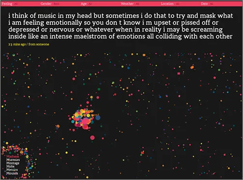
The New York Times is objective. It presents the data and gives you the facts. It does a great job at that. On the opposite side of the spectrum, visualization is less about analytics and more about tapping into your emotions. Jonathan Harris and Sep Kamvar did this quite literally in We Feel Fine (Figure 1-2).
The interactive piece scrapes sentences and phrases from personal public blogs and then visualizes them as a box of floating bubbles. Each bubble represents an emotion and is color-coded accordingly. As a whole, it is like individuals floating through space, but watch a little longer and you see bubbles start to cluster. Apply sorts and categorization through the interface to see how these seemingly random vignettes connect. Click an individual bubble to see a single story. It’s poetic and revealing at the same time.
Interact and explore people’s emotions in Jonathan Harris and Sep Kamvar’s live and online piece at http://wefeelfine.org.
There are lots of other examples such as Golan Levin’s The Dumpster, which explores blog entries that mention breaking up with a significant other; Kim Asendorf’s Sumedicina, which tells a fictional story of a man running from a corrupt organization, with not words, but graphs and charts; or Andreas Nicolas Fischer’s physical sculptures that show economic downturn in the United States.
See FlowingData for many more examples of art and data at http://datafl.ws/art.
The main point is that data and visualization don’t always have to be just about the cold, hard facts. Sometimes you’re not looking for analytical insight. Rather, sometimes you can tell the story from an emotional point of view that encourages viewers to reflect on the data. Think of it like this. Not all movies have to be documentaries, and not all visualization has to be traditional charts and graphs.
Entertainment
Somewhere in between journalism and art, visualization has also found its way into entertainment. If you think of data in the more abstract sense, outside of spreadsheets and comma-delimited text files, where photos and status updates also qualify, this is easy to see.
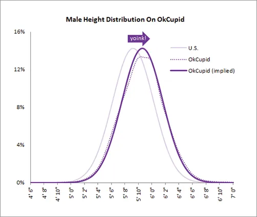
Facebook used status updates to gauge the happiest day of the year, and online dating site OkCupid used online information to estimate the lies people tell to make their digital selves look better, as shown in Figure 1-3. These analyses had little to do with improving a business, increasing revenues, or finding glitches in a system. They circulated the web like wildfire because of their entertainment value. The data revealed a little bit about ourselves and society.
Facebook found the happiest day to be Thanksgiving, and OkCupid found that people tend to exaggerate their height by about 2 inches.
Check out the OkTrends blog for more revelations from online dating such as what white people really like and how not to be ugly by accident: http://blog.okcupid.com.
Compelling
Of course, stories are...