eBook - ePub
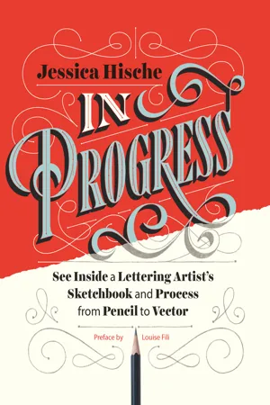
In Progress
See Inside a Lettering Artist's Sketchbook and Process, from Pencil to Vector
- 176 pages
- English
- ePUB (mobile friendly)
- Available on iOS & Android
eBook - ePub
In Progress
See Inside a Lettering Artist's Sketchbook and Process, from Pencil to Vector
About this book
This show-all romp through design-world darling Jessica Hische's sketchbook reveals the creative and technical process behind making award-winning hand lettering. See everything, from Hische's rough sketches to her polished finals for major clients such as Wes Anderson, NPR, and Starbucks. The result is a well of inspiration and brass tacks information for designers who want to sketch distinctive letterforms and hone their skills. With more than 250 images of her penciled sketches, this highly visual ebook is an essential—and entirely enjoyable—resource for those who practice or simply appreciate the art of hand lettering.
Information

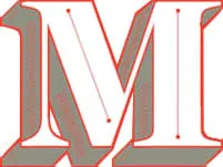
Process in Action: Differing Steps for Different Projects

Most of the work that I do falls into these categories: editorial, advertising, books, logos, and miscellaneous (which includes hard-to-categorize printed and non-printed projects, including some of my type design work). Through case studies, you’ll see how my process shifts depending on the category of work and who the work is for. We’ve gotten over the hump of technical talk; on to the pretty pictures!

Creating artwork for magazines and newspapers is very fun, and because the timelines are generally pretty tight, you can create a large portfolio of work very quickly. Early in my career, people who stumbled upon my portfolio were shocked at the amount of work I’d created in such a short period of time, and I was able to amass such a big body of work because of all the editorial projects I’d been working on. If I look at my calendar from that time, it’s packed with editorial work. I’d be working on up to twelve or fifteen jobs simultaneously, which in retrospect seems crazy. What made it possible to work on so many projects at once was the inflexibility of editorial deadlines—a magazine or newspaper went to press on a certain date, and my artwork had to be delivered by that time. I could piece together my calendar like a complicated puzzle, everything staying neatly in place, jobs hardly ever requiring many rounds of revision or pushing past their original deadlines.
One of the most fun things about editorial work is that you get to read endless fascinating articles and brainstorm about what concepts would best articulate the ideas expressed in them. I particularly love illustrating for science magazines because of all the random things I get to learn about. As an editorial illustrator, you have more freedom to experiment than you often do on other client projects because what you’re creating isn’t a part of a big expensive campaign. It isn’t going to be used by the client on everything they make for all eternity—it exists in just one issue, on one page, as a part of one article of one publication. I don’t do as many editorial jobs now as I used to, but I still love to take them on here and there as palate cleansers.
32° of Fun
Client: Northern Virginia Magazine
Art Direction: Hana Jung
Art Direction: Hana Jung
Much of my early lettering work was quite illustrative, like this piece for Northern Virginia Magazine. I wasn’t quite as crazy about point placement at this time in my career, so everything feels a bit looser. There are a lot of gradients and drop shadows (created not with the drop shadow tool, but by adding a Gaussian blur to duplicated shapes and turning the opacity down to 50 percent or lower), which makes the work feel a bit like cut paper. I used to use a paper texture layer on top of all of my work, which warmed it up and made everything feel cohesive. Now, I try not to rely on textures and tricks to make the work feel “finished.”


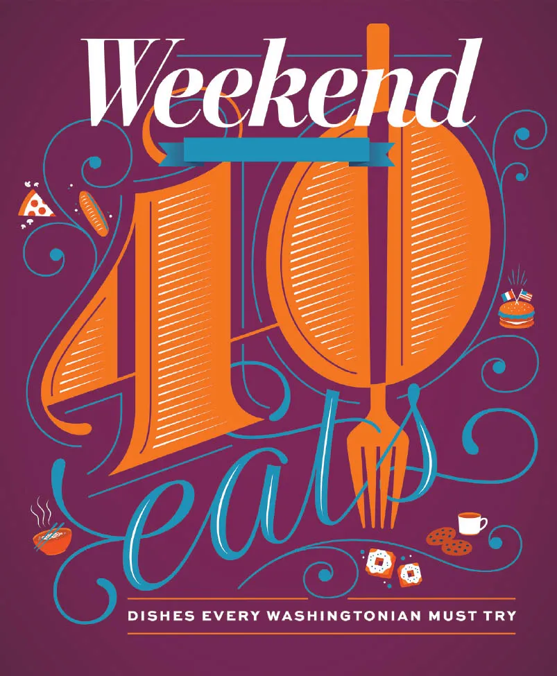
40 Eats
Client: The Washington Post
Art Direction: Chris Barber
Art Direction: Chris Barber
Chris reached out for me to create the cover of the Washington Post’s Weekend section for their annual 40 Eats feature, which highlights forty culinary things to try in DC. In previous issues, a giant 40 was a prominent feature, and as I love giant letters and numbers, I kept that in my design. I wanted to use an unexpected color palette and settled on plum, orange, and cyan.

Fortune 50
Client: Fortune magazine
Art Direction: Michael Solita
Art Direction: Michael Solita
Fortune contacted me to create a giant 50 for their upcoming issue about the fifty most powerful women. Since the timeline was tight, and the layout wasn’t totally nailed down yet, we decided to create two versions—one that was more fancy and feminine and one that was more modern and deco-influenced. The former was the one that ended up in the magazine, but I’m really...
Table of contents
- Cover
- Title
- Copyright
- Dedication
- Contents
- Preface
- Introduction
- The Typographic Arts: Lettering, Calligraphy & Type Design
- The Process
- The Work
- Acknowledgments
- Index
- Chronicle Ebooks
- About the Author
Frequently asked questions
Yes, you can cancel anytime from the Subscription tab in your account settings on the Perlego website. Your subscription will stay active until the end of your current billing period. Learn how to cancel your subscription
No, books cannot be downloaded as external files, such as PDFs, for use outside of Perlego. However, you can download books within the Perlego app for offline reading on mobile or tablet. Learn how to download books offline
Perlego offers two plans: Essential and Complete
- Essential is ideal for learners and professionals who enjoy exploring a wide range of subjects. Access the Essential Library with 800,000+ trusted titles and best-sellers across business, personal growth, and the humanities. Includes unlimited reading time and Standard Read Aloud voice.
- Complete: Perfect for advanced learners and researchers needing full, unrestricted access. Unlock 1.4M+ books across hundreds of subjects, including academic and specialized titles. The Complete Plan also includes advanced features like Premium Read Aloud and Research Assistant.
We are an online textbook subscription service, where you can get access to an entire online library for less than the price of a single book per month. With over 1 million books across 990+ topics, we’ve got you covered! Learn about our mission
Look out for the read-aloud symbol on your next book to see if you can listen to it. The read-aloud tool reads text aloud for you, highlighting the text as it is being read. You can pause it, speed it up and slow it down. Learn more about Read Aloud
Yes! You can use the Perlego app on both iOS and Android devices to read anytime, anywhere — even offline. Perfect for commutes or when you’re on the go.
Please note we cannot support devices running on iOS 13 and Android 7 or earlier. Learn more about using the app
Please note we cannot support devices running on iOS 13 and Android 7 or earlier. Learn more about using the app
Yes, you can access In Progress by Jessica Hische in PDF and/or ePUB format, as well as other popular books in Art & Art General. We have over one million books available in our catalogue for you to explore.