
eBook - ePub
Fourier Series and Transforms
R.D Harding
This is a test
Share book
- 88 pages
- English
- ePUB (mobile friendly)
- Available on iOS & Android
eBook - ePub
Fourier Series and Transforms
R.D Harding
Book details
Book preview
Table of contents
Citations
About This Book
This book helps in giving a qualitative feel for the properties of Fourier series and Fourier transforms by using the illustrative powers of computer graphics. It is useful for wide variety of students as it focuses on qualitative aspects and the flexibility with regard to program modification.
Frequently asked questions
How do I cancel my subscription?
Can/how do I download books?
At the moment all of our mobile-responsive ePub books are available to download via the app. Most of our PDFs are also available to download and we're working on making the final remaining ones downloadable now. Learn more here.
What is the difference between the pricing plans?
Both plans give you full access to the library and all of Perlego’s features. The only differences are the price and subscription period: With the annual plan you’ll save around 30% compared to 12 months on the monthly plan.
What is Perlego?
We are an online textbook subscription service, where you can get access to an entire online library for less than the price of a single book per month. With over 1 million books across 1000+ topics, we’ve got you covered! Learn more here.
Do you support text-to-speech?
Look out for the read-aloud symbol on your next book to see if you can listen to it. The read-aloud tool reads text aloud for you, highlighting the text as it is being read. You can pause it, speed it up and slow it down. Learn more here.
Is Fourier Series and Transforms an online PDF/ePUB?
Yes, you can access Fourier Series and Transforms by R.D Harding in PDF and/or ePUB format, as well as other popular books in Mathematics & Mathematics General. We have over one million books available in our catalogue for you to explore.
Information
ᐳ Part 1
ᐳ Sampling and Resolution
Readers who are familiar with the concepts of sampling and resolution should skip to Part 2.
A request like ‘draw a graph of y = x2, sounds simple enough but turns out to be a little vague on further reflection. What values of x should be used? What scales? How accurately should the job be done? The human mind is very good at coping with this kind of vagueness; if no further information is supplied, most people familiar with this kind of mathematical task would draw a rough pair of Cartesian axes on a plain piece of paper and then a free-hand parabola; probably they would ensure the parabola went through the origin, touching the x axis there. They can do this because at some time they have plotted the function properly, or seen someone else do it, and have remembered the essential features.
To do the task properly, we must first agree on a range of values of x, for example − 10 to +10. In principle we must next calculate y = x2 for every value of x in this range; as there are an infinite number of values this is impossible, so instead a finite number of in-between values are chosen, for example the 21 values x = −10, − 9, −8,…,0, 1,…,10. Next we work out y = x2 at each of these values and assume that these y values will be typical of any further values we may eventually obtain. On this assumption we can then take a piece of graph paper, decide where to rule the axes, and what scales to use. We can now mark a dot for each pair of values (x,y).
The values of y obtained in this way are called sample values of y = x2 obtained at the sample points x. There is no need for the sample points to be regularly spaced; we might look at our graph paper and decide that some points are rather far apart, and we would like some values in-between. The usual procedure for completing our graph would be to add more sample points until they looked close enough together to join each neighbouring dot with a straight pencil line. This is another vague requirement which could be resolved by asking, for example, that ‘no point on the line should be vertically displaced by more than 0.1 units of y from the true value for that x’ Even now there is still some vagueness because every pencil line has finite thickness.
For the purpose of plotting our function, it is becoming clear that whatever we do, we can never plot it exactly. We had better give up the idea and accept that there will always be some fuzziness in our efforts.
‘Fuzziness’ in plotting can be illustrated by a simple computer graphics demonstration. All common computer screens work by illuminating individual blobs on the screen: these blobs cannot be subdivided. Our rule for plotting any function will be: sample the function at suitably spaced values of x, and illuminate the blob which covers the resulting point (x, y). If the blobs are fine enough and the sample points are sufficiently closely spaced, our eyes and brain will see them as a continuous line, if we don’t look too closely. The finer the blobs, the better we will say is the screen resolution; the closer the sample points, the better we will say is the sample resolution.
These effects are illustrated by the program SAMPLE1 (see separate description). As supplied it will plot y = x2 in the range − 10≤ x ≤ 10 using a screen resolution which you input when the program asks. The figure required is the number of blobs per full screen width: you may not ask for fewer than 20, but there is no upper limit; if you ask for greater resolution than actually possessed by the screen, the program will take longer to run but you will not end up with a better figure. Notice the order in which the blobs are illuminated: at first the function is sampled at widely spaced points, and then the values in between are filled in. If you ask for lower resolution than actually possessed by the screen, a square region of blobs will be illuminated to simulate that lower resolution.
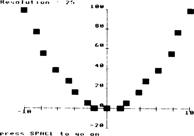
Figure 1.1 Typical display from SAMPLE1, showing a partially sampled function at low resolution.
Run SAMPLE1 a few times with various resolutions. Convince yourself that it is pointless to go beyond maximum screen resolution, and note the number of function evaluations required at maximum resolution.
Convince yourself also that you do not need to go to full resolution to get a very good idea of how the graph looks. If you are confident with the computer, try changing the program to graph some other simple functions; for example, y = ex, y = √x, y = sin x, etc. Remember to choose suitable ranges of x and y.
You will have noted the time needed to plot at full resolution, and perhaps you are wondering if we can make an acceptable graph out of fewer points by joining them up with lines, just as one would do with pencil and ruler on graph paper? The computer can do this too, as demonstrated in program SAMPLE2. This time when you run the program you must input a number which will be the number of sample points at which the computer will evaluate the function. The resulting points will be joined with lines. The computer will then offer you the options of repeating this display with a new value for the number of sample points, or continuing, in which case the function is plotted at the finest possible screen resolution (as for SAMPLE1), and then the graph resulting from the line plotting method is superimposed (in a different colour if you are using colour graphics). From this display you can see where the line plotting method goes wrong, because if the line plotting was as accurate as the screen resolution allows, all of the point plot would be covered over by the line plot. Experiment with the program, starting with two sample points and increasing the number up to the limit of screen resolution. Observe how a quite acceptable graph can be obtained with as few as 20 sample points, and that eventually the line plot and the point plot become identical; but the most important point to note is that the line plot becomes very close indeed to the point plot when the sample resolution is considerably lower than the screen resolution. Later you will see that this is not true under all conditions; the nature of the function and the range over which it is to be plotted affect matters a great deal. If you are using a colour display, you will notice that even when the two plots are getting very close (say beyond 40 sample points) a few isolated spots show up as different. This is due to computer rounding errors.
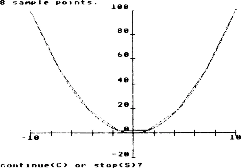
Figure 1.2 Typical display from SAMPLE2, showing an approximation made of straight line segments superimposed on the actual function plotted at the highest available resolution.
When we, or the computer, join up neighbouring points with lines, we are in effect guessing the y values at all the x values between points instead of working them out directly. We are replacing the true graph with the graph of a function which is linear, meaning simply that it has a straight line graph. A different linear function is used between each pair of points. There is a mathematical phrase for this: linear interpolation. Interpolation means guessing the in-between values; linear means use straight lines to do the guessing. There are more complicated ways of doing interpolation, but we will not discuss them here.
What should be concluded from these demonstrations? In every practical application of mathematics, there will be some limit of resolution imposed by the real world; for example, the graininess of a screen, the tolerance with which a metal component can be machined, the limit of accuracy of some measuring device like a stop-watch or weighing scales, etc. So a totally accurate representation of a mathematical function will never be needed; there is just no purpose in attempting to obtain accuracy beyond the limiting resolution. Usually a lower resolution will be adequate for the purpose, which can be chosen according to circumstances, but whatever the resolution that is set, there will be a sampling resolution that combined with interpolation will enable the values in question to be represented with acceptable accuracy.
Mathematical notation:
Sample points will be denoted by xi:i= 1,2,…,N.
Sample values will be denoted by yi:i= 1,2,…,N.
Each sample point would be plotted at coordinates (xi,yi).
ᐳ Part 2
ᐳ Periodic Functions, Harmonics and Fourier Series
> 2.1 Periodicity
Periodic functions are functions which repeat themselves over and over again. They are very important in many applications of mathematics, for example in biological modelling to represent the daily cycle of light and dark, in mechanical engineering to represent the repeated stresses and strains of a rotating component, in the theory of radio waves and circuits, and in acoustics, where a sound wave is due to constantly repeated motions of the molecules of air. Because all these examples involve the idea of time, it is natural to use the symbol t, rather than x, to stand for the independent variable; that is, we will talk of functions y = t2 (for example) rather than y = x2. When plotting graphs, t will be measured along the hori...