![]()
Sample Content
In this section, we will be examining examples of the content that might be included in your UX Style Framework. The emphasis in this area will be on the success guideline titled "Keep it simple."
These chapters will demonstrate how the number of items and the level of definition needed to ensure consistency in your interfaces may be far less than you expect.
Remember...
UX Style Frameworks do not define pages nor complex components. UX Style Frameworks define only the reusable, basic building blocks that will be combined by your designers and developers to create innovative, contemporary, and effective user experiences.
© nenovbrothers / Stockfresh
Sample UX Style Framework Categories
As mentioned previously, UX Style Frameworks are very flexible, and can be customized to fit a wide variety of organizational needs. These sample sections will help you evaluate and categorize various patterns that might be included In your own framework. They will also give owners a working recipe to facilitate research and compile the content for their respective standards.
Scaffolding
These are the foundational items upon which everything else is built: Page dimensions, grids and modules, colors, and typography.
Elements
The basic building blocks of any site. These include links, buttons, containers, tables, lists, etc.
Interactions
This section will define the common interactions on your site: Scroll bars, light boxes, show-hide interactions, carousels, filtering and sorting, etc.
Navigation
These are the elements that help your users move from page to page such as drop down menus, breadcrumbs, previous-next commands, and pagination.
Forms
Perhaps one of the most critical areas of interface design, forms are the most direct way for users to communicate with you.
Displayed Content
Consistent data formatting is one of the most overlooked areas of user interface design. This area covers formatting of prices, dates, and times; tradenames; grammar; and spelling. It also addresses the presentation of graphic elements such as ratings, badges, image galleries, and maps.
Alerts and Errors
The patterns here will allow you to consistently communicate situations which need the user's attention—everything from page-level errors to battery life indicators.
Fixed Items
Although our framework is focused on building blocks, a few complex components should be precisely defined to ensure global consistency. These include items such as headers, footers, and shopping carts.
Other
Includes additional standards for related products such as emails, advertising, and stand-alone mobile applications.
![]()
8 Scaffolding
The team at Twitter Bootstrap coined the term "Scaffolding" for items in this category, and I think it describes them very well. These are the core foundational patterns that everything else in your application or web site is built upon. As such, while there aren't very many items within scaffolding, once defined they should never be broken.
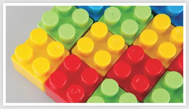
Scaffolding is much like the basic interlocking rules of the popular plastic building block, Lego®. Even though Lego blocks come in all shapes and sizes, in order for the system to work, all blocks must follow the same specifications for connecting. Because these basic specs are never broken, the individual blocks can be combined and reused in limitless ways.
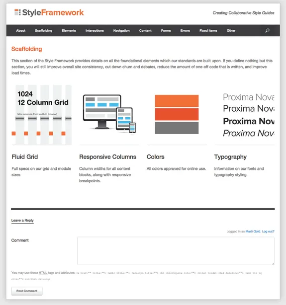
Screenshot of the Scaffolding Category Landing Page from StyleFramework.com.
What to Include in Scaffolding
Page Dimensions and Grid
Although slavish devotion to a grid is often criticized by graphic designers, most UX professionals and developers agree that using some form of grid is crucial for overall design consistency. A functional grid becomes even more critical when creating responsive layouts, as it determines how your various content blocks will behave when moved and resized.
Columns or Modules
In order for your pages to take advantage of reusable components, your content should be sized to fit blocks which span multiple columns within your grid. This page will define those column spans, their sizes, and how those column blocks react when displayed at different widths when using a responsive layout.
Colors
By taking the time to define your complete color palette in the scaffolding section, you eliminate the need to specify detailed color formulas for each individual element presented in the framework. It will also minimize the "eyedropper curse" as designers and developers will quickly learn the precise color information they need is easily located on this page.
Typography
Use this section to provide your typography specifications. This should include the fonts, weights sizes, and any special spacing considerations for body text, headlines, subheadings, bullet point lists, captions, etc. Again, by defining this in the scaffolding section, you will reduce the amount of documentation and CSS required to create page layouts.
Next, we'll examine each of these and further explain why they are included in this foundational group. I will also review the level and various types of information your owners may need to gather In order to effectively define them.
The Grid
Whatever type of grid you decide upon, static or fluid, it should be the first element defined in your UX Style Framework. Much like the foundation of a building, the grid will have an impact on virtually every other element on your site. Using a grid system does not mean that your site's designs will become boring or boxy. It will, however, permit you to save time by incorporating reusable components and improve the overall aesthetics of your site by ensuring visually pleasing alignment of elements.
As you begin compiling all your existing specifications into one location, you may quickly discover that various departments across your company have adopted different grids. Some of these departments may want a fluid grid which resizes based upon the width of the browser window. Some will want a grid which maintains the same number of columns and gutters as it resizes, while others will want to keep a fixed column or gutter width but drop the overall number of columns when moving to smaller formats. Still others will push for three separate static grids—one for desktop, one for tablet, and one for mobile.
As difficult as it may be to reconcile these differences, it is imperative that your organization reach an agreement on a single grid system that everyone will use going forward.
A STANDARDIZED GRID WILL ENSURE:
- • A consistent "framework" for all your pages that is designed to look good on all monitors and devices.
- • Visual continuity from page to page.
- • A greatly accelerated design process, as the grid's consistent measurements permit the crea...