eBook - ePub
Color Management & Quality Output: Working with Color from Camera to Display to Print
(The Digital Imaging Masters Series)
- 344 pages
- English
- ePUB (mobile friendly)
- Available on iOS & Android
eBook - ePub
Color Management & Quality Output: Working with Color from Camera to Display to Print
(The Digital Imaging Masters Series)
About this book
First published in 2012. We have all felt the frustration of wasting time, paper and effort hen our prints or web images don't match the images we see on our monitors. Fortunately, you're holding the resource that will help solve these problems. This book guides you through the hardware settings and software steps you'll need to post professional images and make stunning prints that showcase you artistic vision. In Color Managment & Quality Outprint, Tom P. Ashe, a color expert and gifted teacher, shows you how to color manage your files from input all the way through output, by clearly explaining how color works in our minds, on our monitors and computers and through our printers.
Trusted by 375,005 students
Access to over 1.5 million titles for a fair monthly price.
Study more efficiently using our study tools.
Information
One
COLOR & COLOR VISION
Visual, mental and spiritual phenomena are multiply interrelated in the realm of color and the color arts.1
—Johannes Itten
Colors are the children of light, and light is their mother. Light, that first phenomenon of the world, reveals to us the spirit and living soul of the world through colors.2
—Johannes Itten
If we are going to make the best quality photographs and prints, we need to start by understanding the basics of color. Johannes Itten—the Bauhaus artist, author, educator, and color theorist in the early 20th century—saw color as a seriously complicated and deep topic and art as one of the many disciplines investigating it. Some of these other disciplines include: the physicist, who studies the nature of light, the electromagnetic spectrum, and the measurement of color; the chemist who looks at colorants, such as pigments and dyes, for their ability to produce different colors and reduce their tendency to fade over time; the physiologist, ophthalmologist, and neurologist that investigate the physical response of the eye and the brain (and their components) to color; and the psychologist, who delves into the influence of color on our perceptions, emotions, and behaviors. Itten was also saying the artist — whose interest is in the visual, aesthetic effect and symbolic nature of color and color combinations — is a natural entity, where many of these concerns intersect.
Color gives form and life to our images, and it also has the power to give mood and meaning. Since color is such a pivotal component of a visual artist’s work, it’s important that we, as photographers, have an understanding of how color works.
In this chapter we will explore the three basic components needed for color to exist: light, object, and observer. Our discussion of light will include the nature of different light sources and how these different light sources will impact the colors we see. Then we will examine how the object—depending on its characteristics—either absorbs or reflects portions of the light energy. Finally we will look at the influence we, as observers, and the combination of our eyes and brain, produce and impact the color perceived.
Light
So, not surprisingly, it all starts with light. Color, as well as photography, is not possible without light. Physicists define light as radiation consisting of packets of energy, traveling as electromagnetic waves. And Christiaan Huygens, the 17th-century mathematician and physicist, postulated that white light, or daylight, is composed of different wavelengths of light. He did this by separating sunlight into its components using a prism (as shown in Figure 1.2). Newton divided his spectrum into seven colors—red, orange, yellow, green, blue, indigo, and violet—which, when recombined again, resulted in white light. (Note that this recombination is an additive process, a subject that will come up again in Chapter 2.)
This visible spectrum (the part of the spectrum we can detect and see), which goes from wavelengths of approximately 380 to 730 nanometers, is a small part of the electromagnetic spectrum, which consists of radiation ranging from radio waves to gamma rays. Most of the light that enters our eyes is white light from sunlight or artificial light sources, like tungsten or fluorescent. While the spectrum is often divided into seven or six colors, it can just as easily be divided into fewer components. If we group the colors together at each end of the spectrum and in the middle, then white light can be more simply described as being made up of three major components: blue, green, and red. This corresponds roughly to the sensitivity of the detectors in our eyes that allow us to perceive color.

FIGURE 1.1 Eyjafjallajökull, Iceland, 2011.
Credit: Photograph by the author
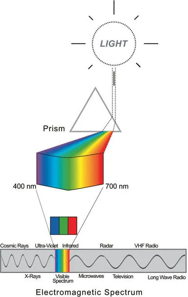
FIGURE 1.2 White light is separated through a prism into the visible spectrum, which is a small part of the electromagnetic spectrum.
Credit: Illustration by the author
Depending on the source of the white light, the red, green, and blue components will be present in different amounts, as seen in the spectral power distribution curves for daylight and tungsten light sources in Figure 1.3. They can combine to create warm light sources such as tungsten lamps (which have a high red component), or cool ones (like daylight in open shade), which have a higher blue component.
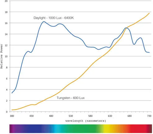
FIGURE 1.3 Spectral energy of daylight and tungsten white light sources. The light sources are measured with a device called a spectral radiometer for their radiance and different wavelengths to produce the data in this graph.
Credit: Illustration by the author
This varying blend of spectrum components in different white light sources is called color temperature, and is described in Kelvin (K). Just so you know, unlike temperature measurements in degrees Celsius or Fahrenheit, Kelvin units are not described as degrees and do not use the degree symbol. Figure 1.4 shows that tungsten lamps have a color temperature of approximately 3200 K, while the overcast daylight is approximately 6500 K and clear blue sky is around 10, 000 K or 12, 000 K. Also notice in Figure 1.4 that 5500K is photographic daylight. This means that 5500 K is the color temperature of most photographic strobe and electronic flash light sources. Correspondingly, 5500 K is the color temperature digital cameras are balanced for when they are set to daylight or flash.

FIGURE 1.4 Color temperature of different continuous light sources.
Credit: Illustration by the author
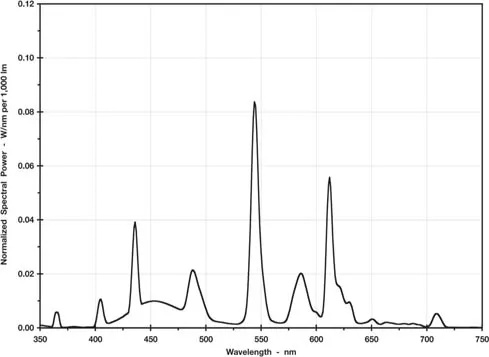
FIGURE 1.5 Spectral output of non-continuous fluorescent light sources.
Credit: Illustration by the author
The Temperature of Light Sources
The temperature of light sources is derived from something called the black body radiation experiment. A black body is an idealized physical structure that starts to radiate light when heat energy is applied to it. When heated to 727 degrees Celsius (1000 K) the black body starts to radiate or glow a dark red. As you heat it more, it glows a brighter red and at 3200 Kelvin glows orange amber. With more and more heat the black body glows yellow, then white, and finally blue at the higher temperatures. Does this make sense that higher temperatures would result in a cooler color? Maybe it would if you picture the flame of a candle. Where is the flame hottest? It’s hottest closer to the wick. What color is the part of the flame that is close to the wick? It’s blue. As you go away from the wick, the color goes from blue to white to possibly yellow, orange, or red, if it has been cooled by something like water.
Continuous versus Non-continuous Light Sources
One thing all the light sources in Figure 1.3 have in common is that they are continuous light sources. This means that daylight, photographic strobes, or tungsten light sources each emit energy at all of the wavelengths in the visible spectrum. Non-continuous...
Table of contents
- Cover
- Half Title
- Titles in The Digital Imaging Masters Series
- Title Page
- Copyright Page
- Bound to Create
- Dedication
- Table of Contents
- Foreword
- Acknowledgments
- Introduction
- Section 1 Color & Color Management
- Section 2 Digital Printmaking & Output
- Index
Frequently asked questions
Yes, you can cancel anytime from the Subscription tab in your account settings on the Perlego website. Your subscription will stay active until the end of your current billing period. Learn how to cancel your subscription
No, books cannot be downloaded as external files, such as PDFs, for use outside of Perlego. However, you can download books within the Perlego app for offline reading on mobile or tablet. Learn how to download books offline
Perlego offers two plans: Essential and Complete
- Essential is ideal for learners and professionals who enjoy exploring a wide range of subjects. Access the Essential Library with 800,000+ trusted titles and best-sellers across business, personal growth, and the humanities. Includes unlimited reading time and Standard Read Aloud voice.
- Complete: Perfect for advanced learners and researchers needing full, unrestricted access. Unlock 1.5M+ books across hundreds of subjects, including academic and specialized titles. The Complete Plan also includes advanced features like Premium Read Aloud and Research Assistant.
We are an online textbook subscription service, where you can get access to an entire online library for less than the price of a single book per month. With over 1.5 million books across 990+ topics, we’ve got you covered! Learn about our mission
Look out for the read-aloud symbol on your next book to see if you can listen to it. The read-aloud tool reads text aloud for you, highlighting the text as it is being read. You can pause it, speed it up and slow it down. Learn more about Read Aloud
Yes! You can use the Perlego app on both iOS and Android devices to read anytime, anywhere — even offline. Perfect for commutes or when you’re on the go.
Please note we cannot support devices running on iOS 13 and Android 7 or earlier. Learn more about using the app
Please note we cannot support devices running on iOS 13 and Android 7 or earlier. Learn more about using the app
Yes, you can access Color Management & Quality Output: Working with Color from Camera to Display to Print by Tom Ashe in PDF and/or ePUB format, as well as other popular books in Mezzi di comunicazione e arti performative & Media digitali. We have over 1.5 million books available in our catalogue for you to explore.