James Elkins's How to Use Your Eyes invites us to look at--and maybe to see for the first time--the world around us, with breathtaking results. Here are the common artifacts of life, often misunderstood and largely ignored, brought into striking focus. With the discerning eye of a painter and the zeal of a detective, Elkins explores complicated things like mandalas, the periodic table, or a hieroglyph, remaking the world into a treasure box of observations--eccentric, ordinary, marvelous.
- 272 pages
- English
- ePUB (mobile friendly)
- Available on iOS & Android
eBook - ePub
How to Use Your Eyes
About this book
Trusted by 375,005 students
Access to over 1.5 million titles for a fair monthly price.
Study more efficiently using our study tools.
Information
1
how to look at a postage stamp
This is a diagram of the first postage stamp, the “Penny Black,” showing the young Queen Victoria. The key was designed to help tell the difference between two nearly identical versions of the stamp; it points out places where the engraver went over the original design, strengthening it and bringing out the queen’s features. After fifteen years of use, the lines had worn down, and they had to be deepened. Later versions of the Penny Black are just a little coarser-looking than earlier ones, and the queen eventually got the kind of intent stare she has in
Figure 1.1. After that the designers changed the color, and the queen ended up with fat cheeks and a somewhat silly expression (Fig. 1.2, top left).
The stamp just says “POSTAGE” and “ONE PENNY.” (With the period, to make it more emphatic.) In 1840, England was the only country making stamps, so there was no need to add the words “Great Britain.” Even today English stamps are the only ones without the name of the country, although France tried to rival them at one point by reducing their name to a tiny “RF,” for “République Française.” When it comes to designing stamps, space is at a premium. The omission of “Great Britain” freed up a fraction of a square inch, and gave the artists more room for the queen’s face.
figure 1.1 A. B. Creeke, Jr., diagram of the original die of the world’s first postage stamp, the Penny Black. Designed by Sir Rowland Hill, profile engraved by Frederick Heath, background by Messrs. Perkins, Bacon, and Company.

Postage stamps are little universes, compressing the larger worlds of art and politics into a square half-inch. The art gets cramped but it also gains a surprising depth, and the politics gets boiled down to platitudes. Stamps make up for their tiny size by having detailed designs, some of them done with microscopically fine engraving machines. The airy trellises that run up each side of the Penny Black and the filigreed lathe work background were made with a machine specially designed for the purpose. Afterward, the central area was erased, and the artist Frederick Heath engraved the queen’s profile. Many of the lines are too small to be quite seen with the naked eye. But they are designed so that we almost see them, and that lends the stamp an entrancing softness. It is as if the stamp had its own atmosphere, like a little bell jar with a plant inside. Heath would have had a magnifying apparatus, so that his view of the stamp would have been like the large key plate. Today, people with Heath’s skills are almost nonexistent, because the work can be done on computer at any convenient magnification. The Penny Black is exactly what it appears to be: a tiny artwork, made on a tiny scale. Today’s stamps are ordinary pictures electronically reduced.
The words “POSTAGE” and “ONE PENNY.,” together with the two filigreed borders, make a complete frame around the queen’s profile. The frame is jointed at the top with two Maltese crosses and at the bottom with two blank squares. In actual specimens of the Penny Black and later issues, there is a different letter in each box; note the “G” and “J” on the stamp in Figure 1.2. They are “check marks” intended to defeat forgers, and each stamp in a sheet had a different combination. I can imagine contemporary counterfeiters having a laugh over this—these days counterfeiters are hardly deterred by metallic strips, anticopying patterns, and micrographic writing. To counterfeit these stamps, all they would have needed to do was to fill in the squares with the letters of the alphabet.
The whole ensemble ends up looking like a painting in a frame. That was the first and most important model for stamps, and it never quite worked. The Penny Black (and the red version in Figure 1.2) doesn’t really look like a painting or a framed medallion, and even if it did, its size would make it look odd. In the next two decades other designers tried to create designs that were intrinsic to stamps. The fourth stamp made after the Penny Black is the 4 penny rose, designed by Joubert de la Ferté; Figure 1.2, top right, is an adaptation of his design. Ferté kept the profile of Victoria but reduced the frame to a set of geometric lines of the kind that might ornament a Greek temple. It is much weaker—much less like a simple picture and frame—than the Penny Black. The “check marks” have grown too big for the frame: they look more like sturdy pillars on the ground plan of some neoclassical house. Victoria’s face is set in a disk, and the disk overlaps the frame on both sides. The idea was to make the stamp look more like a coin, but the idea backfires, and it ends up looking like a large heavy medal placed on top of a picture frame. Ferté’s design could never actually be constructed in three dimensions; it is a paradoxical composition of two different things: an antique medallion and a framed oil painting.
figure 1.2 Nineteenth-century British stamps. 1 penny rose, 1864; 4 penny gray brown, 1880–81; 6 penny gray, 1873–80; 2 penny lilac, 1883–84; 2 ½ penny lilac, 1883–84.
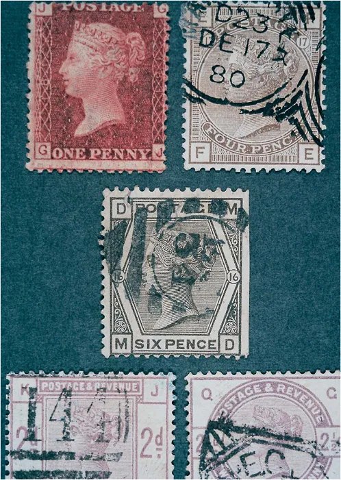
Soon afterward there was a series of stamps in which each value was given a separate design so they could be quickly distinguished. The three pence stamp has three intersecting arcs, the six pence, six (as in Figure 1.2, middle), the nine pence, nine. But this kind of symbolism quickly becomes a problem. The shilling stamp was an ellipse—not an obvious choice—and the two shillings was a mandala, a kind of cat’s-eye ellipse. Other series were designed with even more elaborate shape symbols, but they were never released—and for good reason, since they were more confusing than useful.
Then the designers tried another strategy, and based their stamps on architecture instead of paintings, coins, or numerical symbols. Cecil Gibbons, a philatelist who has studied this subject, calls the new architectural stamps “atrocious.” The designs were divided into blocks, as if the stamps had been built out of rough-hewn marble. Some look as though they were made a little too quickly, so that the blocks don’t fit properly. A couple are reproduced at the bottom of Figure 1.2. The stamp at the lower left is made of little blocks, and the blocks don’t quite fit—there is a little shadow in the gap between them. The one on the lower right is reminiscent of a round window with marble trim.
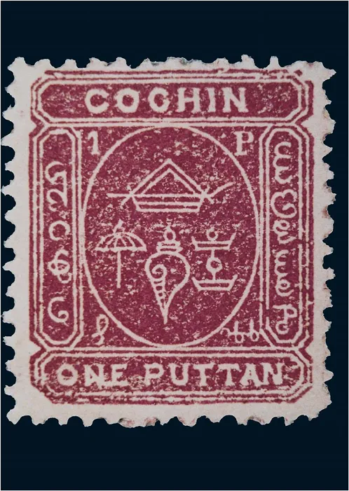
figure 1.3 Cochin ½ puttan yellow, 1892. Scott no. 1.
After the masonry series, the designers turned to heraldry and coats of arms. They made stamps with little shields and rows of compartments with the devices of the royal family. Victoria’s head began to look like the helmet that is put on the top of a traditional coat of arms, and the stamps filled up with obscure symbols.
From this point it is easy to follow the history of stamp design. Each new formula is a new metaphor: first oil paintings, then coins, then number symbols, then masonry, then heraldry…. King George V (who reigned from 1910 to 1936) was a philatelist, and the stamps of his period introduce the horizontal “commemorative” format, which gives more room. In 1929 Britain issued the first stamp without a frame, or rather the first stamp that let the white paper border be the frame. Nowadays anything is possible, and there are triangular stamps, relief-surface stamps, and even 3-D stamps; but these basic design problems have never been solved. The underlying issue is that we still treat stamps as if they had to be modelled on something (paintings, masonry), instead of thinking of them as little objects in their own right.
It is nearly impossible to find stamps that do not rehearse the issues first broached by the Penny Black. In the nineteenth century, country after country produced stamps that looked just like England’s, or else they borrowed their designs from English innovations. Italy, Germany, France, and the United States all began with variants of themes that had already been explored by English designers. Even today stamp designs are centralized, and many of the world’s smaller nations have their stamps made for them by a few companies in New York City. The early stamps of Mongolia were designed in Hungary as part of a long-standing agreement between the two countries. The Hungarian artists were in turn influenced by British design. The stamps of some nineteenth-century Indian states, such as Cochin, Alwar and Bundi, Jhalawar, and Travancore, were often designed in a central British office, and they have the same classical frames as the early British stamps (Fig. 1.3). Victoria gets replaced by all sorts of exotic things. This Cochin stamp has a shell of Indra and a ceremonial umbrella. Nepalese stamps have Nepal’s symbols—a sripech and crossed kuchris. The Mongolian stamps have the soyombi, a kind of coat of arms. To find stamps that are genuinely beyond the reach of European influence it is necessary to look at places so poor and so isolated that they were physically incapable of European-quality printing and design. Some early issues of the Indian state Bhor, for example, are little more than colored washes that were accepted as stamps (Fig. 1.4).
Stamps get ignored because their politics are reductive and their pictures are unrewarding. They tend to be simple and to borrow their ideas from other arts. On occasion a stamp might say something new, or say it in a new way, but most of the time stamps rehearse the lowest common denominator of a nation’s patriotism or its sense of art. Since the mid-twentieth century, the general trend throughout the world has been toward harmless or comical motifs: flowers, animals, movie stars, platitudes. Stamps are getting more trivial, sweet, and childish with each passing year, as if to atone for their first century of aggressive, sentimental nationalism.
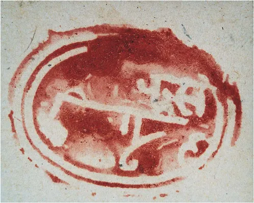
figure 1.4 Bhor ½a carmine, 1879. Scott no. 1.
Every once in a while, stamps can be interesting both politically and artistically. The stamps issued by the newly independent Irish Free State (1922–49) are an example. Ireland had just won its independence, and it took itself very seriously. Heavy, medieval symbols—the shamrock, the Irish harp, the Red Hand of Ulster—were done in somber greens and browns. The captions were seldom in English but in Irish or bilingual Irish and Latin. When Ireland lifted its trade restrictions in the 1950s the stamps began to get playful in the modern manner.
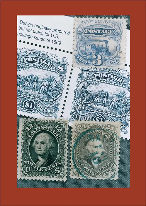
In our rush to be inoffensive we have largely lost the idea that stamps can have interesting meanings, and in our desire for modern efficiency we have forgotten that stamps can be tiny worlds filled with details that can barely be seen. Early American stamps are exceptionally finely done (Fig. 1.5, bottom row). The nearly microscopic lines produce a wonderful, shimmering effect; the tiny “motorwork” scrolls are so fine that they are barely visible even at this magnification. The stamp at the upper right has lines so small they are altogether invisible. Done this way, even a landscape a quarter-inch across can look enormous, full of light and distance and air. Compare it to the stamps in the middle, which were recently printed to commemorate the old stamps. The new stamps are coarse, crude, and uninteresting. Clearly, no one was meant to look at them. The sky is filled with dashes that look like rows of migrating geese, and the picture is ringed with a set of fake pearls.
I wouldn’t say that all stamp designs should be as subtle as these old stamps—but at least the old designers knew that there is no reason to make everything easy to see. It’s a lovely feeling to be drawn closer and closer to a tiny scene and to wonder at its depth and detail. Nineteenth-century stamps could work that kind of magic. Now all we have is colored flaps of paper, with almost nothing to catch the eye.
figure 1.5 Nineteenth-century American stamps, alongside a modern reprint. United States 12 cents black, 1861–62; United States 24 cents red lilac 1861–62; 3 cents ultramarine, 1869; and a modern reprint of an unused issue from 1869.
2
how to look at a culvert
A culvert is a place where a stream passes underneath a road. It might be as simple as a buried pipe to guide the water, or it can be a tube as large as a two-story house....
Table of contents
- Cover Page
- Half Title Page
- Title Page
- Copyright Page
- Table of Content
- Preface
- Things Made by Man
- Things Made by Nature
- Postscript: How Do We Look to a Scallop?
- For Further Reading
- Figure Credits
Frequently asked questions
Yes, you can cancel anytime from the Subscription tab in your account settings on the Perlego website. Your subscription will stay active until the end of your current billing period. Learn how to cancel your subscription
No, books cannot be downloaded as external files, such as PDFs, for use outside of Perlego. However, you can download books within the Perlego app for offline reading on mobile or tablet. Learn how to download books offline
Perlego offers two plans: Essential and Complete
- Essential is ideal for learners and professionals who enjoy exploring a wide range of subjects. Access the Essential Library with 800,000+ trusted titles and best-sellers across business, personal growth, and the humanities. Includes unlimited reading time and Standard Read Aloud voice.
- Complete: Perfect for advanced learners and researchers needing full, unrestricted access. Unlock 1.5M+ books across hundreds of subjects, including academic and specialized titles. The Complete Plan also includes advanced features like Premium Read Aloud and Research Assistant.
We are an online textbook subscription service, where you can get access to an entire online library for less than the price of a single book per month. With over 1.5 million books across 990+ topics, we’ve got you covered! Learn about our mission
Look out for the read-aloud symbol on your next book to see if you can listen to it. The read-aloud tool reads text aloud for you, highlighting the text as it is being read. You can pause it, speed it up and slow it down. Learn more about Read Aloud
Yes! You can use the Perlego app on both iOS and Android devices to read anytime, anywhere — even offline. Perfect for commutes or when you’re on the go.
Please note we cannot support devices running on iOS 13 and Android 7 or earlier. Learn more about using the app
Please note we cannot support devices running on iOS 13 and Android 7 or earlier. Learn more about using the app
Yes, you can access How to Use Your Eyes by James Elkins in PDF and/or ePUB format, as well as other popular books in Art & Art General. We have over 1.5 million books available in our catalogue for you to explore.