Just as we may speak a common language but each do so in our individual voice, we may all write a common type of script yet render it in our own distinctive hand. And—to continue the analogy—just as a talented impersonator may mimic someone’s voice, a skillful forger may produce a convincing imitation of another’s handwriting.
To uncover the forger’s presence and expose his or her historical fakery, commercial fraud, and other criminal activities, the document detective must have a thorough understanding of all aspects of handwriting. The following discussions of the evolution of handwriting and of graphology versus the forensic approach to handwriting questions provide a necessary prelude to a study of forgery and its detection.
EVOLUTION OF HANDWRITING
This discussion of the history of handwriting comprises the following topics: pre-alphabetic writing, the alphabet, early European developments, the medieval period, the Renaissance, American writing systems, other writing fashions, pencil writing, and the advent of mechanical writing.
Pre-alphabetic writing
The earliest examples of true writing are from a pictographic system used by the ancient Sumerians about 3500 B.C. Some three hundred years later, it was followed by a modified form known as cuneiform—from the Latin, meaning “wedge shaped.” That designation comes from the shape of the reed used to impress the characters into moist clay tablets. Mistakes were rubbed out with the thumb, corrections were made, and the tablet was baked into a hard, durable form.1 Tablets bearing private communications might be encased in clay “envelopes” that were crimped shut, then baked.2
The other major script (or handwritten or hand-printed form) of the ancient Near East, the Egyptian hieroglyphics system, also began (about 3000 B.C. with ideographic (symbol) writing. As also happened with cuneiform, it evolved into phonetic writing (wherein symbols represented sounds), then into syllabic writing (in which syllables were combined to make new words).
The alphabet
After syllabic writing came the alphabetical system in which characters represented individual sounds rather than syllables. Apparently it was the Phoenicians, who lived along the Mediterranean’s western coast, who inherited earlier, Semitic alphabetic writing and developed it into a vowelless system about 1000 B.C. (The ancestral Semitic alphabet was also the basis of Hebrew, Arabic, Persian, and other scripts. China, however, failed to develop an alphabet, its brush-written writing instead combining ideograms and phonograms.) The Greeks came into contact with the alphabet from Phoenecian traders.
About 700 B.C., while the Greek alphabet was still in development, it was adopted by the Romans, who subjected it to considerable remodeling. Three of today’s letters—J, U, and W—were not used by the ancients at all. Both U and W developed about a thousand years ago from the letter V, and J developed from I about five hundred years later.3
Early European developments
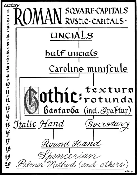
The Romans employed several forms of alphabetic characters: a formal type known as “square capitals”; a more freely written form, “rustica”; and an even freer cursive or near-cursive script used for less formal purposes such as correspondence, accounts, and note-taking. (The latter was typically done with a stylus on a wax tablet, the opposite end of the tool being used to rub out errors.)4 A rounded book hand (as scripts used for manuscript volumes are termed) was the “uncial” (so named because the characters were typically an uncia—one Roman inch—in height); uncials were dominant for book use from the fourth to the ninth century A.D. (figure 1.1).
Half-uncials, which had ascender and descender strokes and thus showed a tendency toward miniscules (today’s “small” or lowercase letters), existed briefly in the third century and were revived in the sixth. About the seventh century word separation and punctuation began to appear; before that words were RUNTOGETHERLIKETHIS and were consequently difficult to read.
The full ascendancy of minuscules alongside capital letters (much as they appear on this page) stemmed from a famous decree by the emperor Charlemagne (Charles the Great, 742–814). Issued in 789, it ordered that all writings were to be done in a specific, standard hand (one that had evolved from a variety of Roman styles). Now known as the Carolingian or Caroline minuscule (from the medieval Latin Carolus, “Charles”), it continued to evolve, reaching its ultimate flowering in the eleventh and twelfth centuries. (See figure 1.1.)
Figure 1.1. The evolution of writing, from Roman square capitals through medieval Gothic to modern handwriting systems, is an important aspect of study for the historical document specialist.
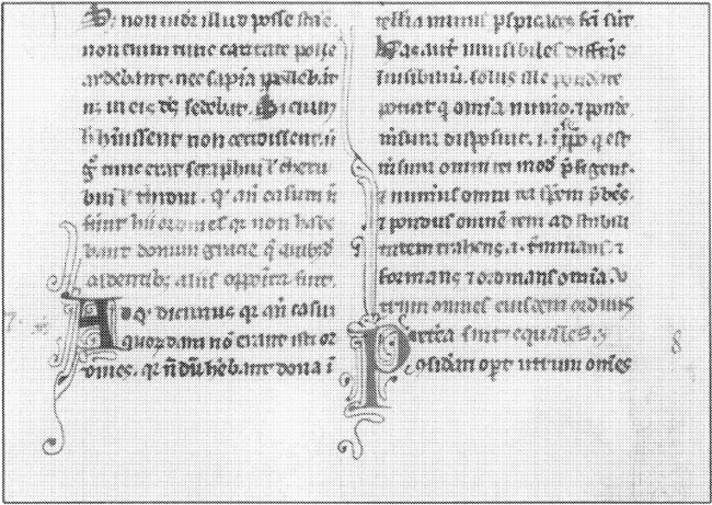
Figure 1.2. Detail from a manuscript book page on vellum produced in the thirteenth century. The bulk of the text is in black ink, and lighter areas (including the ornate P) appear in vermilion.
The medieval period
As the Caroline script was widely disseminated and was rendered in different regions by scribes with varying degrees of training, it was inevitable that divergent forms would arise. Among these so-called national hands, or styles, that evolved from the Caroline was “Gothic” or “blackletter” script (sometimes known as “Old English”). It became a distinct style in northern Europe during the twelfth century and predominated there for the next three centuries. It became especially popular in Germany, where it was adopted as a typeface by the early printers and continued in use to modern times. It spread elsewhere in Europe as well, and as a book hand existed in three essential forms: textura (an angular version); rotunda (a rounded variety), and bastarda (various near-cursive forms). (Again, see figure 1.1.)
From the sixth to the twelfth century, scholarship was monopolized by the church, with monasteries typically maintaining libraries and operating scriptoria (rooms where scribes produced manuscript books). In the twelfth century came the rise of universities and the consequent decline in the church’s monopoly on book productions. There arose a class of secular artisans—including parchmenters, scribes and illuminators, bookbinders, and other craftsmen—who toiled in lay workshops to produce manuscripts commissioned by clients. Now, mere nobles and wealthy merchants could have books as well as princes and ecclesiastics.
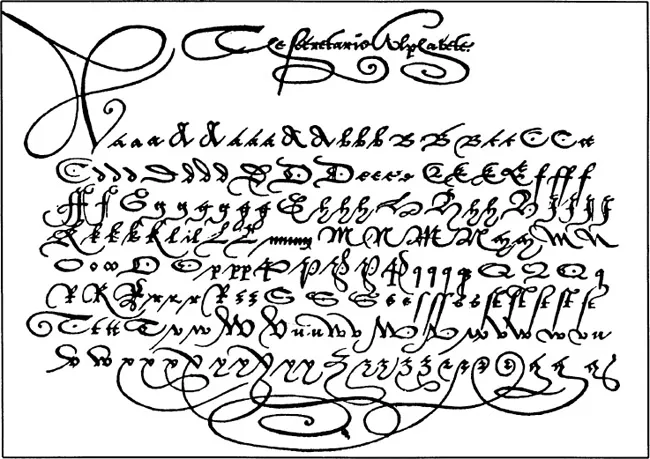
Figure 1.3. The English secretary hand, illustrated here from a penmanship book published in London in 1571, is difficult for the initiate to decipher but can be read with the aid of charts such as this.
The Renaissance
From a cursive form of Gothic bastarda evolved one of the two major hands used during the English Renaissance, the “secretary” hand (figure 1.3). Its more legible rival, the “Italian” hand, evolved from a cursive form of Caroline script. The two hands were used literally side by side: for example, a letter Elizabeth I wrote in 1570 is written in the more everyday secretary hand, but she penned the closing and her signature in italic, or what Shakespeare’s Malvolio termed “the sweet Roman hand.”5
Penmanship up to this time had been produced by the “broad pen”—a reed or quill with the point cut off to make a chisel-edge pen. This produced thick or thin strokes depending on how the pen was held and moved (for example, again see figure 1.1)—the left stroke of the Roman A was thin while the right one was thick. However, “round hand” (a hybrid of secretary and italic) was helped into being by the influence of popular penmanship copy books.6 Since these were printed by copperplate engraving in which the engraver’s tool produced a different type of thick and thin strokes, “there was,” states one authority, “an inclination for the pen to follow the graver, rather than the graver to follow the pen.”7
As a result, the pen now began to be cut to a pointed shape. Just as the engraving burin produced a hairline when moved lightly on the metal plate but a heavier stroke when pressed to cut more deeply, the pointed pen gave a similar effect: it yielded hairline upstrokes but heavier, “shaded” downstrokes (when pressure caused the two points of the split pen to separate). Since the pointed pen moved more swiftly than the broad one, it facilitated fluid penmanship characterized by elaborate flourishes.
American writing systems
In colonial America, trends in handwriting followed those of the mother country. From the landing of the Pilgrims at Plymouth Rock in 1620 until the end of the century, the dominant hand was one that has been called “the ‘Mayflower Century’ Style of American Writing,” showing both secretary and italic features that blended into round hand by century’s end.8
This was followed by the American round-hand system, which dominated from about 1700 to 1840 (figure 1.4). It retained the “copperplate” appearance of its English forebear, and, in addition to flourishes, the writing was characterized by the archaic long s (most often used as the initial letter of an ss combination, and thus somewhat resembling fs or even p). The writing also typically contained superscript abbreviations (e.g., the use of raised letters in such contracted forms as “Wm” for “William” and “Rob
” for “Robert”). This system was followed by a transitional form called modified round hand (ca. 1840–65). This was basically a round-hand system that incorporated stylish modifications as found in the early editions of the copybooks of Platt Rogers Spencer and of the Payson, Dunton, and Scribner system.
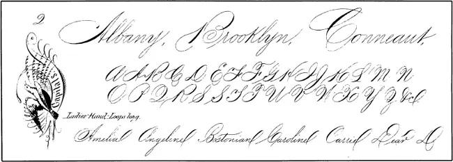
The “Spencerian” system (1865–90) represented the fruits of the two ostensibly competing copybook systems. It was characterized by more angular connecting strokes, was relatively devoid of shading on the small letters, and had more space between them; it also had a distinctive set of capital letters and a slant set at fifty-two degrees from the horizontal. The result was a new, distinctively American hand that was faster to render than the old round hand, and for a time Spencerian became synonymous with penmanship.9 (Figure 1.5.)
Succeeding Spencerian, the “modern vertical” system (1890–1900) represented a reversion to a slower, more legible hand. The letters were almost printlike, and there was an absence of both slant and contrast in shading (being rendered with a relatively constant pen pressure). It was entirely too slow to be practical and passed from the American schools after only a decade.
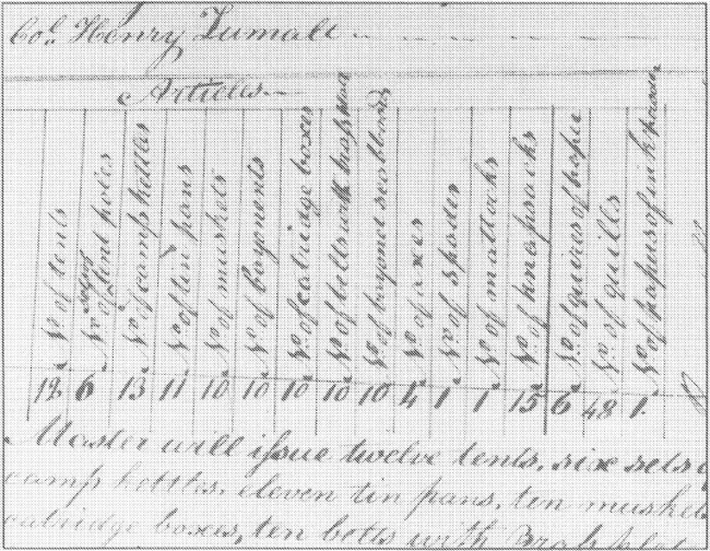
Figure 1.4. Portion of a War of 1812 document penned in American round hand. Note the superscript 1 in “Col.” (above chart) and the use of the long s in “issue” and “Brass” (below). At the end of the list of items to be provided by the quartermaster (turn chart sideways) are requested 6 quires of paper, 48 quills (to be cut into pens), and 1 paper of ink powder (no doubt an iron-gallotannate variety).
Figure 1.5. Spencerian penmanship (after Platt Rogers Spencer) was dominant in America from about 1865 to 1890.
Overlapping modern vertical as successor to Spencerian were a number of “basic popular systems” (1890–1945). Because of their emphasis on a free movement of the arm in penmanship, they were termed “American arm-movement writing” and included the American Book Company, the Palmer, and the Zaner-Bloser methods. Lacking the heavy pressure shading that Spencerian had retained (mostly on the capitals), these systems of handwriting were easy and fast to use and were made popular by the commercial...
Table of contents
Cover
Title
Copyright
Contents
Acknowledgments
Introduction
Part One. Handwriting
Part Two. Additional Aspects
Notes
Recommended Works
Index
Frequently asked questions
Yes, you can cancel anytime from the Subscription tab in your account settings on the Perlego website. Your subscription will stay active until the end of your current billing period. Learn how to cancel your subscription
No, books cannot be downloaded as external files, such as PDFs, for use outside of Perlego. However, you can download books within the Perlego app for offline reading on mobile or tablet. Learn how to download books offline
Perlego offers two plans: Essential and Complete
Essential is ideal for learners and professionals who enjoy exploring a wide range of subjects. Access the Essential Library with 800,000+ trusted titles and best-sellers across business, personal growth, and the humanities. Includes unlimited reading time and Standard Read Aloud voice.
Complete: Perfect for advanced learners and researchers needing full, unrestricted access. Unlock 1.5M+ books across hundreds of subjects, including academic and specialized titles. The Complete Plan also includes advanced features like Premium Read Aloud and Research Assistant.
Both plans are available with monthly, semester, or annual billing cycles.
We are an online textbook subscription service, where you can get access to an entire online library for less than the price of a single book per month. With over 1.5 million books across 990+ topics, we’ve got you covered! Learn about our mission
Look out for the read-aloud symbol on your next book to see if you can listen to it. The read-aloud tool reads text aloud for you, highlighting the text as it is being read. You can pause it, speed it up and slow it down. Learn more about Read Aloud
Yes! You can use the Perlego app on both iOS and Android devices to read anytime, anywhere — even offline. Perfect for commutes or when you’re on the go. Please note we cannot support devices running on iOS 13 and Android 7 or earlier. Learn more about using the app
Yes, you can access Detecting Forgery by Joe Nickell in PDF and/or ePUB format, as well as other popular books in Law & Forensic Science. We have over 1.5 million books available in our catalogue for you to explore.