When is a number large?
Consider the following examples:
- On 6 May 2020 there were 30,000 deaths due to COVID‐19 in the UK, 75,000 in the USA and 265,000 in the world.1
- There were about 634,000 deaths in the UK population, 2,909,000 in the USA and 58 million deaths in the world in 2018.2
- The UK Government stated in 2018: ‘We have invested an extra £1 billion in the NHS [National Health Service] this year.’3
- The UK sent £350 million to the European Union every week.4
- The Global Burden of Disease Report (GBDR) on sepsis estimated that there were 48.9 million cases in 2017, and 11 million deaths, across 195 countries and territories.5
Are these large amounts? They certainly sound like large amounts, but how do we come to terms with what they mean? Large numbers are often quoted on their own by people in authority, to try to impress the public with how big the numbers are. (A useful term might be ‘orphan’ numbers because they are not related to other numbers.) However, there is an old joke that if you ask a statistician how well they are, they will reply ‘Compared with whom?’ Likewise, numbers on their own are by and large meaningless; it is only with comparisons that we can extract a meaning. In example 1, the COVID‐19 deaths are, on their own, just large numbers. However, we can employ an analogy to give them some meaning. The first number of deaths roughly equates to the same number of people at an average Premier League football club in the UK, whereas the second is closer in number to a capacity crowd at Old Trafford, home ground of Manchester United. The third is the size of an average town in the UK (e.g. Southampton). These analogies put the number of deaths into a very human perspective. However, to get a better understanding of these numbers we need more specific comparisons.
A helpful basis for comparison is knowing the approximate size of the populations to which each statistic is referring. In 2019, the population of the UK was 67 million, that of the USA was 330 million and that of the world 7.7 billion (7700 million).6 We can then calculate the ratio of the number of deaths to the size of the population. A ratio is simply one number (numerator) divided by another (denominator). In this case, since the numerator is a subset of the denominator, we have proportions. The deaths per head of population are 0.044%, 0.023% and 0.003% for the UK, USA and the world, respectively. These percentages lead to another comparison: that between countries. The UK appears to be doing worse than the USA, which is doing worse than the rest of the world. Is this a reasonable conclusion? Cause of death is often very unreliably reported. Completion of a death certificate is often assigned to a junior doctor with little training. In an elderly patient with multiple diseases, it can be especially difficult to ascribe one main cause. So in this example we should consider how we know the person died of COVID‐19. Presumably the patient was tested before they died or they had symptoms similar to COVID‐19. However, testing rates have varied widely between countries and diagnosing symptoms of COVID‐19 is very subjective. Thus, these numbers for death rates due to COVID‐19 are not at all reliable and a reliable comparison is therefore difficult.
In contrast, deaths (from any cause) are reliably reported in the UK and the USA and probably well reported for the rest of the world. In example 2, again the numbers by themselves are not meaningful, but compared to the size of the relevant populations we can extract some meaning. A quick calculation reveals that 0.95% of the UK population dies every year, compared to 0.88% in the USA and 0.76% in the world. These numbers on their own are interesting. In the UK about 1 person in 100 dies each year. This brings the numbers down to something we can appreciate. Again, we can compare the proportions dying by country, and once more it appears that the UK is so much less healthy than the USA, and both countries are less healthy than the rest of the world. This may lead to further investigations.
In example 3, we could compare the extra sum invested in the NHS to the annual budget for the NHS, which is about £130 billion, so this extra £1 billion is less than 1% of the total. Another way to look at this is to consider that we now know there are about 67 million people in the UK, so £1 billion equates to about £15 for every person in a year, roughly the cost of five pints of beer (at current UK prices outside of London). It doesn’t sound so big now, does it?
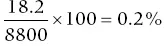
In example 4, it is worth knowing that the UK economy was worth £8.8 trillion a year in 2016 (a trillion is 1000 billion).
7 The £350 million a week given to the EU is £18.2 billion a year, so the amount the UK sends to Europe is
of the UK economy. Again, it doesn’t sound so big now, does it?
If we combine the information from example 5 with the worldwide death data in example 2, we would deduce that approximately 1 in 5 deaths worldwide is due to sepsis. This certainly is a large number! However, all unusual numbers should be subjected to a little scrutiny. As a quick reality check, you might start by asking yourself whether of the people you know who died recently, did 1 in 5 die of sepsis? One would expect the answer to be no. Thus, we might query whether the GBDR is right. One issue is that sepsis can be difficult to diagnose and the rate of diagnosis varies hugely from one country to another, so local experience may be misleading in that in another country sepsis might be more readily diagnosed.
When you hear a number given that you believe the presenter wants to sound big, it is always worth applying reality checks such as those described in Box 1.1. A light‐hearted example has been provided in a video from the Sheffield Methods Research Institute8 concerning a news report that stated that floods in New Zealand had caused 30,000 pigs to be washed down a river. This was then reported uncritically by other news outlets, until someone thought: ‘30,000? That’s an enormous number, is it believable? How many pigs are likely to fall into a river at any one time?’ Going back to the original broadcast, it turned out that the reporter had in fact said 30 sows and pigs, but owing to their New Zealand accent, this got ‘misheard’ and repeated uncritically to the wider media.
A further question about a large number is to ask what period of time the number refers to. By expanding or contracting the time scale, a presenter can make a number look big or small. When a large sum of money is promised, one should ask: How much does this equate to per year? In example 2 above, 634,000 deaths sounds large, whereas 0.95% sounds small. However, if one stated that approximately 1650 people die every day, or about 1 every minute, it may sound even bigger, since in our everyday experience people are not dying every minute! It is worse when reports state the ‘risk of death’ or ‘lives saved’ without stating a time period. The risk of death in the long run is one!
Definitions of the quantities discussed in this chapter are given in the Glossary. Ways of questioning numbers are given in Box 1.1.