New Interfaces to Collections
Physical Visualizations: Turning Data into Space
Michael Haley Goldman, United States Holocaust Memorial Museum, USA, Sara Pitcairn, US Holocaust Memorial Museum, USA
Abstract
As museums continue to explore the visualization of data, can physical manifestations of data sets change our capacity to tell visual stories and increase visitor understanding? Improved access to data as well as changes in technology provide the opportunity to visualize historical data sets as physical spaces in museums that can evoke both historical and felt understanding. Based on examples from several institutions and building on visitor reactions to two recent projects at the US Holocaust Memorial Museum, this paper examines how physical visualizations create a powerful learning environment for the public.
Keywords: data; visualization; exhibitions; audience; learning
Improved access to data as well as changes in technology provide the opportunity to visualize historical data sets as physical spaces in museums. By examining existing models for spatialized data and considering interactions with visitors, we suggest that physical manifestations of data offer something notably different from data visualizations in print or on screen. These physical spaces that visualize data can evoke both historical and felt understanding, supporting the comprehension of historical data as well as an appreciation for the larger meaning of a historical moment. The application of this approach must also take into consideration the ethical and methodological questions faced by all humanities visualizations.
Two installations created from data
In 2019, the United States Holocaust Memorial Museum (USHMM) in Washington, DC mounted two unusual installations. The first, the aptly named One Thousand Seventy-eight Blue Skies, includes 1,078 small, rectangular photographs of sky placed in seven large grids on a single wall outside of the museum’s main historical exhibition. Photographer Anton Kusters took these images between 2012 and 2017, traveling throughout Europe to capture one image at every known Nazi concentration camp and killing center across Europe.
The number of camps is meant to be surprising and was surprising to Kusters when he first started the project. In an interview, Kusters explains “It actually started for me as a way to understand. When I visited the first camp, I had no idea that there were so many camps, even though I learnt about Holocaust in school and at university, I never actually saw it in the way that I saw it when I went to Auschwitz first” (Vantage Editors, 2018). Researchers at the USHMM recently concluded that the Nazis and their collaborators created over 42,000 places of detention during the Holocaust – including these specific locations formally called “concentration camps.”
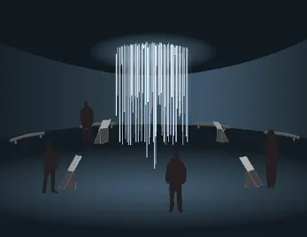
The second installation, a briefly mounted prototype called Liquidation, appeared in an experimental gallery at the Holocaust Museum for four weeks in the summer of 2019. grew from the work of two graduate students from Maryland Institute College of Art, Sarah Maravetz and Gillian McCallion. The pair designed a concept for the installation as part of a three-day residency at the Museum in 2017. Staff at the USHMM developed the prototype installation inspired by the original designs of Maravetz and McCallion.
Liquidation used sculptural elements, light, and projection to illustrate the growth and destruction of the Lodz ghetto during the Holocaust. The Germans created the Lodz ghetto in 1940, forcing over 160,000 Jews into a small section of the city under harsh conditions. Over the next four years, the ghetto population peaked at over 200,000 individuals. Most of the Jews from the ghetto were deported to killing centers including Chelmno and Auschwitz, and the ghetto was destroyed in 1944.
Original concept for Liquidation by Sarah Maravetz and Gillian McCallion, 2017
While both projects included unusual elements for the institution: modern photography, rough prototyping materials, installation in new spaces, what truly distinguishes these installations is their use of historical data sets from the museum’s research and collections. One Thousand and Seventy-eightBlue Skies () portrays data from the first volume of the USHMM’s Encyclopedia of Camps and Ghettos, 1933-1945 (Megargee, 2009). Kusters relied on the work to start his search for each camp location – though he often supplemented the volume with his own research into locations of camps that had yet to be identified. Liquidation adapted data that recorded the monthly population of the Lodz ghetto. Maravetz and McCallion have now graduated from MICA’s Information Visualization program and applied their understanding of data visualization to the original design.
Physical spaces as data visualizations
With both Blue Skies and Liquidation, historical data sets manifest as physical spaces inside the USHMM. Their designs use many traditional visualization methods but also give the data physical volume, going beyond the common projection of data into the flat spaces of pages or screens. The installations fit into a long history of data sets in physical form but also begin to raise questions about how museums – in this case, history museums – can harness the impact of spatialized data for their visitors.
Examples of spatialized data
Art as Physical Visualization
The Blue Skies installation builds on existing practices of the use of data visualization to create art. Kusters’ work represents a well-researched (and time consuming) artistic practice that builds from a premise – locating historic sites – and required considerable time and energy to complete the work. Kusters did not know about the USHMM’s encyclopedia project when he started. He did not start from a data set but the data became a major component of the work – ultimately outlining the number of places to be photographed, though not, unfortunately, all locations and oth...