This book reveals the secrets of a mysterious and artistic trade. Before the age of neon lights and digital screens, signs and billboards were painted by professional sign painters, and James Gardiner dives into the most intricate details of the art. The purpose of different fonts, the shape and size of letters, the layout of the sign, even the materials used to produce various colours and paint on different surfaces, it's all there, displayed in illustrations when possible. Although the book is intended for sign painting, most of the information can be applied in other calligraphy fields. There are many who still find it an expressive and beautiful form of art. Anyone passionate about art in general and calligraphy in particular will find much pleasure reading this small and insightful book. "Perfection is not claimed for this more than for any other work of the kind, but what is claimed for it is that it contains more real practical and valuable information to the Sign Painter than has ever before been presented to him in a published form."
Trusted by 375,005 students
Access to over 1.5 million titles for a fair monthly price.
The letters most used by Sign Painters are Roman, Italic, round and square Block, half Block, or Egyptian, Lower Case and Script.
Roman is the general favorite with letterers. It is also the most difficult to make. Egyptian is the simplest and easiest made, and is therefore generally chosen by beginners.
Nine of the Roman letters, viz., B, D, E, G, O, P, Q, R and T, when properly made, will occupy one-eighth more in width than in height. Six letters, viz., C, F, J, L, S and Z, will occupy the same space from left to right as they do in height. Seven letters, viz., A, K, N, U, V, X and Y, one-sixteenth more in width than in height. H, one-fourth; M, one-third, and W, one-half more in width than height. I, two-thirds of its height in width, and occupies one-sixteenth less in width than in height.
The circular letters, C, G, O, Q and S, to appear equal in size with the rest, must be made to project a little above and below the line.
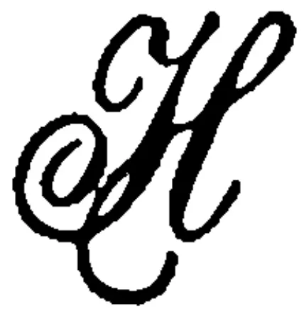
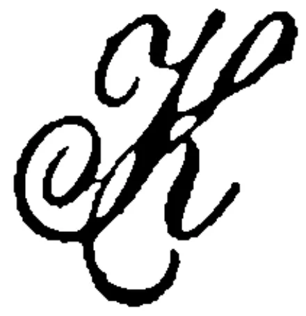
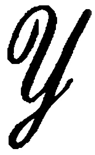
The upper part of B, E, F and R should occupy a trifle less space on the main line of each letter than the lower part, and the upper horizontal projecting curve of B and R should, in the same proportion, be a trifle the smallest. The connecting bar of H, and the center bar of E and F, should be a very little above the center of those letters. The perpendicular width of the curve for P should take up just half the length of the main limb of that letter. The bottom curve of J, with the projecting line on its top, should occupy the same space as the letters C or S. The upper curve of should be smaller than the lower curve. The tail of the R should be made full, and to project nearly as far as the upper curve. The last limb of G should terminate at a little less than half its height. The upper portion of the Y should join the main body of the letter at half its height, and the lower curve of C should project a trifle beyond the upper one.
The width of the main body of a Roman letter must be regulated by its size. For a six inch letter the main stroke should be one inch and a-half wide, the fine stroke, or hair line, one-fourth inch. For a letter one foot in height it should be three inches, and the hair stroke one-half inch wide. And in the same proportion for larger or smaller letters.
The upper point of A and the lower points of V and W should be of the same width as the fine, or hair line.
If two lines are drawn one inch apart, and divided into nine compartments one inch and one-eighth each, the letters B, D, E, G, O, P, Q, R and T will each fill a compartment; then divide off six compartments of one inch square for C, F, J, L, S and Z; then seven compartments of one inch and one-sixteenth each for A, K, N, U, V, X and Y, For H allow one inch and a quarter, for M one inch and three-eighths, for W one inch and a half. I will take a space five-eighths of an inch wide, while & will require one-sixteenth less than an inch in width.
Lower Case Roman.
This is a very popular letter with Sign Painters, and when properly formed, for grace and beauty, is only equalled by its near ally, the Roman Capitals.
The main body of thirteen letters, viz: A, B, D, G, H, K, N, P, Q, U, V, X and Y, will occupy a square each; letters C, E, O R, S, T and Z, require one-sixteenth less width than height; I and 1, one-half their height in width. These relative proportions are stated without their projecting limbs above and below the main body of the letter, which projection should be one half the height of the main body of the letter.
Italic Capitals.
These have all the forms and peculiarities of the Roman Capitals, slightly condensed, and at an angle of sixty-three degrees.
Lower Case Italic.
This letter is rarely introduced in sign painting, but is the prevailing style in show card writing, or wherever quick, off-hand lettering is required.
There is no regular rule governing these letters, if gracefully formed, a little crowding does not injure their appearance; there are many opportunities where they may be worked in advantageously and with good effect in sign work.
Block Letters.
This is the boldest and most massive of all the styles of letters, and is governed by the same rules and proportions in regard to height and breadth as the Roman Capitals; unlike that letter, however, it may be elongated or condensed to a very great extent without injury to its appearance.
The perpendicular and horizontal bars of this letter are the same in size throughout.
By dispensing with curves and using straight lines, and cutting the outside corners off diagonally, we have the Square Block, which is much better adapted to the purpose of elongation or enlargement than the round. The corners should be cut off to the extent of four fifths of the thickness of the main body of the letter; the inside corners may be either rounded or squared.
Next in order is the
Egyptian, or Half-Block.
These useful letters may be denominated the Painter’s stand-by or substitute for all the letters, for when other styles fail for want of necessary space or other significant reasons, these will always be found to fill the bill exactly. When properly proportioned, they are inferior to none for beauty, but as substitutes they may be tortured and tormented with impunity into filling every conceivable space, but crowded and cramped as they often are, they fill every position assigned them with becoming dignity.
Their form and construction as well as their proportion, will be ascertained by drawing two parallel lines one inch apart, and two within these at three-sixteenths of an inch distance from the others for the horizontal bars of the letter. If five compartments of seven-eighths of an inch each are divided off, the letters A, D, K, O, and Q, will each fill a compartment, then divide off ten more three-fourths of an inch wide for B, C, G, R, S, V, X, Y, Z, and &; then three of five-sixteenths less than an inch in width, for H, P, and U; three of five-eighths wide for E, N, and T, M requires a space one-sixteenth less than one inch in width; W, a space one inch and one-eighth; F, L, and J, require a space, nine-sixteenths in width, and I a space three-sixteenths of its height in width.
Like the Block, this style of letter made either round or square. The body of the letter must invariably be of the same size all over.
The Traceotypes afford the best possible advantages for the study of all these letters, and will therefore be found a valuable adjunct to this work.
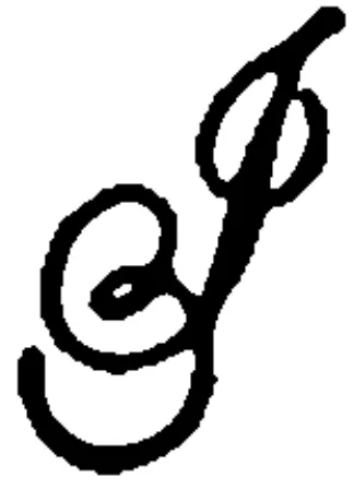
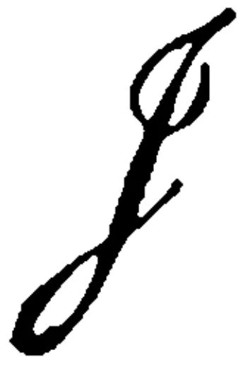
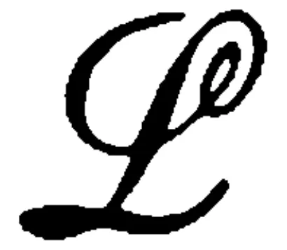
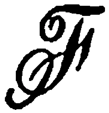
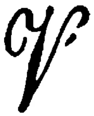
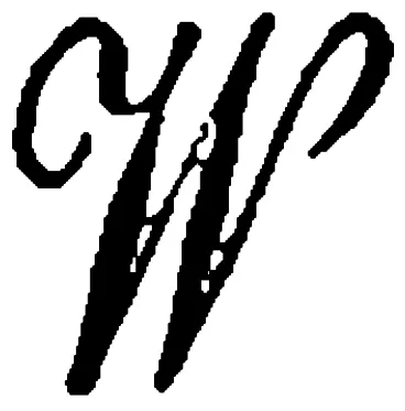
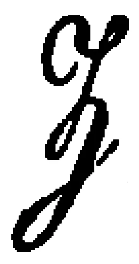
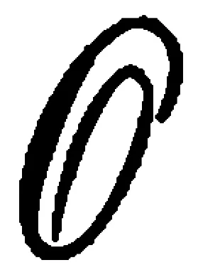
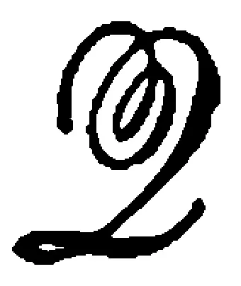
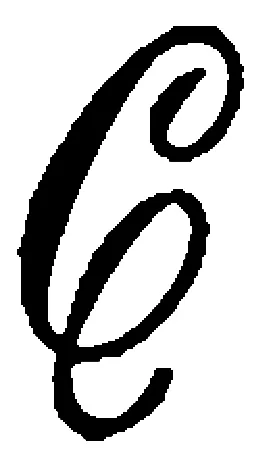
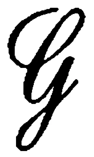
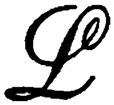
Script
This style of letter makes a beautiful sign but it is very difficult of execution. Some few sign writers make a speciality of it; but generally speaking, there is not enough of it done even in our large cities, to afford painters practice sufficient to attain any degree of perfection. Good penmanship is not essentially necessary in order to become a good Script writer. Some of our best are very inferior penmen. Writing on a sign-board is a very different process from writing on paper. It is necessary, however, to have a pretty correct idea of penmanship, and a good round text copy for your guide.
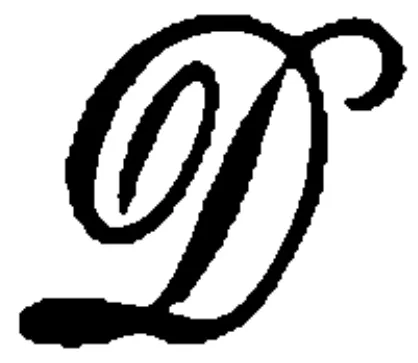
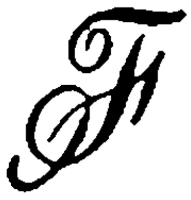
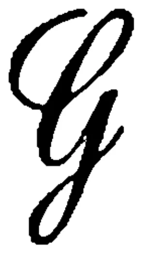
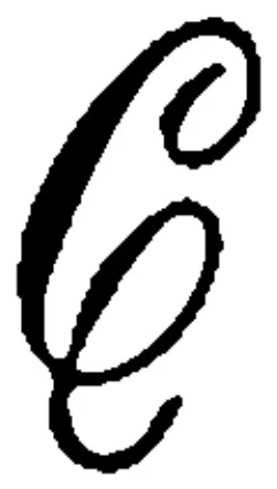
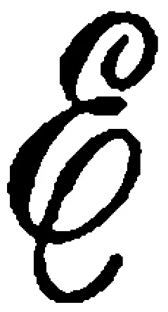
The “Line of Beauty,” so termed by an eminent artist, is formed of two gentle curves, and that line occurs twenty-nine times in forming twenty Script Capitals; it is the first line
; the middle of
,
,
; last of
; fist part of
,
,
; two parts of
; part of
; three parts of
; two of
; part of
,
,
,
; two parts of
; four parts of
; last of
; and middle of
.
A little time judiciously devoted in examining this as a general principle—which is the most important part of twenty out of the twenty-six capital letters and by practice in making this one line gracefully will rapidly contribute to a correct formation of the capital letters. The letters in which the “Line of Beauty” is not introduced are
,
,
,
and
.
In writing Capital Script, all the lines drawn towards the writer are to be gradually swelled and full lines, and all lines from the writer, are to be hair lines; and the curves of the capitals should be evenly true in their oval shape, and sloped to the same angle with the main body of the letter, that being 48 degrees.
The loop to be formed in making the first part of the letters
,
,
; and
should be an equal curve on each side of the loop, which can easily be tested by drawing a straight line from the centre of its top curve to its union at the main body of the letter. If the curves and distances are not equal on both sides of the said straight line, they should be made so, to be correct and graceful.
The small or round text letters should be in the proportion of three-eighths of the size of the capitals, uniform angles and delicate hair lines being essential to their beauty and gracefulness.
Spacing.
There is no rule in Sign Painting to designate the exact distance between the letters forming a word or sentence. It is equally in bad taste, however, to crowd them too closely or to separate them too much.
In cities where painters are paid by the foot for lettering, many good jobs are spoiled by being spread too much, in order to measure a few feet more. This, I suppose, may be called one of the tricks of the trade. It is one, however, that does not reflect much credit on the workman.
The distance between letters must depend in a great measure upon the length of the word and the space it is to occupy. The following rules will be found to work well in regulating the spaces between Roman, Block or Egyptian Capitals. Take, for example, the word ABILITY. We will suppose the letters are each solid blocks of their own size, and six inches in height. We will also have a few blocks of one-quarter, and a few of one-half inch in thickness, to insert between the letters as we proceed.
By placing the letters A and B together we find that, in consequence of the pyramidical form of A, they are connected at the bottom, while there is a great deal of open space between them at the top, which seems to separate the letters sufficiently, but as they must not be connected anywhere we will be compelled to insert the smallest or one-quarter inch block between them.
The next letter is I, which must have a proportionate distance between it and B as between B and A. To accomplish this we will have to insert three of the one-half inch and one of the one-quarter inch blocks.
Between I and L it will be necessary, in order to keep up the same proportionate distance, to insert three one-half inch blocks; and in consequence of the large Open space caused by the projecting lower limb of L, the second I must only be separated from that letter by the smallest or one-quarter inch block.
T is next in order, and will be separated from I by three one-quarter inch blocks. The last letter, Y, when placed alongside of T, appears already sufficiently separated, but as the connection at the upper corner must be broken, we will again insert only the smallest or one-quarter inch block.
The word is now properly spaced, but may be extended at will by increasing the distance equally between each letter; or, suppose it is desirable to extend the word three inches, to do so it will be necessary to insert another one-half inch block between each of the letters.
Another method of spacing is to make the center of the letters the point from which to regulate the distances between them. For this we must draw a center line, that is, a line parallel with and at equal distance from the extreme outside lines.
Between all letters having crossbars at the top and bottom the distance must be the same, as in HID, but if another letter of the same kind follows, as HIDD, the distance will have to be reduced two-fifths, on account of the absence of the upper and lower bar on that side of D. With the next letter following, HIDDE, the same distance will be repeated, while the last letter, N, in HIDDEN, will be one fifth nearer still to the extreme limits of E, to counterbalance the open space formed by the projecting upper and lower limbs of that letter.
These rules will be of great service to the beginner, but to the practiced eye all rules are superfluous. It detects at a glance every imperfection; untiring perseverance is indispensable to the attainment of it, but all who desire it can and may possess it.
Wall Lettering.
There are plac...
Table of contents
Introductory.
Rules for Making and Spacing Letters.
Miscellaneous Receipts
Frequently asked questions
Yes, you can cancel anytime from the Subscription tab in your account settings on the Perlego website. Your subscription will stay active until the end of your current billing period. Learn how to cancel your subscription
No, books cannot be downloaded as external files, such as PDFs, for use outside of Perlego. However, you can download books within the Perlego app for offline reading on mobile or tablet. Learn how to download books offline
Perlego offers two plans: Essential and Complete
Essential is ideal for learners and professionals who enjoy exploring a wide range of subjects. Access the Essential Library with 800,000+ trusted titles and best-sellers across business, personal growth, and the humanities. Includes unlimited reading time and Standard Read Aloud voice.
Complete: Perfect for advanced learners and researchers needing full, unrestricted access. Unlock 1.5M+ books across hundreds of subjects, including academic and specialized titles. The Complete Plan also includes advanced features like Premium Read Aloud and Research Assistant.
Both plans are available with monthly, semester, or annual billing cycles.
We are an online textbook subscription service, where you can get access to an entire online library for less than the price of a single book per month. With over 1.5 million books across 990+ topics, we’ve got you covered! Learn about our mission
Look out for the read-aloud symbol on your next book to see if you can listen to it. The read-aloud tool reads text aloud for you, highlighting the text as it is being read. You can pause it, speed it up and slow it down. Learn more about Read Aloud
Yes! You can use the Perlego app on both iOS and Android devices to read anytime, anywhere — even offline. Perfect for commutes or when you’re on the go. Please note we cannot support devices running on iOS 13 and Android 7 or earlier. Learn more about using the app
Yes, you can access The Sign Painter's Guide, or Hints and Helps to Sign Painting, Glass Gilding, Pearl Work, Etc. by James T. Gardiner in PDF and/or ePUB format, as well as other popular books in Design & Art Techniques. We have over 1.5 million books available in our catalogue for you to explore.