Composition for the 21st ½ century: Image-Making for Animation focuses on composition and its technical and artistic application in animation, illustration, games, and films. It covers all aspects of design and discusses in detail their artistic applicability and impact on image and narrative. Emphasis is placed on the ability of each aspect to support and affect the narrative. Additional case studies explain the successful use of these concepts in films and animation. This book is geared toward students; however, it is also reader-friendly for professionals. Composition for the 21st ½ century: Image-Making for Animation's goal is to comprehend composition as an artistic tool and as a significant part of the professional image-making process.
Key Features:
Teaches the complexity of composition in image-making.
Closes the gap between praxis and theory in animation.
Explains how to produce images that support the narrative in their visuals.
Discusses the need for artistic reasoning in image-making.
Presents case studies that assist the reader in understanding the process as they progress through this book.
Author Bio:
For more than twenty years, Thomas Paul Thesen's career has been about learning and understanding the complexities of art, animation, and image-making, both in still illustration, drawing, and photography, and in the moving image. He has worked in the industry as a character animator and visual development artist for companies such as Pixar, DreamWorks, and Sprite Animation Studios. He has also taught for many years at universities across Asia, the USA, and the UK.
Trusted by 375,005 students
Access to over 1.5 million titles for a fair monthly price.
We have around 35,000 years of art history from about 150 countries. All have different styles and interpretations of their world and every single one is a valid source of inspiration for us. But each individual piece of artwork is based on a culture, with its politics and religion, its people and environment that shaped this type of artwork at a very specific point in time. Art and design are always connected to historical events that influenced them. Art is a representation of that time frame and tells us visually how the people interpreted their world. Design and art is never timeless.
What can be taught in design is its technical side, the rules and the aesthetic of existing design in a historical context, what has proven to be successful. It is difficult to teach the artistic aspects of design because those are so often based on the personality of artists and how their work redefines what design and art can be. What design will be is completely open and cannot be taught.
This book does not intend to teach how design is done; no book really can. It can only teach rules that have been used for centuries. It is up to the designer to take all these rules and bend them, use them, change them, or completely disregard them, according to the project. If you just follow the rules strictly, the design will be rigid and banal. What you have to get into the design is your own personality and taste, thus creating an interpretation of what you believe adds to the existing design canon. You should always push what design has been so far and then open it up into a new direction.
If a book aims to teach you how to do design, then it has already failed, because how can something be taught that has still to be invented anew every single day? The artist’s interpretation of existing design is what can make new design and, in the best scenarios, good design. Learning the rules of image making and using them in a personal and artistic way can lead to something that is creative and unique. Strictly following the rules might not be the right direction.
As animation artists, we deal with images on a daily basis; we dissect images and create characters that are usually for a general audience, as the purpose is either TV animation, feature animation, computer games, commercials, or characters for any other kind of commercial or social purpose. Because we work for an audience that has to accept our characters or environments, it is our task to create a design the audience is comfortable with. We don’t want to repeat the same design idea over and over again but create a contemporary look that invites people into the world we created. This is a tricky task, to find a middle ground that is both new and known, interesting but familiar, so that the design doesn’t surpass the expectation and acceptance of the audience. This very audience usually seeks a look that somehow resembles images familiar to them, something they can relate to. The designer, on the other hand, often likes the unusual and the extraordinary, because that is what we, as artists, are usually looking for in our design. So these two extremes might clash at some point. Designers should not forget the audience when they are working on designs; they should create a look the audience can feel at home in. This does not mean that we should create only the obvious or what the audience wants. Quite the contrary! Animation is an art form and as such has the task to challenge people’s views and push the boundaries of design and aesthetics in general. A middle ground has to be found, a middle ground where both artist and audience are satisfied. Animation in my opinion is not there to make money alone. Animation is there to explore the visual possibilities of the film medium and to explore storytelling in a graphic way or in a way that pushes reality to a new exciting level. When animation just tries to please, as we can often see in big productions, the outcome might not be as satisfying as it could have been from an artistic perspective. It can still obviously satisfy the audience from an entertainment point of view.
Is there such a thing as good design? I believe that there obviously is, but I can’t really pinpoint any of it. Some design is successful because it is very detailed, intricate, and complicated, while others are just crude stick figures that exactly fit the story and therefore represent good design. Both can be great design; it depends on the project they are intended for.
In my opinion, animation is the strongest art form of the future and has power that we can’t even fathom yet. It has the ability to create anything we can imagine, push the boundaries of the known, and create movies that make us wonder, if only the will to create the unique is as big as the financial forces that drive the industry.
What is an image?
Every day, we are surrounded by such a vast number of images in magazines, movies, brochures, and commercials that we rarely ask ourselves what an image is and what it does explain to us on a subliminal level, that is, how the image and its aspects control us and our emotions, our thoughts and reactions. Images can provoke every emotion, from happiness to anger, hate to sadness. Every commercial uses all the aspects of image making to affect our desires and emotions in a profound yet simple way. Images have the strength to make us cry in just a couple of minutes (some in a couple of seconds), if done right. Therefore, if images have the power to evoke such strong emotions, the artist can control them and use all the aspects of image making to trigger exactly the desired emotion in the audience. Of course, this does sound a bit creepy; it has been and is still used for political messages that are less than advantageous. Therefore, every artist who deals with images also has a great responsibility for what the message of their artwork is. Leni Riefenstahl, for instance, should have thought twice about the content of her films before she created some of her stunning visuals for Adolf Hitler.
The root of the word image comes from imago (Latin), which means “likeness, copy.” So an image is a representation of a situation in either two or three dimensions. It can be a drawing, painting, photograph, sculpture, object, glyph, graph, or map.
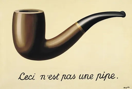
The Treachery of Images (La Trahison des images) from Rene Magritte (Figure 1.1) shows the risk of images and points out what they really are: only imitations of the real object but not the real object themselves. In Magritte’s piece, you see a pipe, but the title underneath says that it is not a pipe. This seems like a contradiction because we do see a pipe. Nevertheless, the pipe in the picture is not a pipe, but just an image of a pipe; it is not the pipe itself. Pictures and images never show the real object. They are always just a representation or interpretation of the object. Even photography, which seems to create an exact replica of the portrayed object or scenery, is like any other image, just an interpretation of it. The color, composition, and mood, for instance, are all aspects of an image that influence its content. Ten people that photograph exactly the same object will create 10 different interpretations. Magritte’s pipe is similar in appearance to a real pipe, but it is not the real pipe.
Figure1.1
René Magritte (1898–1967), La Trahison des images (Ceci n'est pas une pipe), 1929.
What influences the experience of observing images? Every image has a certain mood and content or story that evokes emotions in the viewer. Those emotions are influenced by our past and situations we experienced, which shaped us in one way or another. The emotions are also influenced by our knowledge. By looking at an image, we simply remember what we have seen before and the memory with the attached emotion comes back and thus influences the image looked at. It is our social and natural environments that shape our feelings toward images. Someone that grew up on a farm has very different feelings when looking at a picture of a field of wheat compared to someone that grew up in a metropolis. So every image is received differently by different people. Everybody has a slightly divergent emotion toward images. Swastikas, for example, have been symbols and decorations for thousands of years. But Figures 1.2 and 1.3 do tell different stories because we connect them to opposing historical and religious contexts. Images change and their content is not fixed. With time, every image goes through a development because societies change and we always look at an image from our current perspective. We will never know how people looked at the Sistine Chapel at the time it was created, because we don’t have the same experiences that would allow us to feel the same emotions. So every generation will see art anew.
Figure1.2
Hindu swastika: The evolution of the universe.
Figure1.3
Nazi swastika: The symbol of the “creating, acting life.”
Connecting images
If you look at the swastika in Figure 1.3, that symbol immediately starts a flow of images in your head that are connected to World War II: significant political photos, concentration camps, soldiers marching in Nuremburg, and flags at the Olympics in 1936, but also less realistic interpretations like Indiana Jones and the Last Crusade (1989), Captain America: The First Avenger (2011), Marvel comics, or serious artistic dealings with the topic in the form of novels, music or paintings, sculpture, and installations. This type of swastika should make you uncomfortable because it is so strongly connected to a significant historical event of horrendous proportions. The design of the sign, its simplicity, and aesthetics are quite successful; however, we cannot possibly see it only from that aspect, as its context and meaning overshadow the design. What we can see in the example of the Nazi swastika occurs in every image we look at. Each image, as banal as it might be, tells a story. Some are rather complex and evoke a myriad of contradictory feelings; others are simple and easy to understand, but they all come in a historical context and are connected to an uncountable number of other images. The swastika in Figure 1.2, which is the Hindu swastika describing the evolution of the universe, lacks the connection to World War II and evokes different images of Buddhist and Hindu temples, of serenity and calm. Both swastikas are similar, but they tell completely different stories. An artist creating images needs to ensure that the story told is actually the story that was supposed to be told.
Content
Figure 1.4 shows an advertisement from Pan Am’s campaign for the introduction of the Boeing 707 for transatlantic flights in the early 1960s, a historical step in commercial air travel. The content is fairly easy to understand; there are no hidden clues and there is no complex subtext in the image. It is a print commercial, so by its nature it should be easily understood and read in a split second. But if you take a closer look at the picture, you can see more than just the airplane. The image clearly focuses on the jet engines, which provided a “beautifully quiet, vibration-free comfort at 600 mph,” a unique and most definitely noteworthy feature of a commercial plane of the early 1960s. The size of the massive jet engines overpowers everything else in the image and their polished metal makes them appear clearly impressive and even slightly futuristic. However, they also feel safe as the passengers can even walk underneath them without hesitation (of course the passengers are very far away from the engines, but the flattening of the original three-dimensional image into a flat two-dimensional printed image allows the passengers to appear as if they were walking underneath the engine). Pan Am clearly provides safe and comfortable travel! There are various elements within the picture that give us hints of what emotionally we are supposed to feel. First, there is the metallic shiny surface of the airplane, which clearly defines the object as human-made and as clean, new, and solid. The huge wing of the plane covers nearly one-third of the entire image, thus providing some sort of roof that reminds one of a safe shelter for the passengers. Then there are the dominant jet engines, two of the four mentioned in the text. They look very powerful and are slightly intimidating in their size and complex design and in combination with the word “magic” just above their ability is impressive indeed! Then the blue sky, which we connect with words like “holiday,” “depth,” “air,” “flying,” “clean,” “deep,” etc., crea...
Table of contents
Cover
Half Title
Title Page
Copyright Page
Dedication Page
Table of Contents
Acknowledgments
Author
The Reason Why I Wrote this Book
Chapter 1: The Power of Images
Chapter 2: The Purpose of Images
Chapter 3: The Frame
Chapter 4: Aspect Ratio
Chapter 5: Composition
Chapter 6: Character Staging and Film Language
Chapter 7: Vectors
Chapter 8: Directions
Chapter 9: Shape and Form
Chapter 10: Mood
Chapter 11: Size
Chapter 12: Depth
Chapter 13: Light and Shadow
Chapter 14: Color
Chapter 15: Color Contrast
Chapter 16: Perspective
Chapter 17: Texture
Chapter 18: Movement
Chapter 19: Music and Sound
Chapter 20: Variation
Additional Reading
Index
Frequently asked questions
Yes, you can cancel anytime from the Subscription tab in your account settings on the Perlego website. Your subscription will stay active until the end of your current billing period. Learn how to cancel your subscription
No, books cannot be downloaded as external files, such as PDFs, for use outside of Perlego. However, you can download books within the Perlego app for offline reading on mobile or tablet. Learn how to download books offline
We are an online textbook subscription service, where you can get access to an entire online library for less than the price of a single book per month. With over 1.5 million books across 990+ topics, we’ve got you covered! Learn about our mission
Look out for the read-aloud symbol on your next book to see if you can listen to it. The read-aloud tool reads text aloud for you, highlighting the text as it is being read. You can pause it, speed it up and slow it down. Learn more about Read Aloud
Yes! You can use the Perlego app on both iOS and Android devices to read anytime, anywhere — even offline. Perfect for commutes or when you’re on the go. Please note we cannot support devices running on iOS 13 and Android 7 or earlier. Learn more about using the app
Yes, you can access Composition for the 21st ½ century, Vol 1 by Thomas Paul Thesen in PDF and/or ePUB format, as well as other popular books in Computer Science & Film & Video. We have over 1.5 million books available in our catalogue for you to explore.