![]()
1
Logorrhea, or, How to Watch a Hollywood Movie
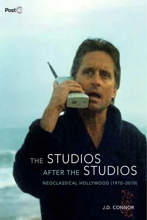
Begin at the beginning of The Core (Jon Amiel, Paramount, 2003). The twenty-two stars rush into the screen in a twirling line before they form their graceful Paramontian arc. The logo freezes and holds for a moment. Then we push into the mountain and turn, suddenly, down into it, through the layers of rock into the warmer oranges and yellows of the mantle, until we reach the core, or, not really the core, but the textual stand-in for the core, the words THE CORE, with their own stand-in for the core’s rotation, a rotating O. The journey from studio to title inaugurates the film as one that can be both experienced, as “a big ride,” as director Jon Amiel puts it, and interpreted, or read: “It also kind of tells you the story, in a funny way.”1 For Hollywood films of the neoclassical era, this is the fundamental duality.
Through the O we move into a rather coloristic graphic spiral that shifts from yellow and orange to yellow and purple and, in the big reveal, turns out to be the spinning top of a temporary carnival ride erected for Green World Day. Taking up the title’s invitation to read the ride, the graphic echoes Saul Bass’s remarkable credits for Alfred Hitchcock’s Vertigo (1958), which discovered celestial abstractions in the eye of the object of desire. Here, though, the abstraction is mere decor. With Vertigo in mind, we might tell this all-too-familiar story: Once upon a time there were authored, obsessional films, and now there are merely vertiginous rides given an arbitrary trade dress.
But the graphic reminder on the other side of the title is still part of the studio’s story, not yet that of a more general history, since Vertigo was a Paramount film. That is, it was. As a result of some cagey dealings by Hitchcock and his agent, MCA’s Lew Wasserman, the Vertigo negative reverted to the director. Hitchcock then moved to Wasserman’s studio, Universal, where Alfred Hitchcock Presents was being filmed. When Vertigo was restored in 1996, it was Universal that restored and reissued it. And it is from Universal that you would buy it. So the opening of The Core is corporate cultural revanchism, an attempt to undo the mistake of letting Vertigo slip away, much as Scottie attempts to resurrect Madeleine, a resurrection that occurs, one might say, on another “green world day.”
Figure 1.1. Journey to the center of the studio in The Core (Jon Amiel, Paramount, 2003)
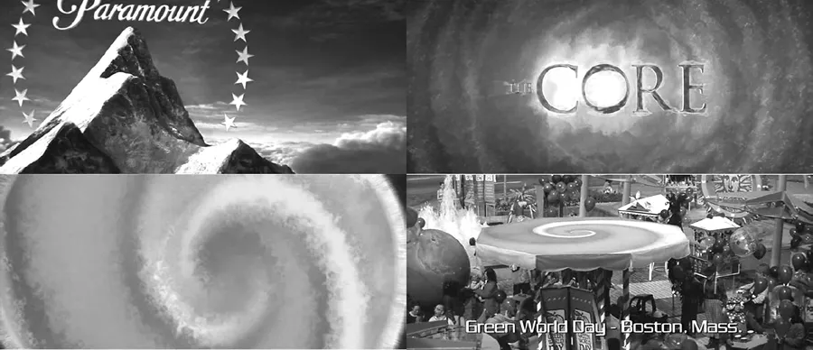
The Core then proceeds to represent and disavow its own aggressions by putting them in the mouth of a slick businessman, who thumpingly exhorts his team: “Let’s hit ’em. Let’s do it. Let’s go make $30 million dollars.” The line is both too craven and, strangely, not ambitious enough, because we know that if a movie like The Core were only to make $30 million, it would be considered a major disappointment.2 The film, to Paramount’s chagrin, did do about $30 million in US box office, and even throwing in international revenues, still did not make back its roughly $74 million budget.3 Needless to say, the film kills off our money-obsessed pitchman right away, and as he dies, the carnival comes to a halt.
Not content to seize its “rightful” Hitchcockian patrimony, The Core goes on, in a subsequent sequence, to remake The Birds (1963), a Hitchcock film released by Universal. Taking back The Birds involves another substantial change. As Amiel explains, in the original the birds were “malevolent”; here they are simply “flying blind.” The blind flying is caused by the earth’s internal slowdown and—like the title image and the interrupted carnival—serves as an emblem of it. These birds no longer swirl around Piccadilly Circus as they are supposed to. Instead, they smash into and through things. Our inclination to believe the just-so story in which the waning of the Hollywood auteur and his murderous gaze makes a place for an unguided action cinema only strengthens.
But if we can again forestall the industrial diagnosis, we might better understand whose authorship is really threatened. In the opening logo bleed (which is what I mean by logorrhea), the journey to the earth’s core is marked off as a journey to the corporate core. The rotating O of the title displays and blocks our access to the corporate-planetary core that no longer rotates. The film is a lesson to be read by Paramount. It offers Viacom an urgent primer in how to restart one of its “core competencies” after a period of disastrous returns. The balance of the film, in which a ragtag group of terranauts must journey to the center of the earth and restart the core, drives this point home. The ship will be called Virgil (epic storyteller–cum–infernal navigator), and the Gatling gun–type laser that will clear the ship’s path through the crust and mantle has twenty-two lenses—one for each star in the original logo.4
Figure 1.2. The Paramontian gun. The Core (Amiel, Paramount, 2003)
“Into the heart of the cosmos”
The logo bleed at the beginning of The Core is particularly elaborate, but not exceptional for its era. Even when the logo does not slide directly into the film, it is quite common for the leaders of the studios and production companies to be tinted or textured to mesh with the production design of the film. Warner Bros. has been the most assiduous in this—the WB shield is reflective, or cloudy, or stony at the beginning of Harry Potters 2001–11), green at the beginning of Matrixes (The Wachowskis, 1999–2003), and an icon in a computer desktop in You’ve Got Mail (Nora Ephron, 1998). Finally, even when the logo does not bleed and the leaders are not colored, the snippet of studio sound track that backs the leader in its iconic form is frequently stripped away and replaced by an appropriate sonic lead-in. Warners, for instance, will drop the orchestrated version of “As Time Goes By” that became standard with its seventy-fifth anniversary for something else—a bleeping modem, a siren, heavy breathing, mood-setting silence. As the production process has been further and further divided, contracted out, and assembled piecemeal for singular efforts, sound and color have become corporate binding agents.
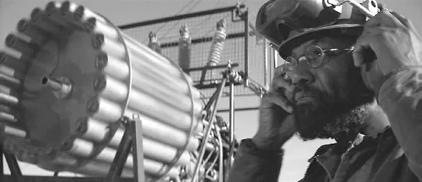
But the logo bleed remains the privileged sign of the intentional integration of studio and story. As a result, the frontier is fiercely guarded. “God forbid you should tamper with the logo,” screenwriter Peter Rader said.5 But in Waterworld (Kevin Reynolds, Universal, 1995), one of Rader’s films, the logo bleed is both elaborate and narratively crucial. As the Universal globe turns, it zooms outward and tilts the polar ice cap toward us. The white region quickly vanishes into the neutral, near chromakey blue of the ocean. That impossibly monochrome ocean dissolves into a shot of a real ocean upon which we find Kevin Costner’s trimaran. Decades of historical exposition are condensed into a single “shot” that quickly establishes the genre conventions—the narrative plausibility of hard, near-future, dystopian sci-fi on the one hand, and the cartoonish, or, rather, graphic reduction of motivation of most of the characters on the other. A film may open efficiently, as this one does, yet fail to find the necessary audience, as this one did. Or, more precisely, it failed to find the necessary popular audience that might have made it profitable. Yet given how quietly the logo bleed can pass by, how even when it tells us what we need to know about the film, we might still not take it as a sign of something we need to know about the studio, then the audience for the bleed may not need to be a popular one.
Figure 1.3. Taking the plunge. Waterworld (Kevin Reynolds, Universal, 1995)
It would be more direct to say that the creation of a popular audience invested in the fate of the studio logo has been one of neoclassical Hollywood’s fundamental projects.6 To attach an audience to a corporation, to brand something as weakly branded as a contemporary studio, would be a major feat. The neoclassical moviegoing experience smudges studio identity in as many ways as the classical Hollywood system reinforced it. Long gone are the days when one saw a Paramount newsreel, a Popeye cartoon, and a Paramount twin bill in a Paramount Publix theater. Today, one is more likely to catch Coke and Nike ads, a number of trailers (diverse in their studio pedigrees, united in their demographic aims) concluding with one from the same distributor as the feature, and finally a single Paramount feature, all in an AMC Loew’s multiplex. Unless the film is one of the few strongly branded franchise films—a Star Trek, or an Indiana Jones, for example—the studio behind it is likely to be not simply unimportant to our viewing but irretrievably lost on us. The film’s credits will be a hodgepodge of levels of attribution: Paramount Pictures presents a David Foster Cooper Layne Sean Bailey production of a Jon Amiel film (The Core, 2003), or Universal Pictures/Dreamworks LLC/Imagine Entertainment present a Brian Grazer production of a Bo Welch film (The Cat in the Hat, 2003). Inside the film, we may find far more effective Coke and Nike ads, extended paeans to the new Mini Cooper, or incongruous Louis Vuitton dropping.
The moment when we pivot from the multibranded exterior of the film to its multibranded interior ordinarily passes unremarked. The pivot is more visible on disc, where the ads are usually absent, and where the first thing one sees is the logo of the home video distribution arm of the studio. There are then the licensing stipulations, a disclaimer that the opinions expressed in the commentary track are not those of the corporation, and several trailers, all from the same studio this time. Still, even in this moment, the studio can slide by because the story, it seems, lies on the other side.
Yet the five or so minutes between the beginning of the final trailer in the theater and the end of the opening credits constitute the zone where every contingency of the film’s production—from the labor that made it to the financing behind it, to the oversight that saved it (or wrecked it), to the distributor’s best attempt to integrate it into that cultural kernel represented by the production slate as a whole—is rearticulated. For mass audiences, almost none of the crediting matters; for industrial audiences, everything from type size to duration carries intense significance.
If credits are the public inscription of the professionals’ contracts, then the opening smudge is, for the vast world of what Variety quaintly calls the “non-pro,” an allegory of our contract with the narrative. Writing about the openings of various films noirs, French critic Marc Vernet has argued that the “cinematic transaction” between the detective and his “dispatcher” is an emblem of the viewer’s relationship to the investigative narrative.7 In the neoclassical Hollywood cinema, the emblem is both more literal and ultimately less precise. The morphing of the contemporary animated logo is concrete to the point of being cartoonish, as in Waterworld, literal to the point of literation, as in The Core’s rolling O. Yet logos do not readily become protagonists that we might think alongside as they attempt to realize their goals in the face of increasing obstacles over the course of a balanced, multiact narrative. Instead, our identification is less with the logo as protagonist than with the emblematic nature of the logorrheal process as such. Will this bit of kitsch have consequences? Will the narrative be integrated with the conditions of its production? Will any of the concerns of the submissive, contracted, incorporated parties mirror our own concerns as the film unspools or the DVD spins?
Branding Utopia
To be sure, such abstract concerns are not typically what come before us as the theater finally darkens and the repeated promises of the feature slide into our experience of the presence of a film. Yet it is surely worth lingering over these openings since every studio has devoted itself to them. Paramount pushed into the mountain; Universal melted the ice cap; Warners morphed the shield into the Bat sign in Batman Forever (Joel Schumacher, 1995); Columbia flew into the lady’s torch in Big Fish (Tim Burton, 2003); Disney turned the cerulean background to its white castle into the walls of Andy’s room in Toy Story, a shot that quickly panned over to reveal Luxo, the Pixar desk lamp (John Lasseter, 1995).
Figure 1.4. Corporate morphing. Batman Forever (Joel Schumacher, Warner Bros., 1995)
Even MGM, the studio that has most struggled to find or maintain its identity throughout the period, played the Lion for all it was worth. The studio not only morphed Leo into the screaming mouth of a boy-band fan in Josie and the Pussycats (Harry Elfont and Deborah Kaplan, 2001); it also attempted to launch an animated series based around him and his family, Lionhearts (1998). That series went nowhere, but at Warner Bros., Steven Spielberg’s Amblin productions launched Animaniacs, which ran from 1993 to 1998 and told stories of Wakko, Yakko, and Dot Warner, three animated characters too “zany” to use in WB cartoons. They lived in the iconic water tower and made self-referential, faux-ironic mischief all over the studio lot.8
Perhaps the most important bit of logo play in the neoclassical era comes at the beginning of Paramount’s Raiders of the Lost Ark (1981). Producer Frank Marshall explains that “Steven was always coming up with great ideas which were sometimes a challenge for the production. And we were setting up in Kauai and he called me over and he said, ‘Look I need to find a mountain, I need you to go find a mountain that looks like the Paramount logo where we can shoot.’ And I went, ‘OK.’ And because it was sort of a last minute request, and we didn’t have CGI [computer-generated imagery] to fall back on, I had to drive around to the whole island until I found a location that would work for us, and for a few extra pineapples, we got it.”9 In this account, the opening is an improvised moment, a director having fun and bringing the film in line with some of the nostalgic techniques that shaped its narrative and its production design. The idea is Spielberg’s; the property is Paramount’s; the film is the consummation of the marriage between auteur and studio.
Yet, as has been the case throughout Spielberg’s career, every solicitation of studio concern has been tempered, subverted, even completely undone by his assertion of a particularly broad claim of authorship. About the opening Spielberg says, “I just thought it would be fun to start with the Paramount mountain. I mean when I was a kid, my first company was called Play Mount Productions, and I had a mountain, whic...