Hands-On Data Visualization with Bokeh
Interactive web plotting for Python using Bokeh
- 174 pages
- English
- ePUB (mobile friendly)
- Available on iOS & Android
About this book
Learn how to create interactive and visually aesthetic plots using the Bokeh package in Python
Key Features
- A step by step approach to creating interactive plots with Bokeh
- Go from installation all the way to deploying your very own Bokeh application
- Work with a real time datasets to practice and create your very own plots and applications
Book Description
Adding a layer of interactivity to your plots and converting these plots into applications hold immense value in the field of data science. The standard approach to adding interactivity would be to use paid software such as Tableau, but the Bokeh package in Python offers users a way to create both interactive and visually aesthetic plots for free. This book gets you up to speed with Bokeh - a popular Python library for interactive data visualization.
The book starts out by helping you understand how Bokeh works internally and how you can set up and install the package in your local machine. You then use a real world data set which uses stock data from Kaggle to create interactive and visually stunning plots. You will also learn how to leverage Bokeh using some advanced concepts such as plotting with spatial and geo data. Finally you will use all the concepts that you have learned in the previous chapters to create your very own Bokeh application from scratch.
By the end of the book you will be able to create your very own Bokeh application. You will have gone through a step by step process that starts with understanding what Bokeh actually is and ends with building your very own Bokeh application filled with interactive and visually aesthetic plots.
What you will learn
- Installing Bokeh and understanding its key concepts
- Creating plots using glyphs, the fundamental building blocks of Bokeh
- Creating plots using different data structures like NumPy and Pandas
- Using layouts and widgets to visually enhance your plots and add a layer of interactivity
- Building and hosting applications on the Bokeh server
- Creating advanced plots using spatial data
Who this book is for
This book is well suited for data scientists and data analysts who want to perform interactive data visualization on their web browsers using Bokeh. Some exposure to Python programming will be helpful, but prior experience with Bokeh is not required.
Tools to learn more effectively

Saving Books

Keyword Search

Annotating Text

Listen to it instead
Information
Using Annotations, Widgets, and Visual Attributes for Visual Enhancement
- Annotations that convey supplemental information about your plots
- Widgets that add interactivity to your plots
- Visual attributes that enhance both the style and interactivity of your plots
Technical requirements
https://github.com/PacktPublishing/Hands-on-Data-Visualization-with-Bokeh.
Creating annotations to convey supplemental information
Adding titles to plots
#Import the required packages

import pandas as pd

#Read in the data

df = pd.read_csv('all_stocks_5yr.csv')

#Convert the date column into datetime data type

df['date'] = pd.to_datetime(df['date'])

#Filter the data for Apple stocks only

df_apple = df[df['Name'] == 'AAL']
#Import the required packages

from bokeh.io import output_file, show
from bokeh.plotting import figure
from bokeh.plotting import ColumnDataSource


#Create the ColumnDataSource object

data = ColumnDataSource(data = {
 'x' : df_apple['high'],
 'y' : df_apple['low'],
 'x1': df_apple['open'],
 'y1': df_apple['close'],
 'x2': df_apple['date'],
 'y2': df_apple['volume'],


})
#Import the required packages
from bokeh.plotting import figure, show, output_file, output_notebook
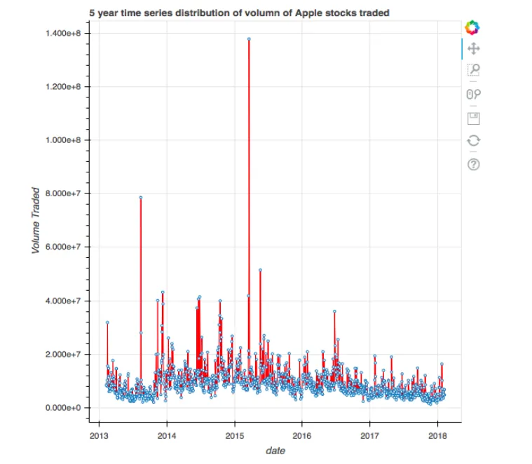
#Create the plot with the title
plot = figure(title = "5 year time series distribution of volume of Apple stocks traded",title_location = "above",x_axis_type = 'datetime', x_axis_label = 'date', y_axis_label = 'Volume Traded')
#Create the time series plot
plot.line(x = 'x2', y = 'y2', source = data, color = 'red')
plot.circle(x = 'x2', y = 'y2', source = data, fill_color = 'white', size = 3)
#Output the plot
output_file('title.html')
show(plot)
Adding legends to plots
#Import the required packages
from bokeh.plotting import figure, show, output_file
#Create the two scatter plots
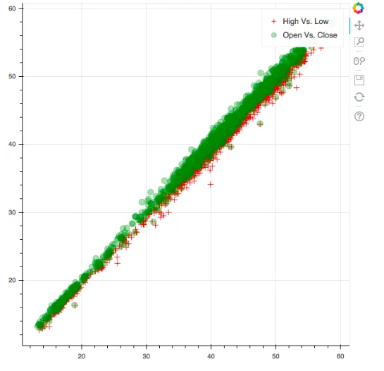
plot = figure()
#Create the legends
plot.cross(x = 'x', y = 'y', source = data, color = 'red', size = 10, alpha = 0.8, legend = "High Vs. Low")
plot.circle(x = 'x1', y = 'y1', source = data, color = 'green', size = 10, alpha = 0.3, legend = "Open Vs. Close")
#Output the plot
output_file('legend.html')
show(plot)
Adding color maps to plots
#Reading in the S&P 500 data

df = pd.read_csv('all_stocks_5yr.csv')

#Filtering for Google or USB

df_multiple = df[(df['Name'] == 'GOOGL') | (df['Name'] == 'USB')]
Table of contents
- Title Page
- Copyright and Credits
- Dedication
- Packt Upsell
- Contributors
- Preface
- Bokeh Installation and Key Concepts
- Plotting using Glyphs
- Plotting with different Data Structures
- Using Layouts for Effective Presentation
- Using Annotations, Widgets, and Visual Attributes for Visual Enhancement
- Building and Hosting Applications Using the Bokeh Server
- Advanced Plotting with Networks, Geo Data, WebGL, and Exporting Plots
- The Bokeh Workflow – A Case Study
- Other Books You May Enjoy
Frequently asked questions
- Essential is ideal for learners and professionals who enjoy exploring a wide range of subjects. Access the Essential Library with 800,000+ trusted titles and best-sellers across business, personal growth, and the humanities. Includes unlimited reading time and Standard Read Aloud voice.
- Complete: Perfect for advanced learners and researchers needing full, unrestricted access. Unlock 1.4M+ books across hundreds of subjects, including academic and specialized titles. The Complete Plan also includes advanced features like Premium Read Aloud and Research Assistant.
Please note we cannot support devices running on iOS 13 and Android 7 or earlier. Learn more about using the app