"Design is not just what it looks like and feels like. Design is how it works."
– Steve Jobs
"True interactivity is not about clicking on icons or downloading files, it's about encouraging communication."
– Ed Scholssberg
Pages are Business Central's object type for interactively presenting information. The page rendering routines that paint the page on the target display handle much of the data presentation details. This allows a variety of clients to be created by Microsoft, such as a web browser resident client, the Windows RTC client, and a universal client that can be used on all devices, such as phones, tablets, and other platforms (iPad, Android, and Windows). Independent Software Vendors (ISVs) have created mobile clients and even clients targeted by devices other than video displays.
One of the benefits of page technology is the focus on the user experience rather than the underlying data structure. As always, the designer/developer has the responsibility of using the tools to their best effect. Another advantage of Business Central pages is the flexibility they provide the user for personalization, allowing them to tailor what is displayed and how it is organized.
In this chapter, we will explore the various types of pages offered by Business Central. We will review many options for format, data access, and tailoring pages. We will also learn about the page designer tools and the inner structures of pages.
We will cover the following topics:
- Page design and structure overview
- Types of pages
- Page designer
- Page components
- Page controls
- Page actions
- WDTU page enhancement exercises
Page design and structure overview
Pages serve the purpose of input, output, and control. They are views of data or process information designed for onscreen display only. They are also user data entry vehicles.
Pages are made up of various combinations of controls, properties, actions, triggers, and AL code, which are briefly explained here:
- Controls: These provide the users with ways to view, enter, and edit data; choose options or commands; initiate actions; and view status.
- Properties: These are attributes or characteristics of an object that define its state, appearance, or value.
- Actions: These are menu items that may be icons.
- Triggers: These are predefined functions that are executed when certain actions or events occur.
The internal structure of a page maps to a tree structure, some of which is readily visible in the page designer display while the rest is in the background.
Page design guidelines
Good design practice dictates that enhancements integrate seamlessly with the existing software, unless there is an overwhelming justification for being different. When we add new pages or change existing pages, the changes should have the same look and feel as the original pages, unless the new functionality requires significant differences. This consistency not only makes the user's life easier, it makes support, maintenance, and training more efficient.
There will be instances where we will need to create a significantly different page layout in order to address a special requirement. Maybe we will need to use industry-specific symbols, or we will need to create a screen layout for a special display device. Perhaps, we will create a special dashboard display to report the status of work queues. Even when it will be different, we should continue to be guided by the environment and context in which our new work will operate.
Business Central page structure
Let's take a look at what makes up a typical page in the Business Central web client. The page in the following screenshot includes a list page at its core (the content area):
Here is a brief description of all of these options:
- The title bar (1) displays page caption and product identification.
- The company indicator (2) acts as a home button. It allows the user to navigate to the Role Center or to refresh the Role Center depending on where the user is at the moment of using the link:
- The filter button is where the user controls the filtering to be applied to the page display.
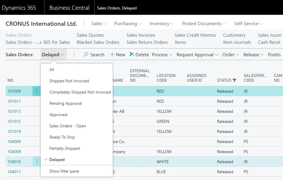
- If we click on the down-facing arrowheads in the filter button, child menu options will be displayed in a drop-down list, as shown in the following screenshot. The same list of options subordinate to Sales Orders is displayed both in the drop-down menu from the filter button and in the detailed list of options in the navigation pane:
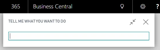
- The search field (4) allows users to find pages, reports, or views based on the object's name (full or partial):
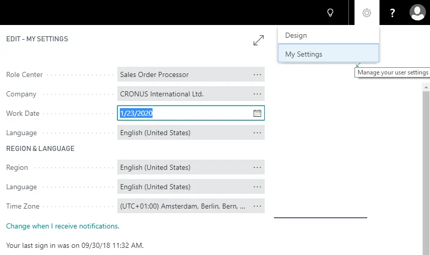
- The settings button (5) provides access to a general set of menu options. It provides access to some basic application information and administration functions, as shown in the following screenshot:
- The ribbon (6) contains shortcut icons to actions. These same commands will be duplicated in other menu locations, but are in the ribbon for quick and easy access. The ribbon can be collapsed (made not visible) or expanded (made visible) under user control.
- The navigation pane (7) contains menu options based on the active Role Center, which is tied to the user's login.
- The content area (8) is the focus of the page. It may be a Role Center, a list page, or a department menu list.
- The FactBox pane (9) can appear on the right side of certain page types, such as card, list, List Plus, document, navigate, or worksheet. A FactBox can only display a Card Part, list part, system part, or a limited set of predefined charts. FactBoxes can provide no-click and one-click access to related information about the relevant data in the content area.
Types of pages
Let's review the types of pages available for use in an application. Then, we will create several examples for our WDTU Radio Station system.
Each time we work on an application design, we will carefully need to consider which page type is best to use for the functionality we are creating. Types of pages available include Role Center, HeadlinePart, list, card, List Part, Card Part, List Plus, document, worksheet, navigate page, ConfirmationDialog, and StandardDialog. Pages can be created and modified by the developer and can be personalized by the administrator, superuser, or user.
Role Center page
Users are each assigned a Role Center page as their home page in Business Central—the page where they land when first logging into Business Central. The purpose of a Role Center page is to provide a task-oriented home base that focuses on the tasks that the user typically needs in order to do his/her job on a day-to-day basis. Common tasks for any user should be no more than one or two clicks away.
The standard Business Central distribution includes predefined Role Center pages, including generic roles such as the bookkeeper, sales manager, and production planner. Some of the provided Role Centers are richly featured and have been heavily tailored by Microsoft as illustrations of what is possible. On the other hand, some of the provided Role Centers are only skeletons, acting essentially as placeholders.
It is critical to understand that the provided Role Center pages are intended to be templates, not final deliverables.
Central to each Role Center page is the activities area. The activities area provides the user with a visual overview of their primary tasks. Within the activities area are the cues. Each blue cue icon (containing a document symbol) represents a filtered li...