1: Chart and be sexy
Without a sound foundation, advanced charting principles will slip through your fingers. Plus, it’s a well-known fact that chartists are damn sexy. Doubt me? I suggest you focus now and you’ll soon reap the rewards.
If this is the first book about technical analysis that you have ever picked up, you’re going to need to grasp some of the basics before moving on. This chapter will provide you with a foundation for the exercises I have set out further down the line.
In the coming chapters, you will have the opportunity to see how I analyse a chart and to practise these skills for yourself. There is no one perfect answer, but to find out whether you are on the right track, you can turn to the ‘Answers’ section following each set of exercises or at the end of each chapter.
Will you promise me that you will not turn to the Answers section immediately? Resist the temptation to immediately flick forward. I want to give you a chance to fill out the review sections for yourself first. This approach is consistent throughout the book. I can guarantee that the people who do not immediately turn to the answers will benefit most in the long run.
We will start laying the groundwork for your charting career by looking at a few main concepts, the first of which is weight of evidence.
Weight of evidence
Imagine you’re a private detective and you’re working towards solving a crime. You wouldn’t look at just one piece of evidence, would you? You’d look at several key pieces of evidence and then make up your mind. That would be the most logical way to progress.
When several chart patterns and indicators point in the same direction, their signals are reinforced.
Use the same method when looking at a chart. When several chart patterns and indicators point in the same direction, their signals are reinforced. If the weight of evidence of several indicators suggests that the share is uptrending, then the bulls have probably taken control of the market.
By using more than just one or two pieces of evidence that the share is trending in a particular direction, you are stacking the odds in your favour. The best chartists try to maintain complete objectivity and remove any emotion or gut-feel from their analysis.
There are hundreds of indicators to choose from. They don’t all help your trading results. If you use 50 indicators, you’ll probably just end up a quivering mess of nerves huddling in the corner. It’s far better to choose a few judiciously. A method that I have found to help me do this is to separate the indicators into five categories.
The families
Indicators tend to fall into several distinct ‘families’. I use at least one of the indicators from each family in order to form an opinion about the share price’s likely direction. This is an ideal application of the weight of evidence theory. The families are:
• the line family
• the moving average family
• the momentum family
• the volume family
• the pattern family.
Throughout the coming chapters, we will explore each of these in turn. You will find some of these families simpler or easier to relate to than others. This is perfectly natural. You can start trading without fully grasping every aspect of charting (I certainly did!). Too much knowledge can paralyse you.
If you are familiar with the way charts are constructed and want to get into the meat of the book, turn to the next chapter and we will begin our analysis using support and resistance lines, and trendlines. Keep reading if this is your introduction to charting or if you’d like a quick refresher on the way price action appears on a chart.
Chart construction
Your computer charting package can produce several different types of charts. We will look at each in turn below.
Bar charts
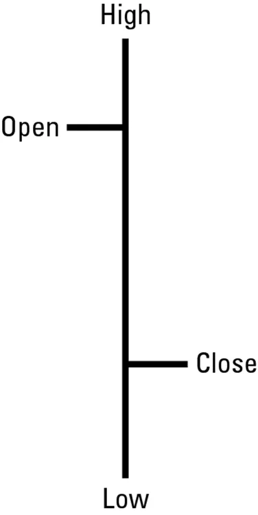
The individual building block of a bar chart is a single bar. Drawing a single bar requires an opening price, a high, a low and a closing price (see figure 1.1). The vertical line shows the high and low of that period. The two horizontal lines depict the open and the close. The open is the horizontal line on the left of the vertical line and the close is the horizontal line on the right of the vertical line.
Depending on what you ask your charting software package to produce, you may view an intra-day, a daily, a weekly or a monthly chart. On a daily chart, one bar will show the share price action for one day. If you look at a weekly chart, the open price will be the opening price at the start of the week and the closing price will be the final price recorded at the end of the week. The high and low will be the overall high for the week and the overall low for the week. In other words, whichever time period you utilise, the bar will show the activity for that session.
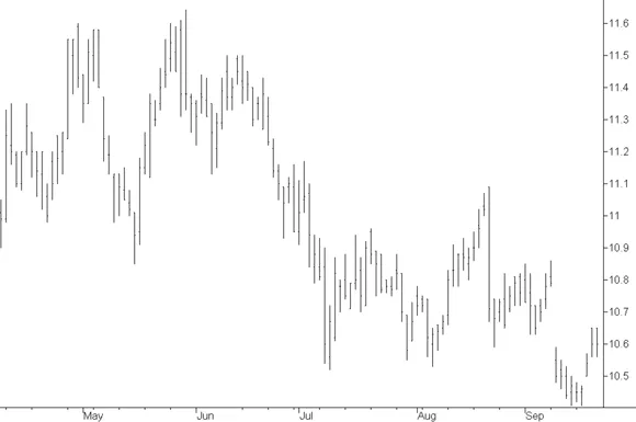
When many of these single period bars are plotted on a chart with the horizontal axis representing time and the vertical axis showing the share price, a traditional bar chart is created (see figure 1.2). The inter-relationships of the bars show whether the share is generally going up in value (that is, bullish), or going down in value (that is, bearish). Periods of sideways progression are also evident.
Indicators may help you understand whether or not the predominant direction is likely to continue. You cannot predict the market direction. As legendary trader Jim Rogers, author of the bestseller Adventure Capitalist, says, ‘Markets will rise higher than you think is possible and fall lower than you can possibly imagine’. The best that you can do is analyse the type of trend that existed in the past and take an educated guess that history will repeat itself. This is the main focus of technical analysts.
Crikey that little bar chart is an ugly thing, isn’t it? It really doesn’t call to my soul and give me an idea about the future direction of the price action. Don’t worry. Once we get through this section, I’ll introduce you to the beautiful and colourful candlestick chart. I know you’ll fall in love with them. They’re divine little creatures.
Figure 1.2: AGL daily — bar chart
Source: SuperCharts version 4 by Omega Research © 1997.
Line charts
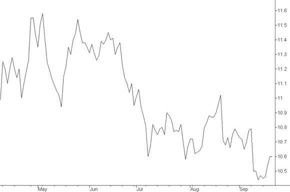
A line chart (see figure 1.3) connects the closing prices for each period, providing less information, but it is, perhaps, a simpler chart to interpret in comparison to the bar chart.
Figure 1.3: AGL daily — line chart
Source: SuperCharts version 4 by Omega Research © 1997.
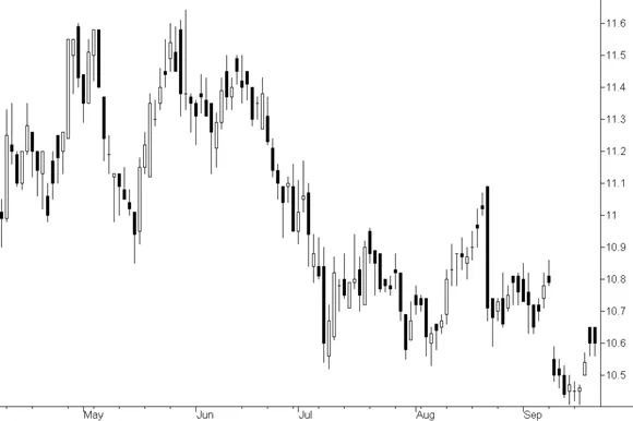
Candlestick charts
A single candlestick represents the same data that you will find in a single bar, however, they look completely different. The origin of the name is obvious when looking at the chart (see figure 1.4 ) — a candlestick chart looks like a series of candles with wicks at either end of the candle. In the next section we will explore the specific implications of each part of the candle.
The three charts shown in figure 1.2, figure 1.3 and figure 1.4 all represent the same information, and the same time scale; however, their graphic format ensures that each chart looks very different.
In my view, using a candlestick chart is clearly superior to using a bar chart or a line chart. I think that bar and line charts are ugly little characters. Bar charts are positively anorexic compared to the full-bodied candles, and line charts only show 25 per cent of the information shown in candlestick charts. (So, basically, candlestick charts are 75 per cent more intelligent than line charts.) I suggest that if you want to beat the markets, you should avoid these inferior types of charts altogether. There are many patterns that a candlestick chart displays that cannot be shown on a bar chart or a line chart. It may take a bit of effort to learn how to interpret these types of charts, but it will give you an edge over other traders in the market.
Figure 1.4: AGL daily — candlestick chart
Source: SuperCharts version 4 by Omega Research © 1997.
It’s important that you know up-front that I’m vastly biased when it comes to candlestick charts. I adore them, the way you’d adore any tool that has brou...