
eBook - ePub
Lighting Design
A Perception-Based Approach
Christopher Cuttle
This is a test
Compartir libro
- 136 páginas
- English
- ePUB (apto para móviles)
- Disponible en iOS y Android
eBook - ePub
Lighting Design
A Perception-Based Approach
Christopher Cuttle
Detalles del libro
Vista previa del libro
Índice
Citas
Información del libro
By reading this book, you will develop the skills to perceive a space and its contents in light, and be able to devise a layout of luminaires that will provide that lit appearance.
Written by renowned lighting expert Christopher (Kit) Cuttle, the book:
-
- explains the difference between vision and perception, which is the distinction between providing lighting to make things visible, and providing it to influence the appearance of everything that is visible;
- demonstrates how lighting patterns generated by three-dimensional objects interacting with directional lighting are strongly influential upon how the visual perception process enables us to recognize object attributes, such as lightness, colourfulness, texture and gloss;
- reveals how a designer who understands the role of these lighting patterns in the perceptual process may employ them either to reveal, or to subdue, or to enhance the appearance of selected object attributes by creating appropriate spatial distributions of light;
- carefully explains calculational techniques and provides easy-to-use spreadsheets, so that layouts of lamps and luminaires are derived that can be relied upon to achieve the required illumination distributions.
Practical lighting design involves devising three-dimensional light fields that create luminous hierarchies related to the visual significance of each element within a scene. By providing you with everything you need to develop a design concept - from the understanding of how lighting influences human perceptions of surroundings, through to engineering efficient and effective lighting solutions – Kit Cuttle instills in his readers a new-found confidence in lighting design.
Preguntas frecuentes
¿Cómo cancelo mi suscripción?
¿Cómo descargo los libros?
Por el momento, todos nuestros libros ePub adaptables a dispositivos móviles se pueden descargar a través de la aplicación. La mayor parte de nuestros PDF también se puede descargar y ya estamos trabajando para que el resto también sea descargable. Obtén más información aquí.
¿En qué se diferencian los planes de precios?
Ambos planes te permiten acceder por completo a la biblioteca y a todas las funciones de Perlego. Las únicas diferencias son el precio y el período de suscripción: con el plan anual ahorrarás en torno a un 30 % en comparación con 12 meses de un plan mensual.
¿Qué es Perlego?
Somos un servicio de suscripción de libros de texto en línea que te permite acceder a toda una biblioteca en línea por menos de lo que cuesta un libro al mes. Con más de un millón de libros sobre más de 1000 categorías, ¡tenemos todo lo que necesitas! Obtén más información aquí.
¿Perlego ofrece la función de texto a voz?
Busca el símbolo de lectura en voz alta en tu próximo libro para ver si puedes escucharlo. La herramienta de lectura en voz alta lee el texto en voz alta por ti, resaltando el texto a medida que se lee. Puedes pausarla, acelerarla y ralentizarla. Obtén más información aquí.
¿Es Lighting Design un PDF/ePUB en línea?
Sí, puedes acceder a Lighting Design de Christopher Cuttle en formato PDF o ePUB, así como a otros libros populares de Architecture y Architecture General. Tenemos más de un millón de libros disponibles en nuestro catálogo para que explores.
Información
1
The Role of Visual Perception
Chapter summary
The Checker Shadow Illusion demonstrates a clear distinction between the processes of vision and perception, where vision is concerned with discrimination of detail and perception involves recognition of surface and object attributes. The role of lighting in this recognition process involves the formation of lighting patterns created by interactions between objects and the surrounding light field. Confident recognition comprises clear perception of both object attributes and the light field. Three types of object lighting patterns are identified, being the shading, highlight, and shadow patterns, and it is by creating light fields that produce controlled balances of these three-dimensional lighting patterns that designers gain opportunities to influence how room surface and object attributes are likely to be perceived.
The evidence of your eyes
Figure 1.1 shows the Checker Shadow Illusion, and at first sight, the question has to be, where is the illusion? Everything looks quite normal. The answer lies in squares A and B: they are identical. That is to say, they are the same shade of grey and they have the same lightness, or to be more technical, they have the same reflectance (and thereby luminance) and the same chromaticity.
Do you find this credible? They certainly do not look the same. Now look at Figure 1.2, which shows a white sheet drawn over the figure with cut-outs for the two squares. Seen in this way they do look the same, and if you take a piece of card and punch a hole in it, you can slide it over the previous figure and convince yourself that the two squares are in fact identical and as shown in Figure 1.2.
This raises a question: how is it that, when the images of these two identical squares are simultaneously focussed onto the retina, in one case (Figure 1.2) they appear identical and in the other (Figure 1.1) they appear distinctly different?
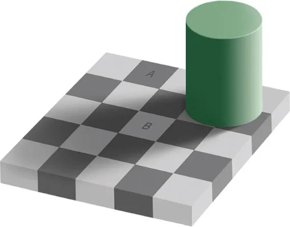
Figure 1.1 The Checker Shadow Illusion. Squares A and B are identical. They are presented here as related colours, that is to say, they appear related to their surroundings. The lighting patterns that appear superimposed over the surrounding surfaces cause a viewer to perceive a ‘flow’ of light within the volume of this space, and which leads to the matching luminances of A and B being perceived quite differently.
(Source: en.wikipedia.org/wiki/Checker_shadow_illusion.html, downloaded January 2013)
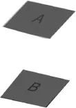
Figure 1.2 A white sheet has been drawn over the Checker Shadow Illusion, with cut-outs for squares A and B, and now they appear to be identical. In this case they are presented as unrelated colours.
Related and unrelated colours
The essential difference is that in Figure 1.1 the two squares are presented as related colours, that is to say, colours are perceived to belong to surfaces or objects seen in relation to other colours, and in Figure 1.2, they are shown as unrelated colours, meaning they are seen in isolation from other colours (Fairchild, 2005). As unrelated colours (grey is a colour), they are perceived to comprise nothing more than rectangular coloured shapes on a plain white background, but when they are set into the context of Figure 1.1, they are perceived as solid elements in a three-dimensional scene that have recognisable object attributes. It is this change in the way they are perceived that causes them to appear differently.
So what are the components of the surrounding scene that make this illusion so effective? Ask yourself, why is the cylindrical object there? Does it contribute something? In fact, it is a vital component of the illusion. So, what colour is it? Obviously, green. Is it uniformly green? Well, yes … but look more carefully at the image of the object and you will see that both its greenness and its lightness vary hugely. The image is far from uniform, so how did you suppose the object to be uniformly green? The answer is that you perceived a distinctive lighting pattern superimposed over the uniformly green object. In Figure 1.3, the area enclosed by the object outline is shown as uniformly green and it appears as nothing more than a formless blob.
The solid, three-dimensional object perceived in Figure 1.1 is observed to be interacting with a directional ‘flow’ of light, which causes a shading pattern to be generated, and this appears superimposed over the green object surface. Note also that the cylinder’s surface is not perfectly matt, and there is just a hint of a highlight pattern due to a specular component of reflection that is apparent at the rounded rim of the cylinder’s top edge. These lighting patterns inform you about the object’s attributes (Cuttle, 2008).
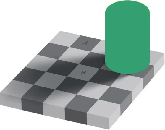
Figure 1.3 Previously the cylindrical object appeared to be uniformly green. Now it is uniformly green, but it does not look like a cylinder. That is because it is now lacking the lighting pattern due to interaction with the ‘flow’ of light.
Now look at the checker board surface. Again we have a pattern due to the lighting, but in this case it is a shadow pattern, which has a different appearance from the shading and highlight patterns, but nonetheless is quite consistent with our perception of the overall ‘flow’ of light within the volume of the space. It will be obvious to you that if two surfaces have the same lightness (which also means they have the same reflectance) and one occurs within the shadow pattern and one outside it, they will have different luminance values. The creator of this brilliant illusion, Edward H. Adelson, Professor of Vision Science at the Massachusetts Institute of Technology, has carefully set it up so that squares A and B have the same luminance value, which means of course, that their images on your retina are identical. However, the function of the visual process is to provide information to the visual cortex of the brain, and here your perceptual process is telling you that, although these two squares match for luminance, they cannot have the same lightness. The one in the shadow must be lighter, that is to say, it must have higher reflectance, than the one in full light. You hold this innate understanding of lighting in your brain, and you cannot apply your conscious mind to overrule it.
In this way, it can be seen that the image focussed onto the retina is simply an optical projection of the visual scene that corresponds directly with the luminance and chromaticity values of the elements within the external scene. Since its inception, the study of lighting has concentrated on the visual process and how illumination may be applied to provide for visibility, later defined in terms of visual performance, but the role of vision is to serve the process of perception, and this occurs not at the retina, but in the visual cortex of the brain. What we perceive is not a pattern of brightness and colour, but a gestalt, this being a psychological term that describes the holistic entity that enables us to recognise all the forms and objects that make up our surroundings (Purves and Beau Lotto, 2003). Consciously, we are aware of three-dimensional spaces defined by surfaces and containing objects, but in order to make this much sense of the flow of information arriving through the optic nerve, we have to be subconsciously aware of a light field that fills the volume of the space. This is how we make sense of squares A and B. Seen in this way, it becomes obvious why attempts to analyse scenes in terms of luminance and chromaticity were bound to lead to frustration.
The role of ambient illumination
For most of the time, we live in a world of related colours. We are surrounded by surfaces and objects which, providing the entire scene is adequately illuminated, our perceptual faculties reliably recognise and make us aware of, sometimes so that we can cope with everyday life, and sometimes to elevate our senses to higher levels of appreciation, as when we encounter artworks or beauties of nature. Recognition involves identifying object attributes associated with all of the things that make up our surrounding environments, and our innate skill in doing this is truly impressive. Scientists working on artificial intelligence have tried to program super computers to perform in this way, but so far their best efforts fall far short of what human perception achieves every moment throughout our waking hours.
Provided that ambient illumination is sufficient, we are able to enter unfamiliar environments, orientate ourselves, and go about our business without hesitating to question the reliability of the perceptions we form of the surrounding environment. It is clear that substantial processing has to occur, very rapidly, between the retinal image and formation of the perception of the environment. There is no good reason why our perceptions of elements of the scene should show in-step correspondence with their photometric characteristics. Visual perception may be thought of as the process of making sense of the flow of sensory input through the optic nerve to the brain, where the purpose is to recognise surfaces and objects, rather than to record their images. Colours are perceived as related to object attributes, and effects of illumination are perceived as lighting patterns superimposed over them. As we recognised the cylinder in Figure 1.1 to be uniformly green with a superimposed shading pattern, so we also recognised the identical squares to differ in lightness because of the superimposed shadow pattern.
There will, however, be situations where we are confronted with elements seen in isolation from each other, and this is particularly likely to occur in conditions of low ambient illumination. When we find ourselves confronted by dark surroundings, reliance upon related colours and identification of object attributes may give way to perception of unrelated colours, and when this occurs, our perceptions do not distinguish lightness and illuminance separately, and luminance patterns dominate. That is to say, the appearances of individual objects within the scene relate to their brightness and chromaticity values, rather than upon recognition of their intrinsic attributes.
Figures 1.4 and 1.5 show two views of the same building. In Figure 1.4, we see a view of this magnificent cathedral in its setting, and we readily form a sense of its substantial mass and the materials from which it is constructed. Also, even if we are not conscious of it, we perceive the entire light field that generates this appearance. In Figure 1.5, our perception of this building is quite different. We have no notion of a natural light field, and the building seems to float, unattached to the ground. It is revealed by a glowing light pattern that does not distinguish between materials, and actually makes the building appear self-luminous. The building’s appearance is dominated by brightness, and object attributes are not discernible. These two views show clearly the difference between related colours, in the daylight view, and unrelated colours in the night-time view. They also give us due appreciation of the role that lighting may play in bringing about fundamental differences in our perceptions.
Under normal daytime lighting, two-way interactions occur that enable our perceptual processes to make sense of the varied patterns of light and colour that are continuously being focussed onto our retinas. Working in one direction, there is the process of recognising object attributes that are revealed by the lighting patterns, while at the same time, and working in the opposite direction, it is the appearance of these lighting patterns that provides for the viewer’s understanding of the light field that occupies the entire space.

Figure 1.4 The object attributes of this building are clearly recognisable, and the ambient illumination provides amply for all elements to appear as related colours. (Chartres Cathedral, France.)
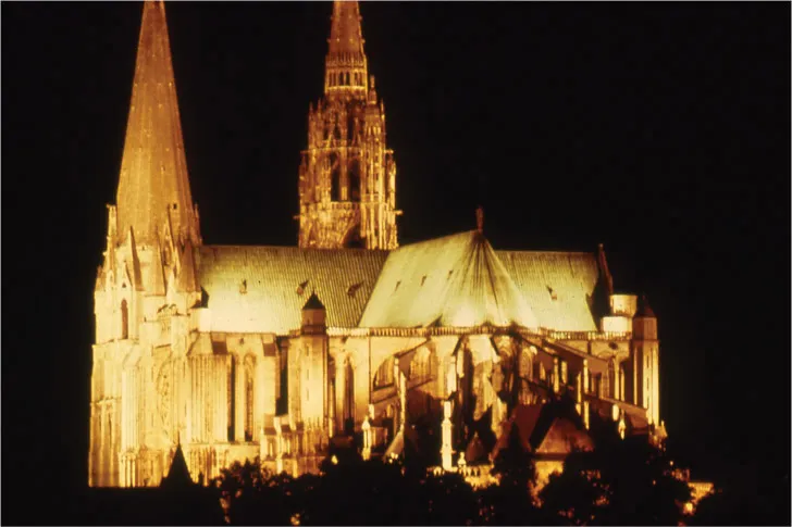
Figure 1.5 The same building, but a vastly different appearance. Low ambient illumination provides a dark backdrop against which the cathedral glows with brightness. Object attributes are unrecognisable in this example of unrelated colours.
Perception as a basis for lighting design
From a design point of view, lighting practice may be seen to fall into two basic categories. On one hand, for illumination conditions ranging from outdoor daylight to indoor lighting where the ambient level is sufficient to avoid any appearance of gloom, we live in a world of related colours in which we distinguish readily between aspects of appearance that relate to the visible attributes of surfaces and objects, and aspects which relate to the lighting patterns that appear superimposed upon them.
On the other hand, in conditions of low ambient illumination, where we have a sense of darkness or even gloom, whether indoors or, most notably, outdoors at night, we typically experience unrelated colours and this may lead to the appearances of objects and surroundings dominated by br...