![]()
CHAPTER 1
LETTERING BASICS
My obsession with lettering started in grade school—fifth grade, to be exact—when I discovered bubble letters in a book I ordered through the Scholastic book program. That bubble font just made everything look so cheerful and cute, and in that moment, I realized that letters and type could portray a mood and style and tell a story, as if they were illustrations themselves. I vividly remember through my high school years writing yearbook comments in a typewriter font, specifically to stand out from all the other comments. It didn’t matter that it took longer; I simply enjoyed the process of lettering and appreciated the joy it gave to the owner of the yearbook. Whether in letters or gifts, I’ve always found myself spending a lot of time thinking about how the lettering was presented, and it was no surprise that I finally ended up at the Ontario College of Art & Design studying illustration. In the end, I discovered that what I truly enjoyed most was exploring the infinite array of type and drawing letters. But I always knew this was the case, since fifth grade!
In this chapter, I explain the simple terminology of lettering basics and how to differentiate between calligraphy, typography, and lettering.
Technical Terms & Definitions, Simply Put …
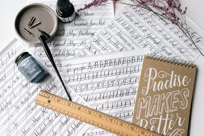
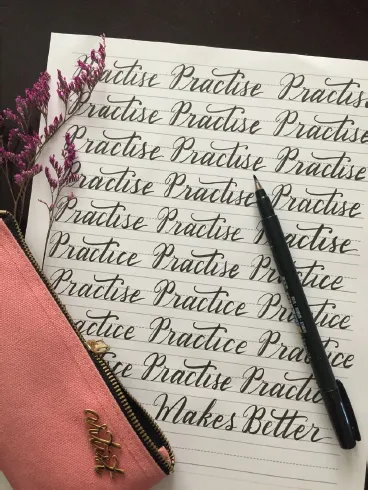
Calligraphy is defined as decorative hand writing. It usually involves some form of pen, nib, brush, or ink. Calligraphy is the art of handwriting—it takes lots and lots of practice and is quite unforgiving. Once the pen has been laid to the paper, there’s no turning back. Mistakes mean starting over, even if you were crossing the last “t” or dotting the last “i” of a full-page masterpiece that took five hours to complete. For this reason, calligraphy can be daunting, but the flourishes and strokes are an art of their own, and the ability to execute calligraphy is an asset in all aspects of life—penning love letters, signing important documents, and, of course, creating extraordinary hand lettering. If you already have a fascination or love affair with calligraphy, you have an advantage when it comes to creating the similar projects here. This book may open your mind to the materials you can possibly apply your calligraphy to and instruct you on what tools to use.
Typography is the art of arranging type for printing and press. There is a technique and process for selecting typefaces, which involves the style of letters or font, point sizes (the letter size), and tracking (the spacing between letters and words). Typography focuses on the style and specific arrangement of letters and numbers to create visual magic for the print and press. This art of laying out and mapping words comes with the vast options of mixing and matching various fonts and type to produce visual interest.
Hand Lettering: If calligraphy is the art of writing and typography is the art of arranging type, spacing, and composition, then hand lettering is the art of drawing letters with calligraphy skills, using typography as a guide. All the projects in this book are achieved with hand lettering. Although it may look like calligraphy, each character is drawn out thoughtfully to resemble it. Design and composition are very important in hand lettering as well, as they are in typography. The combination of these different skills produces hand lettering.
Hand lettering is about being creative with wording and your message. It is about creating visual interest with the letters by changing or trying different fonts in one composition. The magic happens when you choose the right style of lettering to fit your quote/message/sign and emphasize the right words in the process.
How to Begin Creating & Drawing Type: Basic Lettering
My golden rule for lettering is uniformity and balance. Every letter should be the same size, height, and width in capitals, with the exceptions of the letters “I,” which is narrower, and “M” and “W,” which are slightly wider. All letters should be spaced evenly as well. To be honest, I eyeball a lot of stuff, including spacing between letters and sometimes even the size of furniture (to my husband’s dismay). That said, it’s really easy to use a finger, a pencil, or a chopstick to space out your letters when you’re lettering for a sign. If you are able to space them evenly and draw capitals at the same height, you have an advantage already! All the projects in this book require mapping on your surface with masking tape or painter’s tape.
NON-SCRIPT
There are hundreds and thousands of different types of fonts and typefaces, and the differences between each one can be minute. For example, change your sans-serif typeface to a serif typeface with the addition of a couple of tiny strokes:
• Three little strokes can take a regular “A” and transform it into a typewriter-style font (like Courier New)
• Thickening one side creates boldness
• Add a line, and it takes on a modern, Art Deco look
Small and simple strokes change the style completely. Remember to apply the same strokes throughout each letter of the word to create uniformity and balance.
When it comes to what styles suit which project, your eyes will tell you! With so many options to choose from, I will give you just a few of my favorites:
Basic fonts:
Andale Mono (Steve Matteson)
Helvetica (Max Miedinger, Eduard Hoffmann)
Courier New (Howard Kettler)
Modern and contemporary fonts with clean lines:
Letter Gothic (Roger Roberson)
Vertigo (Cassidy & Greene)
Vevey (Vanessa Lam)
Masculine, bold, and serious fonts:
Texas Tango Bold (Billy Argel)
Grafton Titling (Neil Patel)
Langdon (XLN Telecom)
Structured script:
Wisdom (James T. Edmonson)
Cylburn (Dai Foldes)
Fancier (Jess Latham)
Every day, I mentally catalog fonts. Whenever I look at signage, I make mental notes on whether a font looks romantic, cute, modern, bold, etc. Eventually, whenever I have to create something in that category, I already have something to refer to. Sometimes a single letter can be so beautiful that I have to take a photograph of it. With the accessibility of a smartphone camera, I often snap pictures of signs that capture my attention to use as reference at a later date.
CURSIVE & SCRIPT
Hand lettering script for signage starts with your natural hand writing. If you already practice calligraphy, that helps immensely; if you don’t, in the chapters ahead I will show you the rules behind creating your own lettering. In the previous section, you have examples of structured script, which means each letter is the same width and height, with the same spacing in between. The uniformity in the letters creates a clean, feminine look; however, although beautiful, they do not flow and portray character the way cursive script can. In cursive script, balance is still really important—each letter must lean the same way. If it’s upright script, all letters must stay upright.
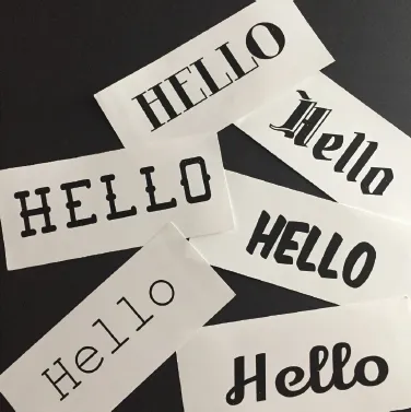
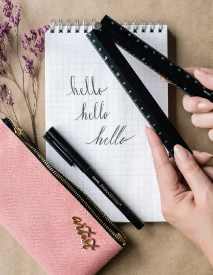
For example, “hello” (left).
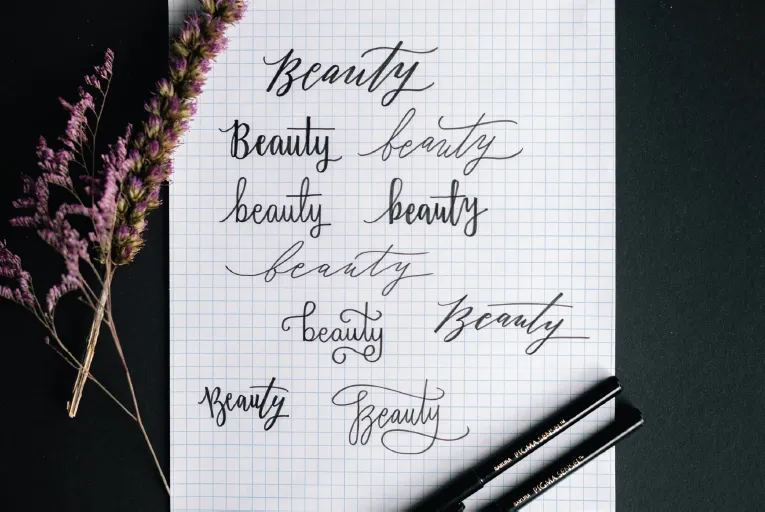
There are so many ways to create variation in script, and with enough practice you will develop a signature style. But take a look at one word and all the possible script variations.
For example, “beauty”:
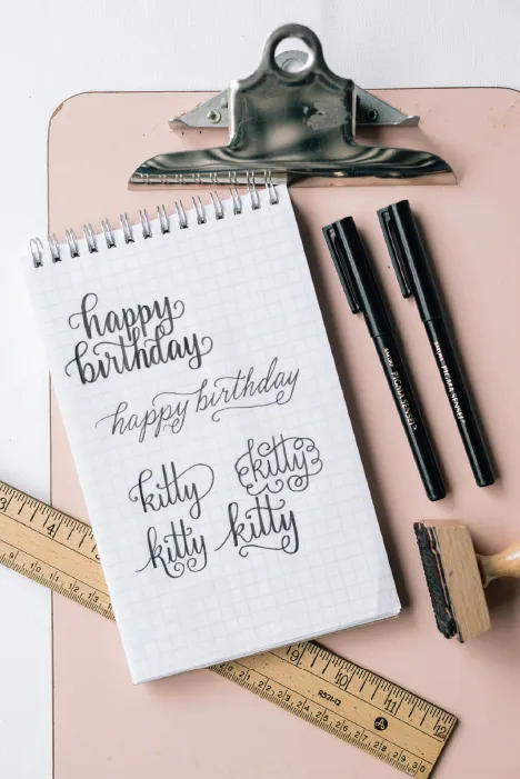
I have to mention: there are some letters that allow you to have way more fun when lettering script. These are my favorites: Lowercase b, d, f, g, h, k, t, y
I mention this because they have strokes and tails that allow for decorative finishes or beginnings. I always get excited to cross the t’s and letter the loops.
For example, “happy birthday” and “kitty”:
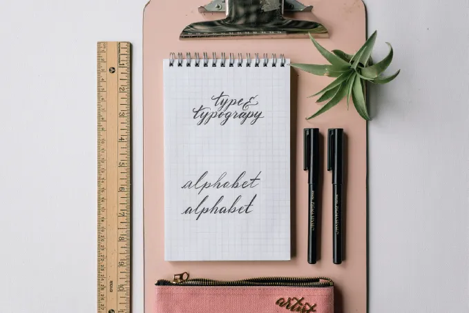
There is no right or wrong. Keep in mind your slants, make sure there is repetitiveness within the word, and see that each stroke almost has a mirror stroke, even if it’s in another letter. As long as there are repetitive strokes throughout the lettering, it will be visually pleasing to the eye, since our eyes love seeing double. The more doubles, the better. In the example below, “Type & Typography,” the descending loops on the y’s, p’s, and g’s, as well as the cross strokes for the t’s, create mirroring and repetition.
For example, “typography” and “alphabet”:
To create a more calligraphic look to your lettering, you must add weight to some of your strokes. Be very particular and selective about this, making sure the weight is placed in the right spots within the letter to ensure, once again, balance. Take a look at the two examples above of “alphabet.” The lettered “alphabet” on top does not have a uniform look since weight is placed on various strokes, while the one below places weight on the correct strokes, creating a good and even appearance.
Why Hand Lettering Is Easy; Try It!
Whenever I letter, I feel like I am drawing. Every strok...