Responsive Web Design with HTML5 and CSS
eBook - ePub

Responsive Web Design with HTML5 and CSS

Develop future-proof responsive websites using the latest HTML5 and CSS techniques, 3rd Edition

Ben Frain

Condividi libro
  1. 408 pagine
  2. English
  3. ePUB (disponibile sull'app)
  4. Disponibile su iOS e Android
eBook - ePub

Responsive Web Design with HTML5 and CSS

Develop future-proof responsive websites using the latest HTML5 and CSS techniques, 3rd Edition

Ben Frain

Dettagli del libro
Anteprima del libro
Indice dei contenuti
Citazioni

Informazioni sul libro

Publisher's note: To make use of the most recent CSS and HTML features, a new, fully revised fourth edition of this book is now available, updated for 2022.

Key Features

  • Understand what responsive web design is and its significance for modern web development
  • Explore the latest developments in responsive web design including variable fonts, CSS Scroll Snap, and more
  • Get to grips with the uses and benefits of the new CSS Grid layout

Book Description

Responsive Web Design with HTML5 and CSS, Third Edition is a renewed and extended version of one of the most comprehensive and bestselling books on the latest HTML5 and CSS tools and techniques for responsive web design.

Written in the author's signature friendly and informal style, this edition covers all the newest developments and improvements in responsive web design including better user accessibility, variable fonts and font loading, CSS Scroll Snap, and much, much more. With a new chapter dedicated to CSS Grid, you will understand how it differs from the Flexbox layout mechanism and when you should use one over the other.

Furthermore, you will acquire practical knowledge of SVG, writing accessible HTML markup, creating stunning aesthetics and effects with CSS, applying transitions, transformations, and animations, integrating media queries, and more. The book concludes by exploring some exclusive tips and approaches for front-end development from the author.

By the end of this book, you will not only have a comprehensive understanding of responsive web design and what is possible with the latest HTML5 and CSS, but also the knowledge of how to best implement each technique.

What you will learn

  • Integrate CSS media queries into your designs; apply different styles to different devices
  • Load different sets of images depending upon screen size or resolution
  • Leverage the speed, semantics, and clean markup of accessible HTML patterns
  • Implement SVGs into your designs to provide resolution-independent images
  • Apply the latest features of CSS like custom properties, variable fonts, and CSS Grid
  • Add validation and interface elements like date and color pickers to HTML forms
  • Understand the multitude of ways to enhance interface elements with filters, shadows, animations, and more

Who this book is for

Are you a full-stack developer who needs to gem up on their front-end skills? Perhaps you work on the front-end and you need a definitive overview of all modern HTML and CSS has to offer? Maybe you have done a little website building but you need a deep understanding of responsive web designs and how to achieve them? This is a book for you!

All you need to take advantage of this book is a working understanding of HTML and CSS. No JavaScript knowledge is needed.

Domande frequenti

Come faccio ad annullare l'abbonamento?
È semplicissimo: basta accedere alla sezione Account nelle Impostazioni e cliccare su "Annulla abbonamento". Dopo la cancellazione, l'abbonamento rimarrà attivo per il periodo rimanente già pagato. Per maggiori informazioni, clicca qui
È possibile scaricare libri? Se sì, come?
Al momento è possibile scaricare tramite l'app tutti i nostri libri ePub mobile-friendly. Anche la maggior parte dei nostri PDF è scaricabile e stiamo lavorando per rendere disponibile quanto prima il download di tutti gli altri file. Per maggiori informazioni, clicca qui
Che differenza c'è tra i piani?
Entrambi i piani ti danno accesso illimitato alla libreria e a tutte le funzionalità di Perlego. Le uniche differenze sono il prezzo e il periodo di abbonamento: con il piano annuale risparmierai circa il 30% rispetto a 12 rate con quello mensile.
Cos'è Perlego?
Perlego è un servizio di abbonamento a testi accademici, che ti permette di accedere a un'intera libreria online a un prezzo inferiore rispetto a quello che pagheresti per acquistare un singolo libro al mese. Con oltre 1 milione di testi suddivisi in più di 1.000 categorie, troverai sicuramente ciò che fa per te! Per maggiori informazioni, clicca qui.
Perlego supporta la sintesi vocale?
Cerca l'icona Sintesi vocale nel prossimo libro che leggerai per verificare se è possibile riprodurre l'audio. Questo strumento permette di leggere il testo a voce alta, evidenziandolo man mano che la lettura procede. Puoi aumentare o diminuire la velocità della sintesi vocale, oppure sospendere la riproduzione. Per maggiori informazioni, clicca qui.
Responsive Web Design with HTML5 and CSS è disponibile online in formato PDF/ePub?
Sì, puoi accedere a Responsive Web Design with HTML5 and CSS di Ben Frain in formato PDF e/o ePub, così come ad altri libri molto apprezzati nelle sezioni relative a Design e Web Design. Scopri oltre 1 milione di libri disponibili nel nostro catalogo.

Informazioni

Anno
2020
ISBN
9781839219795
Edizione
3
Argomento
Design
Categoria
Web Design

6

CSS Selectors, Typography, Color Modes, and More

In the last few years, CSS has enjoyed a raft of new features. Some enable us to animate and transform elements. Others allow us to create multiple background images, gradients, and mask and filter effects, and others allow us to bring SVG elements to life.
We will get to all those capabilities in the next few chapters. Firstly, I think it will be useful to look at more recent improvements to some of the fundamentals of CSS.
No one can know every nuance, capability, and syntax in the CSS language. I've been working with CSS for two decades and on a weekly basis I still discover something new (or just as likely rediscover something I'd forgotten). As such, I don't feel that trying to know every possible CSS property and value permutation is actually a worthy pursuit. Instead, I think it's more sensible to develop a good grasp of what's possible and what capabilities exist that solve the most common problems.
As such, we are going to concentrate in this chapter on some of the techniques, units, and selectors I have found most useful when building responsive web designs. I'm hoping you'll then have the requisite knowledge to solve most problems that come your way when developing a responsive web design.
As there are quite a few topics to cover they have been grouped:
Selectors, units, and capabilities:
  • ::before and ::after pseudo-elements
  • Attribute selectors and substring matching
  • Structural pseudo-classes, including :last-child, :nth-child, :empty, and :not
  • Combinator selectors, including child, next sibling, and subsequent sibling
  • Viewport related length units: vh, vw, vmax, and vmin
  • The calc() function
  • CSS custom properties and environment variables
  • Using @supports to fork CSS
Web typography:
  • @font-face rule
  • Font formats, including .woff and .woff2
  • Font loading control with the font-display property
  • Variable fonts and font features
Color:
  • RGB
  • HSL
  • RGBA and HSLA
As you can see, we have a lot to get through. Let's begin.

Selectors, units, and capabilities

Although they may not seem like the most exciting of subjects, selectors, units, and capabilities are the "meat and potatoes" of CSS. Master these and your power to solve problems with CSS will increase substantially. So, skip this section at your peril!

Anatomy of a CSS rule

Before exploring some of the recent additions to CSS, to prevent confusion, let's establish the terminology we use to describe a CSS rule. Consider the following example:
.round { /* selector */ border-radius: 10px; /* declaration */ } 
This rule is made up of the selector (.round) and then the declaration (border-radius: 10px). The declaration is further defined by the property (border-radius) and the value (10px). Happy we're on the same page? Great, let's press on.
At the time of writing this, the Selectors Level 4 working draft details a host of new selectors such as is(), has(), and nth-col. Sadly, there is not a single implementation in any of the common browsers available. However, if you want to see how things are shaping up for the future, head to the draft at https://www.w3.org/TR/selectors-4/.

Pseudo-elements and pseudo-classes

There is potential for some confusion when we go on shortly to talk about "pseudo" selectors. The reason being is that, in CSS, there are both pseudo-selectors and pseudo-elements. Let's therefore take a moment to establish the difference.
The word "pseudo" in this context means something that is like something but not really it. So, a pseudo-element is something that is like an element but not really one, and a pseudo-selector is something that selects something that isn't really something. Wow, I'm sounding like the Riddler now from Batman! Let's clarify with some code. Here is how you create a pseudo-element in CSS:
.thing::before { content: "Spooky"; } 
That inserts a ::before pseudo-element into the .thing element with the content "Spooky." A ::before behaves like a first child of the element and an ::after behaves like a last child.
The following image might help. It's showing a single element represented in the Firefox developer tools, containing text with both a ::before and an ::after pseudo-element added in CSS:
Figure 6.1: The Firefox developer tools will show you where pseudo-elements are in the DOM
The key thing to remember with pseudo-elements is that if you don't provide a value for 
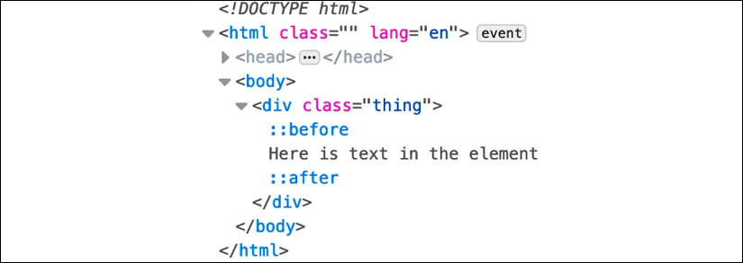
content, nothing will show on the page. Notice the double colon before before? Officially, that is how you should code pseudo-elements as it helps differentiate them from pseudo-selectors, which only use one. However, a single colon worked with the first implementations of ::before and ::after and so you can still write them that way too.
You can't do the same with pseudo-selectors; they always have a single colon. For example, :hover, :active, and :focus are all pseudo-selectors and are written with a sin...

Indice dei contenuti