![]()
Chapter 1
Introduction
Abstract
Why Adrian Mendoza? Why this book?
Adrian has been working at the cutting edge of mobile design and development for more than 15 years. This book is a culmination of his expertise with, experience with, and point of view of mobile devices. This book is unique because it examines both the conceptual and practical nature of creating mobile user experiences. Adrian has been a user, designed UI, and created user experiences for a wide range of different platforms, operating systems, and technologies. From his first Apple Newton MessagePad, to his Palm OS devices, and leading to his first Apple iPhone in 2007, Adrian discusses how and why he has seen the rise of and need for mobile user experience through the history of handheld devices.
Keywords
Apple; Newton; iPhone; Palm; Feature phone; WAP; Mobile user experience; iPod; Web
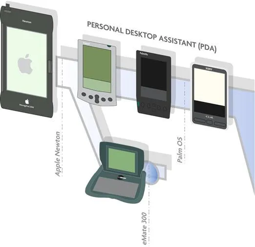
I have a confession. I once owned an Apple Newton MessagePad (Apple’s first PDA), and along with that, a 14.4 dial-up modem … Checking email on an Apple Newton was considered cool in 1998. Since then, I have owned an Apple eMate 300, a Palm V with a wireless modem, a Sony Clie, a Palm 3C, a Motorola RAZR, a Motorola SLVR, and a pile of different iPods, all leading to the iPhone 1G in 2007. You can track the history of mobile devices from the matrix of devices I have owned. As an experience designer, now specializing in mobile user experience, I have seen colossal changes in the user experience from that first Apple Newton to the Apple iPhone, almost 10 years later.
When I began working on user interfaces for Palm OS software in 1998, the form and experience of the user was secondary to the development and capability of the software, let alone the limitations of working with gray-scale displays. As feature phones1 emerged, so did the ability to access the web on our phones, but only wireless application protocol (WAP)-enabled web pages were available. Imagine trying to view your favorite web pages, but only if a WAP version of the website was available. If you did manage to access the site with your limited Internet connection, you would see only text, and, if you were lucky, a few small images.2 Designing a mobile experience was a challenging and almost futile effort given the maturity of the desktop web by the mid-2000s.
The iPhone arrived at just the right time and the right place. I don’t want to say that it was luck, but the stars aligned to bring this kind of design and feature-forward device to an already engaged and hungry audience. By 2007, user experience design was no longer a luxury in web design but an integral part of the design and building process. Complement this with a huge market share of iPods and other emerging handheld devices (e.g., BlackBerrys, GPS devices) all with highly evolved user experiences; we had both consumers ready to consume the web on mobile devices and designers ready on the other end to design interfaces for them. The mobile age was upon us, and it began by a touch and a slide.
For the first time, mobile devices impacted the rest of the computer industry; user experience design and the entire software industry, was turned on its head by something that could fit in your pocket. The iPhone delivered experience designers a platform focused on user interface (UI) and user experience (UX) design; Apple first published its own UI/UX guidelines,3 which were available when the first iOS SDK was released. As other mobile platforms followed the iPhone, and Android and Windows emerged, they also provided guidelines to help build and design for their own experiences.
As user experience designers, we now had a new challenge of migrating our web experiences to the new “mobile web” and “mobile apps,” two platforms that emerged simultaneously. I can still remember one of my first mobile app projects from early in 2009. Our client’s only direction …“Make the app fun!” This wasn’t a typical request, and coming from a client in the financial services realm, maybe a little strange. At that point, the mobile was still the uncharted wild, wild west, and apps were a novelty.
The more I worked on mobile projects, the more I saw the gap widening between the design of user experiences in mobiles compared to those on the desktop. Designers of mobile experience had to take into account new interfaces, new hardware, unique experience design to each mobile platform, and keep those designs updated to include the changing form factors of devices. Mobile user experience was truly a unique discipline that needed its own language for describing, visualizing, and creating experiences. Before Apple released their standards, no standards existed for terminology and graphics to help describe mobile design.
The idea for this book took a few years to evolve into a cohesive notion. I wanted to help answer the questions: How does one start learning how to design for mobile UX? What are the differences compared to the desktop? And what makes mobile UX unique?
This book is a call to action for creating, learning, and visualizing mobile experiences in a structured, effective manner. The outline and direction are simple: Use a series of common user experience patterns to describe and implement mobile experience. These are a set of conceptual patterns that can work across platforms, device, and users. Yet to balance the conceptual, we need to define the practical methodologies and tools to demonstrate the experience. How do we wireframe? What are the user interface elements and code elements to create them, and how do we distinguish them across the unique platforms? How do I prototype those experiences? My goal with this book is to create the mobile UX guide/roadmap, to empower the user experience designer, inform the developer, and engage the curious reader on mobile user experience design. Our industry will shape how people interact with mobile devices, and this book is meant to give us the tools and languages to communicate that experience.
This is not the manifesto of a sole designer; it is one that we will build together.
Now, let’s build some mobile user experiences!
1Feature Phone—Term for mobile phone with basic Internet connection. It mainly opens WAP enabled web pages.
2Stan Miastkowski, “How It Works: Wireless Application Protocol,” PCWord.com, July 3, 2000, http://www.pcworld.com/article/17437/article.html.
3Originally called iPhone Human Interface Guidelines.
![]()
Chapter 2
Why Mobile UX, Why Now?
Abstract
Why mobile user experience? Why now? This chapter answers these important questions. We will look at what makes the mobile experience unique and why we need the creation of a mobile user experience discipline to be able to respond to it. We examine the technology, the right timing, and the users that have created the perfect storm of mobile. Delving deeper, we discuss what about mobile requires our thinking to respond differently to this unique problem of creating experiences for smartphones and tablets. As a result, we will discover the opportunity that mobile presents to us to innovate and engage our users with our mobile user experiences.
Keywords
Mobile; Opportunity; Android; iPhone; Mobile user experience; Users; Technology; Mobile UX; Perfect storm
Introduction
A few years ago, I lectured at a college about the future of the mobile web.1 At the end of the lecture, one of the faculty members approached me with a question. “In the battle between print and the web, who will win?” Taken aback, I answered with: “The war has been over for a while, now we are just counting the bodies …” Now imagine what I would have said had she asked me about the mobile.
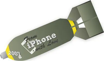
In the case of the mobile, it was not a battle but a leveling impact with the force of an atomic blast. Its effects were fast and far-reaching. The mobile went from being a toy one day to a source of revenue the next. By early 201l, smartphones had outsold desktops.2 By 2013, worldwide smartphone sales were in the billions (1.8 billion to be exact).3 To put this in perspective, with the “personal desktop revolution” that started in the mid-1980s, it has taken more than 20 years to get worldwide PC sales over 300 million (2005).4 With this trend, some users, especially in developing countries, will access the web on a smartphone before they do on a desktop; this is already the case in some countries. We have entered the mobile age and it is coming straight at us like a storm, a perfect storm.
The Perfect Storm of Mobile
Why a perfect storm? Like the figure of speech for the weather, this storm “arose from a rare combination of adverse meteorological factors.”5 It took three unique factors to align and develop to create the mobile storm we are in now. We needed the technology, the users, and user experience all ready at the same time. Had one or another not been available, the ecosystem would not have evolved. Let me explain.
Technology
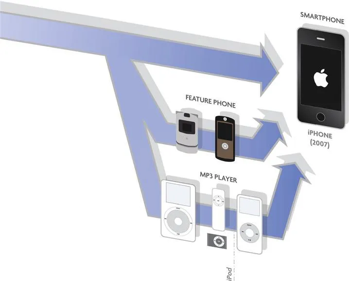
The first factor is the technology itself. By the time the first iPhone appeared, small devices were already commonplace. Users already had a history with iPods, mp3 players, and PDAs; the general public were accustomed to small handheld devices. Feature phones6 used some form of Internet access and these were common across the globe. By this time everyone, including his or her brother, grandmother, or child had a Motorola Razor phone in their pocket. It was the inclusion of touch technology and readily available 2G bandwidth that accelerated the use of the smartphone. The synthesis of a small handheld device with a phone, mp3 player, and camera was the next logical step in the technology trend.
Users
The second factor is the users themselves. Like the technology, they were already familiar with keeping a small handheld device in their pockets. They were familiar with of using and carrying an mp3 player, phone, and/or camera (sometimes carrying all three). Combining these three devices was the logical next step. The groundwork for the usage patterns already existed, and adding Internet usage was a natural expansion. By the time the first smartphones were launched in 2007, users were already familiar with using the desktop web. There was no need t...