Hands-On Data Visualization with Bokeh
eBook - ePub

Hands-On Data Visualization with Bokeh

Interactive web plotting for Python using Bokeh

Kevin Jolly

Condividi libro
  1. 174 pagine
  2. English
  3. ePUB (disponibile sull'app)
  4. Disponibile su iOS e Android
eBook - ePub

Hands-On Data Visualization with Bokeh

Interactive web plotting for Python using Bokeh

Kevin Jolly

Dettagli del libro
Anteprima del libro
Indice dei contenuti
Citazioni

Informazioni sul libro

Learn how to create interactive and visually aesthetic plots using the Bokeh package in Python

Key Features

  • A step by step approach to creating interactive plots with Bokeh
  • Go from installation all the way to deploying your very own Bokeh application
  • Work with a real time datasets to practice and create your very own plots and applications

Book Description

Adding a layer of interactivity to your plots and converting these plots into applications hold immense value in the field of data science. The standard approach to adding interactivity would be to use paid software such as Tableau, but the Bokeh package in Python offers users a way to create both interactive and visually aesthetic plots for free. This book gets you up to speed with Bokeh - a popular Python library for interactive data visualization.

The book starts out by helping you understand how Bokeh works internally and how you can set up and install the package in your local machine. You then use a real world data set which uses stock data from Kaggle to create interactive and visually stunning plots. You will also learn how to leverage Bokeh using some advanced concepts such as plotting with spatial and geo data. Finally you will use all the concepts that you have learned in the previous chapters to create your very own Bokeh application from scratch.

By the end of the book you will be able to create your very own Bokeh application. You will have gone through a step by step process that starts with understanding what Bokeh actually is and ends with building your very own Bokeh application filled with interactive and visually aesthetic plots.

What you will learn

  • Installing Bokeh and understanding its key concepts
  • Creating plots using glyphs, the fundamental building blocks of Bokeh
  • Creating plots using different data structures like NumPy and Pandas
  • Using layouts and widgets to visually enhance your plots and add a layer of interactivity
  • Building and hosting applications on the Bokeh server
  • Creating advanced plots using spatial data

Who this book is for

This book is well suited for data scientists and data analysts who want to perform interactive data visualization on their web browsers using Bokeh. Some exposure to Python programming will be helpful, but prior experience with Bokeh is not required.

Domande frequenti

Come faccio ad annullare l'abbonamento?
È semplicissimo: basta accedere alla sezione Account nelle Impostazioni e cliccare su "Annulla abbonamento". Dopo la cancellazione, l'abbonamento rimarrà attivo per il periodo rimanente già pagato. Per maggiori informazioni, clicca qui
È possibile scaricare libri? Se sì, come?
Al momento è possibile scaricare tramite l'app tutti i nostri libri ePub mobile-friendly. Anche la maggior parte dei nostri PDF è scaricabile e stiamo lavorando per rendere disponibile quanto prima il download di tutti gli altri file. Per maggiori informazioni, clicca qui
Che differenza c'è tra i piani?
Entrambi i piani ti danno accesso illimitato alla libreria e a tutte le funzionalità di Perlego. Le uniche differenze sono il prezzo e il periodo di abbonamento: con il piano annuale risparmierai circa il 30% rispetto a 12 rate con quello mensile.
Cos'è Perlego?
Perlego è un servizio di abbonamento a testi accademici, che ti permette di accedere a un'intera libreria online a un prezzo inferiore rispetto a quello che pagheresti per acquistare un singolo libro al mese. Con oltre 1 milione di testi suddivisi in più di 1.000 categorie, troverai sicuramente ciò che fa per te! Per maggiori informazioni, clicca qui.
Perlego supporta la sintesi vocale?
Cerca l'icona Sintesi vocale nel prossimo libro che leggerai per verificare se è possibile riprodurre l'audio. Questo strumento permette di leggere il testo a voce alta, evidenziandolo man mano che la lettura procede. Puoi aumentare o diminuire la velocità della sintesi vocale, oppure sospendere la riproduzione. Per maggiori informazioni, clicca qui.
Hands-On Data Visualization with Bokeh è disponibile online in formato PDF/ePub?
Sì, puoi accedere a Hands-On Data Visualization with Bokeh di Kevin Jolly in formato PDF e/o ePub, così come ad altri libri molto apprezzati nelle sezioni relative a Informatique e Visualisation de données. Scopri oltre 1 milione di libri disponibili nel nostro catalogo.

Informazioni

Anno
2018
ISBN
9781789131314
Edizione
1
Argomento
Informatique

Using Annotations, Widgets, and Visual Attributes for Visual Enhancement

Now that you have learned how to create plots and layouts in Bokeh, it is time to enhance them visually and add a layer of interactivity using annotations, widgets, and visual attributes.
Annotations are used to add supplemental information to your plots, such as titles, legends, and color maps that provide information about what the plot is trying to convey to the person who views your plot.
Widgets offer interactivity through buttons, drop-down menus, sliders, and textboxes. These widgets allow the person viewing the plot to interact with the plot and make changes to the way he or she wants to view it.
Visual attributes provide a vast range of visual enhancements to the plot, such as colors and fills for the lines and text, and interactivity enhancements such as the hover tool to hover over and select points of interest.
In this chapter, you will learn how to create:
  • Annotations that convey supplemental information about your plots
  • Widgets that add interactivity to your plots
  • Visual attributes that enhance both the style and interactivity of your plots

Technical requirements

You will be required to have Python installed on a system. Finally, to use the Git repository of this book, the user needs to install Git.
The code files of this chapter can be found on GitHub:
https://github.com/PacktPublishing/Hands-on-Data-Visualization-with-Bokeh.
Check out the following video to see the code in action:
http://bit.ly/2sYn4DN.

Creating annotations to convey supplemental information

When creating plots it's fundamental to get across the story that the information in the plot is trying to convey. This can be done by adding titles, legends, and color maps to your plot.

Adding titles to plots

Titles are used to tell the reader about the overall story of the plot.
For the purposes of this chapter, we will use the S&P 500 stock data found on Kaggle. (https://www.kaggle.com/camnugent/sandp500/data).
We will also filter the data to just information about Apple stocks, as illustrated in the following code:
#Import the required packages

import pandas as pd

#Read in the data

df = pd.read_csv('all_stocks_5yr.csv')

#Convert the date column into datetime data type

df['date'] = pd.to_datetime(df['date'])

#Filter the data for Apple stocks only

df_apple = df[df['Name'] == 'AAL']
We will now store the required data in a ColumnDataSource object by using the code shown here:
#Import the required packages

from bokeh.io import output_file, show
from bokeh.plotting import figure
from bokeh.plotting import ColumnDataSource


#Create the ColumnDataSource object

data = ColumnDataSource(data = {
'x' : df_apple['high'],
'y' : df_apple['low'],
'x1': df_apple['open'],
'y1': df_apple['close'],
'x2': df_apple['date'],
'y2': df_apple['volume'],


})
In order to add a title to our plot, we use the code shown here:
#Import the required packages

from
bokeh.plotting import figure, show, output_file, output_notebook

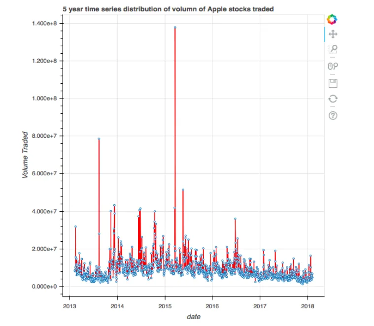
#Create the plot with the title

plot = figure(title = "5 year time series distribution of volume of Apple stocks traded",title_location = "above",x_axis_type = 'datetime', x_axis_label = 'date', y_axis_label = 'Volume Traded')

#Create the time series plot

plot.line(x = 'x2', y = 'y2', source = data, color = 'red')

plot.circle(x = 'x2', y = 'y2', source = data, fill_color = 'white', size = 3)

#Output the plot

output_file('title.html')

show(plot)
This results in a plot with a title, as illustrated here:
In this code, we used the figure function in order to generate the title by using the title argument. Additionally, we can also specify the location of the title using the title_location argument. The various locations for the title are above, left, right, and below.

Adding legends to plots

When we have a plot that has multiple colors for different visualizations in it, it is important for the reader to be able to distinguish between the different colors. This can be done by adding a legend to our plot.
In the following code, we plot two different scatter plots in the same plot, but with different colors. We add a legend to each scatter plot by using the code shown here:
#Import the required packages

from bokeh.plotting import figure, show, output_file

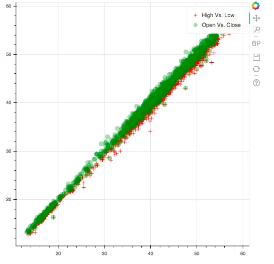
#Create the two scatter plots

plot = figure()

#Create the legends

plot.cross(x = 'x', y = 'y', source = data, color = 'red', size = 10, alpha = 0.8, legend = "High Vs. Low")

plot.circle(x = 'x1', y = 'y1', source = data, color = 'green', size = 10, alpha = 0.3, legend = "Open Vs. Close")

#Output the plot

output_file('legend.html')

show(plot)
This results in a plot with a legend, as illustrated here:
In this code, we used the legend argument while creating the individual scatter plots to specify the legend for that particular plot. We can now clearly distinguish what the green scatter plot and the red scatter plot mean thanks to the legend.

Adding color maps to plots

When we have categorical data, it is a good practice to color the different categories with different colors so that it becomes apparent to the reader that the different colors indicate different categories.
In order to do this, we first filter the S&P 500 stock data for two stocks: Google and USB using the code shown here:
#Reading in the S&P 500 data

df = pd.read_csv('all_stocks_5yr.csv')

#Filtering for Google or USB

df_multiple = df[(df['Name'] == 'GOOGL') | (df['Name'] == 'USB')]
Next, we are going to create a scatter plot between the high and low and categorical...

Indice dei contenuti