![]()
Chapter 1
Understanding Data
When you ask people what data is, most reply with a vague description of something that resembles a spreadsheet or a bucket of numbers. The more technically savvy might mention databases or warehouses. However, this is just the format that the data comes in and how it is stored, and it doesn’t say anything about what data is or what any particular dataset represents. It’s an easy trap to fall in because when you ask for data, you usually get a computer file, and it’s hard to think of computer output as anything but just that. Look beyond the file though, and you get something more meaningful.
What Data Represents
Data is more than numbers, and to visualize it, you must know what it represents. Data represents real life. It’s a snapshot of the world in the same way that a photograph captures a small moment in time.
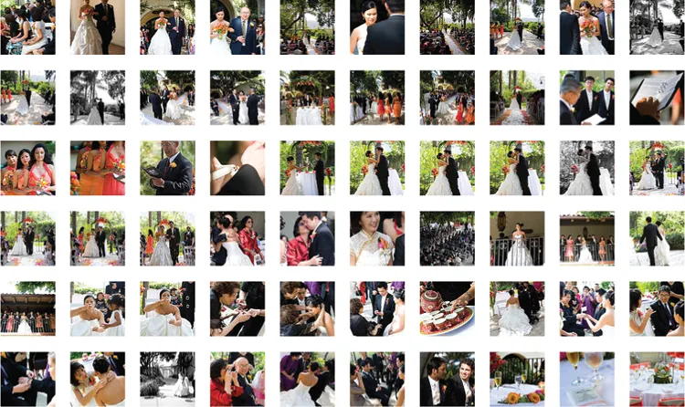
start figure end figure Look at Figure 1-1. If you were to come across this photo, isolated from everything else, and I told you nothing about it, you wouldn’t get much out of it. It’s just another wedding photo. For me though, it’s a happy moment during one of the best days of my life. That’s my wife on the left, all dolled up, and me on the right, wearing something other than jeans and a T-shirt for a change. The pastor who is marrying us is my wife’s uncle, who added a personal touch to the ceremony, and the guy in the back is a family friend who took it upon himself to record as much as possible, even though we hired a photographer. The flowers and archway came from a local florist about an hour away from the venue, and the wedding took place during early summer in Los Angeles, California.
That’s a lot of information from just one picture, and it works the same with data. (For some, me included, pictures are data, too.) A single data point can have a who, what, when, where, and why attached to it, so it’s easy for a digit to become more than a toss in a bucket. Extracting information from a data point isn’t as easy as looking at a photo, though. You can guess what’s going on in the photo, but when you make assumptions about data, such as how accurate it is or how it relates to its surroundings, you can end up with a skewed view of what your data actually represents. You need to look at everything around, find context, and see what your dataset looks like as a whole. When you see the full picture, it’s much easier to make better judgments about individual points.
Imagine that I didn’t tell you those things about my wedding photo. How could you find out more? What if you could see pictures that were taken before and after?
Now you have more than just a moment in time. You have several moments, and together they represent the part of the wedding when my wife first walked out, the vows, and the tea drinking ceremony with the parents and my grandma, which is customary for Chinese weddings. Like the first photo, each of these has its own story, such as my father-in-law welling up as he gave away his daughter or how happy I felt when I walked down the aisle with my bride. Many of the photos captured moments that I didn’t see from my point of view during the wedding, so I almost feel like an outsider looking in, which is probably how you feel. But the more I tell you about that day, the less obscure each point becomes.
Still though, these are snapshots, and you don’t know what happened in between each photo. (Although you could guess.) For the complete story, you’d either need to be there or watch a video. Even with that, you’d still see only the ceremony from a certain number of angles because it’s often not feasible to record every single thing. For example, there was about five minutes of confusion during the ceremony when we tried to light a candle but the wind kept blowing it out. We eventually ran out of matches, and the wedding planner went on a scramble to find something, but luckily one of our guests was a smoker, so he busted out his lighter. This set of photos doesn’t capture that, though, because again, it’s an abstraction of the real thing.
This is where sampling comes in. It’s often not possible to count or record everything because of cost or lack of manpower (or both), so you take bits and pieces, and then you look for patterns and connections to make an educated guess about what your data represents. The data is a simplification—an abstraction—of the real world. So when you visualize data, you visualize an abstraction of the world, or at least some tiny facet of it. Visualization is an abstraction of data, so in the end, you end up with an abstraction of an abstraction, which creates an interesting challenge.
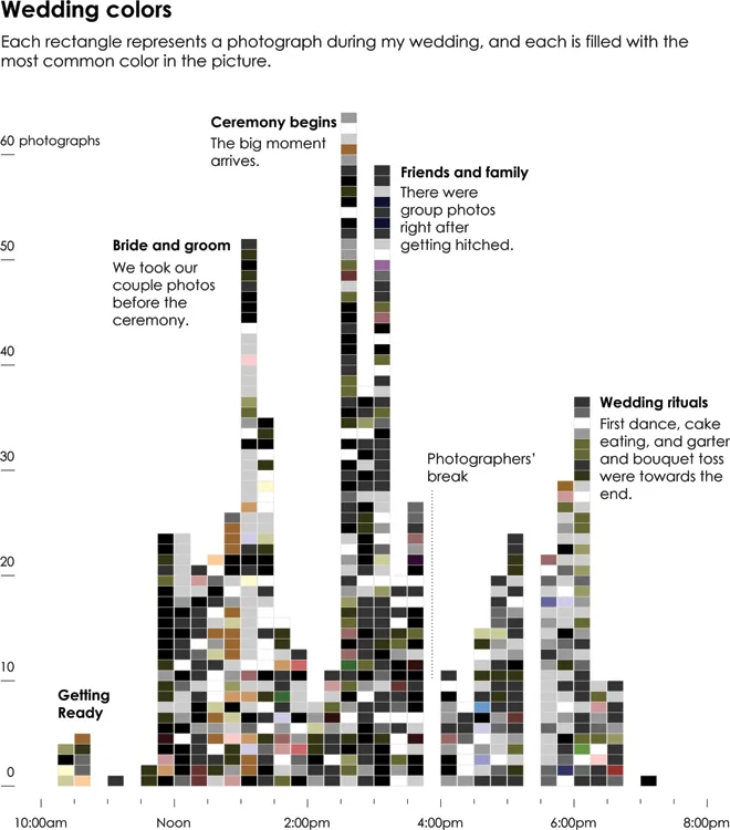
However, this is not to say that visualization obscures your view—far from it. Visualization can help detach your focus from the individual data points and explore them from a different angle—to see the forest for the trees, so to speak. To keep running with this wedding photo example, Figure 1-3 uses the full wedding dataset, of which Figure 1-1 and Figure 1-2 were subsets of. Each rectangle represents a photo from our wedding album, and they are colored by the most common shade in each photo and organized by time.
start figure end figure start figure end figure With a time series layout, you can see the high points of the wedding, when our photographers snapped more shots, and the lulls, when only a few photos were taken. The peaks in the chart, of course, occur when there is something to take pictures of, such as when I first saw my wife in her dress or when the ceremony began. After the ceremony, we took the usual group photos with friends and family, so there was another spike at that point. Then there was food, and activity died down, especially when the photographers took a break a little before 4 o’clock. Things picked up again with typical wedding fanfare, and the day came to an end around 7 in the evening. My wife and I rode off into the sunset.
In the grid layout, you might not see this pattern because of the linear presentation. Everything seems to happen with equal spacing, when actually most pictures were taken during the exciting parts. You also get a sense of the colors in the wedding at a glance: black for the suits, white for the wedding dress, coral for the flowers and bridesmaids, and green for the trees surrounding the outdoor wedding and reception. Do you get the detail that you would from the actual photos? No. But sometimes that level isn’t necessary at first. Sometimes you need to see the overall patterns before you zoom in on the details. Sometimes, you don’t know that a single data point is worth a look until you see everything else and how it relates to the population.
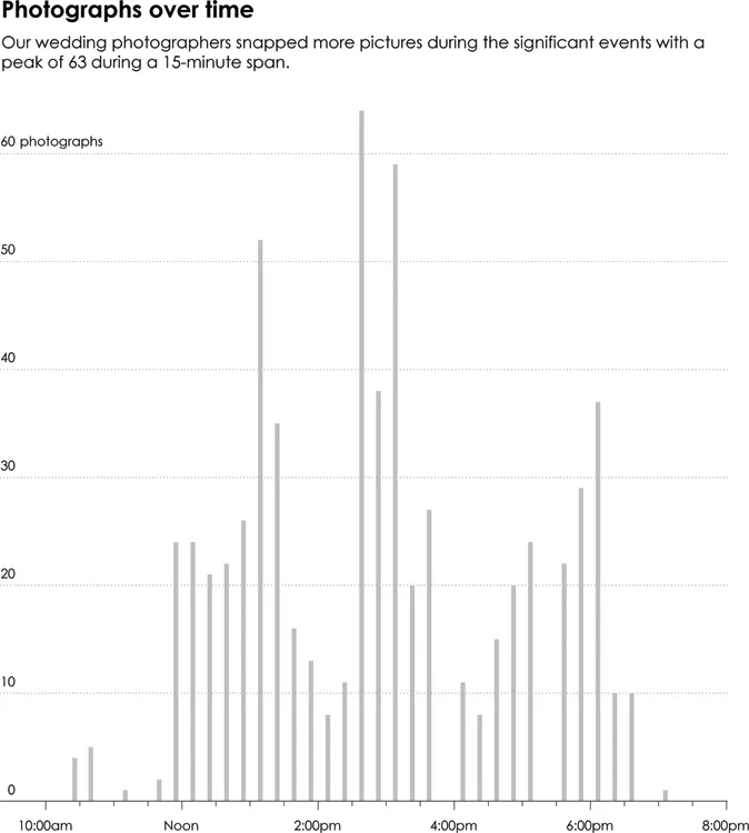
You don’t need to stop here, though. Zoom out another level to focus only on the picture-taking volumes, and disregard the colors and individual photos, as shown in Figure 1-4.
start figure end figure You’ve probably seen this layout before. It’s a bar chart that shows the same highs and lows as in Figure 1-3, but it has a different feel and provides a different message. The simple bar chart emphasizes picture-taking volumes over time via 15-minute windows, whereas Figure 1-3 still carries some of the photo album’s sentiment.
The main thing to note is that all four of these views show the same data, or rather, they all represent my wedding day. Each graphic just represents the day differently, focusing on various facets of the wedding. Interpretation of the data changes based on the visual form it takes on. With traditional data, you typically examine and explore from the bar chart side of the spectrum, but that doesn’t mean you have to lose the sentiment of the individual data point—that single photo. Sometimes that means adding meaningful annotation that enables readers to interpret the data better, and other times the message in the numbers is clear, gleaned from the visualization itself.
The connection between data and what it represents is key to visualization that means something. It is key to thoughtful data analysis. It is key to a deeper understanding of your data. Computers do a bulk of the work to turn numbers into shapes and colors, but you must make the connection between data and real life, so that you or the people you make graphics for extract something of value.
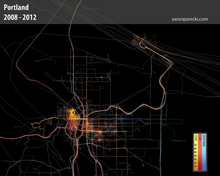
This connection is sometimes hard to see when you look at data on a large scale for thousands of strangers, but it’s more obvious when you look at data for an individual. You can almost relate to that person, even if you’ve never met him or her. For example, Portland-based developer Aaron Parecki used his phone to collect 2.5 million GPS points over 31/2 years between 2008 and 2012, about one point every 2 to 6 seconds. Figure 1-5 is a map of these points, colored by year.
start figure end figure As you’d expect, the map shows a grid of roads and areas where Parecki frequented that are colored more brightly than others. His housing changed a few times, and you can see his travel patterns change over the years. Between 2008 and 2010, shown in blue, travel appears more dispersed, and by 2012, in yellow, Parecki seems to stay in a couple of tighter pockets. Without more context it is hard to say anything more because all you see is location, but to Parecki the data is more personal (like the single wedding photo is to me). It’s the footprint of more than...