
- English
- ePUB (mobile friendly)
- Available on iOS & Android
About this book
Master the challenges of Android user interface development with these sample patterns
With Android 4, Google brings the full power of its Android OS to both smartphone and tablet computing. Designing effective user interfaces that work on multiple Android devices is extremely challenging. This book provides more than 75 patterns that you can use to create versatile user interfaces for both smartphones and tablets, saving countless hours of development time. Patterns cover the most common and yet difficult types of user interactions, and each is supported with richly illustrated, step-by-step instructions.
- Includes sample patterns for welcome and home screens, searches, sorting and filtering, data entry, navigation, images and thumbnails, interacting with the environment and networks, and more
- Features tablet-specific patterns and patterns for avoiding results you don't want
- Illustrated, step-by-step instructions describe what the pattern is, how it works, when and why to use it, and related patterns and anti-patterns
- A companion website offers additional content and a forum for interaction
Android Design Patterns: Interaction Design Solutions for Developers provides extremely useful tools for developers who want to take advantage of the booming Android app development market.
Trusted by 375,005 students
Access to over 1 million titles for a fair monthly price.
Study more efficiently using our study tools.
Information
Part I
UX Principles and Android OS Considerations
- Chapter 1 Design for Android: A Case Study
- Chapter 2 What Makes Android Different
- Chapter 3 Android Fragmentation
- Chapter 4 Mobile Design Process
Chapter 1
Design for Android: A Case Study
Launch Icon

Action Bars and Information Architecture
Before

After
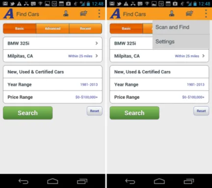
Table of contents
- Cover
- Table of Contents
- Title
- Copyright
- Dedication
- About the Author
- Credits
- Acknowledgments
- Foreword
- Introduction
- Part I: UX Principles and Android OS Considerations
- Part II: Android Design Patterns and Antipatterns
- End User License Agreement
Frequently asked questions
- Essential is ideal for learners and professionals who enjoy exploring a wide range of subjects. Access the Essential Library with 800,000+ trusted titles and best-sellers across business, personal growth, and the humanities. Includes unlimited reading time and Standard Read Aloud voice.
- Complete: Perfect for advanced learners and researchers needing full, unrestricted access. Unlock 1.4M+ books across hundreds of subjects, including academic and specialized titles. The Complete Plan also includes advanced features like Premium Read Aloud and Research Assistant.
Please note we cannot support devices running on iOS 13 and Android 7 or earlier. Learn more about using the app