Part I: Getting Started with Excel Dashboards
Chapter 1: Introducing Dashboards
Chapter 2: Table Design Best Practices
Chapter 3: Using Excel Sparklines
Chapter 4: Chartless Visualization Techniques
Chapter 1: Introducing Dashboards
In This Chapter
• Defining dashboards and reports
• Determining user requirements
• Establishing visualization and design principles
• Reviewing your dashboard prior to distribution
Creating a dashboard in Excel is not the same as creating a standard table-driven analysis. It’s tempting to jump right in and start building away, but a dashboard requires far more preparation than a typical Excel report. It calls for closer communication with business leaders, stricter data modeling techniques, and the following of certain best practices. It’s helpful to be familiar with fundamental dashboard concepts before venturing off into the mechanics of building your own. In this chapter, we discuss basic dashboard concepts and design principles and what it takes to prepare for a dashboarding project.
All workbook examples that we list in this book are available on this book’s companion website at
www.wiley.com/go/exceldr.
What Are Dashboards and Reports?
It isn’t difficult to use the words report and dashboard interchangeably. In fact, the line between dashboards and reports frequently gets muddied. We see countless reports that are referred to as dashboards just because they include a few charts. Likewise, we see many examples of what could be considered dashboards but are called reports.
Now this may all seem like semantics to you, but it’s helpful to clear the air a bit and understand the core attributes of both dashboards and reports.
Defining reports
Reports are probably the most common way to communicate business intelligence. A report can be described as a document that contains data used for viewing and analysis. It can be as simple as a data table (or a database) or as complex as a subtotaled view with interactive drilling.
The key attribute of a report is that it doesn’t lead a reader to a predefined conclusion. Although a report can include analysis, aggregations, calculations, and even charts, reports often require the reader to apply his own judgment and analysis to the data.
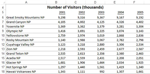
To clarify this concept, Figure 1-1 shows an example of a report. This report shows National Park visitor statistics by year. Although this data can be useful, this report doesn’t steer the reader to any predefined conclusions or in any directions; it simply presents the aggregated data.
Figure 1-1: Reports present data for viewing but don’t lead readers to predefined conclusions.
Defining dashboards
A dashboard is a visual interface that provides at-a-glance views into key measures relevant to a particular objective or business process. A dashboard consists of three key attributes.
→ Displays data graphically (such as in charts). Provides visualizations that help focus attention on key trends, comparisons, and exceptions.
→ Displays only data that is relevant to the goal of the dashboard.
→ Contains predefined conclusions relevant to the goal of the dashboard and relieves the reader from having to perform her own analysis.
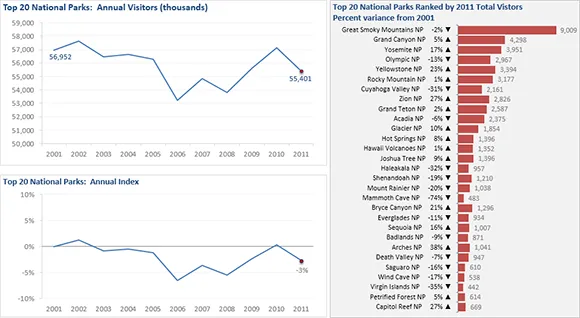
Figure 1-2 illustrates a dashboard that uses the same data shown in Figure 1-1. This dashboard displays information about National Park attendance. As you can see, this presentation has all the key attributes that define a dashboard. First, it’s a visual display that allows you to quickly recognize the overall trend of the attendance. Second, not all the details of the data are shown in this presentation; only the key pieces of information that support the goal of this dashboard. Finally, by virtue of its objective, this dashboard effectively presents you with analysis and conclusions about the trending of attendance.
Figure 1-2: A dashboard provides an at-a-glance view into key measures relevant to a particular objective or business process.
As you take in this concept of reports versus dashboards, remember that Excel doesn’t provide tools specifically designed for dashboards or reports. The beauty of Excel is that any of its tools can be used to perform virtually any task that you need. For example, you can use the chart, pivot tables, and macros features in a basic report or to play a key role in a dashboard presentation. In this book, we introduce you to the many ways that you can leverage everyday Excel tools to build your own dashboard components.
Establish the User Requirements
Imagine that your objective is to create a dashboard that provides information about monthly service subscriptions. Do you jump to action and slap together whatever comes to mind? Do you take a guess at what information would be useful in a dashboard like this? These questions sound ridiculous, but it happens more that you think. We are constantly called to action but are rarely provided the time to gather the true requirements for the project. Between limited information and false deadlines, the end product often ends up not being used or causing more work than value.
This brings us to one of the key steps in preparing to build a dashboard — collecting user requirements. These user requirements include defining your audience, data sources, performance measures, refresh schedules, and so on.
In the non-IT world of the Excel analyst, user requirements are practically useless because of the hard left and right turns we’re asked to make every day. So the gathering of user requirements sometimes seems like a waste of valuable time in the ever-changing business environment.
But it’s time to get into the dashboard state of mind. After all, would you rather spend your time upfront gathering user requirements or at the end painstakingly redesigning the dashboard you’ll surely come to hate?
Consider how many times you’ve been asked for an analysis, only to be told, “No. I meant this.” Or, “Now that I see it, I realize I need this.” As frustrating as that can be for a single analysis, im...