![]()
CHAPTER 1
The Most Popular Chart Patterns
Why Chart Patterns Are So Important
In this chapter I am showing chart examples without the OVI indicator. This is deliberate. You'll see some of the same charts with the OVI displayed in Chapter 2.
The study of charts is known as technical analysis. This comes in two forms:
1. Chart patterns—seen directly by looking at the charts.
2. Indicators—typically these are mathematical algorithms derived from price and volume.
For the purpose of this book we're going to focus on chart patterns, and as we progress through the chapter I'll explain why. Principally it's because they're the purest interpretation of price action, and as traders we want our main focus to be on price!
Chart patterns are vitally important to traders, and frankly should be just as important to longer-term investors as well. Traditionally long-term investors focus more on the financial reports of a company. The problem with that approach is that a share's stock market performance is not correlated perfectly to the past quarter's results. It's also based on future estimates, the market's view of management, and the quirks of the market itself.
Charts give us a visual representation of how the markets are interpreting a company's financial performance, its management capabilities, and its future prospects.
Over many decades, technical analysis has proved that familiar patterns will form repeatedly and that some patterns may give rise to the increased possibility of a particular future event occurring. So, for example, one pattern may often lead to a stock rising, and another pattern may often lead to a stock falling.
The idea, of course, is that chart patterns increase our odds of success. But that's not the whole story. The real secret is that the most useful chart patterns are the ones around which you can implement a simple and safe trading plan.
Not all chart patterns are conducive to this, so in this chapter I'm only going to focus on the ones that have proven to be the most reliable to recognize.
Understanding chart patterns will not guarantee you success. But align a reliable chart pattern with a robust trading plan and the OVI—well, now you have a great chance of achieving great results!
So this chapter is an overview of the patterns I consider the most useful for us moving forward.
PRICE BARS
When I look at charts I typically view them as candlestick charts. It's just a personal preference, and just in case you're not familiar with them, here's a quick summary of how to view price bars in a chart.
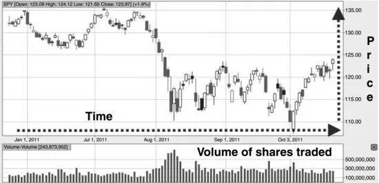
Typically we view a price chart from left to right, with time on the horizontal axis and price on the vertical axis. (In Figure 1.1 you'll also see volume bars underneath the price chart. Each bar corresponds with the price bar above it.)
INDIVIDUAL PRICE BARS
Each price bar shows the price activity over a certain period of time. Price bars can literally be for a “tick,” or a minute, or for a 5-minute, 30-minute, 60-minute, daily, weekly, monthly, or yearly period, depending on the length of time you're looking at.
Obviously the shorter time frame you trade, the shorter the time period of the chart you'll want to look at. In this book we're focused on the daily bars, meaning each bar represents one day.
Price bars can be represented in different ways. The simplest way to depict the price range for a particular period of time is by way of a simple vertical bar that displays the high and low points for that bar.
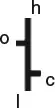
The most common way to view price bars is a simple vertical bar that displays the high and low, and a left horizontal tag for the opening price and a right horizontal tag for the closing price (as shown in Figure 1.2).
As you can see, the extremes of the bar represent the high (h) and the low (l). The left tag represents the price the stock opened at for the day (o), and the right tag represents them price the stock closed at for the day (c).
So each bar contains the following information for its period of time:
- OPEN: the price at which the stock opened on that day.
- HIGH: the highest price the stock reached that day.
- LOW: the lowest price the stock reached that day.
- CLOSE: the price at which the stock closed that day.
In the example in Figure 1.2, the stock closed lower than the open, we can see that quite clearly. You can also see it moved higher than the open at some point during the day. It also moved lower than the final close at some point during the day.
Now let's look at the same bar but using a Japanese candlestick (see Figures 1.3 and 1.4).
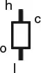
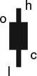
With the candlestick, we still have the low and the high as vertical lines (shadows), but what we have instead of the left and right tags is the top and bottom of the body of the rectangle.
When we have a hollow body as in Figure 1.3, it means that the price closed higher than it opened.
When we have a filled body as in Figure 1.4, it means the price closed lower than it opened.
When you view price charts you'll notice that the bars on the chart will often be in color. Typically, if the close is higher than the previous day's close, then the bar will be green. If the close is lower than the previous day's close, then the bar will be red.
You can get a scenario where the stock close is higher than the open on the specific day, but the close is still lower than the close of the previous day. In such a case the bar will be hollow and red. Table 1.1 is a summary.
Table 1.1 Reading Japanese Candlesticks
| Close > Open | Close > Previous Close | Green + Hollow |
| Close < Open | Close > Previous Close | Green + Filled |
| Close > Open | Close < Previous Close | Red + Hollow |
| Close < Open | Close < Previous Close | Red + Filled |
| > means “higher than.” < means “lower than.” |
Table 1.2 Defining a Trend
| Uptrend | An uptrend can be described as a sequence of higher lows in conjunction with higher highs. |
| Downtrend | A... |