![]()
Chapter 1
The Basics: Candlestick Construction
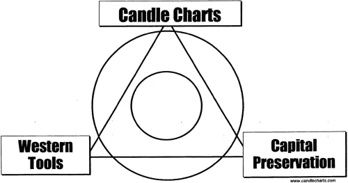
My firm has an exclusive strategy called the trading triad. I like to make the analogy that trading is like a three-legged stool. What happens if you take away one leg of the stool? It’s going to fall over. So it is with the trading triad, as illustrated in Figure 1.1.
The first leg is the basics of candlesticks. Construction of the chart with individual price lines, development of recognizable patterns and trends, and how these reveal market momentum. The second leg is a study of Western technicals. I do not believe that candlestick charts replace technicals or even traditional Western-style bar charts. You still need four price factors: open, high, low, and close, which become even more valuable when studied as part of trend lines and moving averages. The third leg is the study of how this information works to reduce risk and to promote preservation of your investment capital.
You might have heard the expression, “Water can both sink and raise a ship” This wisdom applies in so many places, including how you use candlestick charts. These are timing tools, of course, but they can provide so much more. You can also use candlesticks to manage and reduce risk, and to make more informed decisions involving your portfolio. That is where the real value to candlestick charting is going to be found.
Candlestick patterns give you very specific turning points, or reversals. These appear in several ways: as single candlesticks, two-part patterns, or three-part patterns. On a bar chart, you look for reversals by tracking a long-term trend line or picking up on popular technical signals like the well-known head and shoulders. Candlestick patterns will certainly provide a clearer signal in the moment of a pending reversal. However, you also need to remember that the overall technical pattern and trend is more significant than any single candlestick.
For example, you might notice a clearly defined candlestick pattern, but by the time it forms, it may be too late to act. What is important to keep in mind is that whatever market you are looking at, you can use candlestick charts to improve the timing of your trades. This works in any time frame and in any market condition.
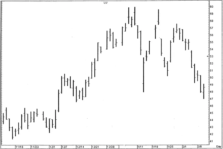
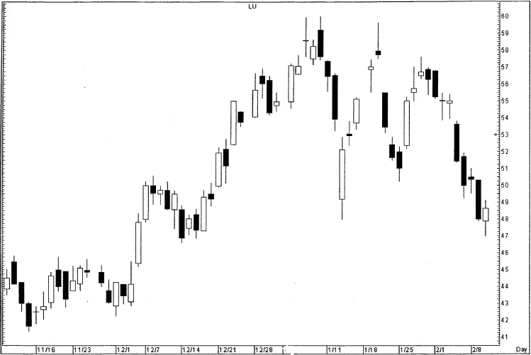
Figure 1.2 is a typical bar chart. Review this keeping an important point in mind: the candlestick chart is constructed using exactly the same data as that used for the bar chart. So I have taken the same data displayed in this bar chart and converted it into a candlestick chart in Figure 1.3.
- - - - - - - - - -
A bar chart is also called an OHLC chart, a simple price chart showing the day’s trading range in a vertical line or stick; the opening price, a smaller extension out to the left; and the closing price, a small extension to the right.
- - - - - - - - - -
THE CANDLE LINE
The candlestick takes the information found on the bar chart and adds a third dimension to it. The bar chart’s vertical stick is replaced by a rectangle topped and bottomed by the borders of the trading range, plus an extension above and below the rectangle; so it is the same up-and-down size as the bar chart’s stick. The new dimension is that some candlestick rectangles are white and others are black. The white rectangles appear on days that the price moves upward (closing price is higher than opening price). Black rectangles show up on downward-moving days (when closing price is lower than the opening price).
- - - - - - - - - -
A candlestick chart is a formation reporting the day’s trading range in a rectangular white formation for upward-moving days, or in a rectangular black formation for downward-moving days. The upper and lower borders of the rectangle are the opening and closing prices.
- - - - - - - - - -
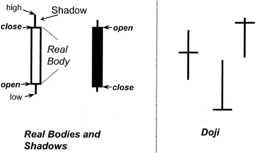
The name “candlestick” comes from the fact that “wicks” are seen either above or below the rectangles (or both above and below). Each segment of the candlestick chart has a descriptive name. The rectangular body (white or black) is called the “real body” because its upper and lower borders represent opening and closing price.
- - - - - - - - - -
A real body is the candlestick’s rectangle, bordered by opening and closing prices and excluding any price points above or below those levels.
- - - - - - - - - -
Any extension above the rectangle is called the upper shadow; and any extension below the rectangle is called the lower shadow. For example, if the opening price is $32.10 and the closing price is $34.00, there was a real body change of $1.90. However, during the day, the price range might have moved up as far as $35 per share and down as low as $32 per share. In this case, you would see both an upper shadow and a lower shadow.
- - - - - - - - - -
The upper shadow represents a session’s price range above the range between opening and closing price, extending to the day’s highest price.
The lower shadow represents a session’s price range below the range between opening and closing price, extending to the day’s lowest price.
- - - - - - - - - -
John Murphy, former CNBC talk show host, once told me that a viewer called in and asked the question, “What are those charts that look like hot dogs?” I briefly considered calling them “hot dog charts” to make them appealing to Americans, but thought better. But it makes the point that these charts are still relatively new in the West.
No matter whether you think of these as candlesticks or hot dogs, they involve a lot of new terminology. It is going to be important to master this terminology before you can effectively use candlesticks. For example, what is it called when the opening and closing price are the same level or very close? This is a doji formation. The word “doji” is Japanese for “mistake.”
- - - - - - - - - -
Doji, meaning “mistake” in Japanese, is a candlestick with opening and closing prices at the same price level or very close; rather than a rectangle, the real body is a horizontal line.
- - - - - - - - - -
When a doji also has both upper and lower shadows, it resembles a cross. The real body is the horizontal line and the shadows are the vertical lines. Of all of the single candlestick formations, the doji is one of the most important. I will explain why a bit later; for now I am only trying to introduce some of the important basic concepts and definitions. The formation of the candlestick (including the doji) is summarized in Figure 1.4.
For full comprehension of the doji candle, watch Steve explain on the DVDs included with this book.
The “candle line” refers to all of the features you find in candlesticks: the real body, upper and lower shadows, open and close, and the direction of price movement. This is summarized on the left portion of the illustration. On the right side, I have summarized the appearance of the doji. Notice that there are three possible doji formations: the cross (with upper and lower shadows), as well as those with a shadow only on one side.
The candlestick is so valuable because it gives you such a wealth of information in a relatively simple design. This includes everything at a glance:
- the day’s complete trading range
- opening and closing p...