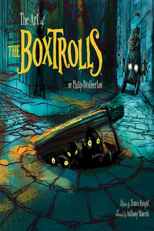
LAIKA, the studio behind the hit films Coraline and ParaNorman, introduces audiences to a new breed of family: the Boxtrolls, a community of quirky, mischievous creatures who have lovingly raised an orphaned human boy named Eggs in the amazing cavernous home they've built beneath the streets of Cheesebridge. When the town's villain, Archibald Snatcher, comes up with a plot to get rid of the Boxtrolls, Eggs decides to venture above ground where he meets and teams up with fabulously feisty Winnie to devise a daring plan to save Eggs' family. The Art of The Boxtrolls features the amazingly detailed artwork that went into this film's creation, including character sketches, puppets, textiles, set dressing, and 3-D printed facial models, alongside the story of the film's development.
Trusted by 375,005 students
Access to over 1.5 million titles for a fair monthly price.
“The Boxtrolls is a hierarchical story about the people from below and the people above and a man who wants to climb the social ladder. A vertical city just made sense.”
Anthony Stacchi
Upon reading the script, a film director typically begins piecing together a vision of how he or she imagines the finished film to look. Each director’s process might be different, but the primary job is always the same: to express that vision as clearly as possible so that the rest of the filmmaking crew can help make that vision a reality. Armed with strong ideas of what he wanted The Boxtrolls to look like, Stacchi went in search of imagery that “justified and supported” his ideas. “In my experience,” he says, “good research usually ends up reaffirming the vision you already have, and helps explain your vision to others.” The German Expressionist art movement of the early twentieth century conveyed many of the key components of Stacchi’s early vision for The Boxtrolls. Marked by bold colors and abstract shapes, Expressionism favored the artist’s inner emotional landscape over external physical landscapes, and paintings of this era often reflected political or religious attitudes of their time. Many films and filmmakers through the years have drawn from Expressionism’s inspirational waters. One of the first and most widely recognized was Robert Wiene’s The Cabinet of Dr. Caligari (1920). Directors Alfred Hitchcock, Orson Welles, and Ridley Scott, among others, also borrowed freely from this style.
For Stacchi, it was mostly director David Lean’s evocative use of light and shadow in his black-and-white film version of Oliver Twist (1948) along with the sewer chase scenes from Carol Reed’s The Third Man (1949) that best demonstrated his vision for The Boxtrolls. “Once I had an inkling of what I wanted the story to look like,” Stacchi says, “I knew immediately who I wanted to take the first crack at design.”
He turned to renowned French graphic novelist Nicolas de Crécy, whose highly detailed illustrative depictions of urban European life had precisely the right mixture of gritty realism and dark fantasy. “I’d never met de Crécy, but I loved his artwork,” Stacchi explains. “His organic use of lines, patterns, and shapes gives his cityscapes the same complexities that you find in nature. So we reached out to him for a few key images.” It was a working relationship that was not without some challenges. “I don’t speak French,” Stacchi notes, “and his English isn’t great; so all our communications had to be translated.” In the end, it was well worth the effort, because the handful of illustrations provided by de Crécy had unlocked the door to production design for the entire film.
Michel Breton · colored pencil & digital
With de Crécy’s key images in hand, Stacchi went in search of another concept illustrator who could both emulate and build upon the graphic novelist’s style, and apply it to all of the film’s principal environments. To his amazement, he didn’t even have to leave the building. French Canadian artist Michel Breton had recently finished work on LAIKA’s first film, Coraline, and was ready for a new project. Prior to Coraline, he’d made a splash in the animation world with his contributions to 2003’s The Triplets of Belleville. Upon learning of Breton’s connection to The Triplets of Belleville and seeing how naturally his style dovetailed with de Crécy’s, Stacchi knew he’d found his illustrator.
Breton accepted the job and enthusiastically embraced Stacchi’s vision for the film. “When I read the script and started drawing,” he says, “my approach was to think about ...
Table of contents
Cover
Title
Copyright
Contents
Preface
Foreword
Introduction
Ch. 1 Roaming the Streets
Ch. 2 The World Below
Ch. 3 Snatcher’s Realm
Ch. 4 Life at the Top
Acknowledgments
About the Author
Chronicle Ebooks
Frequently asked questions
Yes, you can cancel anytime from the Subscription tab in your account settings on the Perlego website. Your subscription will stay active until the end of your current billing period. Learn how to cancel your subscription
No, books cannot be downloaded as external files, such as PDFs, for use outside of Perlego. However, you can download books within the Perlego app for offline reading on mobile or tablet. Learn how to download books offline
Perlego offers two plans: Essential and Complete
Essential is ideal for learners and professionals who enjoy exploring a wide range of subjects. Access the Essential Library with 800,000+ trusted titles and best-sellers across business, personal growth, and the humanities. Includes unlimited reading time and Standard Read Aloud voice.
Complete: Perfect for advanced learners and researchers needing full, unrestricted access. Unlock 1.5M+ books across hundreds of subjects, including academic and specialized titles. The Complete Plan also includes advanced features like Premium Read Aloud and Research Assistant.
Both plans are available with monthly, semester, or annual billing cycles.
We are an online textbook subscription service, where you can get access to an entire online library for less than the price of a single book per month. With over 1.5 million books across 990+ topics, we’ve got you covered! Learn about our mission
Look out for the read-aloud symbol on your next book to see if you can listen to it. The read-aloud tool reads text aloud for you, highlighting the text as it is being read. You can pause it, speed it up and slow it down. Learn more about Read Aloud
Yes! You can use the Perlego app on both iOS and Android devices to read anytime, anywhere — even offline. Perfect for commutes or when you’re on the go. Please note we cannot support devices running on iOS 13 and Android 7 or earlier. Learn more about using the app
Yes, you can access The Art of The Boxtrolls by Philip Brotherton in PDF and/or ePUB format, as well as other popular books in Media & Performing Arts & Film & Video. We have over 1.5 million books available in our catalogue for you to explore.