- 176 pages
- English
- ePUB (mobile friendly)
- Available on iOS & Android
eBook - ePub
About this book
This extraordinary volume examines the life and animation philosophy of Maurice Noble, the noted American animation background artist and layout designer whose contributions to the industry span more than 60 years and include such cartoon classics as Duck Dodgers in the 24 ½th Century, What's Opera, Doc?, and The Road Runner Show. Revered throughout the animation world, his work serves as a foundation and reference point for the current generation of animators, story artists, and designers. Written by Noble's longtime friend and colleague Tod Polson and based on the draft manuscript Noble worked on in the years before his death, this illuminating book passes on his approach to animation design from concept to final frame, illustrated with sketches and stunning original artwork spanning the full breadth of his career.
Trusted by 375,005 students
Access to over 1.5 million titles for a fair monthly price.
Study more efficiently using our study tools.
Information
Subtopic
Artist BiographiesSTEP 06:
Color

A Phil DeGuard background from Duck Dodgers in the 24½th Century.
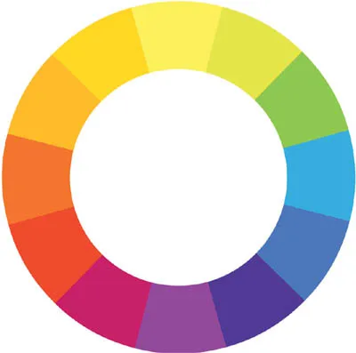
RYB subtractive color wheel.
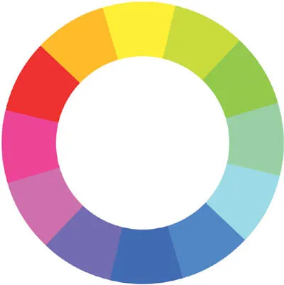
CMYK additive color wheel.
“No one uses color as well as Maurice. He is the Master.”—Chuck Jones
Before discussing Maurice’s process of transferring his black-and-white drawings into color, let’s first look at some of his thoughts about color itself.
Maurice used to tell us, “In a film, the two first things that an audience responds to emotionally are music and color.” While he loved design, Maurice had a real passion for music. He loved to listen to it, and he loved to play it. To Maurice, good music touched emotions in a way no other art form could. And his ideas on color were very much in tune (pun forgivable) with his approach to music. Depending on the needs of the story, he could turn the chroma (intensity) down to a barely audible hum. Or when something more dramatic was needed, he could turn the hues up as far as Technicolor would allow, shaking the very seats of cinema halls. For Maurice, color was his emotional link from the story to an audience. But, as in every element of Maurice’s design, he made sure that color never upstaged the characters and, more important, always pushed the story.
THE BASICS
This chapter is an examination of Maurice’s thoughts on color and assumes that most readers will have had some basic color theory. For those of you who haven’t studied color before, there are a large number of good resources available. A strong knowledge of color basics will vastly improve any designer’s work. That said, Maurice wanted to include some notes about color basics to use as a reference point for some of the ideas that will follow:
Color is a mental thing: just what each individual sees. Color is not in the object but is the light it reflects. The textures of all objects greatly influence the color. Where there is no light, there is no color. Light is not a tangible thing. We see color because certain wavelengths are reflected by objects, while others are absorbed. We call this the light spectrum and approximate it with pigments (paint) in what we call a color wheel. The color wheel just helps us simplify color to make it easier to understand.
There are two theories of light: prismatic and pigment. Prismatic color theory deals with light only and how it is reflected and combined to make colors. Pigment theory deals with colors reflected by pigments and their combinations.
Maurice used the traditional pigment color wheel as reference when he talked to us about color theory. Despite that, he was very familiar with prismatic color theory and frequently used additive color combinations in his work as well. Explore as many ideas and theories as you can. As you become comfortable with color, you will find out what works best for you. Exploration and experimentation are the keys to good color work.
At the studio, Maurice’s way of communicating color ideas to other artists was based on the range of Cel-Vinyl paints, developed by the Cartoon Colour Company of Culver City, California. But Maurice also used it on his color sketches and everything else that was related to color. He knew every color and shade by memory, and after working with him a while, so did we. If Maurice said, “Make this object vermillion 4,” everyone knew exactly what he meant. Art director Susan Goldberg, who worked with Maurice on Fantasia 2000, had a poetic view of Maurice’s use of Cartoon Colour callout numbers:
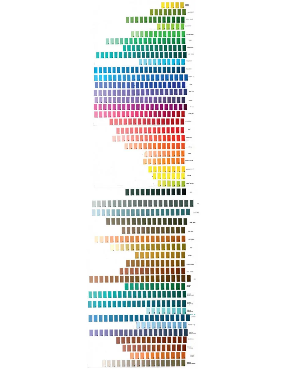
The Cartoon Colour range of cel-vinyl paint.
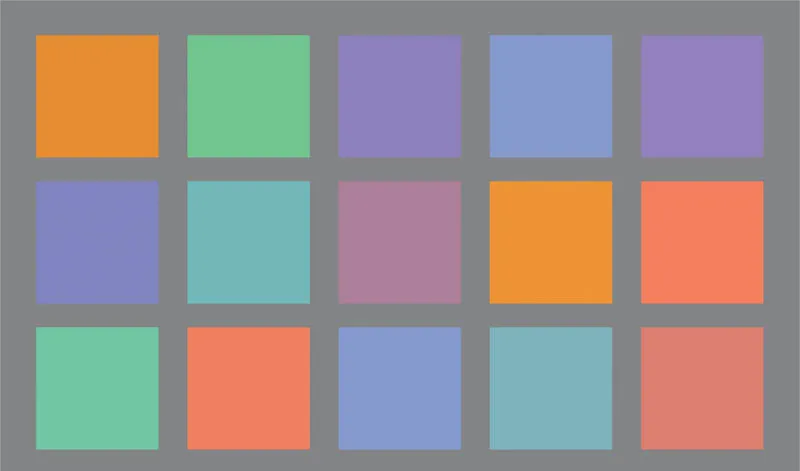
Cool colors tend to recede and warm colors advance.
Maurice always reminded me of Beethoven, who at the end of his life could no longer hear his beautiful compositions, and Maurice with his disintegrating eyesight could only see his work in his head. I know that he basically dictated his paintings to the artists by using cel color numbers, brilliant to the end!
Generally speaking, the color wheel is divided into cool and warm colors. Cool colors have a blue base, and warm colors have a red base. Then there are colors such as green and purple that can lean toward cool or warm depending on how they are mixed. It’s good to be aware that color also has dimension. The eye is more sensitive to red, thus warm colors seem to advance and cool colors retreat when viewed on the same plane. This effect is even stronger when cool and warm colors are viewed together. As designers we can take advantage of this interplay in our design.
I once asked Maurice to explain his process in developing color ideas for a film. He confessed that most of his approach to color and design was instinctual. He explained that once he started designing color on a film, he was primarily applying color ideas formed during his research stage, leaving the rest to experimentation. He said, “People often ask me if I use color reference; it really depends on what I’m doing. Color is emotional for me, so I usually just paint with my gut. That doesn’t mean I stick a brush in my belly button. It means that when I read through a script or look at a board I begin to visualize what a scene might look like. I do what feels right to me.” Maurice then admitted to me that there were no real rules with color. Good use of color will be as varied as the stories being told, and the designers who are applying their personal interpretation to these stories. He said, “The key to good color is to think about why you are using the colors you are.”
Seeing that I was still not quite satisfied with his answer, Maurice offered to let me take him to have a hot turkey sandwich. Food always inspired him to say many things, some of which were useful.

A color key from Drafty, Isn’t It? Maurice often used warm light, and cool shadows, or alternately cool light with warm shadows to create interest and depth.
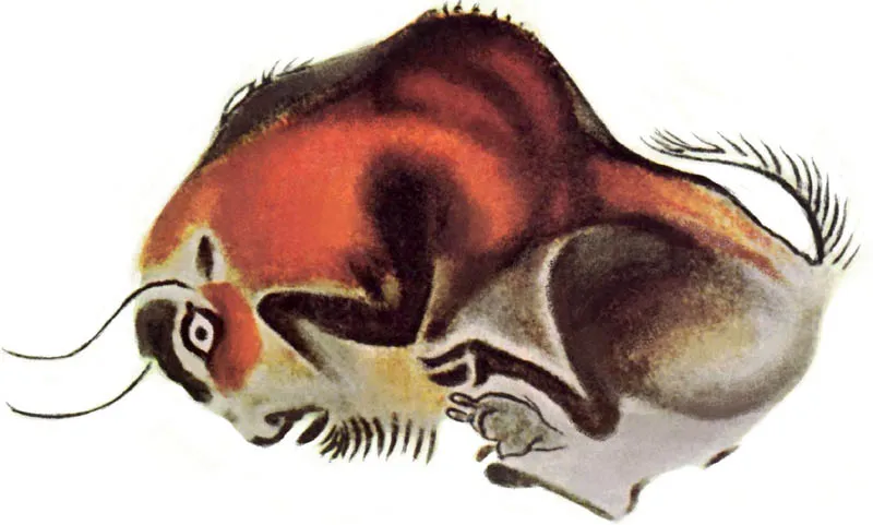
The primitive colors as seen in this bison from the Altamira cave ceiling.
COLOR PERSONALITY
While digging into his mashed potatoes, Maurice continued to explain that all colors have emotions and cultural meanings associated with them, and that as designers we can take advantage of this. At the time we were working on a series of folk tales, and he reminded me that different cultures associate different meanings to colors than we did in Burbank. However, thinking about color personality could be a useful tool when first starting out, as he expressed it:
Be careful to use these ideas as a rough guide, and not as a rule. In time, using color will be[come] second nature.
White, black, and red are the most powerful colors you can use. I like to call them the primitive colors. If you go back far enough in time, you will find that these are the base colors for the art of almost any culture. Black is as dark as you can go, white the lightest. Red has the most energy. In animation, these colors are usually used sparingly, primarily as accent colors.
White is often associated with purity and cleanliness and is often used as an accent. White represents light, triumph, innocence, purity, and joy. I love doing scenes with snow because the characters then become the accents. White is the lightest color in the paint box and will always draw the eye to wherever it is in the composition. I rarely use pure white, usually tinting it a bit by adding another color. The exception perhaps is in the whites of the eye...
Table of contents
- Cover
- Title
- Copyright
- Contents
- Dedication
- Preface
- Foreword
- Prologue
- Introduction
- Step 01 Getting Started
- Step 02 Story
- Step 03 Breaking Down the Elements
- Step 04 Research and Inspiration
- Step 05 Design
- Step 06 Color
- Step 07 Layout
- Step 08 Final Film
- Acknowledgments
- Index
- Image & Art Credits
- About the Author
Frequently asked questions
Yes, you can cancel anytime from the Subscription tab in your account settings on the Perlego website. Your subscription will stay active until the end of your current billing period. Learn how to cancel your subscription
No, books cannot be downloaded as external files, such as PDFs, for use outside of Perlego. However, you can download books within the Perlego app for offline reading on mobile or tablet. Learn how to download books offline
Perlego offers two plans: Essential and Complete
- Essential is ideal for learners and professionals who enjoy exploring a wide range of subjects. Access the Essential Library with 800,000+ trusted titles and best-sellers across business, personal growth, and the humanities. Includes unlimited reading time and Standard Read Aloud voice.
- Complete: Perfect for advanced learners and researchers needing full, unrestricted access. Unlock 1.5M+ books across hundreds of subjects, including academic and specialized titles. The Complete Plan also includes advanced features like Premium Read Aloud and Research Assistant.
We are an online textbook subscription service, where you can get access to an entire online library for less than the price of a single book per month. With over 1.5 million books across 990+ topics, we’ve got you covered! Learn about our mission
Look out for the read-aloud symbol on your next book to see if you can listen to it. The read-aloud tool reads text aloud for you, highlighting the text as it is being read. You can pause it, speed it up and slow it down. Learn more about Read Aloud
Yes! You can use the Perlego app on both iOS and Android devices to read anytime, anywhere — even offline. Perfect for commutes or when you’re on the go.
Please note we cannot support devices running on iOS 13 and Android 7 or earlier. Learn more about using the app
Please note we cannot support devices running on iOS 13 and Android 7 or earlier. Learn more about using the app
Yes, you can access The Noble Approach by Tod Polson in PDF and/or ePUB format, as well as other popular books in Media & Performing Arts & Artist Biographies. We have over 1.5 million books available in our catalogue for you to explore.