eBook - ePub
Never Use Futura
About this book
It's everywhere, including the moon (on the commemorative plaque left by Apollo 11 astronauts), Nike sneakers, the artworks of Barbara Kruger, Ed Ruscha, and Jenny Holzer, 2001: A Space Odyssey credits, Domino's Pizza boxes, Absolut Vodka bottles, and Red Bull cans. Richard Nixon used it for his presidential campaign, as did Hillary Clinton. Indeed, Futura is one of the most used fonts in the world today—the typeface of modern design—more so even than Helvetica. This fascinating book explores the cultural history and uses of a face that's so common you might not notice, until you start looking, and then you can't escape it. Douglas Thomas traces Futura from its Bauhaus-inspired origin in Paul Renner's 1924 design, to its current role as the go-to choice for corporate work, logos, motion pictures, and advertisements. Never Use Futura is illuminating, sometimes playful, reading, not just for type nerds, but for anyone interested in how typefaces are used, take on meaning, and become a language of their own.
Trusted by 375,005 students
Access to over 1.5 million titles for a fair monthly price.
Study more efficiently using our study tools.
Information
Topic
ConceptionSubtopic
Conception générale
Modernism was more fun when it employed Futura. Here Paul Rand uses it as a counterpoint to a playful Picasso-inspired collage for the inaugural cover of Jazzways magazine, 1946.
1
MY OTHER MODERNISM IS IN FUTURA
WHEN ALFRED H. BARR promoted modern European art to new audiences in the United States, modern typefaces came along for the ride. In 1936, while preparing a new exhibition titled Cubism and Abstract Art for the Museum of Modern Art in New York City, Barr created a chart to accompany the show to help people understand the many modern art movements that had contributed to abstraction. It connects the different strands—like cubism, futurism, Dadaism, constructivism, surrealism, and the Bauhaus—with one another, across countries, genres, and years. The chart itself was typeset in the most modern typefaces Barr had available, including Futura.1
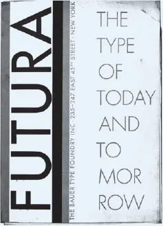
For most Americans, Futura and other new German typefaces were their everyday consumption of modernism. Futura burst into appearance in magazines, books, newspapers, and posters. Its resonance, along with some gutsy advertising by Bauer Type Foundry, asserted Futura’s place at the typographic table, as “The Typeface for Our Time.” It was imagined, drawn, named, and advertised as mathematical over cultural, revolutionary over historical, and distinctively “The Type of Today and Tomorrow,” unlike new cuts of old classics or romantic remixes of past glories (think Times New Roman, released in 1932).2
An early Bauer Type Foundry advertisement for Futura in the United States, 1928
The thing about Futura that designers like myself know, though, is that some of its letterforms are not as revolutionary as some of Paul Renner’s original ideas. It’s a compromise, expertly crafted to be commercially viable to the widest possible audience, from art deco acolytes to avant-garde New Typography followers, and even the workaday printer looking to breathe new life into old layouts.
Beginning with his initial drawings in 1924, Renner was attempting to create a new typeface to fit the age. Like his Bauhaus contemporaries, he played with basic geometry—circles, squares, triangles, and straight lines—to compose his first Futura. The allure was clear: simple shapes could be produced mechanically and bore little visceral reference to preindustrial, humancentric modes of production (handwriting, calligraphy), which undergirded centuries of conventional typography.3
Instead, he went for even older models: capital letters followed the classical proportions and elemental shapes of roman monumental type; lowercase, the proportions of sixteenth- and seventeenth-century French letters by Claude Garamond and Jean Jannon. The familiar proportions gave Futura additional legibility and accessibility, in contrast with contemporary typographic experiments, and even Futura’s competitors, like Kabel and Erbar, both of which had slightly different proportions. In this way, Futura’s balance of tradition and experiment made it revolutionary, pragmatic, and, ultimately, popular.
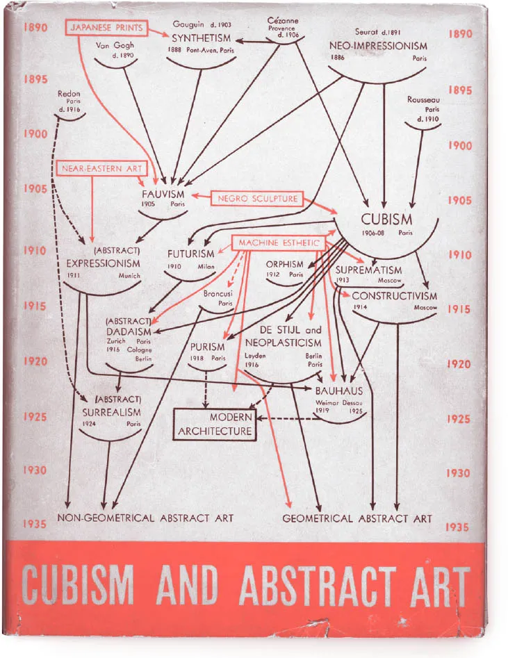
Museum of Modern Art director Alfred H. Barr’s Cubism and Abstract Art diagram was one of the first schemas for modern art itself, typset using an Intertype machine in Futura and Vogue (an early Futura competitor in the United States).
Some of Renner’s early letterforms were extreme, if simple. The lowercase m and n were straight lines and 90-degree angles, the lowercase g was formed from a circle and a triangle, the lowercase a was a circle enclosed by two lines at a right angle, and the lowercase r was a line with a dot next to it. On the lowercase e, the horizontal stroke disconnected from the end of the circular stroke, making it look more like a modern Euro symbol than a recognizable letter e.* In addition to being an endlessly interesting design exercise, Renner’s early experimental letters led the way for versions of Futura that undoubtedly sold better, but still hearkened to geometry, modernism, and, above all, form.
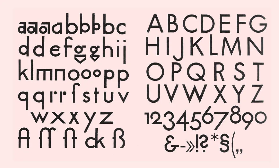
Early test prints of Futura, 1924–25
In preparation for Futura’s commercial release in 1927, Renner and Bauer shelved the extreme letterforms in favor of slightly more conventional and certainly more legible shapes. But printers could still purchase the innovative a, g, m, and n as alternates.4 Renner and Bauer’s iterative approach later became a smug hallmark of Futura’s advertising: “The evolution of such a face entailed endless refinements…involved rejection after rejection before the final effects were achieved that justified Futura’s immediate acceptance.”5
At first glance, almost all the letters in the 1927 Futura look like strict compass-and-ruler formations. In the first two weights, Light and Medium, the roman capitals form familiar shapes: a circular O, a sharp triangular M and A, an R made from a half-circle and straight lines, a T that is two straight lines, and a half-circle D. The letters seem precise, with mechanical monolinear strokes and little variation. And yet, at its heart, Futura is not only geometric. The letters E, F, L, and P reveal the classical double-square proportions essential to the entire typeface. The result marries the avant-garde concern with line, shape, and form to millennia-old typographic traditions.6
The final letterforms support a facade of strict geometry that masks the sophistication of the letter-forms. Many of the changes are subtle deviations from mathematical purity that are essential for obtaining the right visual effect. It’s like the extra space on the bottom part of a matte in a picture frame: even if all sides are mathematically equal, if you don’t account for visual weight, the frame looks wrong. In well-drawn geometric typefaces, visual sleights of hand abound to ensure the type...
Table of contents
- Cover
- Title
- Dedication
- Copyright
- Contents
- Foreword, Futura!
- Back to the Futura
- 1 My Other Modernism is in Futura
- 2 Spartan Geometry
- 3 Degenerate Typography
- 4 Over the Moon for Futura
- 5 Futura in the Wild
- 6 Show Me the Money
- 7 Past, Present, Futura
- 8 Futura by Any Other Name
- Never Use Futura?
- Acknowledgments
- Notes
- Image Credits
- Index
Frequently asked questions
Yes, you can cancel anytime from the Subscription tab in your account settings on the Perlego website. Your subscription will stay active until the end of your current billing period. Learn how to cancel your subscription
No, books cannot be downloaded as external files, such as PDFs, for use outside of Perlego. However, you can download books within the Perlego app for offline reading on mobile or tablet. Learn how to download books offline
Perlego offers two plans: Essential and Complete
- Essential is ideal for learners and professionals who enjoy exploring a wide range of subjects. Access the Essential Library with 800,000+ trusted titles and best-sellers across business, personal growth, and the humanities. Includes unlimited reading time and Standard Read Aloud voice.
- Complete: Perfect for advanced learners and researchers needing full, unrestricted access. Unlock 1.5M+ books across hundreds of subjects, including academic and specialized titles. The Complete Plan also includes advanced features like Premium Read Aloud and Research Assistant.
We are an online textbook subscription service, where you can get access to an entire online library for less than the price of a single book per month. With over 1.5 million books across 990+ topics, we’ve got you covered! Learn about our mission
Look out for the read-aloud symbol on your next book to see if you can listen to it. The read-aloud tool reads text aloud for you, highlighting the text as it is being read. You can pause it, speed it up and slow it down. Learn more about Read Aloud
Yes! You can use the Perlego app on both iOS and Android devices to read anytime, anywhere — even offline. Perfect for commutes or when you’re on the go.
Please note we cannot support devices running on iOS 13 and Android 7 or earlier. Learn more about using the app
Please note we cannot support devices running on iOS 13 and Android 7 or earlier. Learn more about using the app
Yes, you can access Never Use Futura by Douglas Thomas in PDF and/or ePUB format, as well as other popular books in Conception & Conception générale. We have over 1.5 million books available in our catalogue for you to explore.