VIII.—HARMONY-BUILDING WITH DARK-AND-LIGHT
AS there is no one word in English to express the idea contained in the phrase “dark-and-light,” I have adopted the Japanese word “notan” (dark, light). It seems fitting that we should borrow this art-term from a people who have revealed to us so much of this kind of beauty. “Chiaroscuro” has a similar but more limited meaning. Still narrower are the ordinary studio terms “light-and-shade,” “shading,” “spotting,” “effect” that convey little idea of special harmony-building, but refer usually to representation.
Notan, while including all that these words connote, has a fuller meaning as a name for a great universal manifestation of beauty.
Darks and lights in harmonic relations —this is Notan the second structural element of space-art ; p. 7.
The Orientals rarely represent shadows; they seem to regard them as of slight interest—mere fleeting effects or accidents. They prefer to model by line rather than by shading. They recognize Notan as a vital and distinct element of the art of painting.
The Buddhist priest-painters of the Zen sect discarded color, and for ages painted in ink, so mastering tone-relations as to attract the admiration and profoundly influence the art of the western world.
Our etching and book illustration have long felt the effect of contact with Japanese classic painting, though the influence came indirectly through the Ukiyoye color prints and books.
Such names as Kakei, Chinese of the Sung dynasty (p. 96), Soga Shubun, the Chinese who founded a school in Japan in the fifteenth century (p. 17), Sesshu, one of the greatest painters of all time (p. 97), Sotan, Soami, Motonobu, Tanyu are now placed with Titian, Giorgione (p. 51), Rembrandt, Turner, Corot and Whistler. The works of Oriental masters who felt the power and mystery of Notan are becoming known through the reproductions that the Japanese are publishing, and through precious examples in our own museums and collections. This in one of the forces tending to uproot our traditional scientific art teaching which does not recognize Dark-and-Light as worthy of special attention.
Appreciation of Notan and power to create with it can be gained, as in the case of Line, by definite study through progressive exercises. At the outset a fundamental fact must be understood, that synthetically related masses of dark and light convey an impression of beauty entirely independent of meaning,—for example, geometric patterns or blotty ink sketches by Dutch and Japanese.
When this occurs accidentally in nature, —say a grove of dark trees on a light hillside, or a pile of buildings against the morning sky,—we at once feel the charm and call the effect “picturesque.” The quality which makes the natural scene a good subject for a picture is like musical harmony. It is the “visual music” that the Japanese so love in the rough ink paintings of their masters where there is but a hint of facts (pap.97, 99)—a classic style which is the outward expression of a fine appreciation, and whose origin and practice are admirably set forth in “The Book of Tea.” Recognition of Notan as an individual element will simplify the difficulties of tone-composition and open the way for growth in power
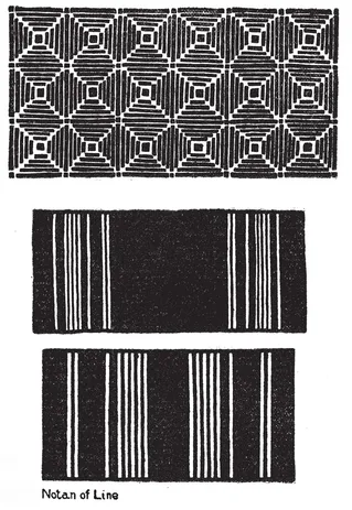
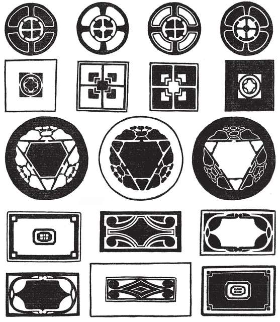
NOTAN OF LINE. As long as the lines of a design are kept of uniform width, the beauty is limited to proportion of areas and quality of touch, but widen some of the lines, and at once appears a new grace, Dark-and-Light. The textile designers who are restricted to straight lines, have recourse to this principle. They widen lines, vary their depth of tone, glorify them with color, and show that what seems a narrow field is really one of wide range.
EXERCISE
Choose some of the previous geometric line patterns, and widen certain of the lines, as illustrated in the plate. Incidentally this will give good brush practice, as the lines are to be drawn at one stroke. Push the point of the brush down to the required width, then draw the line. Try a large number of arrangements, set them up in a row and pick out the best. In choosing and criticising, remember that every part of a work of art has something to say. If one part is made so prominent that the others have no reason for being there, the art is gone. So in this case; if one line asserts itself to the detriment of the others, there is discord. There may be many or few lines, but each must have its part in the whole.
In a word, wholeness is essential to beauty ; it distinguishes Music from Noise.
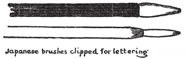
LETTERING. When forming part of an artistic composition, in books, posters, manuscripts, illuminations, etc., lettering should be classed as Notan of Line. Obviously the spacing of masses of letters has first consideration, and is usually a simple problem in rectangular composition. The effect is a tone or group of tones more or less complicated according to sizes of letters, thickness of their lines and width of spaces between and around them. I have found the reed-pen and the Japanese brush (clipped) the best in-plements for students’ lettering (see below). Having suggested that Lettering, including Printing, as an art, is a problem in composition of line and notan, it seems hardly worth while to introduce special exercises here. Johnston has treated this subject exhaustively; the reader is referred to his book “Writing, Illuminating and Lettering,” to Walter Crane’s and other good books on lettering. Compare fine printing, old and new, Japanese, Chinese and Arabic writing, and ancient manuscripts and inscriptions —Egyptian, Greek, and Mediæval.
Repetition, p. 24, and variation in two values, p. 67
Landscape compositions by HOKUSAI, three values, pp. 76, 82, 114
IX.—TWO VALUES—VARIATIONS—DESIGN
DARK-AND-LIGHT has not been considered in school curricula, except in its limited application to representation. The study of “light and shade” has for its aim, not the creation of a beautiful idea in terms of contrasting masses of light and dark, but merely the accurate rendering of certain facts of nature, —hence is a scientific rather than an artistic exercise. The pupil who begins in this way will be embarrassed in advanced work by lack of experience in arranging and differentiating tones. Worse than that, it tends to cut him off from the appreciation of one whole class of great works of art. As in the case of Line, so again in this is manifest the narrowness and weakness of the scheme of nature-imitating as a foundation for art education. The Realistic standard always tends to the decay of art.
The student in an academic school, feeling the necessity for a knowledge of Dark-and-Light when he begins to make original compositions, has usually but one resource, that of sketching the “spotting” as he calls it, of good designs and pictures—an excellent practice if followed intelligently. His difficulties may be overcome (1) by seeing that Notan is an element distinct from Line or Color; (2) by attempting its mastery in progressive stages leading to appreciation.
METHOD OF STUDY
Line melts into Tone through the clustering of many lines. Direct study of tone-intervals begins with composition in two values—the simplest form of Notan. There may be several starting-points ; one might begin by blotting ink or charcoal upon paper, by copying the darks and lights from photographs of masterpieces, or by making scales. Experience has shown that the straight-line design and the flat black ink wash are most satisfactory for earlier exercises in two values. Instead of black and white, or black and gray, one might use two grays of different values, or two values of one color (say light blue and dark blue) according to need.
The aim being to understand Notan as something by which harmony may be created, it is best to avoid Representation at first. Notan must not be confounded with Light and Shade, Modelling or anything that refers to imitation of natural objects.
The beginner may imagine that not much can be done with flat black against flat white, but let him examine the decorative design of the world. He will find the black and white check and patterns derived from it, in old velvets of Japan, in the woven and printed textiles of all nations, in marble floors, inlaid boxes and architectural ornament. The use of these two simple tones is as universal as Art itself. They appear in the black vine on the white marble floor of the Church of the Miracoli at Venice ; on the wall of the Arabian Mosque, and the frieze of the Chinese temple. They have come into favor on book covers and page borders. Aubrey Beardsley went scarcely beyond them. R. Anning Bell and other artists have boldly carried them into pictorial work in the illustration of children’s books.