![]()
PART 1
The Basics
![]()
Chapter 1
Italic AND Copperplate /
Italic OR Copperplate
Choosing between two beautiful and useful styles of calligraphy can be daunting. Before embarking on the study of calligraphy, beginners are frequently faced with exactly this choice. They may make their decisions by asking themselves some questions:
1. Which style appeals to me more?
2. Would Italic or Copperplate be more useful to me?
3. Which class is being offered at a time that fits into my schedule?
If you are equally drawn to both alphabets, and scheduling is not a problem, another question may arise: Why not learn both?
There are good reasons both for and against studying the two scripts simultaneously. If you have no familiarity with either Italic or Copperplate, and especially if you have never used a calligraphy pen of any kind, it is probably preferable to make a choice. Why? Since the two alphabets are written with very different pens, achieving the motor control for each is, of necessity, a separate process that requires exercise and concentrated practice.
We say “probably preferable” rather than “absolutely essential” because, with a reasonable amount of effort (and quite a lot of practice time), learning two sets of motor skills is certainly not out of the question. But most of us are circumscribed by time limitations, so even with the best intentions and a fully focused mind, learning to use the tools for Italic and Copperplate simultaneously can be quite difficult.
We therefore recommend that you, the beginner, make a choice. But which to choose? Choose the hand that you prefer. Thinking about commercial uses for calligraphy and/or calligraphy-for-profit at this time is fairly pointless. We will discuss how to get rich doing calligraphy (just joking) later in this book, but for the moment, be advised: you will not be going into business as a calligrapher quite yet. So look at some examples of Italic and Copperplate and make a choice.
But having said that, we are certainly well aware that many of you have already had some experience with both Italic and Copperplate and we would like to suggest that you can use this book in two ways: to pursue one set of instructions and exercises to advance your skills in either alphabet, or to alternate between the two. By comparing the results of similar exercises with different alphabets, you will enjoy the startling contrasts that result.
Let’s pause to define the two alphabets and put them into their historic context.
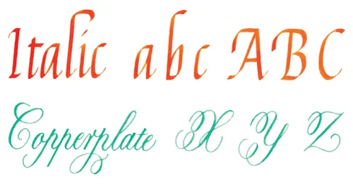
ITALIC
Italic calligraphy, also called Chancery Cursive, was the handwriting of the Renaissance. It made its first appearance in the early fifteenth century, and flourished during the sixteenth century. Italic was used primarily as a correspondence and business hand, an informal script that was written more quickly than the formal contemporary manuscript hands, such as Humanist Bookhand and the late Gothic scripts, which were used in documents, illuminated bibles, and other church books.
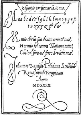
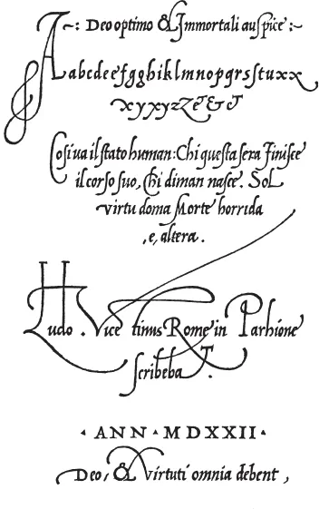
Early examples of Italic come from the Chancery office of the Vatican, hence the names Chancellaresca Formata (formal Chancery script) and Chancellaresca Corsiva (the informal, linked style of Italic), but quickly spread through Western Europe. Among the most famous examples that are available to modern calligraphers are the writing books (contemporary “how-to” books that taught how to write Italic) of three Italian masters: Ludovico degli Arrighi, Giovanniantonio Taglienti, and Giovanbattista Palatino. Each of these writing teachers published a text book on Italic writing with glorious examples of the script, showing simple lettering as well as some wonderfully flourished calligraphy.
Arrighi’s book, L’Operina, has been translated into English and reproduced in facsimile with the pages beautifully hand-lettered, in a close approximation of Arrighi’s style, by the twentieth century American calligrapher John Howard Benson.
There are many other examples of sixteenth century Italic available for the student to examine. It is interesting to compare these earlier forms of some of the letters with our contemporary Italic alphabet. It is important to realize that the Italic hand of the sixteenth century remains elegant and easily legible nearly 500 years later.
Palatino
Tagliente
Arrighi
COPPERPLATE
Copperplate calligraphy, unlike other styles of writing, owes its name to a printing method, Copperplate engraving. The development of these letterforms, starting in the late seventeenth century and culminating with the English writing masters in the mid-eighteenth century (and indeed continuing well into the nineteenth century), were in effect a symbiosis between the shapes produced by the pen (or quill, actually) and the strokes that could be incised in a metal printing plate. In the hands of a master engraver, the hardness of the plate lent itself to curvilinear forms that were both rounder and more linear than the shapes of Italic letters, and the Copperplate alphabet developed a form, slant, and rhythm that has its own special character.
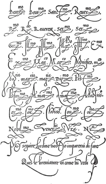
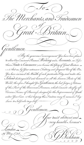
Various names have been given to this family of letterforms, the most common of which, to English speaking calligraphers, is either Copperplate or English Roundhand. A similar alphabet that developed in France in the seventeenth century is called Anglaise, but the forms we will be concentrating on in this book derive largely from the work of the English writing masters. Their artwork has been preserved for us in The Universal Penman, a compendium of extraordinary examples of penmanship dating from 1733 to 1743.
England’s commercial preeminence during the eighteenth century called for a clear, legible, and rapidly written correspondence hand, and the clerks trained in Copperplate script were able to satisfy the demands of this flourishing business empire. Many of the examples of Copperplate that we study today were created by the writing teachers who were in lively competition with each other to attract students. We are fortunate to have examples of broadsheets (single pages of calligraphic prowess) as well as copy books to enable us to study Copperplate at its finest.
ABOVE AND OPPOSITE:
George Bickham, The Universal Penman
![]()
Chapter 2
Tools & Materials,
Light, Posture, Practice
Whether you are starting from scratch or reacquainting yourself with calligraphy, it’s a good idea to read this chapter before you begin to write.
TOOLS & MATERIALS
The materials required for basic calligraphy are simple and inexpensive, but not always easy to locate. All you actually need to get started are pen, ink and paper, but it is necessary to determine which products are good and which are not. If you go into an art supply store and say, “I’d like to purchase calligraphy materials,” you’ll be very lucky to get any of the tools of the serious calligrapher, as opposed to hobby kits and packaged sets. It’s always best to be armed with some specific information so that you can request exactly what you need. (Whether or not the shop will actually have what you need is another question. Mail-order calligraphy suppliers are often a better source of calligraphy materials than local art supply stores.)
The materials below are recommended for both Italic and Copperplat...