![]()
Learning Objectives
1. Reaping the benefits from organizing data and displaying them in histogram form
2. Gaining skill in interpreting frequency histograms
3. Constructing a cumulative frequency diagram
4. Finding quartiles from a cumulative graph
1-1 DATA: AN AID TO ACTION
Much human progress grows from the practice of keeping and analyzing records. Important examples are the records leading to the calendar, an appreciation of the seasons, the credit, banking, and insurance systems, much of modern production processes, and our health and medical systems. We shall, therefore, begin by explaining how to organize, display, and interpret data.
What does this book do? This text primarily equips the reader with the skills
1. to analyze and display a set of data,
2. to interpret data provided by others,
3. to gather data,
4. to relate variables and make estimates and predictions.
ORGANIZING DATA: THE USE OF PICTURES
Data often come to us as a set of measurements or observations along with the number of times each measurement or observation occurs. Such an array is called a frequency distribution.
To display a frequency distribution and disclose its information effectively, we often use a type of diagram called a frequency histogram. Let us look at some histograms. Examples 1 and 2 suggest some benefits we get from organizing data and displaying them in histogram form.
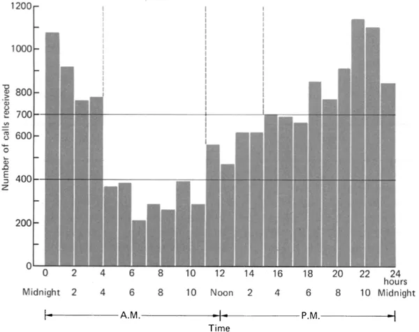
EXAMPLE 1 Allocation of police. The chief of police of New York City has enlisted as many men as his budget permits. He has divided his forces about equally to cover three daily shifts; the first shift runs from midnight until 8 A.M., the second from 8 A.M. until 4 P.M., and the third from 4 P.M. until midnight. This system is bringing many complaints, and it is clear that during certain hours of the day the police calls require more police than are available. The chief selects a certain Sunday in August as a guide to action and makes a histogram (Fig. 1-1) showing the frequency distribution of emergency police calls, hour by hour, in New York City during this Sunday. Using this Sunday in August as a guide for late summer Sundays, what action, short of hiring additional police, does the histogram suggest?
Discussion. The histogram vividly exhibits the changes in the numbers of police calls from hour to hour during the 24-hour period. The day’s calls appear to divide into three types of periods:
Figure 1-1 Frequency distribution of New York City police calls during a Sunday in August.
Source: Adapted from R. C. Larson (1972). Improving the effectiveness of New York City’s 911. In Analysis of Public Systems, edited by A. W. Drake, R. L. Keeney, and P. M. Morse, p. 161. Cambridge, Mass.: M.I.T. Press.
1. A connected interval of peak demand, about 700 or more calls per hour from 0 to 4 hours (midnight to 4 A.M.), and another interval from 15 to 24 hours (3 P.M. to midnight); these two intervals join to become one period as we run from one day to the next starting at 15 hours and running through to 4 hours the next day (3 P.M. to 4 A.M.).
2. A period of medium demand, over 400 calls to less than 700 calls per hour from 11 A.M. to 3 P.M.
3. A period of low demand, about 400 or fewer calls per hour from 4 A.M. to 11 A.M.
A study of such histograms over a period of time gives important information about the number of police required for emergency duty during a given shift. Figure 1-1 shows that there are over twice as many calls during the 7-hour period between 6 P.M. and 1 A.M. as during the 7-hour period between 4 A.M. and 11 A.M.
If we assume that the chief does not want to change the shift times, then he might reallocate his force so that the numbers on the shifts are more nearly proportional to the numbers of calls received during the shifts. A practical nonstatistical problem then arises. How can arrangements be made with the union to reschedule the shifts? In the actual event, the rescheduling was worked out. Note that the guide to action came from looking at the whole distribution of calls, not just the average number of calls per hour.
EXAMPLE 2 A gap in the histogram. The quality control expert W. E. Deming reported that part of a manufacturing process involves making steel rods. These rods have a lower specification limit (LSL) of 1.000 cm on their diameters; rods smaller than 1.000 cm are too loose in their bearings. Such rods are rejected, or thrown out, which implies losses of labor and material and of the overhead expenses incurred up to this point in the manufacturing process. As an aid to action, the quality-control engineer constructs Fig. 1-2, a histogram displaying the inspectors’ m...