eBook - ePub
Graphic Design Rules
365 Essential Design Dos and Don'ts
- English
- ePUB (mobile friendly)
- Available on iOS & Android
eBook - ePub
Graphic Design Rules
365 Essential Design Dos and Don'ts
About this book
DON'T use comic sans (except ironically!) but DO worship the classic typefaces like Helvetica and Garamond. Graphic Design Rules is a handy guide for professional graphic designers, students, and laymen who incorporate graphic design into their job or small business. Packed with practical advice, this spirited collection of design dos and don'ts takes readers through 365 rules like knowing when to use a modular grid—and when to throw the grid out the window. All designers will appreciate tips and lessons from these highly accomplished authors, who draw on years of experience to help you create good design.
Trusted by 375,005 students
Access to over 1.5 million titles for a fair monthly price.
Study more efficiently using our study tools.
Information
Topic
DesignSubtopic
Design GeneralType & Typography

DON’T use Comic Sans
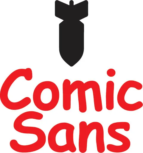
Well, we had to put it in, didn’t we? Comic Sans is arguably the most inappropriately used typeface in history since its first appearance in 1995. It was designed for Microsoft a year earlier by Vincent Connare (who incidentally is very philosophical about his notoriety among type fans) to supply user-friendly menus for people who were a bit scared of computers. When it was included as one of the font choices in Windows 95, it took off faster than a speeding bullet. Everyone with a computer and the notion they could do graphic design started using it on their homemade letterheads, party invites, curricula vitae, shop signs, well, you get the picture. Comic Sans wasn’t designed to do all these things, so why did everyone like it so much? Connare thinks people like to use it because “it’s not like a typeface.” Ouch! What better reason can there be to not use Comic Sans? TS

DO use Comic Sans . . . ironically

Did I just say you shouldn’t use Comic Sans? Well, I was only kidding. One of the great things about typefaces that are vilified due to inappropriate application or overuse is they gain a platform from which they can be used to portray irony, sarcasm, satire, and so on. If you’ve got a dispiriting message that you want to make light of, for instance “Turning forty-six next week and really happy about it—party on!” Comic Sans might just be your typeface of choice. The problem is that those invitees who aren’t graphic designers won’t get the joke. Using type ironically can be very effective and indeed great fun, but only if the irony isn’t wasted. Therefore, think carefully before you decide to use Comic Sans, Child’s Play, Dot Matrix, Bullets Dingbats, or any other novelty typeface that requires anyone to figure out why you chose the typeface in the first place. If the joke isn’t immediately transparent, you should probably have gone for Times New Roman instead. Ha ha—do you get it? No? TS
DO accept that Times New Roman has its uses
Times New Roman is an incredibly useful typeface. It’s well designed, with elegant letterforms, and displays excellent readability and legibility characteristics. It’s also very economical with space, a property that harks back to its origins as a typeface designed for the Times newspaper in 1932. Its biggest problem is that it’s so totally ubiquitous, it has lost its personality. Everyone with a computer can identify it, thanks once again to Microsoft, who’s bundled it with Windows since 1992 and made it the default typeface for Word before switching to Calibri in 2007. It’s also one of the most widely used typefaces in mass-market paperbacks, particularly in the United States. This is why we graphic designers get all haughty about using it. Are we being fair? I’m not so sure. If it’s not such a great typeface, how come it’s used more than any other for so many varying applications? I think it’s time to accept Times New Roman for what it is and give thanks for its usefulness. But will I be using it for my next commercial design commission? No way—it’s Times New Roman, for goodness’ sake! TS
DON’T use Zapf Dingbats

Good design is about good ingredients. A talented chef uses the best spices, vegetables, and meats. A bad chef chooses the premade cake mix rather than making a wonderful cake from scratch. Zapf Dingbats are well drawn and have an excellent pedigree, created by Hermann Zapf. But they are ubiquitous and off the shelf. They work well for handmade signs for lost dogs or birthday parties. Like most design elements, a good rule of thumb is to ask this question: would my mother design this? Unless your mother is a noted designer, she will likely design an invitation for her weekly bridge game using Zapf Dingbats. Your poster for a client, such as the Melbourne Opera or the Louvre, deserves better. Unfortunately, while they are useful and in some instances (the triangle and simple star) acceptable, Zapf Dingbats will create work that is dull, ordinary, and expected. As a designer, one of our jobs is to create delight. Invent a custom form for an arrow, asterisk, or scissors. If great design is in the details, why would choosing a banal detail be the right choice? SA
DO worship classic typefaces
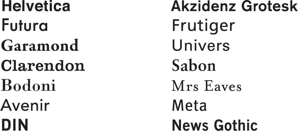
What designates a typeface as a classic? First, it doesn’t mean the typeface has to be a hundred years old, as any typeface providing a marker for a prominent graphic style can be considered a classic. In 2009, I was fortunate to work with designer and writer Tamye Riggs on a book about classic fonts. She came up with a great analogy to automobiles: every year seems to produce its own classic car; the same can be said of fonts. Any typeface that makes a credible mark on typography has a right to join the classics club—Sentinel (as used in this book) is a good example of a relatively new font that has become a classic very quickly. The digital revolution has placed thousands of (often quite bad) fonts at our disposal, but for me it’s the typefaces that have best made the transition from movable type to digitized font that are the true classics. These are fonts that will always remain relevant and should indeed be worshipped, although respected is probably a better word. Use them wisely and often—they’ll never let you down. TS
DO learn about typographic classification
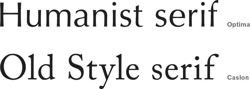
It’s normal to make type choices based on the feel you get from a typ...
Table of contents
- Cover
- Title
- Copyright
- Contents
- The Book of Rules
- Type & Typography
- Layout & Design
- Color
- Imagery & Graphics
- Production & Print
- The Practice of Design
- Author Biographies
- Index
- Image Credits
Frequently asked questions
Yes, you can cancel anytime from the Subscription tab in your account settings on the Perlego website. Your subscription will stay active until the end of your current billing period. Learn how to cancel your subscription
No, books cannot be downloaded as external files, such as PDFs, for use outside of Perlego. However, you can download books within the Perlego app for offline reading on mobile or tablet. Learn how to download books offline
Perlego offers two plans: Essential and Complete
- Essential is ideal for learners and professionals who enjoy exploring a wide range of subjects. Access the Essential Library with 800,000+ trusted titles and best-sellers across business, personal growth, and the humanities. Includes unlimited reading time and Standard Read Aloud voice.
- Complete: Perfect for advanced learners and researchers needing full, unrestricted access. Unlock 1.5M+ books across hundreds of subjects, including academic and specialized titles. The Complete Plan also includes advanced features like Premium Read Aloud and Research Assistant.
We are an online textbook subscription service, where you can get access to an entire online library for less than the price of a single book per month. With over 1.5 million books across 990+ topics, we’ve got you covered! Learn about our mission
Look out for the read-aloud symbol on your next book to see if you can listen to it. The read-aloud tool reads text aloud for you, highlighting the text as it is being read. You can pause it, speed it up and slow it down. Learn more about Read Aloud
Yes! You can use the Perlego app on both iOS and Android devices to read anytime, anywhere — even offline. Perfect for commutes or when you’re on the go.
Please note we cannot support devices running on iOS 13 and Android 7 or earlier. Learn more about using the app
Please note we cannot support devices running on iOS 13 and Android 7 or earlier. Learn more about using the app
Yes, you can access Graphic Design Rules by Tony Seddon,Sean Adams,Peter Dawson,John Foster in PDF and/or ePUB format, as well as other popular books in Design & Design General. We have over 1.5 million books available in our catalogue for you to explore.