Introduction
We often hear that society is becoming more visual, that we are becoming dominated by ‘the image’. It is certainly true that technology has made it much easier for us to produce and distribute images. It is also the case that the development of consumerism has led to new levels of visual sophistication in the production and dissemination of advertisements, through social media, the Internet and on our mobile devices. If we just compare the technical standard of commercials and promotional material that we find now to that of 30 years ago, the changes are staggering. But in fact this idea of the visual is rather restricted. Those who research the visual have argued that this is problematic (Smith, 2008), that the visual involves so much more than photographs, commercials and film clips. This book agrees with this position offering a very specific kind of tool kit for analysing a much wider range of visual communication. We say more about the book and how it sits alongside others which provide introductions or methods of visual analysis shortly. But first we want to say what we mean by visual communication. What does this book take as the visual? This has huge importance as regards how we approach and carry out visual analysis.
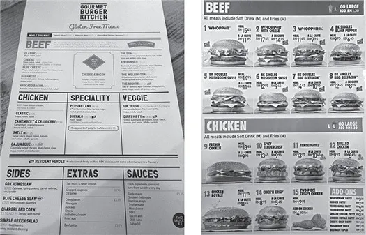
This idea of the increasing impact of images is not as clear as we might think. Images can be pictures, but we also have mirror images, images in our minds and dreams. Even writing on a page presents an image including the kinds of typeface used and the texture of the paper upon which it is printed that may bring certain kinds of associations to the reader. If we look at the two menus in Figure 1.1, they are a kind of image or visual wholes used to communicate. The menu on the left for a gluten-free burger kitchen is printed on a rougher type of paper than that for the fast-food restaurant to the right where everything looks shiny and smooth. The gluten-free menu has no pictures, whereas we see photographs of almost shining burgers in the fast-food case. But why is this so? Why might it be inappropriate for the gluten-free menu to also carry these? Also the two use colour, fonts and spacing in very different ways. Visual communication in this sense comprises objects and things that we experience as wholes, which are part of everyday life activities and which are built up of observable qualities.
At a superficial level a casual observer might say that the gourmet-kitchen menu looks more ‘up-market’ than the fast-food menu. They may say it looks more ‘serious’ than the more ‘lively’ fast food. In this book such menus are the kinds of data for which we provide tools for analysis. Both of these are instances of visual communication that are intended to communicate ideas and values about burgers. In marketing terms one of these must communicate ideas of a consumer experience of something more ‘natural’, ‘unprocessed’, perhaps ‘authentic’, while the other must communicate ‘lively’, ‘quantity’, ‘immediate’. What we want to show in this book is that these forms of visual communication can be broken down and analysed in details. While the viewer may experience the menu or other forms of visual communication as a whole, as a physical thing, it is at this level of detail that we can begin to understand how they work. We will be highly specific as to how these ideas of ‘natural’ or ‘lively’ can be communicated. And the tools that we present that allow us to do so can allow us to ask and answer all kinds of research questions. For example, a research project may take an interest in the marketing of ‘healthy’ food, in other words in how food stuffs that are quite ordinary are dressed up to appear ‘natural’, ‘traditional’ or ‘honest’.
Figure 1.1 A gluten-free burger menu (left) and a fast-food Burger King menu (right)
The materials of visual communication
When analysing visual communication in this book we do not use the notion of ‘images’ which is fact very vague and not useful for analytical purposes, but the idea of ‘semiotic materials’. This has the advantage that it captures the ‘stuff’ of which all kinds of visual communication is made. Semiotic materials can be photographs, office spaces, commercials or food containers. All these artefacts have materiality, a physical presence and a design that make them into the wholes that we experience, like the menus, or like the room or place where you are sitting. This idea of semiotic materials is fundamental for how we approach such artefacts, such instances of visual communication. It captures how we experience them in everyday life, how we use them, and how we can explore them as researchers. It also helps us to think about how these materials are manufactured and designed in our societies for specific reasons and how they shape what we can do with and through them.
To help us to think about materiality and wholes, we can use the example of a shampoo bottle. This is a semiotic material that we take to be a whole. A shampoo bottle has, of course, a physical shape. If manufactured for a female consumer group, they are often tall, slender and slightly rounded, suggesting elegance and smoothness. The texture may also be very glossy to indicate the results once used to wash the hair. You would not want a jagged and uneven surface. This surface is used to brand the product, using letter forms, colours, an icon that resembles an item of fruit and a small scientific-type diagram. We immediately recognize such a bottle on the shelf in a grocery store and relate to it as being a form of visual communication. We take it to be an artefact that sets up and codes social meanings. In this case the meaning relates to ‘elegance’, ‘natural’, ‘ingredients’, ‘smoothness’ and of course ‘femininity’.
But other shampoo bottles may use shape, texture, colours and fonts to tell us that the product is for men, where we find a matt black finish, a squat-shaped bottle and more angularity in both shape and the use of fonts. These material objects are experienced by people as whole things that are interrelated with ideas about ‘naturalness’, ‘beauty’, ‘masculinity’, ‘technology’, and so on, as well as simply regarding the nature of personal hygiene. And fundamentally, on another but interrelated level, such objects are part of a longer history of the growth of the commodification, standardization and commercialization of goods in society and the technologies that are used in these processes. These objects are therefore part of wider forms of social meanings, ideas and types of social interaction. A person from 150 years ago would not really understand what they were looking at. They would not really know what kinds of visual communication these bottles were, nor would they grasp the meanings that would come so naturally to us regarding things like nature and gender.
The notion of visual communication we are getting at here is one that encompasses the design of a menu or a bottle that holds shampoo. It is also related to the clothes we wear, children’s toys, how we design our office and home spaces, and the way a school building is constructed to suggest things like ‘conformity’ or ‘creativity’. Visual communication is done and shaped through computer software, the look of weapons, the construction of your bicycle, or the meaning given to the configurations of stars in the night sky or the scientific models used to show how it works. And it is not so much that we simply look at this communication. It is a part of our world into which we are infused. It is how we express ourselves and forms the realms through how we can do this as prescribed by the available tools, technologies and shared understandings. This visual world is not just pictures that we look at but is the very world of meanings in which we live. And crucially, for all forms of communication this is not necessarily a consensual world, but one where different interests compete to define how things are and how they look.
Semiotic materials and social behaviour
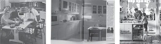
In Figure 1.2 we find three pictures of IKEA kitchens from IKEA catalogues. A simple observation would be that the former ones, from 1975 and 1985, look ‘old fashioned’ as compared with 2016. But the word ‘fashion’ can conceal the way that objects can communicate very specific kinds of ideas. As with the menus and the juice carton we can think about the way that a different fashion in kitchen design involves different social meanings.
If we look at the photographs we see that the kitchen from the 1970s was personalized and by present standards fairly randomly organized. It is a practical place inhabited by an everyday family eating but not interacting. In the 1980s this has changed as all parts of the kitchen have become fixed and integrated as a whole. There is an emphasis on everything being the same kind of shape. Here interior design began to become normalized. In this image we also see a single place set to eat, with a glass of white wine. So unlike the earlier kitchen which was a place to get things done, the 1980s kitchen begins to say something about you as a person. At this point we begin to sense the rise of what came to be named ‘lifestyle marketing’ where products become more aligned with issues of taste and the ideas people have about themselves.
In the 2016 kitchen we see something different again. Here, on one level, there has been a reduction of order and integration. The units are now designed for flexibility, to be multipurpose. This is part of the marketing approach where it is emphasized that furniture can be moved and adapted to a range of needs. In the catalogues the kitchen is no longer an isolated space but open-plan, linked to other living spaces. We find a shift to more natural materials and textures. And the activities depicted in the kitchens tend to be social or creative. These activities often foreground ‘solutions’ and point to the way that the kitchen can help manage typical life challenges. Here the design as it is presented not only hints at taste but lays out very clear scripts for how the kitchens meet the needs of contemporary family life, where for example, as in the 2016 kitchen, dad and son enjoy ‘quality time’.
What we can see in these examples of kitchen designs are not only changes in fashion but the coding of domestic space with different social meanings. We see how semiotic materials can structure how we behave and interact. The kitchen designs, as a form of visual communication, are semiotic materials shaped into a whole. We can then ask what kinds of ideas about domestic life are communicated? What kinds of identities are valued or devalued? While the 1985 kitchen is ordered, modern, uncluttered and aligned with taste, the contemporary kitchen is rich with organic textures and full of earth-tone colours, yet also incredibly designed. Looking at the image, colours are carefully matched to create a kind of coherence amongst plants, surfaces, object and clothing. These kitchens are sold for people who need solutions, who need to manage their lives better. We might ask why it is so. Why was it simply not important in 1975 to seek out solutions or to think about your selection of kitchens as part of a life-management project? And why has there been a rise in this kind of coordination of semiotic materials, where the colour and texture of children’s clothing may match with that of work surfaces and cooking utensils? As we show in this book semiotic materials tend to have certain social meanings built into them. But how they are used in contexts relates to ideas and values present in a particular time and place.
Figure 1.2 Kitchens in the IKEA catalogue from 1975 (left), 1985 (middle) and 2016 (right)
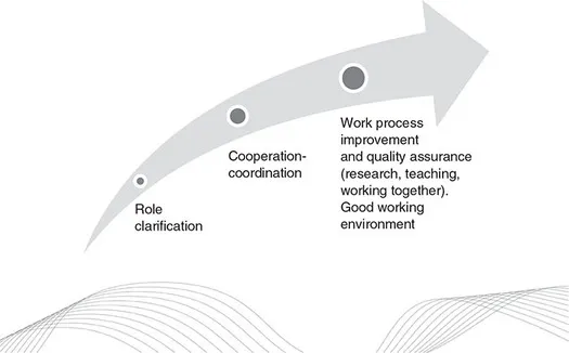
In Figure 1.3 we see another semiotic material designed as a whole, which also shapes behaviour and social interaction but in a very different way. This is a PowerPoint slide containing a diagram. It is taken from a presentation at a ‘leadership’ meeting attended by one of the authors. The diagram was used as part of a workshop where management explained how collaboration amongst colleagues and quality on teaching and research could be improved if everyone more carefully described their roles and what they do. Yet the diagram, while on the one hand ‘explaining’ things, also conceals other things. It uses semiotic materials to carry out a form of symbolism to hide a number of things that in fact make the proposed idea both pointless and also highly problematic.
If we look at the diagram we can see that the three stages presented by the management sit on an arrow that grows in width from left to right and that also moves in an upward direction. From left to right we have ‘role clarification’, which leads to ‘cooperation and coordination’, and then to better quality of work and work environment. The diagram does not explain how one stage leads to the next but symbolizes this sequence of causality through the arrow. The slide also carries a ‘wave’ at the bottom comprising fine lines (and is part of the graphic profile of the university). This symbolizes a kind of light, easy, constant movement. At no point are these ideas communicated in language, yet this becomes part of how the process is presented.
Figure 1.3 A PowerPoint slide from a university meeting on ‘leadership’
One present characteristic of public institutions is a growing bureaucratization as part of processes of marketization, where outputs must improve and increase. If you work in such an institution you will be constantly showing how you are doing things better, improving qualities. Management must demonstrate that they are steering work processes in ways that will lead to such improvements, and the PowerPoint slide is part of such a performance management. But researchers have shown that these bureaucratic processes often do nothing to actually change the work environment but rather create extra work and distract from actual institutional priorities (Power, 1999).
In fact there are many concrete and practical obstacles to improving quality at the university. The majority of staff at the university simply have no research time factored into their contracts. Describing their role will not change the quality of research. And there had been problems with heavy teaching loads where many staff had become stressed and overworked. Many staff also work on temporary contracts which does not lead to the kinds of settled work environment that fosters quality. Of course, the solutions to such things are costly and relate to deeper budgetary problems in the institution and factors within the Swedish educational system. But nevertheless management are required to show what they are doing to improve outputs. So these often happen in ways that exist at a bureaucratic level only. The above PowerPoint is one such example. If we all define our roles better at different levels of management then we will all work together better and the quality of everything will improve. The causal process is communicated visually through the arrow that rises, meaning higher quality, and that gets thicker, somehow suggesting ‘more’. The wavy lines at the bottom help to communicate that it will be light and easy and part of a ‘dynamic’ process. Like the menus, shampoo bottles and kitchens the PowerPoint slide deploys semiotic materials to communicate social meanings. And this also communicates about actions and social relations. If you like, the ideas and values of marketization, of quality assurance, are built into the diagram.
This diagram also points to one important way that visual communication has changed. While society may not have necessarily become ‘more visual’, a new design culture has evolved. We saw this in the details in the burger menus where ideas about the food are communicated by fonts and colour, the 2016 kitchen with its ‘rhyming’ between different kinds of semiotic materials. And we see it in the PowerPoint diagram. It has been argued that in society we now tend to rely less on writing to communicate (Kress and van Leeuwen, 2001). The menu designs could be thought about as part of such a change. But such a shift means that things like process, causalities and identities may no longer be so much explained as symbolized. The naturalness of the burger is not explained but symbolized through fonts and textures. On the PowerPoint slide, causality is communicated by an arrow and a wavy line. In such a case writing, as...