In this chapter, we'll first consider the existing controls that WPF offers us and look at how we can use them to create the layouts that we require. We'll investigate the many ways that we can modify these controls to avoid the need to create new controls.
We'll examine the various levels of functionality that are built into the existing controls and then discover how to best declare our own controls when required. We'll then take an in-depth look at the various options that we have and determine when it's best to use each one. Let's jump straight in and take a look at the various layout controls.
Investigating the built-in controls
There is a wide range of controls included in the .NET Framework. They cover most common scenarios and it is rare that we will need to create our own controls in a typical form-based application. All of the UI controls tend to have their functionality built up from a large number of common base classes.
All controls will share the same core-level base classes that provide the core-level functionalities and then a number of derived framework-level classes that provide the functionality that is associated with the WPF Framework, such as data binding, styling, and templating. Let's investigate this further.
Inheriting framework abilities
As with the base classes in our application framework, the built-in WPF controls also have an inheritance hierarchy, with each successive base class offering some additional functionality. Let's look at the Button class as an example. Here is the inheritance hierarchy of the Button control:
System.Object System.Windows.Threading.DispatcherObject System.Windows.DependencyObject System.Windows.Media.Visual System.Windows.UIElement System.Windows.FrameworkElement System.Windows.Controls.Control System.Windows.Controls.ContentControl System.Windows.Controls.Primitives.ButtonBase System.Windows.Controls.Button
As with every object in the .NET Framework, we start with the Object class, which provides low-level services to all classes. These include object comparison, finalization, and the ability to output a customizable string representation of each object.
Next is the DispatcherObject class, which provides each object with thread affinity and associates them with a Dispatcher object. The Dispatcher class manages a prioritized queue of work items for individual threads. Only the thread that the associated Dispatcher object was created on can access each DispatcherObject directly and this enables derived classes to enforce thread safety.
After the DispatcherObject class, we have the DependencyObject class, which enables all derived classes to use the WPF property system and declare Dependency Properties. The GetValue and SetValue methods that we call to access and set their values are also provided by the DependencyObject class.
Next up is the Visual class, which has the primary role of providing rendering support. All elements that are displayed in the UI will extend the Visual class. In addition to rendering each object, it also calculates their bounding box and provides support for hit testing, clipping, and transformations.
Extending the Visual class is the UIElement class, which provides a number of core services to all of its derived classes. These include the event and user input systems and the ability to determine the element's layout appearance and rendering behavior.
Following on from that is the FrameworkElement class, which provides the first framework-level members, building upon the foundation of the core-level classes that it extends. It is the FrameworkElement class that enables data binding through the DataContext property and styling through the Style property.
It also provides events that relate to an object's lifetime, an upgrade of the core-level layout system to a full layout system and improved support for animations, among other things. This is typically the lowest-level class that we might want to extend if we were creating our own basic elements, as it enables derived classes to partake in the majority of the WPF UI capabilities.
The Control class extends the FrameworkElement class and is the base class for most of the WPF UI elements. It provides appearance templating through the use of its ControlTemplate functionality and a host of appearance-related properties. These include coloring properties, such as Background, Foreground, and BorderBrush, along with alignment and typeface properties.
Extending the Control class is the ContentControl class, which enables controls to have one object of any CLR type as its content. This means that we can either set data objects or UI elements as the content, although we may need to provide a DataTemplate for the data objects if they are of a custom type.
The final class in the long line of parent classes that the Button class extends is the ButtonBase class. In fact, this is the base class for all buttons in WPF and it adds useful functionality for buttons. This includes automatically converting certain keyboard events to mouse events, so that users can interact with the buttons without using a mouse.
The Button class itself adds little to its inherited members, with only three related bool properties; two that specify whether a button is the default button and one that specifies whether the button is a cancel button. We'll see an example of this shortly. It has an additional two protected overridden methods that get called when the button is clicked, or when an automation peer is created for it.
While WPF enables us to modify existing controls to such a degree that we rarely need to create our own, it is important to be aware of this inheritance hierarchy, so that we can extend the appropriate and most lightweight base class that fulfills our requirements when we need to.
For example, if we wanted to create our own custom button, it would typically make more sense to extend the ButtonBase class, rather than the Button class, and if we wanted to create a totally unique control, we could extend the FrameworkElement class. Now that we have a good understanding of the make-up of the available controls, let's see how they are displayed by the WPF layout system.
Laying it on the line
In WPF, the layout system is responsible for attaining the sizes of each element to be displayed, positioning them on screen, and then drawing them. As controls can be contained within other controls, the layout system works recursively, with each child control's overall position being determined by the position of its parent panel control.
The layout system first measures each child in each panel in what is known as a measure pass. During this pass, each panel calls the Measure method of each child element and they specify how much space they would ideally like to have; this determines the UIElement.DesiredSize property value. Note that this is not necessarily how much space they will be given.
After the measure pass comes the arrange pass, when each panel calls the Arrange method of each child element. During this pass, the panels generate the bounding boxes of each of their child elements, dependent upon their DesiredSize values. The layout system will adjust these sizes to add any required margins or additional adjustments that may be needed.
It returns a value to the input parameter of the panels' ArrangeOverride method and each panel performs its own specific layout behavior before returning the possibly adjusted value. The layout system performs any remaining required adjustments before returning execution to the panel and completing the layout process.
We need to be careful when developing our applications, to ensure that we do not unnecessarily trigger additional passes of the layout system, as this can lead to poor performance. This can occur when adding or removing items in a collection, applying transforms on the elements, or by calling the UIElement.UpdateLayout method, which forces a new layout pass.
Containing controls
The existing controls can mostly be split into two main categories; those that provide layout support for other controls, and those that make up the visible UI, and are arranged in it by the first category of controls. The first category of controls are of course panels and they provide a variety of ways to arrange their child controls in the UI.
Some provide resizing capabilities, while others don't, and some are more efficient than others, so it's important to use the right panel for the job at hand. Additionally, different panels offer different layout behaviors, so it is good to know what the available panels are and what they each offer us in terms of layout.
All panels extend the abstract Panel class, and that extends the FrameworkElement class, so it has all of the members and functionality of that class. However, it doesn't extend the Control class and so it cannot inherit its properties. It therefore adds its own Background property to enable users to color the gaps between the panel's various items.
The Panel class also provides a Children property that represents the items in each panel, although we do not typically interact with this property unless creating a custom panel. Instead, we can populate this collection by simply declaring our child elements directly within the panel element in XAML.
We are able to do this because the Panel class specifies the Children property in a ContentPropertyAttribute attribute in its class definition. While the Content property of a ContentControl normally enables us to add a single item of content, we are able to add multiple items into panels because their Children property, which is set as the content, is a collection.
Another Panel class property that we might need to use is the IsItemsHost property, which specifies whether a panel is to be used as a container for the items of an ItemsControl element, or not. The default value is false, so it makes no sense to explicitly set this property to false. In fact, it is only ever required in a very particular situation.
That situation is when we are replacing the default panel of an ItemsControl, or one of its derived classes, such as a ListBox, in a ControlTemplate. By setting this property to true on a panel element in a ControlTemplate, we are telling WPF to place the generated collection elements in the panel. Let's see a quick example of this:
<ItemsControl ItemsSource="{Binding Users}"> <ItemsControl.Template> <ControlTemplate TargetType="{x:Type ItemsControl}"> <StackPanel Orientation="Horizontal" IsItemsHost="True" /> </ControlTemplate> </ItemsControl.Template> </ItemsControl> In this simple example, we are replacing the default internal items panel of the ItemsControl element with a horizontal StackPanel. Note that this is a permanent replacement and no one can make further changes to this without providing a new ControlTemplate. There is however, a far easier way to achieve the same result and we saw an example of this in Chapter 4, Becoming Proficient with Data Binding:
<ItemsControl ItemsSource="{Binding Users}"> <ItemsControl.ItemsPanel> <ItemsPanelTemplate> <StackPanel Orientation="Horizontal" /> </ItemsPanelTemplate> </ItemsControl.ItemsPanel> </ItemsControl> In this alternative example, we simply provide a new ItemsPanelTemplate for the ItemsControl through its ItemsPanel property. Using this code, the internal panel can still be easily changed without the need to provide a new ControlTemplate and so, when we don't want other users to be able to swap out the inner panel, we use the first method, otherwise we use this method.
The Panel class also declares a ZIndex Attached Property, which can be used by child elements to specify a layered order within the panel. Child elements with higher values will appear above, or in front of, elements with lower values, although this property is ignored in panels that do not overlap their children. We'll see an example of this in the next section, so let's now focus on the panels that derive from the Panel class and what they offer us.
Canvas
The Canvas class enables us to explicitly position child elements using combinations of the Canvas.Top, Canvas.Left, Canvas.Bottom, and Canvas.Right Attached Properties. This is vaguely similar to the old Windows Forms system of control placement.
However, when using WPF, we don't typically layout UI controls in a Canvas. Instead, we tend to use them more for displaying shapes, constructing graphs, showing animations, or drawing applications. Take the following example:
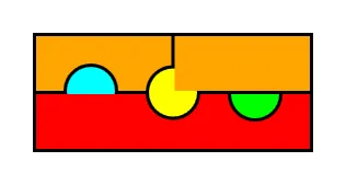
<Canvas Width="256" Height="109" Background="Black"> <Canvas.Resources> <Style TargetType="{x:Type Ellipse}"> <Setter Property="Width" Value="50" /> <Setter Property="Height" Value="50" /> <Setter Property="Stroke" Value="Black" /> <Setter Property="StrokeThickness" Value="3" /> </Style> </Canvas.Resources> <Canvas Canvas.Left="3" Canvas.Top="3" Background="Orange" Width="123.5" Height="50"> <Ellipse Canvas.Top="25" Canvas.Left="25" Fill="Cyan" /> </Canvas> <Canvas Canvas.Left="129.5" Canvas.Top="3" Background="Orange" Width="123.5" Height="50" Panel.ZIndex="1" /> <Canvas Canvas.Left="3" Canvas.Top="56" Background="Red" Width="250" Height="50" ClipToBounds="True"> <Ellipse Canvas.Top="-25" Canvas.Left="175" Fill="Lime" /> </Canvas> <Ellipse Canvas.Top="29.5" Canvas.Left="103" Fill="Yellow" /> </Canvas> This example demonstrates a number of important points, so let's first see the visual output of this code before discussing it:
The top-left rectangle is the output from one canvas and the top-right and bottom ones are from two other canvas instances. They are all contained within a parent canvas element with a black background. The three inner canvases are spaced to give the effect that they each have a border. They have been declared in the order of top-left, top-right, bottom, and the last element to be declared is the middle circle.
The left circle is being drawn in the top-left canvas and we can see where it is overlapping the canvas' apparent bottom border, which shows that it is not being clipped by its parent canvas. However, it is being clipped by the lower canvas element and this demonstrates that UI elements that are declared later will be displayed over the top of earlier declared elements.
Nev...