- 200 pages
- English
- ePUB (mobile friendly)
- Available on iOS & Android
eBook - ePub
About this book
Top performing dotcoms share a common feature. It isn't a new software plug-in or a design gadget or any other piece of technology. These sites share a passionate focus on usability. This book is written by an international usability consultant, writer and trainer who specializes in the design and evaluation of web-based and wireless applications,
Trusted by 375,005 students
Access to over 1.5 million titles for a fair monthly price.
Study more efficiently using our study tools.
Information
Topic
DesignSubtopic
E-Commerce1 Introduction
There are hundreds of books aimed at the people who design web sites. Books that tell you how to write HTML with the very latest editing tools. Books that show you how to design 3D buttons in Adobe PhotoShop. Books that explain how to code in Perl and Java. Books that discuss fashionable mark-up languages, such as XML, DHTML and VRML.
This book takes a different approach: it assumes that the people who use web sites just want an easy life.
This assumption states that people will always choose a simple way of achieving their goals over a complex way. So this book on web site development hardly mentions technology. Instead, it focuses on the customers of the technology: it explains how to design e-commerce sites that ordinary people can use.
Such an approach is sorely needed. There is hardly an area of work or business life that has not been affected by computing technology. But customers of this technology are almost universally ignored. Operating systems crash on a daily basis and applications bail out with an indecipherable error message. Simple and obvious tasks are implemented in ways so convoluted that customers often need to be taught how to carry them out. New versions of software are released that look different – they have more intricate icons, different beeps and swish animated features – but the fundamental problems remain (and new problems are introduced). Is it a coincidence that the only other industry that refers to its customers as ‘users’ (and treats customers with equal contempt) is the drug industry?
E-commerce is the latest development that attempts to persuade customers that technology will make their lives easier. Simple observation lends the lie to this assertion. In offices and homes throughout the world, customers of e-commerce sites are suffering from what I like to call ‘technological Tourette’s syndrome’. Sufferers of real Tourette’s syndrome have a compulsion to swear, twitch and shout. And indeed, customers of e-commerce sites often act the same way.
‘My “cookie expired”? What the **** does that mean?’
‘****! How do I actually buy this thing!’
‘I don’t believe it! This ******* page crashed my browser!’
We see that people who use e-commerce sites grunt, swear and jerk, just like people with real Tourette’s syndrome.
Yet the notion of usability is not new. It was just ahead of its time. Only a few years ago, product manufacturers disregarded usability because the benefits accrue to the people who buy a product, not the people who make it. For example, for a manufacturing company to invest funds in improving the usability of a VCR, the product manager needed to be convinced that consumers base their purchase decision on usability. But everyone knows that if we ask a customer to choose between two VCRs, the customer’s decision is based mainly on features, price and aesthetics. It is only later – when the customer cannot work out how to stop the clock from flashing ‘12:00’ – that usability (or the lack of it) becomes a motivating factor. And by then it is too late.
We can conclude that manufacturers are rarely bothered with optimising usability because they make money from the one-off sale of the product. The costs of poor usability are borne entirely by the ‘user’.
The contempt is almost palpable.
Convergence has tipped this business model on its head. Many products nowadays only generate revenue for companies if they are used. Indeed, some products, such as mobile phones and the set-top box for interactive television, are sold to consumers at a fraction of their manufacturing price – sometimes given away. High-tech companies now make money from people using the product, not buying it: just as razor manufacturers before them discovered that the real market was in the blades, not the razor. This applies in spades for e-commerce sites: if a customer cannot use your site, they will not use your site, no matter how much is spent on advertising and marketing. Conversely, the easier it is for customers to buy, the more customers will buy. In this model, improved usability has short- and long-term benefits for both the company and the individual product manager.
Almost on a monthly basis independent surveys bear this assertion out, highlighting the amount of business lost by sites that are difficult to use. We read that people who want to buy products are unable to because of navigation difficulties: customers are unable to find the correct page to choose the product, or are unable to find the payment option. We read that sites crash, are under construction, or are otherwise inaccessible.
So it is now obvious that web sites need to be usable. The good news is that usability has finally come of age.
The bad news is that usability is perceived as screen design: choosing the correct fonts, colours and icons. In fact, usability is a process: it is not something that can be stapled on at the end of development. To say that usability is about screen design is as erroneous as saying that branding is all about a good logo. Of course screen design plays a role in usability, but it is a small role. This means that optimising the colours, fonts and icons on your site will improve usability by, at best, 15 per cent. It’s like the old adage: you can put make-up on a pig, but it’s still a pig.
Screen design is just one of three important components. Web sites that score high on usability also show a second key feature: consistency. Consistency accounts for about 25 per cent of a web site’s usability. We can all point to annoying inconsistencies in (or between) much of the software we use. For example, the ‘Cut and paste’ operation in Microsoft Excel works differently from every other piece of software – even other Microsoft products. Choose ‘Cut’ in Microsoft Word and the selection disappears. Choose ‘Cut’ in Microsoft Excel and ‘marching ants’ appear around the selection, but it remains where it is. In this example, the inconsistency causes no more than a hesitation (‘Did I choose “Cut” or something else?’), but move the application domain to a nuclear power station or the control room of a chemical plant and one man’s hesitation quickly becomes another man’s environmental catastrophe.
The third component of usability, the remaining 60 per cent, is accounted for by task focus.
You know a web site has task focus when you get a warm feeling that the person who designed the site knew exactly what you wanted to do. The site works the way you expect. There is no need to go searching through menus or dialogue boxes for obscure commands: the main things you want to do are there in front of you – easy to find and simple to carry out. The web site delights you. Another example comes from the world of successful computer games: very quickly, the ‘interface’ disappears and you are exploring the world of the game – the task.
Rules for good visual design are plentiful – you can get them from a book. Using code libraries and then testing against a style guide can achieve consistency. But achieving task focus is much more complicated – it requires a process, and it is the substance of this book.
The process described in this book for ensuring usability is based closely on a recent usability standard, Human-Centred Design Processes for Interactive Systems (BS-EN ISO 13407: 1999). One of the strengths of this standard is that it can be tailored to support existing design methodologies. Because the process is not tied to any one notation or tool set, it can be easily adapted to create models in whichever notation and tool set the programming team uses. By following the human-centred design process described in the standard, project managers, designers and developers can ensure that systems will be effective, efficient and satisfying for customers.
The standard describes four principles of human-centred design:
- 1 active involvement of customers (or those who speak for them);
- 2 appropriate allocation of function (making sure human skill is used properly);
- 3 iteration of design solutions (therefore allow time in project planning);
- 4 multi-disciplinary design (but beware overly large design teams).
… And four key human-centred design activities:
- 1 understand and specify the context of use (make it explicit – avoid assuming it is obvious);
- 2 specify user and socio-cultural requirements (note there will be a variety of different viewpoints and individuality);
- 3 produce design solutions (note plural, multiple designs encourage creativity);
- 4 evaluate designs against requirements (involves real customer testing not just convincing demonstrations).
The standard itself is generic and can be applied to any system or product. This book tailors the process to e-commerce design based on many years’ practical experience. The aim is to describe a practical method to help software developers, project managers, business analysts and user interface designers build better e-commerce sites. The approach is iterative and deliverable-based; forms or designs are completed at the end of each stage, which then constitutes the requirements and design specification for a project.
The book does not assume any background in human factors and usability: its aim is to provide step-by-step guidance to help non-experts carry out each stage of a proven customer-centred design process. The book is based on practical consultancy assignments with a number of clients in the financial and high-technology sectors (including Hewlett-Packard, Telewest, Motorola, The Financial Times, Thomas Cook and Philips).
The customer-centred design process has four steps (see Figure 1.1).
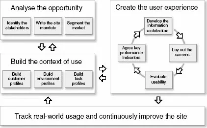
Figure 1.1 The customer-centred design model
A good way to start is with an assessment of your current design method, so I recommend you take the quick test in Chapter 2. This will show the strengths of your current approach and should identify areas for improvement.
Next, turn to the first part of the book that describes how to analyse the opportunity. This stage provides the business context for the web site: within this stage we will identify the stakeholders (Chapter 3), identify why the site is being developed (Chapter 4), and segment the market for the site (Chapter 5).
The second part of the book describes how to build the context of use. This results in a rich description of customers (Chapter 6), the environment in which they access the site (Chapter 7) and a description of realistic activities or ‘task scenarios’ (Chapter 8).
Part three shows how to use these data to create the user experience. This is an iterative process. Chapter 9 starts the process by showing how to develop key performance indicators for the web site: quantitative measures, based on key customer and business requirements, that the management team use to determine if the site is ready to ‘go live’. Chapter 10 describes practical techniques to develop the information architecture (the high-level, conceptual model), with Chapter 11 devoted to laying out the screens (the detailed design), starting with paper sketches and then moving to electronic slide shows or interactive prototypes. Chapter 12 shows how to evaluate the site’s usability, by using both usability experts and representative customers.
The final step in the process, described in the last part of the book, is to track real-world usage and continuously improve the site once it has been deployed.
This book aims to present a concise summary of each of these areas. Readers who are keen to learn more will hopefully find the concluding sections of each chapter, ‘Further reading and weblinks’, useful. To help you decide if a weblink is truly useful before firing up your browser, I have tried to annotate most of them with direct quotations from the article. The final chapter of the book provides some practical ideas on ways to apply the techniques immediately.
There are four key benefits from a customer-centred approach: higher revenues, loyal customers, improved brand value and process improvement.
- Higher revenues:
- fewer changes downstream means earlier time to market;
- earlier time to market brings competitive advantage;
- customers use all of the site’s functionality, not just a sub-set;
- early and continuous customer involvement reduces lifecycle costs;
- customers cost less to service (they won’t need to phone up to check their order went t...
Table of contents
- Cover Page
- Essential readings from Taylor & Francis:
- Title Page
- Copyright Page
- List of figures
- List of tables
- Preface
- Acknowledgement
- 1 Introduction
- 2 Is your site customer centred?
- Part I: Step 1: Analyse the opportunity
- Part II: Step 2: Build the context of use
- Part III: Step 3: Create the user experience
- Part IV: Step 4: Track real-world usage and continuously improve the site
- Appendices
Frequently asked questions
Yes, you can cancel anytime from the Subscription tab in your account settings on the Perlego website. Your subscription will stay active until the end of your current billing period. Learn how to cancel your subscription
No, books cannot be downloaded as external files, such as PDFs, for use outside of Perlego. However, you can download books within the Perlego app for offline reading on mobile or tablet. Learn how to download books offline
Perlego offers two plans: Essential and Complete
- Essential is ideal for learners and professionals who enjoy exploring a wide range of subjects. Access the Essential Library with 800,000+ trusted titles and best-sellers across business, personal growth, and the humanities. Includes unlimited reading time and Standard Read Aloud voice.
- Complete: Perfect for advanced learners and researchers needing full, unrestricted access. Unlock 1.5M+ books across hundreds of subjects, including academic and specialized titles. The Complete Plan also includes advanced features like Premium Read Aloud and Research Assistant.
We are an online textbook subscription service, where you can get access to an entire online library for less than the price of a single book per month. With over 1.5 million books across 990+ topics, we’ve got you covered! Learn about our mission
Look out for the read-aloud symbol on your next book to see if you can listen to it. The read-aloud tool reads text aloud for you, highlighting the text as it is being read. You can pause it, speed it up and slow it down. Learn more about Read Aloud
Yes! You can use the Perlego app on both iOS and Android devices to read anytime, anywhere — even offline. Perfect for commutes or when you’re on the go.
Please note we cannot support devices running on iOS 13 and Android 7 or earlier. Learn more about using the app
Please note we cannot support devices running on iOS 13 and Android 7 or earlier. Learn more about using the app
Yes, you can access E-Commerce Usability by David Travis in PDF and/or ePUB format, as well as other popular books in Design & E-Commerce. We have over 1.5 million books available in our catalogue for you to explore.