1.1 Why interactive web graphics from R?
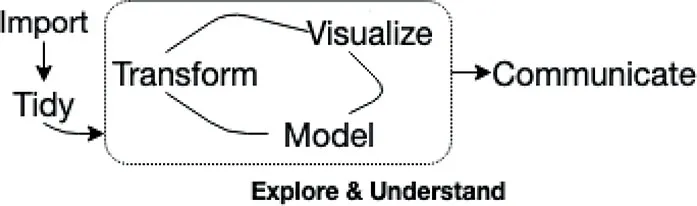
As Wickham and Grolemund (2016) argue, the exploratory phase of a data science workflow (Figure 1.1) requires lots of iteration between data manipulation, visualization, and modeling. Achieving these tasks through a programming language like R offers the opportunity to scale and automate tasks, document and track them, and reliably reproduce their output. That power, however, typically comes at the cost of increasing the amount of cognitive load involved relative to a GUI-based system.1 R packages like the tidyverse have been incredibly successful due to their ability to limit cognitive load without removing the benefits of performing analysis via code. Moreover, the tidyverse’s unifying principles of designing for humans, consistency, and composability make iteration within and between these stages seamless – an important but often overlooked challenge in exploratory data analysis (EDA) (Tidyverse team, 2018).
In fact, packages within the tidyverse such as dplyr (transformation) and ggplot2 (visualization) are such productive tools that many analysts use static ggplot2 graphics for EDA. Then, when it comes to communicating results, some analysts switch to another tool or language altogether (e.g., JavaScript) to generate interactive web graphics presenting their most important findings (Yau, 2016; Quealy, 2013). Unfortunately, this requires a heavy context switch that requires a totally different skillset and impedes productivity. Moreover, for the average analyst, the opportunity costs involved with becoming competent with the complex world of web technologies is simply not worth the required investment.
Even before the web, interactive graphics were shown to have great promise in aiding the exploration of high-dimensional data (Cook et al., 2007). The ASA maintains an incredible video library, http://statgraphics.org/movies/, documenting the use of interactive statistical graphics for tasks that otherwise wouldn’t have been easy or possible using numerical summaries and/or static graphics alone. Roughly speaking, these tasks tend to fall under three categories:
• Identifying structure that would otherwise go missing (Tukey and Fisherkeller, 1973).
• Diagnosing models and understanding algorithms (Wickham et al., 2015).
• Aiding the sense-making process by searching for information quickly without fully specified questions (Unwin and Hofmann, 1999).
Today, you can find and run some of these and similar Graphical User Interface (GUI) systems for creating interactive graphics: DataDesk https://datadescription.com/, GGobi http://www.ggobi.org/, Mondrian http://www.theusrus.de/Mondrian/, JMP https://www.jmp.com, Tableau https://www.tableau.com/. Although these GUI-based systems have nice properties, they don’t gel with a code-based workflow: any tasks you complete through a GUI likely can’t be replicated without human intervention. That means, if at any point, the data changes, and analysis outputs must be regenerated, you need to remember precisely how to reproduce the outcome, which isn’t necessarily easy, trustworthy, or economical. Moreover, GUI-based systems are typically ‘closed’ systems that don’t allow themselves to be easily customized, extended, or integrated with another system.
Programming interactive graphics allows you to leverage all the benefits of a code-based workflow while also helping with tasks that are difficult to accomplish with code alone. For an example, if you were to visualize engine displacement (displ) versus miles per gallon (hwy) using the mpg dataset, you might wonder: “what are these cars with an unusually high value of hwy given their displ?”. Rather than trying to write code to query those observations, it would be easier and more intuitive to draw an outline around the points to query the data behind them.
library(ggplot2)
ggplot(mpg, aes(displ, hwy)) + geom_point()
Figure 1.3 demonstrates how we can transform Figure 1.2 into an interactive version that can be used to query and inspect points of interest. The framework that enables this kind of linked brushing is discussed in depth within Section 16.1, but the point here is that the added effort required to enable such functionality is relatively small. This is important, because although interactivity can augment exploration by allowing us to pursue follow-up questions, it’s typically only practical when we can create and alter them quickly. That’s because, in a true exploratory setting, you have to make lots of visualizations, and investigate lots of follow-up questions, before stumbling across something truly valuable.
library(plotly)
m < – highlight_key(mpg)
P < – ggplot(m, aes(displ, hwy)) + geom_point()
gg < – highlight(g...