![]()
SECTION II
Design
![]()
4
Psychology of Color
Introduction
Brain Stimulation
Visual Perception of the Brain
Color System
Color Theory
References
Introduction
Color is part of our daily routine, from our waking life and imagination to our dreams. The meaning of color starts from our general perspective. For example, the sun is yellow, which we know without thinking. We have seen the sun so many times that it is part of our subconscious minds. But the meaning of yellow in our dreams is an entirely different answer; each person will react to yellow from a different perspective. Do they have a fear of yellow, or perhaps a negative or positive association with it? In this case, the meaning of yellow will vary from individual to individual.
We do not discuss in depth how to understand color’s various levels and types of meaning. Instead, we analyze the human visual experience solely in the context of interaction with interfaces. We cannot classify and define all colors, because everyone has a different relationship to color based on past experience. Therefore, we consider the basics of color and their general meanings, which may vary according by country and culture.
Considered psychologically, color is a nonvocal, purely visual means of communication. In design, color is similar to typefaces. How you use color—darker or lighter—creates a personality that complements the content, including the images and typography. The color or colors used speak to the user just as much as the type itself. It is important to make a decision early in your project about what color or colors to use in the interface, because without color the interface would be incomplete.
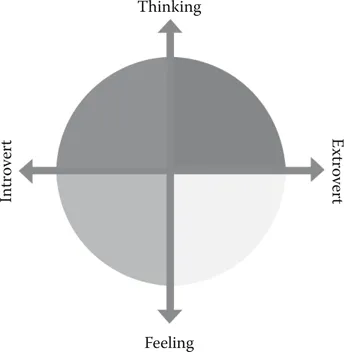
Figure 4.1
(See color insert.) Color energies diagram.
Brain Stimulation
The use of color creates different dimensions of depth within the hierarchy and identity of the UI. The user not only accesses information but also receives subconscious and psychological messages from the colors in the UI that are related specifically to the user.
Each type of color stimulates different parts of our brain, such as the following:
1. Anger
2. Hunger
3. Happiness
4. Worry
5. Fatigue
6. Excitement
7. Concentration
Swiss psychologist Carl Jung identified four color energies that define our temperaments: cool blue, earth green, sunshine yellow, and fiery red (“Can Color Really Change How You Feel and Act?” 2016). Everyone has characteristics of all these colors, but some people have less of some colors and more of others. Therefore, there is no perfect equation defining universal color psychology, but the characteristics may be used to keep testing (“Can Color Really Change How You Feel and Act?” 2016).
The four main energy characteristic colors are listed below with their meanings and how our bodies and minds react to them (Figure 4.1).
Cool blue: cautious, precise, deliberate, questioning, formal
Earth green: caring, encouraging, sharing, patient, relaxed
Sunshine yellow: sociable, dynamic, demonstrative, enthusiastic, persuasive
Fiery red: competitive, demanding, determined, strong-willed, purposeful
A wide range of theories from culture, science, and religion can help us understand how to use colors. In applying color to user interfaces, we must consider some of these aspects to match the use of color to the user interface (Meerwein, Rodeck, and Mahnke 2007).
Visual Perception of the Brain
The relationships between visual perception and interfaces have evolved rapidly since early digital-computing interfaces, including the way in which we interact with them. The ergonomics of visual interaction in the past usually involved sitting at a desk. Now, however, we have interfaces almost everywhere, from cars to ATM machines. Our entire environment involves interfaces, one way or another, whether we are young or old.
Our brain required adjustment to all these changes. Not all screens are the same. In 1990, computer screens were very low in resolution compared with today because of computers’ memory capacities. Our visual perception has adjusted accordingly.
Color System
Digital interfaces use the RGB color system, which stands for red, green, and blue. Zooming into any screen, you can see how RGB pixels are arranged to create colors. This process is called additive color, which is a very different method compared with using oils or any other type of physical paint. Physical colors are mixed to create subtractive color, which is based on red, yellow, and blue as primary. We use both types of color systems daily, from watching TV to reading a printed book. Figure 4.2 shows how the process of light creates the various colors we distinguish with our eyes.
Figure 4.2
(See color insert.) Red, green, and blue mixed on a screen, which always contains a black background. Mixing all three colors yields white.
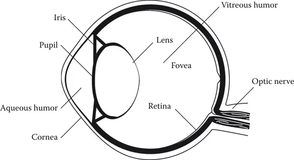
The wonderful miracle of our visual system allows us to enjoy, interact, and experience the world around us. This system comprises two main parts: first, the brain, which does all the complex processing of imagery, and second, the eye, which receives light rays in the visual wavelengths of the electromagnetic spectrum, usually 300–700 nm (Figure 4.3). The eye receives light and sends an electrical signal to the brain through the optic nerve. Light passes through the eye in the following order: cornea, aqueous humor, iris, lens, vitreous humor, and finally retina.
Figure 4.3
Diagram of the eye.
The cornea is a transparent layer. The iris creates a round aperture, varying in size. When bright light enters the eye, the iris gets smaller, while when it is dark, the iris dilates and expands. The fovea is the area where human vision is the sharpest. The retina recog...