![]()
CHAPTER 1
Compiling the Data:
How to Make It All Make Sense
In God we trust. All others must bring data.
—Robert W. Hayden
Compilation of the Data:
Knowing What Data to Analyze
With so many fancy programs on data analysis around, there are many different options when it comes to looking at data. Before deciding on one of these programs you first need to decide what data to analyze. An easy place to start would be data that come to you at regular intervals throughout a school year, with time in-between to really impact instruction. That type of data may come from short-cycle assessments, content unit tests, assessment of learning targets, quizzes, or even midterm exams. It is important that you have time to analyze the data before another assessment is given, and that you have time to change something instructionally before you test again. For the sake of example, let’s use short-cycle assessments. In your school these may be called quarterly assessments or common assessments, or even benchmark assessments. These are assessments that test certain standards that have been taught over a given amount of time. Quarterly assessments given four times a year allow a lot of time for instructional changes, but don’t think that just because you’re looking at quarterly data you have a whole quarter of a year to analyze it. In order for the analysis of data to be effective, it must be done quickly. Remember, old data is cold data and that means the analysis should be done within a couple of weeks of the administration of the assessment. A chart titled A Practical Data Analysis Timeline, on page 73, which describes the different timelines of the data analysis process, is included for you in the Blueprints section of this book. Basically it follows the premise that you give an assessment, you analyze the data within a set time frame, and then intentionally change something you do before you reassess at the end of the next time period.
Tip: One way to determine which data to analyze is to list all your sources of data and then rank them according to which ones most impact your instruction. The # 1 ranked data should be the first one that you analyze.
Compilation of the Data:
Knowing How to Visually Represent the Data
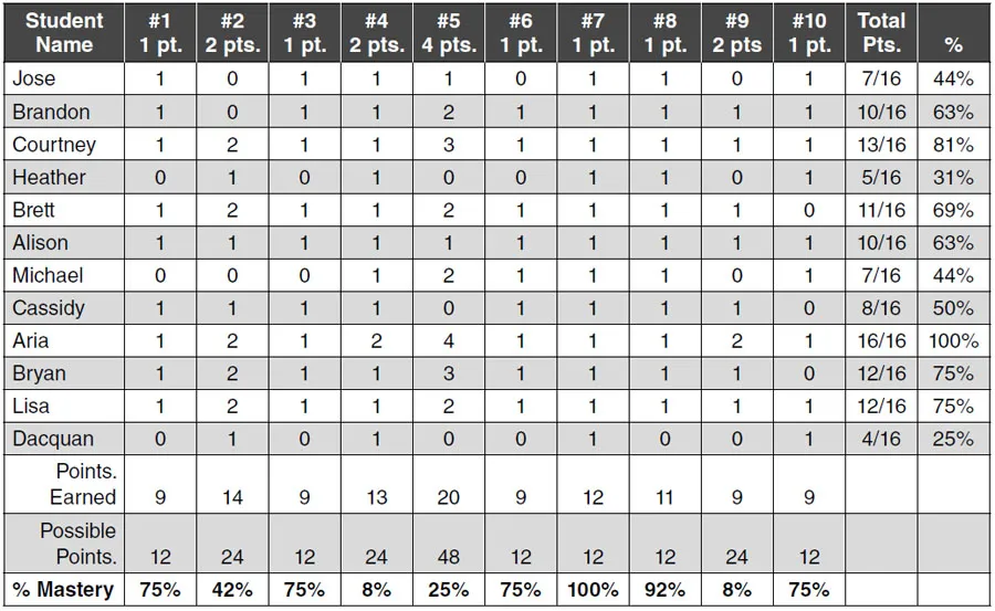
Once you’ve selected the assessment data to analyze, the question becomes how to visibly organize the data so that you have the best “view” of it. Depending on how data-savvy you are this can be anything from a class profile graph to a simple data chart. The important thing is that your main piece of data is very comprehensive and holistic. In other words, you don’t want your main representation to be a graph that includes many different subgroups, or categories; instead, it should be a simple chart that includes all of the student scores on one page. Figure 1.1 shows a simple data chart in which the students’ names are listed as well as their scores for each test item. The scores reflect the number of points the student scored on each question. If the question is worth two points, and a “1” is placed in the box, that means the student scored one of the two points on that question. Study Figure 1.1.
According to this data chart only one student earned the maximum number of points (4) on question #5, while all of the students earned the maximum number of points (1) on question #7. Notice also that only 1 student out of 12 got all of the questions correct, while 5 out of 12 scored below 50%. Finally, notice that the percent of mastery for each item requires that the student earn both points on the 2-point questions, and 3 or 4 points on the 4-point questions to be considered true “mastery.”
Figure 1.1 represents a clear, concise representation of the data. For your convenience, a blank Assessment Data Chart is provided for you on page 74 in the Blueprints section.
Representing the Data:
The Class Profile Graph
When thinking about how to compile your data sometimes the old saying “less is more” rings true. You can get so bogged down in charts and graphs that many times you lose track of what’s what. If you’re a person new to looking at data, then you’re going to want to keep it simple. The Data Chart has everything you need to be able to analyze your data. You don’t need any other graphs or charts. With that being said, sometimes it’s helpful to see the data through different graphical representations.
■ Figure 1.1 Assessment Data Chart
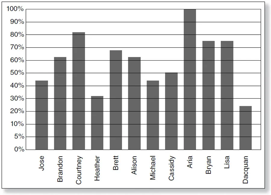
If you’re a person already familiar with looking at data, or you’re a really strong visual learner, you might want to compile the data in different ways. The next logical way of looking at the data would be to take the information from the Data Chart and compile a Class Profile Graph. A Class Profile Graph is a bar graph that shows the overall percentage score for each student on that assessment. An example of a Class Profile Graph using the data from Figure 1.1 is shown in Figure 1.2 on page 4. Notice that this graph doesn’t give you any information as far as the individual items. It does, however, give you an overall look at your class.
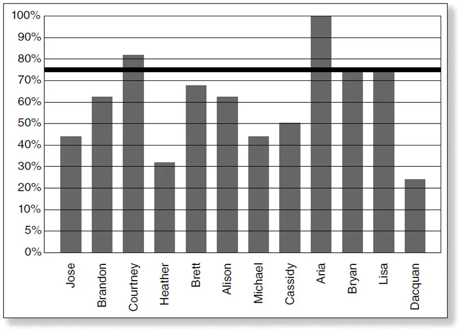
Once you have compiled your data into a Class Profile Graph, you can add different criteria to it to make it more detailed. For example, you can add a line at whatever percentage you consider to be “proficient.” This has been done for the graph in Figure 1.3 on page 4.
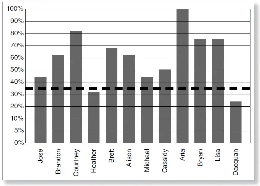
This may be 75% or 80%—whatever you deem “mastery.” You also may want to add a line at the percentage mastery for your state test; e.g., if the state cut percentile for a test is 35%, that means the students need to score 35% or above on the state test to be considered “passing.” An example of a cut score graph is shown in Figure 1.4.
■ Figure 1.2 Class Profile Graph (Overall Percentage Score for Each Student)
■ Figure 1.3 Class Mastery Graph (Overall Percentage Score for Each Student with the Line for Mastery)
■ Figure 1.4 Class Cut Score Graph (Overall Percentage Score for Each Student with the Line for Cut Score)
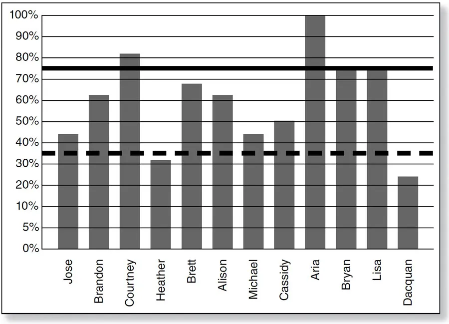
Another way to compile the data for a Class Profile graph would be to place both the cut percentage and the percentage considered “mastery” on the same graph. Figure 1.5 on page 6 shows what that type of graph would look like.
A logical recommendation would be that you try out different types of Class Profile Graphs and find one or two that help you best understand your data. A blank Class Profile Graph has been provided for you on page 75 in the Blueprints section.
Tip: If you choose to share this graph with parents or students, simply replace each of the student names with a number. This will help to insure anonymity.
Representing the Data:
The Item Analysis Graph
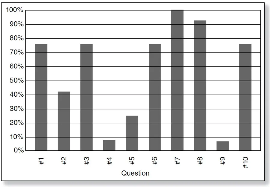
Many of us like to know how our students performed on individual items. The information on the Assessment Data Chart can easily be compiled into an Item Analysis Graph. An Item Analysis Graph reflecting the data from the Data Chart in Figure 1.1 is shown in Figure 1.6 on page 6.
■ Figure 1.5 Class Mastery and Cut Score Graph (Overall Percentage Score for Each Student with the Line for Mastery and the Line for the Cut Score)
■ Figure 1.6 Item Analysis Graph (Percentage of Class for Mastery of Each Item )
This graph will show at a glance how the entire class performed on each individual item with regard to mastery. It will go a long way in determining the format of the questions the class...