This collection offers an expansive, multiplatform exploration of the rapidly-expanding area of motion design and motion graphics, taking into account both theoretical questions and creative professional practice. Spanning interaction design, product interfaces, kinetic data visualizations, typography, TV and film title design, brand building, narrative storytelling, history, exhibits and environments, editors R. Brian Stone and Leah Wahlin offer an interdisciplinary range of academic essays and professional interviews that together form a dialogue between motion design theory and professional practice.
Written for both those critically engaged with motion design as well as those working or aspiring to work professionally in the field, the book features a range of international contributors and interviews with some of the best-known designers in the field, including Kyle Cooper, Karin Fong, and Daniel Alenquer.
The Theory and Practice of Motion Design seeks to illuminate the diverse, interdisciplinary field of motion design by offering a structured examination of how motion design has evolved, what forces define our current understanding and implementation of motion design, and how we can plan for and imagine the future of motion design as it unfolds.
An accompanying online resource site, www.motionresource.com, contains visual representations of the examples described in the text.
Trusted by 375,005 students
Access to over 1.5 million titles for a fair monthly price.
“Motion is an abstract language with the potential of being understood across cultures, so it follows that type in motion may point to a form of communication without boundaries. How that form evolves remains to be seen.”
It is known by different names—type in motion, motion graphics, kinetic typography, moving letters, and so on. What the names describe is a computer or movie screen filled with type that moves around, letterforms that morph, or words that appear and disappear to a musical beat. On the quieter side, there are measured sequences of words that tell a story, give instructions, or reveal a poem in silence. Examples today abound in film titles, music videos, television advertisements, web sites, apps, and information/service kiosks.
What is common to these examples is typography that doesn’t stand still. In contrast to static or fixed type in printed matter, where ink is married to paper, type that relies on time as a design element produces dynamic form that is synonymous with new media, movies, and computers. These forms, shaped by time and motion, are often compared to performances of dance, music, and theater. There has never been a time when this much attention has been paid to type in motion. We have books and articles on the subject, courses of study, design firms specializing in motion graphics, and conferences and exhibitions devoted to showing and understanding this work. Motion is an abstract language with the potential of being understood across cultures, so it follows that type in motion may point to a form of communication without boundaries. How that form evolves remains to be seen.
While we celebrate type in motion today, with easy access on our screens, it is instructive to look back over history to understand our fascination with motion and our attempts to capture and replicate it. Some of the earliest marks made by Western man in caves located in France and Spain attempt to depict hunts in progress. Hunters chase a large animal, shooting arrows at it, a scene forever frozen in time. Life is motion and artists over history have attempted to portray events in life, often by capturing a moment or a movement in time. The results have been paintings and sculptures, stories and dances, and more recently, photographs and films. In a 1956 Paris Review interview, the writer William Faulkner observed, “The aim of every artist is to arrest motion, which is life, by artificial means and hold it fixed so that a hundred years later, when a stranger looks at it, it moves again since it is life” (Stein, 1956).
Dynamic typography precedents
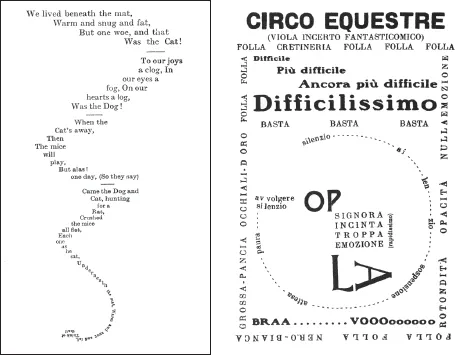
Graphic designers have a rich legacy of book design to build upon. Long before the advent of the moving picture (movies) in 1895, there were occasional attempts at giving life to type in print. A delightful example is Lewis Carroll’s contribution, in his 1865 book Alice’s Adventures in Wonderland, to visualize “The Mouse’s Tale” which sets words in the shape of a mouse’s tail. This 19th century “example of the use of typographic form to reflect the subject of the text” (Spencer, 1983, p. 12) is exploited by Guillaume Apollinaire fifty years later in France with his Calligrammes (visual poetry), explorations in creating pictures with typographic arrangements. Setting type in prescribed shapes was not new; early handset books in Europe, for example, sometimes set the colophon, at the end of the book, in a particular shape, more for visual effect than semantic rationale. But in Carroll’s “The Mouse’s Tale,” word and image are one, a unique fusion of the verbal and visual (Figure 1).
The Futurists and Dadaists in the early decades of 20th century Europe wrestled with typography in ways that challenged the vertical and horizontal strictures of the printed page. They used type to visually suggest sound and motion, as in Lucio Venna’s 1917 piece, “Circo Equestre.” Here, dynamic composition captures the liveliness of a one-ring circus, complete with words like “Silenzio!” and “Braa…..voooooo!” that are yelled out by the ringmaster and the crowd. Type becomes image, and we are given the chance to see and hear the excitement of the event (Figure 2).
Figure 1, 2 “The Mouse’s Tale” from Alice’s Adventures in Wonderland by Lewis Carroll (1865). (left), “Circo Equestre” by Lucio Venna (1917). (right)
Source: Spencer, 1983, p. 12.
Source: Spencer, 1983, p. 23.
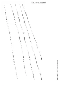
Another classic example is Apollinaire’s 1916 “Il Pleut/It’s Raining” (Figure 3), which draws diagonal lines of rain with words. Drawing pictures with type, sometimes referred to as concrete poetry, was but one avenue in this rebellion against typographic convention; other avenues included dynamic page compositions that featured a range of typefaces, sizes, weights, and arrangements. As the century progressed, other designers and artists, such as Malevich, Lissitzky, Zwart, and Tschichold, continued this assault on convention with their dynamic, expressive, and asymmetrical typography.
Figure 3 “Il Pleut/It’s Raining” by Guillaume Apollinaire (1916).
Source: Spencer, 1983, p. 19.
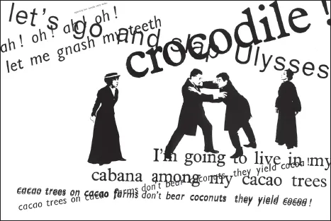
Massin’s The Bald Soprano in 1964—a book that re-presents Eugene Ionesco’s absurdist play in printed words and images—raises dynamic typography to a new level. Massin’s visually rich rendering of the spoken word allows the reader to hear different actors speak their lines in a far more engaging and faithful manner than conventional type ever could (Figure 4). It is sobering to appreciate the fact that this dynamic typography was achieved long before computers arrived on the scene to help “manipulate” type. The lesson here is that the tool is ultimately less important than the idea. True, while today’s computers and software afford us a playground for broad exploration, that exploration has to be driven by an idea, often a desire to try something new, unconventional, and even absurd. The marriage of new thinking with new technologies has long been part of our history.
Figure 4 Massin’s visualization of Ionesco’s play The Bald Soprano.
Source: Ionesco, 1964
How it started for me
As a graphic designer educated in the United States in the mid-1960s, I learned about typography, photography, illustration, and the thoughtful and skillful arrangement of those elements on single or multiple pages. These were formal, aesthetically-driven considerations, with occasional technical questions when we dealt with pre-press and printing issues. We never discussed time as an element for consideration, except in the context of deadlines. While in school, my heroes consisted of graphic designers like Glaser and Rand, photographers like Avedon and Penn, illustrators like Saul Steinberg, Folon, and the San Francisco psychedelic poster artists, musicians like the Beatles, Dylan, and Reich, and film directors like Fellini, Bergman, Ray, and Kurosawa. They all fed my visual and cultural education, the effects of which would not be felt for a decade or more.
Like most everyone, I grew up watching movies, both live action and animated, which I loved. Time as a design element became relevant when I began experimenting with a 16-mm movie camera and basic animation in graduate school in the early 1970s. I delighted in manipulating countless individual images, each with a minor change, and viewing them at 24 frames a second to produce the illusion of movement. Moving shapes, colors, and textures fascinated me, as did resulting patterns and rhythms. I discovered that I could work with time as a design element, one that I could control with as much precision as needed to produce the desired visual effect. 24 frames a second became the grid for decisions on speed, pacing, rhythm, and duration of elements on the screen. To quote a student I taught many years later, “I now appreciate how long and how short a second really is.” My heroes then were experimental filmmakers like Sharits, Emschwiller, Brackage, and especially McLaren.
Norman McLaren, an animator at the National Film Board of Canada, produced visually stunning and technically challenging short films during his 46 years at the Film Board, from 1941 to 1987. A unique technique of his was to work directly on clear film strips, by painting or scratching with a variety of paints and tools, allowing him to bypass the camera entirely. By projecting the resulting sequences, he created pure film motion—animated painting in the purest sense. This avenue of exploration into often abstract film animation has today been eclipsed by the more commercially lucrative animated stories of the Disney and Pixar kind. Thankfully, there has always existed a fringe element of experimental animators pushing the boundaries of the medium and ever-evolving technology.
As a grad student, I emulated McLaren’s way of working by applying strips of Letraset dots directly on clear 16mm film. Like McLaren, I didn’t know what the resulting film would look like until projecting it. A love of experimentation drove me to continue trying out different patterns of dots, combinations of dots, and even dots on the sound track, another McLaren trick of producing hand-made sound.
Kinetic typography
Fast-forward to 1994, when I was preparing an assignment for an Advanced Typography course at Carnegie Mellon. I realized that I was limiting students to type on paper, not unlike the way I was taught thirty years before. I wondered why I wasn’t dealing with type in new formats and environments—for example, type that moved, similar to what we see in movies, on television, and computer screens. Why not liberate type from the page and give it motion and life? I also had in hand an early version of MacroMind Director, so I came up with a project that tasked the students to visualize spoken words in a dynamic way, making use of this new software. The results were stunning!
These early examples fell into two categories. One group used time to sequence the appearance of words or phrases in meaningful ways, while the other used time to animate words and move them across the screen. The key factor in all of them was the control available in making a word, phrase, or punctuation appear precisely when the designer wanted the viewer to see them. Each method produced videos that communicated ideas and feelings in ways unique to the time-based medium of computers. When comparing the differences between paper-based and computer-based communication, it became clear that the former dealt with the presentation of words on a page, words fixed in position, never changing. The latter dealt with a controlled presentation of words, based more closely on the spoken word than the printed word.
Visually interpreting spoken word is similar to live performance. Students start the project by reading their words out loud, listening carefully to their speed, volume, and pacing, then visually notating the written text. This notated text becomes the basis for early storyboards of how the...
Table of contents
Cover
Half Title
Title Page
Copyright Page
Author Notes & Acknowledgements
Table of Contents
Introduction: The Theory and Practice of Motion Design
Part 1: Theoretical Perspectives
Part 2: Practice & Application
Index
Frequently asked questions
Yes, you can cancel anytime from the Subscription tab in your account settings on the Perlego website. Your subscription will stay active until the end of your current billing period. Learn how to cancel your subscription
No, books cannot be downloaded as external files, such as PDFs, for use outside of Perlego. However, you can download books within the Perlego app for offline reading on mobile or tablet. Learn how to download books offline
Perlego offers two plans: Essential and Complete
Essential is ideal for learners and professionals who enjoy exploring a wide range of subjects. Access the Essential Library with 800,000+ trusted titles and best-sellers across business, personal growth, and the humanities. Includes unlimited reading time and Standard Read Aloud voice.
Complete: Perfect for advanced learners and researchers needing full, unrestricted access. Unlock 1.5M+ books across hundreds of subjects, including academic and specialized titles. The Complete Plan also includes advanced features like Premium Read Aloud and Research Assistant.
Both plans are available with monthly, semester, or annual billing cycles.
We are an online textbook subscription service, where you can get access to an entire online library for less than the price of a single book per month. With over 1.5 million books across 990+ topics, we’ve got you covered! Learn about our mission
Look out for the read-aloud symbol on your next book to see if you can listen to it. The read-aloud tool reads text aloud for you, highlighting the text as it is being read. You can pause it, speed it up and slow it down. Learn more about Read Aloud
Yes! You can use the Perlego app on both iOS and Android devices to read anytime, anywhere — even offline. Perfect for commutes or when you’re on the go. Please note we cannot support devices running on iOS 13 and Android 7 or earlier. Learn more about using the app
Yes, you can access The Theory and Practice of Motion Design by R. Brian Stone, Leah Wahlin, R. Brian Stone,Leah Wahlin in PDF and/or ePUB format, as well as other popular books in Media & Performing Arts & Film & Video. We have over 1.5 million books available in our catalogue for you to explore.