Information Design provides citizens, business and government with a means of presenting and interacting with complex information. It embraces applications from wayfinding and map reading to forms design; from website and screen layout to instruction. Done well it can communicate across languages and cultures, convey complicated instructions, even change behaviours. Information Design offers an authoritative guide to this important multidisciplinary subject. The book weaves design theory and methods with case studies of professional practice from leading information designers across the world. The heavily illustrated text is rigorous yet readable and offers a single, must-have, reference to anyone interested in information design or any of its related disciplines such as interaction design and information architecture, information graphics, document design, universal design, service design, map-making and wayfinding.
eBook - ePub
Information Design
Research and Practice
- 750 pages
- English
- ePUB (mobile friendly)
- Available on iOS & Android
eBook - ePub
Information Design
Research and Practice
About this book
Trusted by 375,005 students
Access to over 1 million titles for a fair monthly price.
Study more efficiently using our study tools.
Information
Topic
DesignSubtopic
Business GeneralPart 1
Historical perspectives
1
Early visualizations of historical time
‘To see at one glance all the centuries that have passed’
Information design: research and practice, pages 3–22
This chapter focuses on the visualization of historical time, illustrated by key examples from the eighteenth century when the modern timeline was invented. We are fortunate in having not only surviving examples of printed timelines from the period but also explanations written by their makers, revealing the ambitions they had for visualization. An important divergence is evident, between those who want to use rhetorical visual metaphors to tell a graphical story, and those who prefer to let the data ‘speak for itself’, allowing patterns to emerge from the distribution of data points across a surface.
Emergence of the modern timeline
Timelines are routinely used to represent history, plotting events chronologically.1 In the eighteenth century, the first modern timelines replaced typographic representations of historical time such as lists and tables on the one hand, or symbolic shapes on the other. These designs made novel use of space, in formats that we continue to recognize in modern information visualization. In doing so they reflected a changed model of how time is conceived, one where the past is a uniform, arithmetic space in which events are situated.
Perhaps the simplest representation of past time is the list. Events are named, and maybe dated, in sequential order, and are organized as a row or column. Even now, the name ‘timeline’ is regularly used for such lists, in which events are packed close on one another, and the space occupied by each event is a simple outcome of the size of the label or description. Such lists tell us about order, and not much else. A significant step up in representational capacity is the table or matrix. These make it possible to coordinate multiple lists in time, showing not only sequence but synchrony. A landmark is Eusebius’s chronicle of c.300, which synchronized Christian history with that of the pagans and Jews in a series of parallel columns (Feeney 2007, 29). Such matrices still fail to offer two important pieces of information: the intervals between events and an overall sense of scale. Only by mapping time arithmetically can these features of history be represented; they appear in the true timelines that emerged in the early to mid eighteenth century. Within these designs, a range of graphical rhetorical devices was available to highlight trends, connections, and influences. These continued an alternative tradition that was not based on lists or tables but used vivid figurative images to represent the shape of history. Examples from across the centuries appear in Rosenberg and Grafton’s Cartographies of time (2010), including chains (p. 39), trees (p. 50, p. 57), the hand (p. 51), the body (p. 55), architecture (p. 80), and animals (p. 91). Those authors who eschewed such figurative imagery preferred to use only the patterns, empty spaces, outliers, and other shapes that emerge from spatially organizing the data against time and other measures. The innovative examples presented here fall mainly into the latter category.
In our own time, two similar contrasting approaches to visualization can be identified. At one extreme lies the designer who does not trust the reader or viewer to engage with the ‘story’ unless given vivid visual clues. Such clues have been memorably characterized as ‘chart junk’ by Edward Tufte (1983), though it should be said that there is no simple equation: decorated charts bad, undecorated good. There has been considerable debate, and experimental investigation, concerning the possible value of rhetorical images in visualization (e.g. Bateman et al. 2010; Borgo et al. 2012; Borkin et al. 2012; Hullman, Adar, and Shah 2011; Inbar, Tractinsky, and Meyer 2007; Vande Moere and Purchase 2011; Vande Moere et al. 2012). This may be seen as part of a broader question concerning how far all design is a form of rhetoric (Buchanan 1985), pursued in specific contexts by, for example, Joost and Scheuermann (2006), Crilly et al. (2008), Kostelnick (2008), Lockton, Harrison, and Stanton (2008), and Wrigley, Popovic, and Chamorro-Koc (2009). In the chronographics of the eighteenth century, two contrasting approaches to visualization are already apparent – those adopting strongly authorial visual structures tending to tell the viewer what to think, and those where the patterns in the data are allowed to emerge more automatically.
Christoph Weigel’s Discus chronologicus: a mechanical model of history
In 1720 Christoph Weigel of Nuremberg (1654–1725) published a Discus chronologicus that epitomizes a mechanical, unadorned approach to historical data. It organizes history from the birth of Christ down to the author’s own time as though it were a clock face. The sequence of years begins and ends not at the top but at the left of the dial. Concentric rings represent each of fourteen European kingdoms. This clock has a hand: a paper pointer fastened at the centre that can be rotated, so that the reader is always certain which ring represents which kingdom (Figure 1).
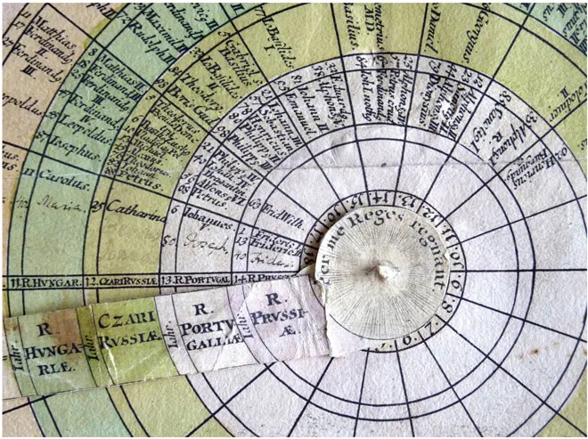
Figure 1 Weigel, Christoph. 1720. Discus chronologicus. Nuremberg: Weigel. 51 × 49 cm. Detail.
Collection: Stephen Boyd Davis. Photograph: Stephen Boyd Davis.
The spandrels are filled with a textual explanation drawing attention to the chart’s features. The claims made by Weigel will be repeated by many subsequent authors of diagrams of time. It is worth quoting his whole opening sentence: ‘In order to understand and use this round chronological table properly it should be noted that it was our goal to present together on a single sheet all emperors and kings in the European empires flourishing in the years of Christ, along with the Roman popes, in their correct year order and succession, beginning from the Nativity down to current times, in such a way that one can see in one effortless view which rulers reigned in the same time together.’2 These claims are, then: that all the knowledge is condensed within a single sheet; it may be seen in one view; its use is effortless; and it represents both sequence and synchrony of the historic events represented. The sense of a large body of knowledge, even a totality, being brought under a single gaze, in which information is more or less effortlessly acquired, will recur through the remainder of the century and beyond.
Weigel makes no attempt to shape the sequences of events into any narrative beyond that which simply emerges from seeing time flow from year to year around the dial, and from being able to see, with the help of the ruler, when events in different kingdoms coincide. We can speculate on the reasons why his chart has this abstemious form, forgoing figurative metaphor. The clock is an obvious influence. While clock faces were sometimes decorated, and often surrounded by figurative allusions to time and fate, clocks are essentially machines, modelled on – and arguably producing – a mechanical model of undifferentiated time (Dohrn-van Rossum 1996; Sherman 1996). It is significant that such a model of uniform time should be applied by Weigel not just to the time of day but to history. It is really only with Newton that the idea takes hold of time as ‘absolute, true, and mathematical’ (Newton 1687), part of a general shift to quantification and a growing admiration for mechanical systems and principles (Boyd Davis 2010; Crosby 1997). Newton himself spent thirty years working on the chronology of ancient kingdoms (Buchwald and Feingold 2012), a synthesis of his mathematical and occult interests – though he seems never to have made a diagram of history.
More than a hundred years earlier, Helvicus (1581–1617) had consciously departed from the traditional packed table of history that gave no sense of scale or interval, by using each double-page spread of his Theatrum historicum to represent exactly one hundred years. A phrase from Weigel’s rubric, ‘in equal intervals of centuries’ (‘aequalibus seculorum intervallis’, Weigel 1720) echoes one in Helvicus: ‘on the equal intervals of centuries and decades’ (‘de aequalibus centenariorum et denariorum intervallis’, Helvicus 1609). Few publishers had taken up Helvicus’ challenge to use equal graphic space for equal time, but the clock-like arrangement perhaps encouraged Weigel to think along those lines.
Mathematical divisions of time and space were also fundamental to another publication format, the volvelle. These used cut-out paper components, typically a small movable disc mounted within a larger one, calibrated with numbers and other signs, to function as a paper substitute for larger, more expensive wood and metal instruments. They were used to determine the locations of the heavenly bodies, tides, the timing of Easter, and as other kinds of analogue calculator (Kanas 2012). Being constructed on mathematical-mechanical principles they necessarily treated time as a uniform quantity, while the marks printed on them were generally limited to the bare facts of the calculation (Figure 2). Any rhetorical shaping of the knowledge presented was confined to the accompanying text. There seems an obvious continuity between such devices and Weigel’s chart of history.
As mentioned above, Weigel’s claims (1720) include the idea that the user’s glance encompasses a totality of information. He also emphasizes the structural qualities that his chart brings out – the ‘correct year-order and succession’ (‘richtigen Jahr-ordnung und folge’). He emphasizes how ‘one can see immediately, on one line through all the empires, who lived at the same time’ (‘so wird man in einer lienie durch alle Reiche so gleich sehen, welche mit denselbigen zu gleicher Zeit gelebet haben’). He explains that the century-lines have been emphasized so that ‘they catch the eye quickly without a lot of searching’ (‘ohne vieles Nach-suchen desto eher in die Augen fallen’). This emphasis on visible, even self-revealing structure builds on the claims made for the knowledge that such diagrams represent – that of chronology.
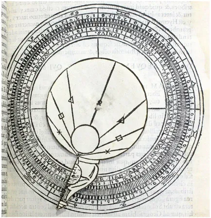
Figure 2 Gallucci, Giovanni Paolo. 1588. A volvelle. ‘Wheels to find the position of the sun, and of the moon, in the zodiac’ (‘Rotulae ad inveniendum locum solis, et lunae in zodiaco’). Theatrum mundi et temporis. Venice: Giovanni Battista Somasco. Book Three, p. 119. Approx 10 × 10 cm.
Collection: Library of the Middle Temple, London, by kind permis...
Table of contents
- Cover
- Title
- Copyright
- Contents
- Foreword
- Introduction
- Contributors
- Part 1 Historical perspectives
- Part 2 Theoretical approaches
- Part 3 Cognitive principles
- Part 4 Practical applications
- Index
Frequently asked questions
Yes, you can cancel anytime from the Subscription tab in your account settings on the Perlego website. Your subscription will stay active until the end of your current billing period. Learn how to cancel your subscription
No, books cannot be downloaded as external files, such as PDFs, for use outside of Perlego. However, you can download books within the Perlego app for offline reading on mobile or tablet. Learn how to download books offline
Perlego offers two plans: Essential and Complete
- Essential is ideal for learners and professionals who enjoy exploring a wide range of subjects. Access the Essential Library with 800,000+ trusted titles and best-sellers across business, personal growth, and the humanities. Includes unlimited reading time and Standard Read Aloud voice.
- Complete: Perfect for advanced learners and researchers needing full, unrestricted access. Unlock 1.4M+ books across hundreds of subjects, including academic and specialized titles. The Complete Plan also includes advanced features like Premium Read Aloud and Research Assistant.
We are an online textbook subscription service, where you can get access to an entire online library for less than the price of a single book per month. With over 1 million books across 990+ topics, we’ve got you covered! Learn about our mission
Look out for the read-aloud symbol on your next book to see if you can listen to it. The read-aloud tool reads text aloud for you, highlighting the text as it is being read. You can pause it, speed it up and slow it down. Learn more about Read Aloud
Yes! You can use the Perlego app on both iOS and Android devices to read anytime, anywhere — even offline. Perfect for commutes or when you’re on the go.
Please note we cannot support devices running on iOS 13 and Android 7 or earlier. Learn more about using the app
Please note we cannot support devices running on iOS 13 and Android 7 or earlier. Learn more about using the app
Yes, you can access Information Design by Alison Black, Paul Luna, Ole Lund, Sue Walker, Alison Black,Paul Luna,Ole Lund,Sue Walker in PDF and/or ePUB format, as well as other popular books in Design & Business General. We have over one million books available in our catalogue for you to explore.