There has been some solid work done in the area of User-Centered Design (UCD) over the last few years. What's been missing is an in-depth, comprehensive textbook that connects UCD to usability and User Experience (UX) principles and practices. This new textbook discusses a theoretical framework in relation to other design theories. It provides a repeatable, practical process for implementation, offering numerous examples, methods, and case studies for support, and it emphasizes best practices in specific environments, including mobile and web applications, print products, as well as hardware.
- 329 pages
- English
- ePUB (mobile friendly)
- Available on iOS & Android
eBook - ePub
About this book
Trusted by 375,005 students
Access to over 1.5 million titles for a fair monthly price.
Study more efficiently using our study tools.
Information
1 | Introduction to User-Centered Design |
In 2009, Jakob Nielsen and his user testing team at the Nielsen Norman Group reported findings from a study on mobile device usability. The results were disappointing. In fact, Nielsen (2009) wrote that watching users “suffering during our sessions reminded us of the very first usability studies we did with traditional websites in 1994. It was that bad” (par. 6).
Most disconcerting and surprising to Nielsen and his team, as well as mobile device designers everywhere, was that users carrying out tasks as part of the 2009 study performed worse than similar users carrying out the same tasks with mobile devices in 2000. In some cases, users of 2009 devices took one or more minutes longer to find something as simple as the local weather forecast than users of 2000 devices.
How could such a result be possible? Those who used mobile devices at the turn of the century remember all too well how frustrating using mobile devices could be, especially when trying to access information from the web. These devices featured tiny screens as well as a tiny touch-tone telephone keypad interface requiring you to choose a letter from a range represented on a number (see Figure 1.1 for a sample of a 2000-era mobile device). Added to difficult input of text was poor network connectivity and interfaces displayed on phone screens clearly designed to display on 1024 × 768 pixel desktop screens. Still, users in 2009 managed to do worse than users in 2000.
Obviously, mobile devices have improved since 2000. In fact, the iPhone was available in 2009 (introduced to the market in 2007) when Nielsen Norman reported on their study. The iPhone and other smart, touchscreen phones performed better in the study than other mobile devices. Nevertheless, despite their better features and quick, widespread adoption, they were not overnight panaceas. The iPhone in 2007, the iPad in 2010, and other extraordinary technology, built with an array of never-before-seen features, have not brought users solutions that deliver mistake-free experiences. One need only look at Google’s Wave (Figure 1.2) platform to understand that building state-of-the-art technology does not guarantee a better user experience or market success.
Google Wave was a synchronous (or real-time) communication platform (as opposed to asynchronous communication such as email). The idea was that, rather than cobble together any variety of different technologies to manage projects, share files, instant message, talk, and email, a group of people working together or even just a group of friends or family could use Wave to do everything under one roof. Wave was built to give users every tool they might possibly need to share information. One quick glance at the Wave interface certainly demonstrates this:
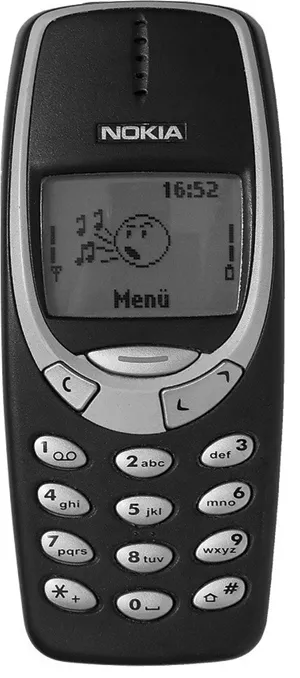
FIGURE 1.1 2000 era mobile device, the Nokia 3310 “Nokia 3310 blue R7309170 wp.” (Rainer Knäpper, Free Art License; http://artlibre.org/licence/lal/en/.)
• Traditional email supplemented by photo profiles of everyone online.
• Built-in search function pulling up returns from key words shared in email or in the ongoing chat window in the upper right of the screen.
• An archive of previous communications, file storage, even the capability of playing back parts of previous meetings that had been recorded and stored. Google Wave had it all (Parr 2009).
With much fanfare and promise, Wave debuted to “an enthusiastic crowd of developers” in 2009 (Arrington 2010, par. 2). One year later, with only minimal adoption by users, development stopped. By 2012, Google had officially killed it.
At EyeGuide, the eye-tracking research and control company cofounded in 2011 by Brian Still and Nathan Jahnke, one of the development team’s favorite sayings is “making something awesome don’t mean using something awesome.” With all due respect to Kevin Costner’s character in Field of Dreams, a fantasy baseball movie from the 1980s, people will not necessarily come if you build it. Just as users struggle with poor technology and don’t want to use it, users also struggle with well-designed technology and don’t want to use it. If both technologies are built poorly or built well, each has an equal chance of frustrating users or causing them to perform poorly. This results in not only a bad marketing outcome, but often a bad financial outcome as well.
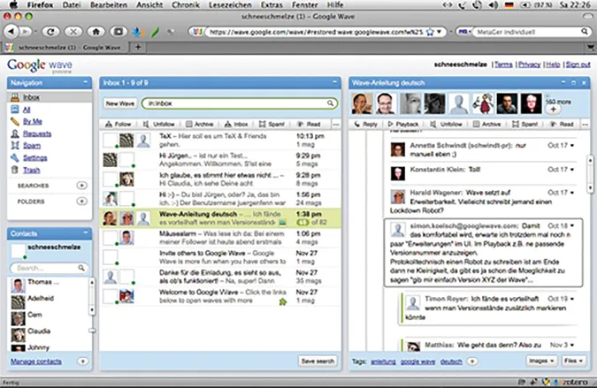
FIGURE 1.2 Google Wave “Google Wave in Firefox 3.5 under Mac OS X Leopard.” (Jürgen Fenn. Taken on November 28, 2009, Creative Commons Attribution 2.0; https://creativecommons.org/licenses/by/2.0/.)
In “Why Software Fails,” Robert Charette (2005) writes that software “failures are universally unprejudiced: They happen in every country, to large companies and small; in commercial, nonprofit, and governmental organizations; and without regard to status or reputation. The business and societal costs of these failures…are now well into the billions of dollars a year” (43). One key reason they fail is poor communication between developers and users, which can be seen in the example of Oxford Health Plans. In 1997, Oxford employed a new automated business system without getting feedback on its development or from its users—patients and caregivers. As the business expanded, the system couldn’t keep up, resulting in $400 million in uncollected payments and $650 million more in unpaid bills. When public investors learned of Oxford’s problems, its stock dropped from $68 dollars a share to $26, a $3.4 billion dollar loss in one day (Parr 2009, 45). Managers and developers initially made no effort to build a system that accommodated user needs, and even once the system was operational, their continued lack of effort to gather feedback from users about how to correct the system ultimately caused it to fail.
Of course, not every company is like Oxford. Charette (2005) mentions Praxis High Integrity Systems as an example of a company that requires “customers be committed…not only financially, but as active participants in” a new system’s creation (48). Praxis, according to Charette, focuses a “tremendous amount of time understanding and defining the customer’s requirements, and it challenges customers to explain what they want and why. Before a single line of code is written, both the customer and Praxis agree on what is desired, what is feasible, and what risks are involved, given the available resources” (49).
Other organizations are also leading the way in creating development processes and products that engage, proactively, their intended users. Pinterest, Uber, and Airbnb, among others, are examples of organizations that don’t focus on making things for users, but rather, as Patrick Stewart (2014) writes, “facilitate the exchange of value between users” (par. 2). At the core of what they do is something Stewart refers to as design thinking.
Design thinking is iterative in nature, but at the heart of how it works is empathy. Designers need to have empathy for a user’s experience. As Stewart (2014) notes, Airbnb founder Brian Chesky “rents Airbnb apartments while hosting other users at his apartment” (par. 20) to better “empathize with both renters and hosts and experience the quality of consumer-producer interactions first hand.” From this participation, he learns, in an experiential fashion, what customers must do to find a place to stay, what obstacles get in the way of that effort, what tools they use, how and when they engage with those tools, and how those tools do and don’t work to aid users in accomplishing their goals. He doesn’t let his users design Airbnb for him, but he doesn’t design the application without understanding their motives and needs.
Unfortunately, for every Airbnb, there are as many or more that do not subscribe to user-centered design (UCD) thinking. The OpenOffice computer mouse prototype (Figure 1.3), unveiled in 2009, is an example.
Complete with 18 features, including an Analog Xbox 360-style joystick with optional 4-, 8-, and 16-key command modes, 512 kb of its own flash memory, and three different button modes, the OpenOffice mouse represented in form and function the most obvious violation of Steve Krug’s (2006) simple but effective first law of usability: “Don’t make me think!” (11). Krug explains, “It’s the overriding principle—the ultimate tie breaker when deciding whether something works or doesn’t…” (11). Krug writes primarily about web design, but this sentiment is true for any product or process people use. To use a product effectively, “it should be self-evident. Obvious” (11).
This truth is not limited to examples of over-designed products or processes. It is easy to pick on things, like the OpenOffice mouse, that fail to be understandable and are not usable for their intended users because they have too many features or functions to comprehend. Certainly, too much utility, or the intrinsic capability of a product or process to complete certain functions or tasks, in a product is a factor in whether users can figure out how to work it or how to use it in particular situations. High-utility interfaces cannot always be avoided. Aircraft cockpit controls, which have been studied since World War II in an effort to make them intuitive to pilots, are an example of high-utility interfaces that are necessary.
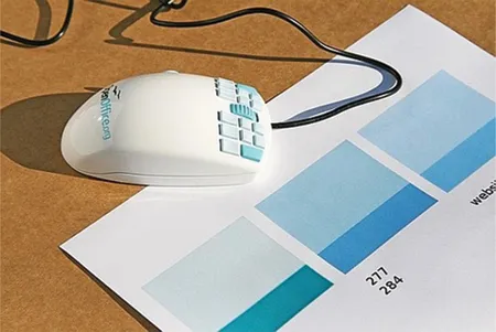
FIGURE 1.3 OpenOffice mouse with 18 built-in functions. (Reprinted with permission from UXcertification.com.)
There are equally unusable low utility interfaces or interfaces that you can only do certain obvious things with while using them. The elevator control images in Figure 1.4a and b illustrate that it is quite possible to make what should be a user-friendly interface unusable. In Figure 1.4a on the left, the elevator control seems simple and straightforward, but the buttons for the floor increase up and to the right in an awkward pattern; Floor 16’s button is actually below Floor 5’s button. In Figure 1.4b on the right, the floor buttons increase from left to right and include an icon, BR, whose physical location in the building is unclear.
Take a walk around your house (or office or campus) and you’re likely to find something designed poorly. In our everyday lives, there are countless examples of things made for us to use but not focused on how we would use them in our real-world experiences. For example, Brian was having lunch at an upscale restaurant. The sink faucets in the bathroom were automatic although Brian initially thought they were broken. Nothing on the faucet itself told Brian how to use it. The soap dispenser made sense, but even when Brian waved his hands beneath the faucet, that action didn’t trigger the water to run. In desperation, he used his soapy hands to push down on the faucet, which he noticed was a little taller than it should be. His hunch paid off. The water started. Cold water? Hot water? He couldn’t control what he got. Luckily, the temperature wasn’t too extreme and he could wash off the soap. However, the water didn’t shut off. Brian looked around in a panic. Did he just break the faucet? He reached across and pushed down the faucet in the sink to his right and it came on and started the flow of water. That told Brian the faucet worked by pushing. Eventually, the water stopped, but there were many anxious moments about what might have happened had the water not shut off.
Beyond Brian’s mundane example, there are examples of where poor design leads to or exacerbates tragic accidents. The Bhopal, India, gas leak in 1984 and the Chernobyl, Ukraine, nuclear reactor disaster in 1986 are both (Meshkati 1991) prime examples of failures in systems because of a noticeable lack of consideration for human factors. At Chernobyl, despite some engineers’ heroic efforts to stop the nuclear reactor’s dangerous meltdown, there were no systems in place to allow operators to carry out actions in emergencies to control the reactor. There weren’t alarms to warn them of danger, and by the time the reactor began to fail, there weren’t sufficient warnings or tools to prevent the unfolding disaster. To this day, the region around Chernobyl is uninhabitable, and more than 7,000 reported cases of thyroid cancer in children under age 18 have been attributed to the radiation fallout (Nuclear Energy Institute 2015).
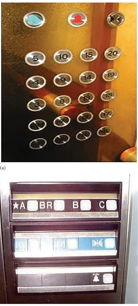
FIGURE 1.4 Images of confusing elevator controls. (a) Awkward pattern for organizing elevator buttons and (b) what does BR mean? Another example of confusing elevator button labeling. (Reprinted with permission from John Bartholdi, http://www2.isye.gatech.edu/~jjb/misc/elevators/elevators.html.)
Union Carbide’s storage plant leaked dangerous gas into Bhopal, India, in December 1984. Almost 3,800 people were killed and another 200,000 injured. Again, although numerous physical and organizational failures led to this disaster, poor design not centered on the needs and capabilities of the plant’s operators contributed to the disastrous outcome. Meshkati (1991) notes that plant staff and workers, undertrained and overworked, were responsible for monitoring too many gauges, some of which were often broken. Ironically, many signs informing responsible staff about monitoring plant safety were written in English although the staff predominantly spoke and read Hindi.
In Set Phasers on Stun, Casey (1998) catalogues a distressing number of tragic stories stemming from mistakes caused by how users interacted with products. They include the death of a cancer patient repeatedly given the wrong dosage of radiation because the technician had inadvertently typed in an X instead of an E to operate the radiation therapy machine. The crash of an Air France Airbus in 1988, which killed two children and injured many others, is another example. After this crash, and a subsequen...
Table of contents
- Cover
- Half Title
- Title Page
- Copyright Page
- Table of Contents
- Preface
- Acknowledgments
- Authors
- Chapter 1 Introduction to User-Centered Design
- Chapter 2 Origins
- Chapter 3 UCD Principles
- Chapter 4 Research Users
- Chapter 5 Assess the Situation
- Chapter 6 Balance and Filter Design Features
- Chapter 7 Build Out an Operative Image
- Chapter 8 Test the Design
- Chapter 9 RIDE (Report, Iterate, Deploy, Evaluate)
- Chapter 10 International UCD
- Chapter 11 Hardware UCD
- Chapter 12 Print UCD
- Chapter 13 Mobile UCD
- Chapter 14 UCD Teams
- Chapter 15 UCD Tools and Technologies
- Index
Frequently asked questions
Yes, you can cancel anytime from the Subscription tab in your account settings on the Perlego website. Your subscription will stay active until the end of your current billing period. Learn how to cancel your subscription
No, books cannot be downloaded as external files, such as PDFs, for use outside of Perlego. However, you can download books within the Perlego app for offline reading on mobile or tablet. Learn how to download books offline
Perlego offers two plans: Essential and Complete
- Essential is ideal for learners and professionals who enjoy exploring a wide range of subjects. Access the Essential Library with 800,000+ trusted titles and best-sellers across business, personal growth, and the humanities. Includes unlimited reading time and Standard Read Aloud voice.
- Complete: Perfect for advanced learners and researchers needing full, unrestricted access. Unlock 1.5M+ books across hundreds of subjects, including academic and specialized titles. The Complete Plan also includes advanced features like Premium Read Aloud and Research Assistant.
We are an online textbook subscription service, where you can get access to an entire online library for less than the price of a single book per month. With over 1.5 million books across 990+ topics, we’ve got you covered! Learn about our mission
Look out for the read-aloud symbol on your next book to see if you can listen to it. The read-aloud tool reads text aloud for you, highlighting the text as it is being read. You can pause it, speed it up and slow it down. Learn more about Read Aloud
Yes! You can use the Perlego app on both iOS and Android devices to read anytime, anywhere — even offline. Perfect for commutes or when you’re on the go.
Please note we cannot support devices running on iOS 13 and Android 7 or earlier. Learn more about using the app
Please note we cannot support devices running on iOS 13 and Android 7 or earlier. Learn more about using the app
Yes, you can access Fundamentals of User-Centered Design by Brian Still,Kate Crane in PDF and/or ePUB format, as well as other popular books in Computer Science & Computer Science General. We have over 1.5 million books available in our catalogue for you to explore.