![]()
A
Oxen
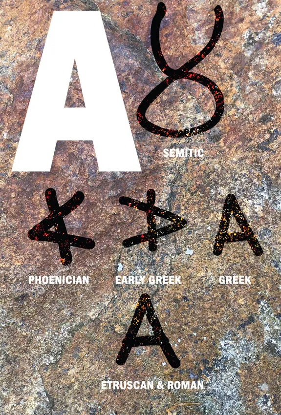
The A is one of the earliest letters, and has held its spot in first place for several thousand years. The letter’s birthplace was Egypt, as a symbol for the ox, which was obviously held in high esteem by our ancient forebears. The Chinese had a special fondness for the ox evidenced by its inclusion in their Zodiac. The ox’s characteristics include steadiness countered with a bit of stubbornness.
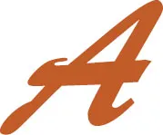
The early semites drew this character to look like an 8 with the top cut off. The Phoenicians, which called their version the Aleph, drew it in a similar way to our modern K. Eventually they transformed it to look much like our present-day A, except upside down and tilted to the right. In the diagram you can see the reference to the horns, head and ears.
When the Greeks got their hands on it, they renamed it the Alpha, and rotated it 180 degrees. They eventually pointed it upright to create the modern Alpha.
The Etruscans appropriated the Greek Alpha and kept it in unchanged. The Romans perfected the design adding geometry and visual corrections to the design.
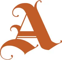
The A is the second most used letter in the English language, so its roots as a draft animal are understandable. Now that we know that the A is derived from the ox’s head, we can harness this energy. There are many options to work this energy into the letterform, ranging from weight, line quality, variation, slants and geometry. The A is one of the more common letters in the alphabet, and this workhorse of a letter’s history has earned its employment in our modern usage.
The ox at times needs to be yoked so that it gets its job done correctly, so when drawing an A for a complete typeface, it has to get along with the other characters in the family. This means the relationship of the horizontal and angled strokes have to be similar to the other characters to be visually appealing. This limits the creativity of the designer a bit, but it aids in readability. On the other hand, if you are drawing an A for a logo or custom lettering you can remove the yoke and let the ox be more expressive.
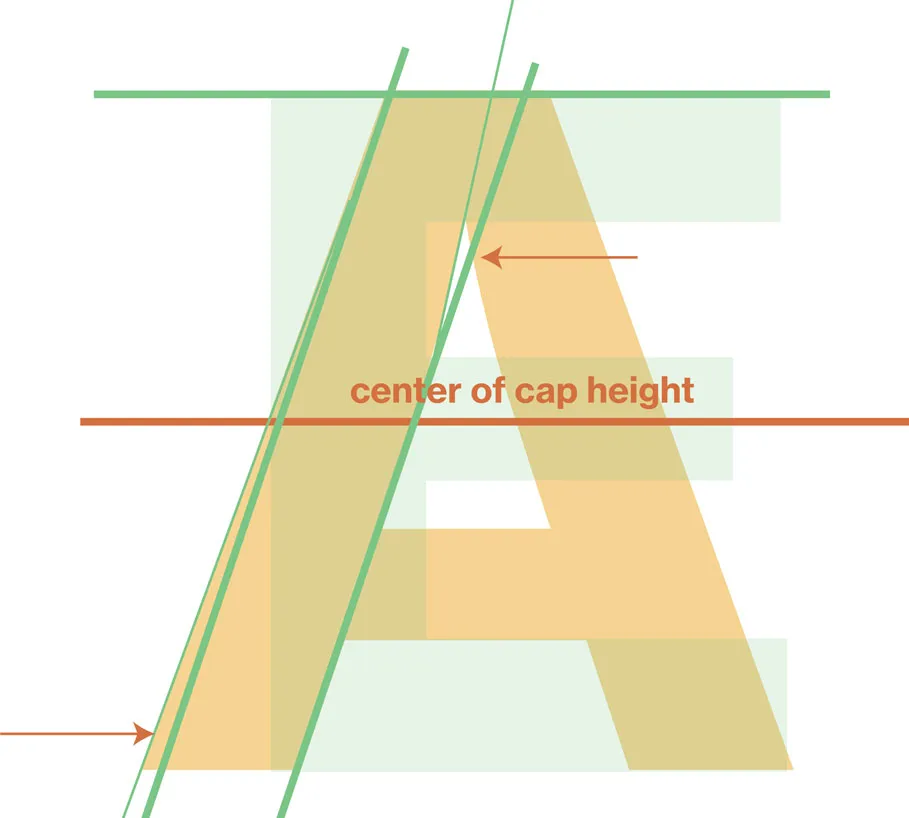
The visual energy from the A is derived from the angled strokes, so when drawing this letter, think of the energy an ox exerts while plowing a field or carting a load. Even though the reference to an ox’s head has been rotated 180 degrees, the energy still is completely directional. It moves your eye rapidly to the next letter form, so because of this, kerning becomes of utmost importance.
Drawing the A
The Greeks and Romans understood that the human eye had issues with lines, the lens tends to make columnar shapes pinch in their middle, flaring out at their tops and bottoms. To correct this they used Entasis to visually correct for this phenomena. Entasis adds a slight swelling to the column to visually correct for the issue. Type designers also use this approach to correct for the eye adding weight to stroke’s intersection, for example, some designers would taper the point where the A’s two angled strokes meet. Ink trapped typefaces show an extreme example of this.
It may be tough to make these tweaks if you are using a brush, nib, pastel or chalk, because the weight variations are achieved by pressure, the direction of the stroke and other variables. With most calligraphic letterforms, the weight variations are the most noticeable with rightward and leftward angles. Strokes leaning to the right tend to be heavier, and because of the downward motion and the angle of the pen’s nib. Because of this, many noncalligraphic typefaces have developed with a similar weight variation. Times New Roman is a great example of this. If you’re drawing vectors, these adjustments are made by the simple addition of Bezier points.
Times New Roman
• Note the relationship of the A to the E, especially in the placement of the A’s hroizontal stroke or bar.
• In some designs, the diagonal strokes taper at the top or apex and flare at the bottom.
Humanist
Brush
Geometric
Blackletter
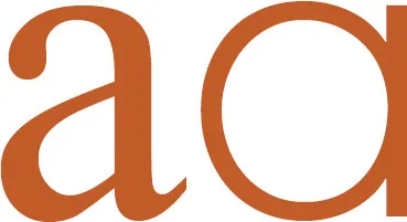
The lowercase a has an interesting background. The variation that has the curved shoulder on the top and the bowl on the lower half came into existence in the late Roman period. It was a way to simplify the writing process. The French later created a version that looked like a lowercase c closed by a vertical stroke on the right.
![]()
B
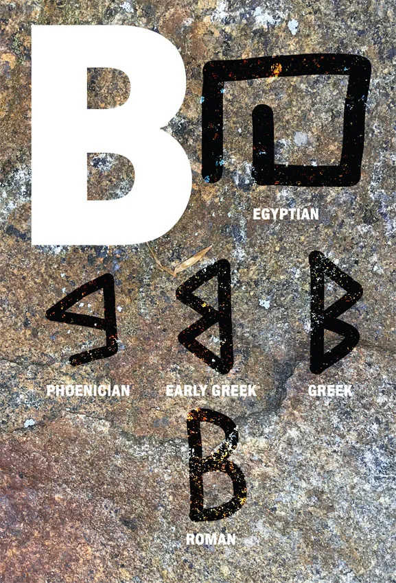
The letter B’s (formerly known as the Bayt) ancestors can also be traced back to Egypt. It was a glyph that represented shelter, as in housing. The idea of shelter was extremely important to the survival of our ancestors, it kept them out of the elements, and lent a degree of safety to their very existence. Many ancient cities that have the prefix “Beth” were named after housing, such as Bethel and Bethlehem.
The early Semites didn’t change the B much from the Egyptian design, but as the letter passed on to the Phoenicians, some changes occurred. They closed the shape up and angled the block shape, adding a left pointing angle to the design.
The early Greeks retooled the Bayt into their Beta by bending the slanted stroke to create the double arched side of the Beta. The Greeks eventually created a flipped version, for the purpose of writing from left to right.
The Etruscans used the right reading Beta, but once in the Roman’s hands, it had a facelift. The Romans visually corrected the B with minor tweaks, such as extending the bottom curve beyond the upper.
Drawing the B
It should comes as no surprise that the B’s foundation reflects our ancestor’s domiciles. The B has an almost structural feel to it, reminiscent of an architect’s floorplan. I visualize a two-story building with bay windows. In my opinion, the B is one of the more difficult letters to dra...