![]()
ONE
Learning to See
| • | Cameras are Everywhere |
| • | Our Compositional Progression |
| • | Eye/Brain Disconnect |
| • | Visual Intensity |
| • | Being Aware of Everything In Your Frame |
| • | Exercises |
Every image starts as a black frame. The things that we photographers choose to put into the frame are elements that either add to or take away from the unique image that we're creating. It takes a myriad of considerations to make sure that the image we're creating conveys the idea we inend because what our brains perceive is different from what the lens records. In this book, we'll explore how to create images that capture our creative vision.
FIGURE 1 Photography is one of the most popular hobbies in the world, and thanks to cell phones, millions of people have a camera on them at all times.
Cameras Are Everywhere
Nearly every cellphone has a camera, computers have built-in web cameras, millions of people own point-and-shoot cameras that they keep with them almost all the time, traffic lights and stop signs have cameras, and a select group of people own a single-lens reflex (SLR) camera.
One reason that cameras are so popular is because they make it easy to capture and preserve moments from our lives long after the memory has evaporated from our minds.
Do you remember exactly what you looked like for your high school graduation? How about for your first date? If you had taken a photograph, you could capture that moment and memory exactly. Of course, sometimes our memories are fonder than the actual event, and we don’t want a photo of what it was really like (you wore that to your senior prom?)!
Another big reason, though, is that images are very powerful and a core part of our world. Human society has been dominated by images, whether we’re looking at images in caves painted 17,000 years ago or images of celebrities in embarrassing situations in the tabloids. A good image can convey an idea on its own more uniquely than any other medium, no translation required, and anyone, in any corner of the earth, can easily share an image with a potential audience of billions of people with only an Internet connection. Those images can be very powerful and world-changing, such as photos of victims of war, or very silly, such as a funny cat photo. Either way, images are a powerful and efficient way to universally convey ideas.
Since their availability to the general public via the Kodak Brownie, cameras have made it easy to create an image. Digital cameras have really lowered the bar for taking a technically perfect photo, with better automatic exposure systems and flexibility to adjust exposure because of how much information a RAW file captures, and instant histograms that tell you if your shot will be correctly exposed before you take the photo. Once you’ve purchased your digital camera and accessories, the only cost when you press the shutter is your time to process the image. We’ve come a long way since the film days when you’d take multiple exposures of the same subject to be sure you nailed it perfectly and then had to pay to get each roll of film developed.
However, what cameras haven’t automated is figuring out what to put into your frame, or, more specifically, what to put where in your frame to create the image that you’ve mentally set out to create. That’s a lot harder, for many reasons, and we’re going to help you learn to do that better in this book. Fortunately, it’s a lot cheaper to learn these skills by trial and error now than it was back in the film days! The other big thing we’re going to show you is how to use the same techniques you’re using while shooting to determine what (if anything) you should do at your computer to optimize your image.
If you’ve read composition books in the past, you’ll find that they typically fall into two categories. The first is a list of rules, which sometimes takes the form of clever chapter titles, yet really boils down to a list of rules. If you were to take the time to write down all these so-called rules, you’d find that they conflict with each other. Inevitably, every composition book says somewhere that you shouldn’t be afraid to break the rules, which pretty much says the “rules” are meaningless. Yes, once in a while these rules will help you get a better photo (and by “better,” we mean one closer to your vision), but without understanding why your image is better when you do something, you’re sort of taking a blind-squirrel-finds-a-nut approach to photography—take a lot of shots, and eventually you’ll get a good one.
The other type of composition book is one that gets very new agey and talks about how the photographer was feeling— insert arbitrary emotion here—and how the photography really conveys said arbitrary emotion, without talking about how the photographer created the emotion. That’s not usually helpful, either, because it doesn’t teach you to take a better photo or really explore what’s appealing to a viewer about the image and how the photographer conveyed that experience.
Now, prepare yourself for something different. We’re about to delve into how our brains perceive images, and, no matter what your skill level, we’re going to do our best to make you into a better photographer.
Our Compositional Progression
The very first step toward making yourself a better photographer is not a rule, but a question. Before you pick up your camera, even before you put your lens on your camera, ask yourself something: What about this scene is interesting to me? That simple question, which really drives at the essence of what you want to convey with any image you’re about to take, should drive every compositional choice you make, from what lens you use to where you stand to which exposure settings you want to use. Yet, for some reason, many photographers often seem to press the shutter button on their cameras without any thought as to why they’re taking the shot or what’s in the frame.
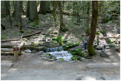
Let’s take a concrete example. Yosemite is a popular national park in California. During the spring and summer months, the park runs a tour where they put everyone on a large, roofless bus and drive around the valley roads, with guides pointing out interesting things to see. At one point, there’s a small waterfall by the side of the road, and if you listen closely as the bus passes, you hear the sound of fifty cameras going “click” at once (and smell the wonderful odor of diesel fumes). Most people end up with a photo like Figure 2.
Since we naturally put the most important thing at the center of the image, the waterfall will be roughly centered in nearly every person’s shot. Chances are that the people shooting were so focused on the waterfall that they didn’t even pay attention to
FIGURE 2 A snapshot of a small waterfall in Yosemite National Park.
how big it would be in the frame, or whether anything else, such as a fellow tourist, was also included in their epic waterfall photo.
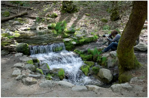
Occasionally, someone who may have read a compositional “rule book” will be on the tour bus. She’ll remember being taught a rule that the subject should always fill the frame! She’ll press the zoom button on her camera and end up with a shot like the one in Figure 3. It’s definitely a better image, and it will still help trigger her memory later on. By zooming in, she won’t have to remember what she was taking a picture of! But in the end, it still has the same flaws as the first shot and makes the waterfall look like a tiny puddle and not something that belongs on a tour (of course, if you’re trying to express your unhappiness with the tour, that might be exactly what you want, but we’re going to assume that’s not the case).
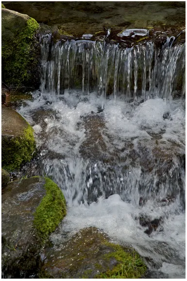
When there is someone on the bus focused on improving his photography, he’ll get off the bus, walk up to the waterfall, and remember what he was taught in his photo class. He’ll remember a rule that vertical subjects should have vertical framing. He’ll be looking for S-curves (lines that curve and meander around, roughly resembling a big “S”) because some other rule told him that S-curves are good. And he’ll follow the rule that says fill the frame. He’ll take an image that looks like Figure 4, and even though it’s a little better than the first two, it’s nothing to write home about. While it’s better than the earlier shots in that it’s clear the shot is about the waterfall, it’s unclear what’s interesting about this waterfall and why he took a shot of it. If anything, the previous shot (Figure 3) was better because it gave a sense of scale and a tiny bit of silliness because this tiny waterfall was part of a tour of a humongous valley.
FIGURE 3 Zooming in on the small waterfall lets it fill the frame, but the shot still isn’t as good as it could be.
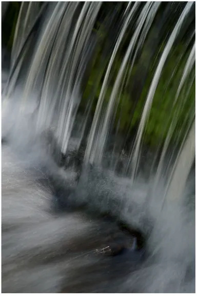
If our intrepid photographer were to walk a little bit closer to the waterfall, he’d notice many gentle curves as the water cascades over the rock and see a neat interplay of light and color with the green moss and the white water. Many people (the authors included) find those details the interesting part of this scene. Next it becomes a question of making the technical choices to support this vision. Picking a long lens would let him isolate that part of the falls from the surrounding area, and a slow shutter speed would emphasize the water’s motion by letting it flow through the image. In the end, you’d get something like Figure 5.
Since photography is subjective, it’s possible that some of you reading this book will prefer one of the earlier shots to the later one. That’s perfectly fine, but ask yourself why you like the earlier shots better. What captures your attention in this scene? What’s more interesting about one shot over another? What would you have done to emphasize that aspect? There are certainly multiple good shots of a single location, and everyone has a different vision of a scene, but the point remains that you should ask yourself what’s interesting to you before picking up your camera.
If it’s hard for you to identify what’s interesting, try this. Imagine you’re about to paint your image rather than taking a photo. As a painter, you can explicitly pick what to include and not include in your painting. Then, figure out what you can do with your camera to include only the things you would have in your painting in the photo.
FIGURE 4 Using some of the traditional “rules” results in a slightly better photo, but it’s still not capturing what’s really interesting about the waterfall.
FIGURE 5 By focusing on what interests you about a scene and using your camera and lenses to emphasize that, you’ll get a better photo than if you just try to follow the...
