Written both for students and working professionals, this book walks readers step-by-step through the foundations of color grading for projects of any size, from music videos and commercials to full-length features.
In this clear, practical, and software-agnostic guide, author Charles Haine introduces readers to the technical and artistic side of color grading and color correction. Color Grading 101 balances technical chapters like color-matching, mastering, and compression with artistic chapters like contrast/affinity, aesthetic trends, and building a color plan. The book also includes more business-focused chapters detailing best practices and expert advice on working with clients, managing a team, working with VFX, and building a business. An accompanying eResource offers downloadable footage and project files to help readers work through the exercises and examples in the book.
This bookserves as a perfect introduction for aspiring colorists as well as editors, cinematographers, and directors looking to familiarize themselves with the color grading process.
Trusted by 375,005 students
Access to over 1.5 million titles for a fair monthly price.
George Lucas had a hit on his hands. Star Wars was showing in movie theaters all over the country at the same time. In a new change to the business model, it was also showing simultaneously in those theaters, instead of rolling out across markets as had been the previous distribution model for hit pictures. This allowed the director to see the film at multiple theaters back to back, even in the same evening. A fan of technology himself, Lucas noticed that the image looked differently in every theater he visited. Some projectors had brand new bulbs set to the right brightness and color balance (often by well-trained union projectionists), and the print looked precisely like it had back at the lab. Other theaters hadn’t maintained their projector as well and there would be a noticeable shift, with the image at the wrong brightness or color balance from an aging bulb, frustrating the filmmaker’s desire to create a consistent experience for the audience.
If you’ve ever been frustrated with how your movie doesn’t look at home like it did in the edit suite, or on your cousin’s PC the way it does on your Mac, you understand his pain. Like any filmmaker, this inconsistency drove him nuts, so he worked with a team of engineers to create the THX certification standards for theaters. This ensured that any theater you would go to would look identical to any other theater. The brightness, color, and sound volume wouldn’t be set by the projectionist, they would match precisely with the standard set by the director in the post production suite. If you saw the THX logo and heard its signature noise at the start of a movie, you could be confident that it looked correct. Not brighter, not more colorful, not louder, but accurate. Identical to every other theater.
Unfortunately, there is no similar standard for modern web and streaming video. While, yes, there is a standard for HD video (Rec. 709), it’s not well enforced by TV manufacturers, and it is especially chaotic in the world of internet video. There are many coming standards for televisions such as Rec. 2020 and Dolby Vision, but these again only apply to television sets, and for better or worse much of the content we create is now consumed on computers, tablets, and phones. As many of you have noticed, your video looks differently on Vimeo, on YouTube, on a Mac, on a PC, on your phone, and on a TV if you find it there. There are even differences within how different apps will show the same content on different smart TVs. Even within the same streaming platform, it’s possible to notice a slight color shift when streaming quality turns up and down on a program.
It is one of the frustrations of this industry that even on very expensive TVs the image doesn’t look the same from monitor to monitor. The only place the image ever looks “right” is on a calibrated broadcast monitor, or in a grading theater. You can’t even “trim” to try and match the end monitor (making your Vimeo upload darker, for instance, if you feel Vimeo lightens your image), since if you make it darker (so it looks better on, say, Vimeo on an iPhone 6S), it might not look as good on an iPhone 8, and if you make it brighter to look good on the iPhone 8, it might look terrible on Vimeo on a PC laptop. There is nowhere near the consistency in digital platforms to make it reasonable to create individual output specs for each one, and even if you could, there are just too many. If you wanted to trim, you’d need to make dozens or perhaps even hundreds of versions. You would lose your mind. As frustrating as it is, in the current environment you just have to make it look good on the broadcast monitor and then let it go.
As recently as the 1990s it was quite common to have a fancy “grading” monitor and a low end “consumer” monitor set up in the color suite so you could preview how your program might look on a lower end monitor as you worked. The musician Bob Dylan apparently always listens to song mixes in his truck before finally approving them to be sure they match the feeling he wants when heard over radio. But as release platforms get increasingly diverse, it’s impossible to set up a color suite that has enough iPads and iPhones and Android Phones and Macs and PCs all streaming at various bit rates to really preview how it will look on all the platforms. A quick stop in any electronics store to compare the image on all of the available TVs and monitors is a good reminder of just how different they continue to look from each other.
If this is the case, why color grade at all? Well, because you want to get the image as close as possible to looking good at least once in its life. At least partially it’s so that you get the pleasure of seeing our project in all its glory, that one time. In addition, some video nerds (the author among them) go to the work of calibrating their home systems for accuracy and can see your work as intended. Home TVs are also increasing in quality and color accuracy, and with a quick pass through the menus many TVs under $1000 are starting to look very good. Theaters show with a high level of accuracy, even though many are no longer willing to pay for THX certification; most, especially the nice ones, project very accurate images.
In addition, even though there is variation monitor to monitor, audiences get used to it. If you are delivering to a client who always looks at footage on their home TV that is set too bright, they are used to everything looking too bright and have adapted to it. Thus your “dark” scenes, which are still technically too bright on your clients “bright” TV, will read as dark to them since they’ve watched all their content on that miscalibrated device.
From there, you have to let it go into the world, accepting that it will never look quite as good as it did in the grading suite. However, it will look consistently different. A “warm” monitor will make everything “warmer” throughout. If you have a grade that is set up so that present day scenes should be yellow, and flashbacks should be blue, that distinction will still translate since both the yellow scenes will get warmed up by the monitor and the flashback blues will as well. Even in a world of frustrating fragmentation in monitoring, color grading is still worth doing. We’ll talk later in the book about making “trim” passes for specific platforms where you know the variables (for instance, making a grade for theater and a grade for TV), but most projects just don’t have the time to manage that kind of workflow for more than a few key outlets, most likely the TV format of Rec. 709 or Rec. 2020 and the theatrical display formats included within the DCP specification.
There are as many ideas about what looks good as there are filmmakers. Some people will gravitate towards bright, saturated colors; some will gravitate towards cooler, denatured images. Different individuals have different tastes.
Every project also has different needs. While there are some filmmakers who like a consistent look film to film (the color-blind Chris Nolan has a very blue tinged look across many of his films), some filmmakers (such as the Coen Brothers) work hard to customize the look of their project for each individual film based on the needs of that project. In stills below from Burn After Reading and O Brother, Where Art Thou?, the same directing team had vastly different storytelling needs and worked to craft distinct looks for both images.
On top of those subjective variations, camera manufacturers want to preserve as much original scene information as possible. Picture someone standing in a room on a sunny afternoon. The window of the final grade might be blown out to pure white. But the original camera design
Still from Burn After Reading (2008)
Still from O Brother, Where Art Thou? (2000)
is probably trying to capture that information outside the window so that it can be used for later color grading if you choose. Camera manufacturers are trying to give you options in post, to enable more choices later. In order to do that, they have to make sacrifices earlier in the process, which can often mean flattening out the “look” of the image in camera, trying to preserve as much picture information as possible. The designers of the camera assume you want to record useable picture information from the widest range of brightness possible, in this image that would include useable information outside the window and useable information inside on the people’s faces.
We define the range of brightness to darkness that a camera is capable of recording as “latitude,” while we talk about a range of absolute values as being a “dynamic range.” Your scene has a dynamic range, with a scene shot in your closet at night having a narrow range of values (dark to slightly less dark), and a scene under the canopy of trees with a view of an open field in the sunshine in the summer having a wide range of values.
When you expose an image, you are lining up the latitude of the device you are using to capture images with the dynamic range of the scene you are capturing. In general, professional motion picture capture devices are all focused on being as wide a latitude as possible in the tones they can capture, at the sacrifice of looking “good” straight out of the box. Since some cameras have more latitude than others, some are capable of capturing more of the source dynamic range. At the end of the line, display devices have a dynamic range, with a certain range of tones that the display is capable of showing. For a long time this was a very limited dynamic range, as even the “brightest” television sets and theatrical projections didn’t get very bright, but the industry is producing brighter “HDR” monitors, which show “high dynamic range” imagery that requires a much higher brightness to achieve.
In order for most professional cinema cameras to capture the widest latitude of imagery, they often sacrifice how the image looks when it’s recorded to preserve flexibility. The major exception to this rule is what we call “broadcast” cameras. While broadcast isn’t always in the name (though it is with the Blackmagic URSA Mini Broadcast), broadcast cameras are designed to deliver a live image direct to an audience. Popular with news and multi-camera television, such as talk shows, Broadcast cameras are designed to look “good” right out of the gate, but this always involves some level of image quality sacrifice in order to do so. Many consumer cameras, such as the Canon 5D, that are designed for users to open up the box on Christmas and shoot beautiful video, make the same sacrifice of applying contrast to the image in camera to create a more pleasing image, at the sacrifice of capture latitude.
Generally, when you will have the time in post to do a color grade, you want to avoid broadcast and consumer cameras and instead work with a camera that is designed assuming you’ll be color grading later, since those cameras will be designed to deliver a wider latitude image that gives you greater flexibility in post.
This is where shooting in “log” comes into play. While it’s not always necessary (it’s not with raw cameras, for instance), a “log” mode for a camera is a system that was developed to capture a wider latitude of brightness ranges into a smaller container. This creates a flatter looking image originally (as seen in the split screen on the previous page, with the log view on the left), but offers more flexibility in the grade. The standard HD video container was only really designed for around seven to nine stops of latitude, but if you want to capture wider latitude, shooting log, if your camera supported it, was a method of doing so. Of course, at the end if you were finishing to HD you’d end up with only those seven to nine stops again, but by capturing log you could have more imagery available to work with as you choose what to highlight, and what to let blow out into highlight or disappear into shadow.
What Hardware Do I Need to Color Grade?
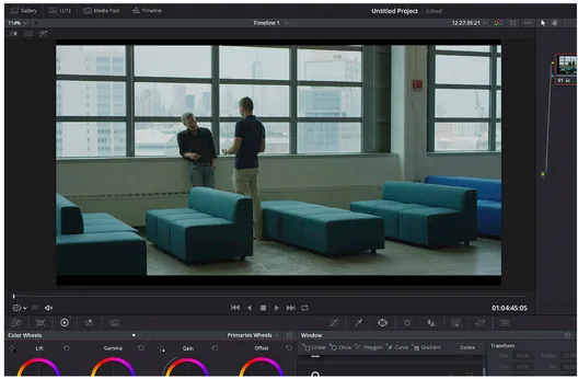
Until fairly recently, you needed to invest a tremendous amount of money to have a color grading suite. Color is a very resource intensive process, as each image is manipulated through a color engine that requires powerful computing resources. However, advances in computing over the last decade have made it easier to get started color grading than ever before. The author has color graded multiple feature films in both HD and 4K UHD resolution on a 2013 Macbook Pro (the 15” Retina model). It wasn’t fun, but it worked.
The key advancement that has made this kind of thing possible is improvements in graphics processing power, or the GPU (graphics processing unit). The GPU is the hardware in your computer that powers your computer display, and it is a custom designed card that has a single purpose in the world: making your display run. In order to do this, it has an architecture custom designed for processing images. Because of the popularity of video games, which want high resolution and high refresh rates, there is tremendous development going on all the time in the GPU marketplace, and those developments are relatively affordable to many because of the volume of the gaming market.
Luckily for those of us in the film and video industry, digital video is somewhat similar to computer graphics, and thus the same power that is being designed into gaming GPUs can be used by video applications to make them run faster. Applications like Adobe Creative Cloud, DaVinci Resolve, and some parts of Avid take advantage of GPU power to accelerate processing. More th...
Table of contents
Cover
Half Title
Title
Copyright
Contents
Introduction: "Why Doesn't My Footage Look as Good as Other People's?"
Overview: What Is Color Grading, Exactly?
Tech 1 Hardware, Software, Monitoring
Tech 2 Codecs and Pipeline
Tech 3 Basic Primary Grading
Tech 4 Matching
Tech 5 Curves, Shapes, and Keys
Tech 6 Tracking and Keyframing
Tech 7 Plugins, Noise Correction, and Heavy Processing
Tech 8 Mattes, Alpha, Composites, and Cleanup
Tech 9 LUTs and Transforms
Tech 10 Onset Workflow, Panels, Dailies, and Online/Conform
Conclusion
Index
Frequently asked questions
Yes, you can cancel anytime from the Subscription tab in your account settings on the Perlego website. Your subscription will stay active until the end of your current billing period. Learn how to cancel your subscription
No, books cannot be downloaded as external files, such as PDFs, for use outside of Perlego. However, you can download books within the Perlego app for offline reading on mobile or tablet. Learn how to download books offline
We are an online textbook subscription service, where you can get access to an entire online library for less than the price of a single book per month. With over 1.5 million books across 990+ topics, we’ve got you covered! Learn about our mission
Look out for the read-aloud symbol on your next book to see if you can listen to it. The read-aloud tool reads text aloud for you, highlighting the text as it is being read. You can pause it, speed it up and slow it down. Learn more about Read Aloud
Yes! You can use the Perlego app on both iOS and Android devices to read anytime, anywhere — even offline. Perfect for commutes or when you’re on the go. Please note we cannot support devices running on iOS 13 and Android 7 or earlier. Learn more about using the app
Yes, you can access Color Grading 101 by Charles Haine in PDF and/or ePUB format, as well as other popular books in Media & Performing Arts & Film & Video. We have over 1.5 million books available in our catalogue for you to explore.