As 'visual animals' architects continue to live and work in a pictorial age in which image-making remains the central activity of environmental design. Selling Architectural Ideas explores the promotional role of architectural graphics and drawing at the point of communication, i.e. at their point of sale. By substituting the words 'communication' and 'presentation' with the word 'selling' we confront the reality of a highly competitive world in which the process of creating images for selling architectural ideas is approached as a more persuasive and, therefore, more successful design tool.
- 160 pages
- English
- ePUB (mobile friendly)
- Available on iOS & Android
eBook - ePub
Selling Architectural Ideas
About this book
Trusted by 375,005 students
Access to over 1.5 million titles for a fair monthly price.
Study more efficiently using our study tools.
Information
1 The Power of the Image
Today they [architects] are in the business of selling images, just as much as magazine and book publishers, television producers, art directors, photographers and writers.
1 The Power of the Image
The selling of architecture nowadays extends beyond the traditional design presentation to a single commissioning client. Aside from the client now lie the serried ranks of preview and planning committees, local amenity societies and competition juries, not to mention the Lottery Commission, Royal Fine Art Commission and English Heritage, etc., and how they will react to the appearance of any new design being proposed. Consequently, the architect has learned to make manifest how a building will appear before it is built; if these skills are not developed, nobody—no matter how clever the design intention—will ever give them permission to build it.
Because of this architects, rather than promote themselves as construction technicians, have taught themselves to become visual prophets. While technical proficiency, if not virtuosity, is today taken for granted, the presentation of the visualised objects of their imagination has become paramount. Architectural design presentation has a long history going back centuries before the present-day wizardry of computer graphics. For instance, in this painting by Domenico Cresti we see Michelangelo marketing his design for the Basilica of St. Peter in Rome using a large and immaculately made wooden model. We also see a committee of powerful clients who will judge the merits of the design against a scaled preview of its three-dimensional incarnation (fig. 1). However, 130 years before this event took place perspective drawing had been invented and its use as a medium of visualisation and presentation was gathering momentum. Together with the later development of a coordinated orthographic projection in the eighteenth century, the primacy of drawing as the central design and marketing tool of architecture became firmly established.

Fig. 1: Michelangelo Shows Pope Paul IV the Model of the Dome of St. Peter’s, 1620, Domenico Cresti (also known as Passignano). Courtesy: Casa Buonarroti, Florence.
Even a built architecture is consumed via a photographic image of itself. Indeed, Bryan Appleyard observes that architects are notoriously fastidious about how their finished buildings will appear in this medium:
This is, of course advertising, but it provides the imagery for which we tend to rely for our judgements…. As a result, architecture exists alongside other consumer goods. We see clothes on one page, recipes on another and buildings on a third. They are not real, but we act as if they were. Architecture, the Queen of the Arts, is reduced to the level of a frock or a sauce.
However, at its ‘point of sale’ architectural drawing and the graphic image function as the major design concept representatives. Furthermore, a common denominator of all those designers who are successful in publishing their ideas in the architectural press and successful in selling, is the ability to invent and create compelling images. Indeed, many of them became celebrated for their image-making skills well before being known for their built architecture.
Anatomy of an Image
Meanwhile, the function of visual communication in the commercial world of advertising is, to quote Bill Bernbach of the Doyle Dane Bernbach ad agency, ‘to speak its message with the greatest possible impact in the least possible time. It must arrest, hold, persuade, implant an idea and give specific information.’ However, if we compare the amount of time spent viewing an architectural image with the inordinate amount of time expended in its creation, it becomes important that we understand the difference between an image that engages and shapes the mind of the viewer and one that invites instant visual rejection.
At the heart of any visual communication is, of course, its meaning. Any visual message has two dimensions: a semantic dimension and a symbolic dimension. While the former indicates the immediate significance of a picture, its symbolic dimension can evoke wider and deeper connotations of meaning and emotion. For instance, in the world of advertising various products are promoted to address specific fantasies latent in the consumer. Lodged deep in the subconscious, these comprise either optimistic ‘futuristic’ or ‘science fiction’ concepts or our dreams of a future based on a nostalgia for the halcyon days of an imaginary bygone rural past. These and other fantasies can be awakened by specific ad images: farmhouse kitchens and pastoral landscapes in which to promote the wholesomeness and purity of a ‘healthy’ product; lakes and oceans against which to advertise the prowess of an automobile or the softness of a shampoo—settings which nudge notions of rebirth as well as triggering primitive sexual associations. Also, there is the use of deserts, sunsets and tropical jungles to symbolise dreams of exotic places and as frames of reference in which to place an ordinary product tantalisingly out of reach.
The potency of the symbolic dimension is illustrated in a trial ad campaign conducted by the Adshel outdoor advertising agency in selected locations in the south of England. This proclaimed a bogus product against a backdrop of an orange, sun-bleached Antipodean outback. The ad portrayed a perfume bottle in the shape of a simplified head wearing a wide-brimmed hat around whose brim hung little glass ‘corks’. The ad announced: ‘Sheila, The First Australian Perfume’. Below the bottle in parenthesis could be seen the words: ‘(also kills flies)’. Although the product was non-existent, the ad caused countless people to ask for the perfume at the cosmetic counters of department stores and chemists, its wit and visual appeal attracting a gullible and unsuspecting consumer (fig. 2).

Fig. 2: ‘Sheila’, bogus perfume ad. Courtesy: Adshel.
We also find an underlying symbolic dimension at work in architectural design. For instance, if a spiritually cleansing Modernist philosophy marketed the promise of a born-again escapism from the grime and ornateness of our industrial past, and a Post-Modernist style nostalgically marketed the cosy, feel-good factor of traditional orders and past values, and a so-called ‘high-tech’ architectural language appeals to our science-fiction fantasy of the future, then a fractal and Chaos Theory-driven Deconstructivism symbolises the pre-Millennium dream for the radical change of a new order. Furthermore, this symbolism can be found reflected in different drawing techniques. For example, imagine an appropriate drawing technique for the design presentation of a log cabin and compare it with that of a hightech building. Immediately, the notion of each architectural type suggests its own line quality; possibly, a freehand line for the former and a hard-line treatment for the latter. This response can also be extended. While thinking of the same two building types you should mentally designate drawing mediums, lettering styles and drawing surfaces for each imaginary presentation. The fact that the two resulting lists may provoke quite different responses is significant. This is because the various mediums and drawing techniques can, in themselves, impart emotional characteristics particular to their use. In image-making and project presentation it is the sympathetic deployment of these mediums and techniques that, in relation to a design idea at its point of sale, can enhance or detract from the meaning of the communication.
However, before we can deliver the message in a drawing, we first have to engage the eye of the viewer. By drawing parallels from research which informs the design of ads, and by studying the graphic work of leading-edge architects, we may begin to understand something about the creation of more compelling images. But first we have to understand the basic ingredients of the pictorial language.
Visual Scanning
Pictorial displays seem to respond to the nature of our field of vision in two basic ways. One is the single-glance graphic, which usually contains a single point of focus. It presents information apparently seen in a single fleeting moment and is intended for rapid visual consumption. Such graphics range from ads to quick sketches (the former often absorbed from the corner of the eye) and to Impressionist paintings which portray a diffuse impression of the behaviour of light on objects with one central point of focus. Single-glance graphics simulate a fixed, momentary view of our field of vision in which the area of sharp focus—representing a stationary point of convergence of our two eyes—is surrounded by blurred outer reaches that reflect the gradual diffusion of information into the regions of peripheral vision.
By contrast, in switched-foci graphics the total area of the pictorial display is evenly in sharp focus and filled with a rich array of detail to invite a close encounter with all regions of the information. Perhaps the best example of this type of image is found in Pre-Raphaelite and a Super-realist art which fills large canvases with meticulously painted ‘photographic’ detail, such as landscapes in which every individual blade of grass is ‘seen’. Although structured within a fixed cone of vision, such images respond to the voraciousness of our eye and can induce it to make a more searching journey around their formats. A visual field evenly filled with rich detail is represented by this elevation entitled The Wall that was Observed for a Long Time (fig. 3). Using a technique reminiscent of the engravings of Piranesi, this ink drawing by Franco Purini literally crams every inch of its surface with a concentration of simulated surface textures. Although time-consuming to create in freehand, such arrays of minute detail, if sufficiently compelling, can engage the eye across the entire area of their composition.
However, when we look at an image or a scene the eye cannot focus on more than one very small point at any one time. This tiny point of acuity exists at the centre of the much wider field of vision. Visual data received outside the focused centre of vision becomes progressively less determinate as it ranges out to the blurred outer reaches of our peripheral vision. Therefore, a scene is never actually viewed ‘at a glance’; rather, it is reconstructed via a scanning sequence in which the eye continuously flits from point to point to complete an almost instantaneous visual reconnaissance of the situation. The raison d’être of an image emanates from this perceptual ‘stitching’ together of information for its ultimate registration in the brain.
Studies of saccades, i.e. fast gaze, shifting eye movements, confirm that people tend to scan arrays of pictorial information in much the same way text is read, i.e. in a western culture working downward and scanning from left to right (and the opposite in right-to-left reading cultures). Research using the Eye Movement Recorder—an apparatus which allows the videoed tracking of the movement of the point of convergence of the eyes over two-dimensional visual information—has established that the eye and brain makes this initial scan to determine the basic equilibrium, or balance, of an image. This is established when the location and relationship of the main horizontal and vertical forces within the image have been identified. Recognition of this underlying structural abstraction is important because it functions as the backbone of a composition. These basic axial forces are also embodied in both regular and irregular shapes contained within the image—their balancing vertical and horizontal axes being instantly sensed.
In her book, A Primer of Visual Literacy, Donis Dondis documents the results of research that identifies two phases of rapid scrutiny in the scanning of visual material. Following the initial sweep and its search for the equilibrium of the image, the eye makes a secondary visual pass which seeks the meaning of the image.
According to Dondis the compositional axes divide formats into areas of information that are capable of presenting different degrees of challenge to the eye. For instance, when the lower half of a picture holds dominance over the upper half, this relationship makes for a stress-free or, in psychological parlance, ‘levelled’ compositional response. However, the fact that an inverted version of this relationship of emphasis appears more stressful stems possibly from its challenge to our learned experience in the natural landscape. Also, when the left-hand side of a format exerts dominance over the right-hand side, we locate emphasis in the region where the eye expects to encounter information. Furthermore, when we draw the eye into the lower left region of the format, we create a maximum stress-free levelling, as this area represents the natural resting place of the information-gathering eye.
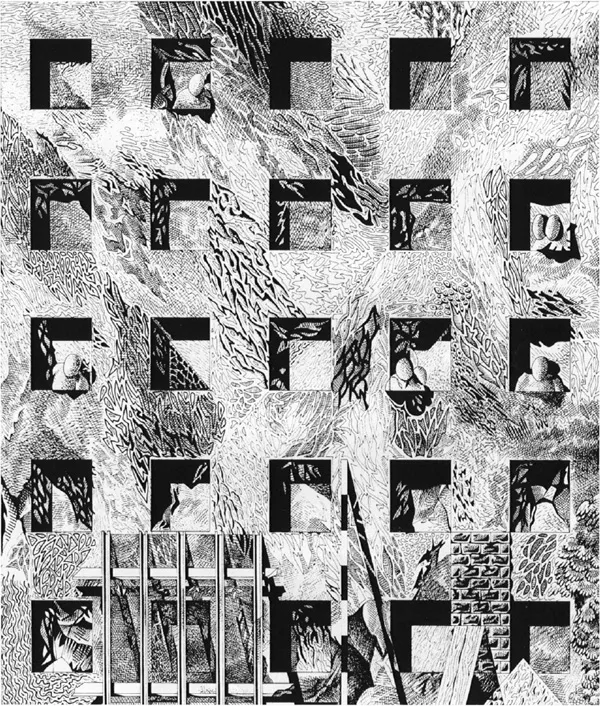
Fig. 3: The Wall that was Observed for a Long Time, 1984, ink drawing, Franco Purini.
On the other hand, when the right-hand side of a composition embodies more visual emphasis than its left-hand counterpart, we begin to build in a degree of perceptual surprise, if not anxiety, which is termed ‘sharpening’. This response occurs because the eye is less prepared to encounter information in this general region. However, when the full weight of emphasis is located in the right-hand area of the format, especially in the upper region, we create the sharpening effect of maximum stress and surprise. Much of this and other eye movement work has been applied to graphic and, espe...
Table of contents
- Cover
- Halftitle
- Title
- Copyright
- Contents
- Acknowledgements
- Introduction
- 1. The Power of the Image
- 2. Presentation as Narrative
- 3. Layout Design Issues
- 4. Architectural Selling Techniques
- 5. Personalised Promotional Tools
- Bibliography
- Index
Frequently asked questions
Yes, you can cancel anytime from the Subscription tab in your account settings on the Perlego website. Your subscription will stay active until the end of your current billing period. Learn how to cancel your subscription
No, books cannot be downloaded as external files, such as PDFs, for use outside of Perlego. However, you can download books within the Perlego app for offline reading on mobile or tablet. Learn how to download books offline
Perlego offers two plans: Essential and Complete
- Essential is ideal for learners and professionals who enjoy exploring a wide range of subjects. Access the Essential Library with 800,000+ trusted titles and best-sellers across business, personal growth, and the humanities. Includes unlimited reading time and Standard Read Aloud voice.
- Complete: Perfect for advanced learners and researchers needing full, unrestricted access. Unlock 1.5M+ books across hundreds of subjects, including academic and specialized titles. The Complete Plan also includes advanced features like Premium Read Aloud and Research Assistant.
We are an online textbook subscription service, where you can get access to an entire online library for less than the price of a single book per month. With over 1.5 million books across 990+ topics, we’ve got you covered! Learn about our mission
Look out for the read-aloud symbol on your next book to see if you can listen to it. The read-aloud tool reads text aloud for you, highlighting the text as it is being read. You can pause it, speed it up and slow it down. Learn more about Read Aloud
Yes! You can use the Perlego app on both iOS and Android devices to read anytime, anywhere — even offline. Perfect for commutes or when you’re on the go.
Please note we cannot support devices running on iOS 13 and Android 7 or earlier. Learn more about using the app
Please note we cannot support devices running on iOS 13 and Android 7 or earlier. Learn more about using the app
Yes, you can access Selling Architectural Ideas by Tom Porter in PDF and/or ePUB format, as well as other popular books in Architecture & Architecture General. We have over 1.5 million books available in our catalogue for you to explore.