Demonstrating the power and variety of typography from hand-drawn to kinetic, this fully updated new edition of The Fundamentals of Typography covers the principles of using type across a range of media.
Starting with a comprehensive introduction to the history of typography, the authors provide detailed explanations and inspirational examples of type usage from leading practitioners from around the world. With expanded practice exercises and four new case studies, this book gives students everything they need to know to use type effectively and creatively.
- 200 pages
- English
- ePUB (mobile friendly)
- Available on iOS & Android
eBook - ePub
The Fundamentals of Typography
About this book
Trusted by 375,005 students
Access to over 1.5 million titles for a fair monthly price.
Study more efficiently using our study tools.
Information
chapter 1
type and language
Typography has developed over the last 600 years as the printing process has evolved. The characters that are printed, however, have been developed over a much longer time period as language itself has developed from Egyptian hieroglyphs to the Latin letters we use today.
This chapter looks at the history of typography in relation to the development of language together with the cultural and historical changes the world has undergone. Typography is not only a craft, it is also part of a wider context. Having an understanding of this context can help to inform and enrich typographic practice.
Type and language
Type is the means by which an idea is written and given visual form. Many typefaces in use today are based upon designs created in earlier historical epochs, and the characters themselves have a lineage that extends back thousands of years to the first mark-making by primitive man, when characters were devised to represent objects or concepts.
This section is an introduction to the complex origins of type. An appreciation of typography naturally involves understanding how written language developed. A general timeline is presented here, but it is important to remember that there is overlap across epochs and for many major developments, there exist counter-claims to the invention. What is shown here serves as a guide to the major milestones in typography.
This section aims to be as comprehensive as possible, but it is impossible to be conclusive. One of the wonders of typography is this fluidity, its ability to adapt to circumstances, technological advances and cultural shifts. For simplicity, this section has been divided into the following categories: The Alphabet, Early Printing, 1800s, Arts and Crafts Movement, The Early Twentieth Century, 1950s, 1960s, 1970s, 1980s, 1990s and Graphic Design Since 2000.
Language is not static
Letters, language and indeed typography develop and change over time as the dominant power inherits, alters, adapts and imposes its will on existing forms. The modern Latin alphabet is a result of such ongoing transition, having been developed and adapted over several millennia.
For example, the modern letter ‘A’ was originally a pictogram representing an ox’s head, but as the Phoenicians wrote from right to left, the symbol was turned on its side. Under the Greeks, who wrote from left to right, it was turned again and finally, the Romans turned the character full-circle, giving it the form that we recognize today.
 |  |
| A pictogram of an ox’s head… | …has been turned on its side by the Phoenicians… |
 |  |
| ...rotated by the Greeks… | …and turned upright by the Romans, to form the modern ‘A’. |
THE ALPHABET
| Latin | Arabic |
 |  |
| Chinese | Greek boustrophedon |
 |  |
Reading direction
The direction in which text is read varies from language to language and is determined in part by historical factors such as how text used to be written. For example, Chinese calligraphers use paint brushes to draw ideograms and so it is easier to write down the page with the right hand, while controlling the scroll with the left.
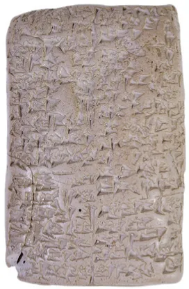
Cuneiform tablets
Cuneiform uses a wedge-shaped stylus to make impressions into a wet clay tablet and is one of the earliest standardized writing systems. It was developed in ancient Mesopotamia, the region that is now east of the Mediterranean, from about 4,000 BC until about 100 BC. Early forms of cuneiform were written in columns from top to bottom, but later changed to be written in rows from left to right. With this change the cuneiform signs were turned on their sides. Cuneiform began to die out as other language systems such as Aramaic spread through the region in the seventh and sixth centuries BC, and as the use of Phoenician script increased.
Some terms to be familiar with
There are many terms used within this book that you’ll need to be familiar with, many of which are often confused.
PHONOGRAM
A written symbol, letter, character or other mark that represents a sound, syllable, morpheme or word.
IDEOGRAM
A graphic element that represents an idea or a concept.
ICON
A graphic element that represents an object, person or something else.
SYMBOL
A graphic element that communicates the ideas and concepts that it represents rather than denoting what it actually is.
PICTOGRAM
A graphic element that describes an action or series of actions through visual references or clues.
Hieroglyphs
Hieroglyphs use a pictogrammatic writing system and were used by several cultures including the Ancient Egyptians and Incas. Each pictogram represents an object rather than a vocal sound. There are over 750 individual Egyptian pictograms. Hieroglyphs can be written from right to left, left to right, or downwards. This is indicated in each piece of text by the direction in which the objects face. For example, if they are facing to the left, the inscription is read from left to right. Border lines are used to indicate that text should be read from top to bottom.
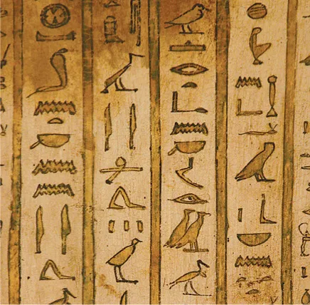
Hieroglyphs on papyrus, reading downwards, as i...
Table of contents
- Cover
- Title Page
- contents
- introduction
- 1 type and language
- 2 a few basics
- 3 letterforms
- 4 words and paragraphs
- 5 using type
- &
- conclusion
- working with ethics
- further reading
- glossary
- credits
- eCopyright
Frequently asked questions
Yes, you can cancel anytime from the Subscription tab in your account settings on the Perlego website. Your subscription will stay active until the end of your current billing period. Learn how to cancel your subscription
No, books cannot be downloaded as external files, such as PDFs, for use outside of Perlego. However, you can download books within the Perlego app for offline reading on mobile or tablet. Learn how to download books offline
Perlego offers two plans: Essential and Complete
- Essential is ideal for learners and professionals who enjoy exploring a wide range of subjects. Access the Essential Library with 800,000+ trusted titles and best-sellers across business, personal growth, and the humanities. Includes unlimited reading time and Standard Read Aloud voice.
- Complete: Perfect for advanced learners and researchers needing full, unrestricted access. Unlock 1.5M+ books across hundreds of subjects, including academic and specialized titles. The Complete Plan also includes advanced features like Premium Read Aloud and Research Assistant.
We are an online textbook subscription service, where you can get access to an entire online library for less than the price of a single book per month. With over 1.5 million books across 990+ topics, we’ve got you covered! Learn about our mission
Look out for the read-aloud symbol on your next book to see if you can listen to it. The read-aloud tool reads text aloud for you, highlighting the text as it is being read. You can pause it, speed it up and slow it down. Learn more about Read Aloud
Yes! You can use the Perlego app on both iOS and Android devices to read anytime, anywhere — even offline. Perfect for commutes or when you’re on the go.
Please note we cannot support devices running on iOS 13 and Android 7 or earlier. Learn more about using the app
Please note we cannot support devices running on iOS 13 and Android 7 or earlier. Learn more about using the app
Yes, you can access The Fundamentals of Typography by Gavin Ambrose,Paul Harris,Sallyanne Theodosiou in PDF and/or ePUB format, as well as other popular books in Design & Graphic Design. We have over 1.5 million books available in our catalogue for you to explore.