- 520 pages
- English
- ePUB (mobile friendly)
- Available on iOS & Android
eBook - ePub
About this book
This book will assist journalists and Flash developers who are working together to bring video, audio, still photos, and animated graphics together into one complete Web-based package.
This book is not just another Flash book because it focuses on the need of journalists to tell an accurate story and provide accurate graphics. This book will illustrate how to animate graphics such as maps, illustrations, and diagrams using Flash. It will show journalists how to integrate high-quality photos and audio interviews into a complete news package for the Web.
Each lesson in the book is followed by a learning summary so that journalists can review the skills they have acquired along the way. In addition, the book's six case studies will allow readers to study the characteristics of news packages created with Flash by journalists and Web developers at The Washington Post, MSNBC.com, and Canadian and European news organizations.
Trusted by 375,005 students
Access to over 1.5 million titles for a fair monthly price.
Study more efficiently using our study tools.
Information
Part I
Why Flash Journalism?
Chapter 1 | |
A New Form of Storytelling |
On January 26, 2001, an earthquake struck the city of Bhuj in northern India. The disaster left most of the buildings in rubble, and tens of thousands died. Half a million people in the state of Gujarat lost their homes. On the other side of the world, news coverage of the devastation seemed both familiar and very remote: a television reporter’s voiceover; video of broken concrete, dust, and ruined streets; reports of people who were injured; interviews with other people describing the missing and the dead. Media attention focused on the losses and relief efforts.
The first example of Flash journalism I remember seeing is a slideshow from the Associated Press about the Gujarat earthquake. Tears came to my eyes as I watched it on my computer. The slideshow begins with a low hum of voices and some thumping and crunching, like chunks of concrete dropping onto rock. Photographs of huge collapsed buildings fade in, then fade out. One or two voices become distinct, speaking a language I do not understand; they sound concerned, worried, urgent. Photos show a lifeless hand protruding from a truck, a man wiping his eyes, a row of covered bodies in the street. Car horns blow. People stand in line for food. A child cries out. A man carries a sobbing girl, her ankle wrapped in white bandages.
No voices in English can be heard. No text appears on the screen. There is no motion apart from the fading in and out of each photograph. Somehow the combination of photographic moments and on-site audio put me in the middle of the scene of destruction and pulled me close to the stricken people—in a way video on television never had. Bhuj became nearer to me. Seven months later, on September 11, I remembered those people and that earthquake in India.
The AP slideshow about the Gujarat earthquake is one example of a way to tell a story online, on a computer screen. This type of presentation combines two media forms that have been available for more than a century, still photography and audio recording. The form bears similarities to video—in fact, video images could have been edited to produce a similar presentation—but this form is distinct from video in that it uses only still photos, which capture and freeze a single instant in time. This form differs from a typical TV news segment of the same length in that there is no introduction, no voiceover, no captions. All the sound is natural sound, from the scene, without an interviewer’s questions.
Slideshows with Photos and Sound
By 2005, most Internet users had seen photo slideshows, some of which play automatically, while others require the user to click a button to change the image. Most of these slideshows include text for caption and credit information. In some cases, the caption is not visible until the user clicks or rolls over a certain element in the window. In other cases, the caption is always visible below or beside the photo.
This slideshow format is specific to digitally delivered media—although photographers have long used slide projectors to show their work to an audience gathered together in one room, and it could also be argued that clicking Next or Back is similar to turning the page in a book or magazine. By itself, then, the slideshow format does not constitute a new form of storytelling. By itself, it is simply a new way to present or deliver photojournalism—a storytelling form that has existed since Roger Fenton went to Balaclava in 1855 to photograph the Crimean War.
To See Examples of Photo Slideshows
The (Durham, N.C.) Herald-Sun Gallery:
http://www.herald-sun.com/gallery/
MSNBC.com: “The Week in Pictures”
http://www.msnbc.msn.com/id/3842331/
Star Tribune Slide Shows (Minneapolis):
http://www.startribune.com/stories/319/
washingtonpost.com: “CameraWorks”
http://www.washingtonpost.com/wp-srv/photo/
Sound adds a dimension that photos with text captions do not, and cannot, possess (Figure 1.1.01). A photo alone engages only one of the five senses. Sound adds information to the experience of a photo, which can change the story that the viewer experiences:
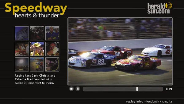
Fig. 1.1.01 Combining on location audio with photojournalism: The Orange County Speedway, a NASCAR racetrack in North Carolina, comes to life in this multimedia feature story from The (Durham, N.C.) Herald- Sun. Printed by permission of The Herald-Sun, Durham, North Carolina. Package produced by Dave Cone.
- If the person in the photo speaks about the moment when the photo was taken, the listener receives one view of the story.
- If the photographer speaks about taking the photo, the listener receives a different view.
- If the audio track contains the natural sound of the scene, the listener receives additional information about the site where the photo was taken.
- If the natural sound was not recorded at the time when the photo was taken, the listener may receive a false impression of the scene.
- If the audio includes music, the listener’s emotional response might be manipulated.
The use of audio in these slideshows is not startlingly new; documentary filmmakers have used sound to enhance their visual stories since the 1930s. Recordings of journalistic interviews and natural sound are edited into audio story formats every day for broadcast on public radio stations around the world. In fact, from a radio journalist’s point of view, it could be said that adding photos to the sound changes the story that the listener experiences:
- The scene in the photo might show something that cannot be adequately described with words.
- The photo might show something that differs significantly from the impression given by the speakers in the recorded audio.
- A wide-angle view or an extreme close-up might convey a great deal more than words or natural sound can.
Not all online slideshows include sound; the decision to include it or not depends on the goals for the presentation, as well as professional realities. Sometimes it is just not possible to get relevant sound to accompany photos.
Sound can detract from the quality of the presentation if the audio quality is poor, if the sound editing is badly done, or if the content of the sound is either redundant or irrelevant to the visuals. Done well, however, the addition of sound to photojournalism can exercise tremendous power over the user.
Animated Infographics
In newspaper offices, the word infographics (or sometimes just graphics) refers to a specific type of illustration that helps tell the story. Usually such a graphic includes one or more blocks of text that help explain what is illustrated. Television newsrooms use the word graphics to refer to similar storytelling visuals. Television graphics are usually specified as either OTS (over the shoulder) or full screen; they may be still or motion.
Larger news organizations employ graphic designers to create original news graphics as needed for the daily newscast or print editions. Both large and small news organizations use ready-made graphics provided by subscription services such as the Associated Press, Reuters, and News in Motion (part of Knight Ridder/Tribune Information Services).
After an event such as the destruction of the space shuttle Columbia on February 1, 2003, TV viewers expect to see animated graphics that explain what happened. The animation for television might be created with exactly the same software tools as the animation published on a news Web site. If the tools are the same, does that mean the two animations (on TV and on the Web) are likely to be the same?
Not necessarily. While the online graphic designer could create an animation that simply plays from beginning to end, exactly like a TV animation, in most cases the online designer will build in some options that enable the user to control parts of the animation. Control is the primary difference between an animation on TV and an animation online. The online designer is not required to give control to the user, but it is always possible for the designer to do so.
USA Today explained the space shuttle Columbia disaster with a package of several animated infographics, including one (“Shuttle Breakup/The Final Hour”) that opens with a map showing Africa, Asia, Australia, and the Pacific Ocean. The shuttle appears inside a circle located off the west coast of Australia (Figure 1.1.02). The time is noted: 8:16 a.m. The control in this case affects the pacing of the animation: When the user clicks the Next button, the shuttle moves eastward; the time shown is 8:19 a.m.; the caption text explains that the shuttle began its descent at that time.
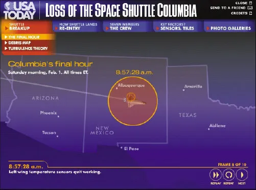
Fig. 1.1.02 USA Today’s “Loss of the Space Shuttle Columbia” includes an interactive map that illustrates what happened, as well as the location of the shuttle, at what time. Printed by permission of USA Today.
USA Today’s “Loss of the Space Shuttle Columbia”: http://www.usatoday.com/graphics/shuttle_evolution/gshuttle_
disasterl2/flash.htm
disasterl2/flash.htm
Evolution of USA Today’s Shuttle Columbia Disaster Graphic: http://www.usatoday.com/graphics/shuttle_evolution/
This page illustrates how journalists constructed this breaking news story package online, producing the first version less than one hour after the first reports of a problem with the shuttle, on the morning of February 1, 2003, and continuing with updated versions through April 23.
By clicking multiple times, the user can watch the shuttle cross the Pacific as the map zooms in closer. The time and the caption change with each click. By 8:52:59 a.m., the shuttle is just west of California, and a blinking circle and a warning tone indicate that a sensor in the left wing has gone offline. The use of sound here is especially effective. By 8:59:33 a.m. the map zooms in and the state of Texas almost fills the window. The shuttle is over the city of Dallas. With the last click (Frame 10), the animation of the shuttle fades and is replaced by an inset square showing detail of the debris field.
What distinguishes this example (and other online animations) from those shown on TV? The online user can:
- Absorb the information step by step, at a pace he or she chooses.
- Replay the animation immediately.
- View the animation at a time that is convenient to him or her.
The user’s ability to control the pace affects the storytelling significantly. Knowing that users can proceed at their own speed, graphic designers can pack in more detailed information, including text and audio.
In another segment of the USA Today shuttle package (“Key Factors/Clues to Columbia’s Breakup”), for example, sensors are illustrated in a cutaway view of the shuttle’s left wing. Dragging the cursor across a timeline animates the sensors’ activity from 8:52 to 8:59 a.m. When the cursor rolls over any of the shuttle’s sensors, a text label appears, describing what that particular sensor monitored. The sensor activity tells part of the story of how systems faile...
Table of contents
- Cover
- Title Page
- Copyright
- Dedication
- Table of Contents
- Acknowledgments
- Introduction
- Part I: Why Flash Journalism?
- Part II: How to Make Things in Flash
- Part III: Case Studies
- Afterword: The Future
- About the Flash Journalists
- Appendix A Preloaders
- Appendix B Loading SWFs into SWFs
- Appendix C Video in Flash
- Very Useful Keyboard Shortcuts
- Flash Reserved Words List
- Index
Frequently asked questions
Yes, you can cancel anytime from the Subscription tab in your account settings on the Perlego website. Your subscription will stay active until the end of your current billing period. Learn how to cancel your subscription
No, books cannot be downloaded as external files, such as PDFs, for use outside of Perlego. However, you can download books within the Perlego app for offline reading on mobile or tablet. Learn how to download books offline
Perlego offers two plans: Essential and Complete
- Essential is ideal for learners and professionals who enjoy exploring a wide range of subjects. Access the Essential Library with 800,000+ trusted titles and best-sellers across business, personal growth, and the humanities. Includes unlimited reading time and Standard Read Aloud voice.
- Complete: Perfect for advanced learners and researchers needing full, unrestricted access. Unlock 1.5M+ books across hundreds of subjects, including academic and specialized titles. The Complete Plan also includes advanced features like Premium Read Aloud and Research Assistant.
We are an online textbook subscription service, where you can get access to an entire online library for less than the price of a single book per month. With over 1.5 million books across 990+ topics, we’ve got you covered! Learn about our mission
Look out for the read-aloud symbol on your next book to see if you can listen to it. The read-aloud tool reads text aloud for you, highlighting the text as it is being read. You can pause it, speed it up and slow it down. Learn more about Read Aloud
Yes! You can use the Perlego app on both iOS and Android devices to read anytime, anywhere — even offline. Perfect for commutes or when you’re on the go.
Please note we cannot support devices running on iOS 13 and Android 7 or earlier. Learn more about using the app
Please note we cannot support devices running on iOS 13 and Android 7 or earlier. Learn more about using the app
Yes, you can access Flash Journalism by Mindy McAdams in PDF and/or ePUB format, as well as other popular books in Languages & Linguistics & Communication Studies. We have over 1.5 million books available in our catalogue for you to explore.