This is a practical guide for teachers and trainers who are responsible for designing and writing instructional material. Focusing on layout and the visual presentation of text, the author of this work uses "before and after" formats to illustrate the importance of clarity, structure and emphasis.
Trusted by 375,005 students
Access to over 1 million titles for a fair monthly price.
This chapter considers how choosing an appropriate page-size for a book or document determines subsequent decisions about the detailed planning of the work. Here I discuss the advantages and limitations of choosing a page-size from the range of standard sizes recommended by the International Organization for Standardization.
Printed materials come in many shapes and sizes. Until recently there have been no specific rules or guidelines which might suggest to writers, designers or printers why they should choose one page-size in preference to any other. The research literature on legibility and textbook design offers little help, for page-size is not an issue that features in many textbooks on typographic research. Why then do I choose to open my guide to designing instructional text by discussing page sizes?
Many people expect a review of typographic design to begin with issues such as type-sizes, type-faces and line-lengths. Indeed, the first question that an editor of a forthcoming journal once asked me was, ‘What type-size should I use?’ However, it is important to realize that the choice for this variable is already constrained by earlier decisions. Clearly we do not expect to find large type-sizes in a pocket dictionary nor a single column of print in a daily newspaper. These examples are extreme, but they illustrate the point. The choice of page-size comes first, and this affects the choices that are available for subsequent decisions.
The size of the page (and these days, the electronic screen) determines the size of the overall visual display. The reader needs to be able to scan and read this display easily, be it large like a wall chart, or small like a pocket timetable. The reader needs to be able to scan, read and focus on both the gross and the fine details. The size of the page or screen constrains the decisions that writers and designers make about these details.
The choice of an appropriate page-size is not always easy. A number of factors contribute to decisions about which page-size to use. Perhaps the most important one is some knowledge of how the information is going to be used. Other factors are reader preferences, the costs of production and marketing, basic paper sheet sizes and, more generally, the need to conserve resources and avoid waste.
Standard page-sizes
In the case of printed texts, one of the most obvious things that can be wasted is the paper itself. It is for this reason that there is great interest in manufacturing standard page-sizes, and the International Organization for Standardization has achieved an intriguing solution to this problem.
The page-sizes that we commonly see are cut from much larger basic sheets which have been folded several times. The present-day variety in page-sizes results from manufacturers using different sizes for their basic printing sheets and folding them in different ways. If the basic printing sheets were all one standard size, however, and the method of folding them allowed for little if any wastage at the cutting stage, then great economies could be achieved.
As an aside we may note that the need to rationalize paper sizes has been discussed for a long time in information printing. In 1798, for example, the French government prescribed a standard for official documents based on the proportion of 1:1.41 with a basic printing sheet of one square metre in area. In 1911, Wilhelm Oswald proposed 1:1.414 (that is, 1:
2) as the ‘world format’. In 1922 the German standard, DIN 476, was published. For this standard the ratio of 1:
2 was retained with a basic printing sheet size of one square metre. The German standard, together with the A, B and C series of sizes, was adopted in 1958 by the International Organization for Standardization (ISO). Today the ISO series is recommended by the 50 or more national standards bodies which together make up the ISO.
The dimensions of the sizes in the ISO A and B series of sizes are set out below. The C series relates to envelope sizes for use with standard-sized documents and need not concern us here. In the United Kingdom the A series is now well known, especially the more commonly used A4 and A5 sizes. The B series, which is rooted in the same principle as the A series, and whose sizes fall in between those of the A series is, however, not so common.
ISO series of trimmed paper sizes:
A series
B series
Designation
Size (mm)
Designation
Size (mm)
A0
841 × 1189
B0
1000 × 1414
A1
594 × 841
B1
707 × 1000
A2
420 × 594
B2
500 × 707
A3
297 × 420
B3
353 × 500
A4
210 × 297
B4
250 × 353
A5
148 × 210
B5
176 × 250
A6
105 × 148
B6
125 × 176
A7
74 × 105
B7
88 × 125
A8
52 × 74
B8
62 × 88
A9
37 × 52
B9
44 × 62
A10
26 × 37
B10
31 × 44
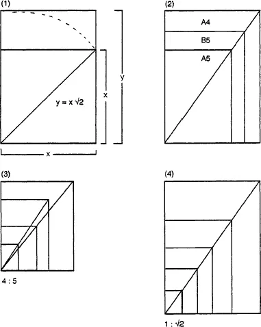
The unifying principle of the ISO-recommended range of sizes is that a rectangle with sides in the ratio of l:
2 can be halved or doubled to produce a series of rectangles each of which will retain the proportionsof the original (see Figure 1/1). A rectangle of any other proportion will generate geometrically similar rectangles only at every other point in the process of halving or doubling (Figure 1/1).
Figure 1/1
ISO paper sizes.
(1) This diagram illustrates the principle of construction and shows that the ratio of the sides of the rectangle is the same as that of the side of a square to its diagonal.
(2) This illustrates the fit between the A and the B series of sizes. For example, B5 falls between A5 and A4, and is geometrically similar.
(3) A rectangle of non-standard proportions. Note that the process of halving generates two geometrically dissimilar series of rectangles.
(4) A rectangle of standard proportions. This case is unique in that halving generates geometrically similar rectangles at each point in the series.
As the pages of a book are made by folding the larger basic printing sheet in half – once, twice, three times or more – all the pages made from a standard size basic sheet will be in the ratio of 1:
2. Basic sheets which do not conform to this standard do not exhibit the property of geometric similarity when folded to form pages of a book, and this can create waste.
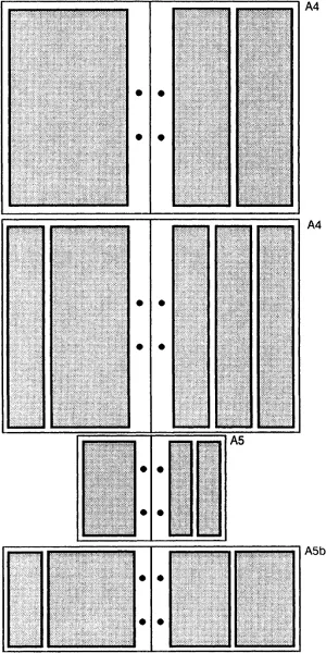
We may note at this point, of course, that documents can be bound at the top (notebook style) or on the left, and that they may be arranged in a vertical (portrait) or horizontal (landscape) style. These variations allow for a variety of page layouts (see Figure 1/2).
However, the astute reader will recognize that I have not chosen an ISO page-size for this book and will rightly ask, ‘Why not?’ The answer lies in the fact that, as noted earlier, a number of factors contribute to decisions about which page-size to use, and that some of these may seem more important than others.
Figure 1/2
Some possible subdivisions of ISO standard pages.
Before planning can begin the designer/author has to ask a number of questions, such as:
1. How, when and where will this document be used?
2. How will the document be multiplied/printed/displayed?
3. Do additional ...
Table of contents
Front Cover
Half Title
Title Page
Copyright
Contents
Preface and acknowledgements
1 Choosing a page-size
2 Basic planning decisions
3 Type-sizes and inter-line spacing
4 Choosing type-faces
5 Space and structure
6 Writing instructional text
7 Theory into practice
8 Diagrams and illustrations
9 Tables and graphs
10 Forms and questionnaires
11 Text design for the visually impaired
12 Instructional text and older readers
13 Designing electronic text
14 Evaluating instructional text
Postscript – Designing text for busy readers
Subject Index
Author Index
Frequently asked questions
Yes, you can cancel anytime from the Subscription tab in your account settings on the Perlego website. Your subscription will stay active until the end of your current billing period. Learn how to cancel your subscription
No, books cannot be downloaded as external files, such as PDFs, for use outside of Perlego. However, you can download books within the Perlego app for offline reading on mobile or tablet. Learn how to download books offline
Perlego offers two plans: Essential and Complete
Essential is ideal for learners and professionals who enjoy exploring a wide range of subjects. Access the Essential Library with 800,000+ trusted titles and best-sellers across business, personal growth, and the humanities. Includes unlimited reading time and Standard Read Aloud voice.
Complete: Perfect for advanced learners and researchers needing full, unrestricted access. Unlock 1.4M+ books across hundreds of subjects, including academic and specialized titles. The Complete Plan also includes advanced features like Premium Read Aloud and Research Assistant.
Both plans are available with monthly, semester, or annual billing cycles.
We are an online textbook subscription service, where you can get access to an entire online library for less than the price of a single book per month. With over 1 million books across 990+ topics, we’ve got you covered! Learn about our mission
Look out for the read-aloud symbol on your next book to see if you can listen to it. The read-aloud tool reads text aloud for you, highlighting the text as it is being read. You can pause it, speed it up and slow it down. Learn more about Read Aloud
Yes! You can use the Perlego app on both iOS and Android devices to read anytime, anywhere — even offline. Perfect for commutes or when you’re on the go. Please note we cannot support devices running on iOS 13 and Android 7 or earlier. Learn more about using the app
Yes, you can access Designing Instructional Text by James Hartley in PDF and/or ePUB format, as well as other popular books in Education & Education General. We have over one million books available in our catalogue for you to explore.